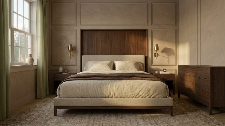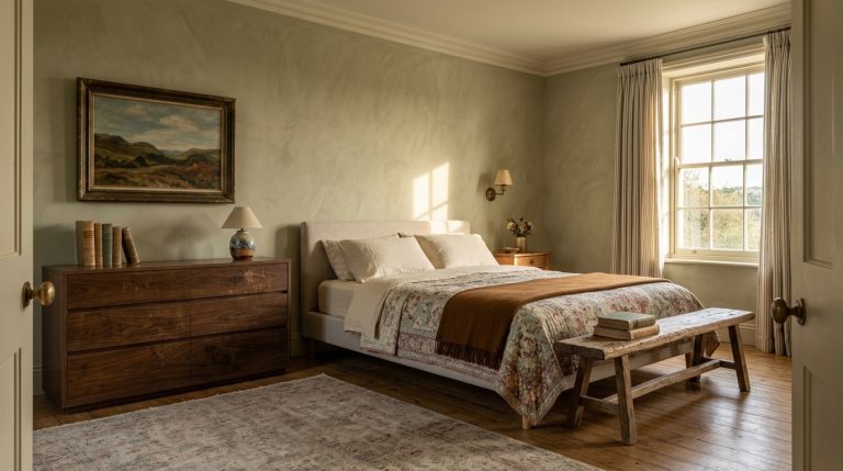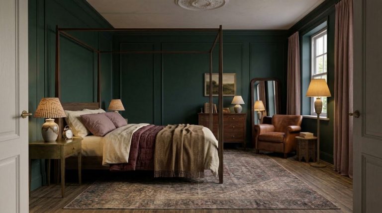
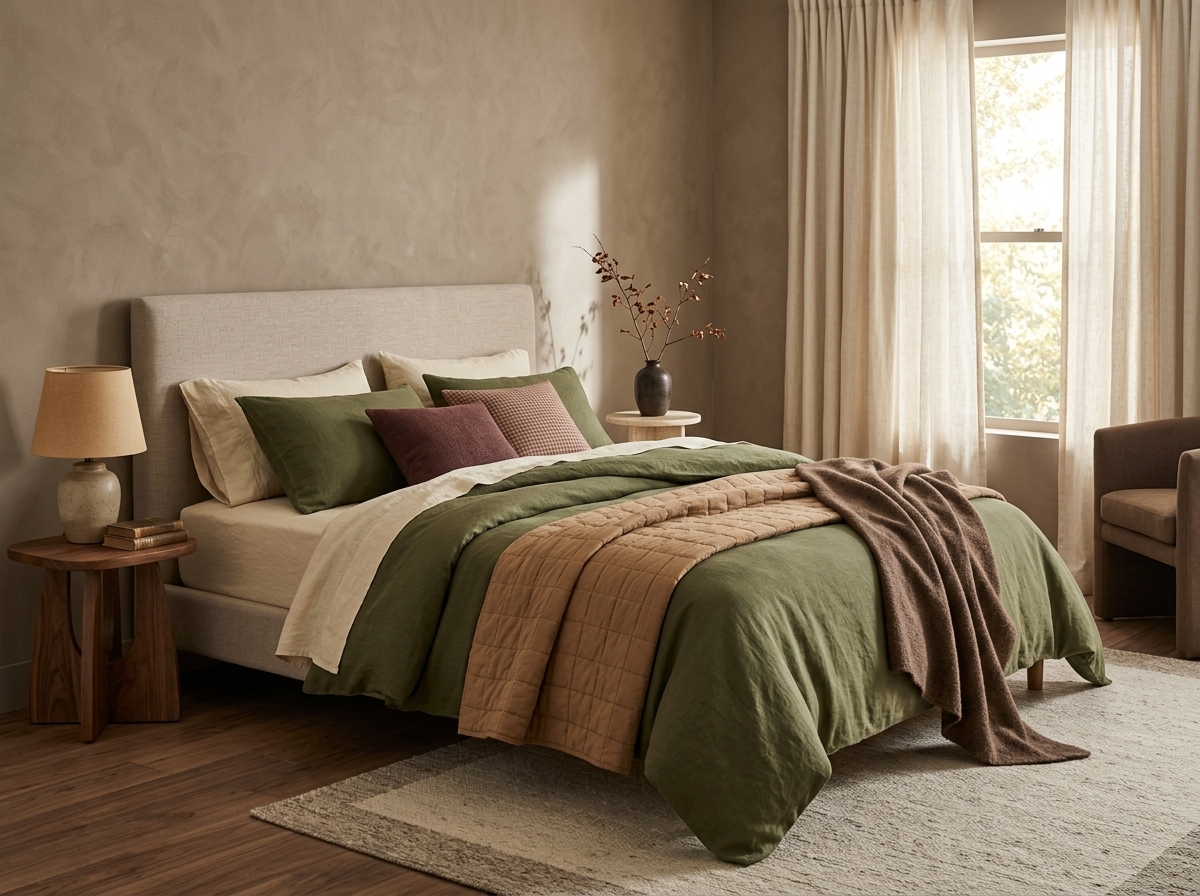
23 Fall Bedding Combos That Make a Bedroom Feel Warm, Layered and Cozy
Fall bedding does not need pumpkins printed across the duvet or an entirely orange bed.
In fact, some of the most convincing fall bedding combos barely use orange at all. Olive can become autumnal beside camel and walnut. Navy feels warmer when tobacco brown enters the palette. Dusty rose shifts away from spring once it sits beside cocoa, oatmeal, or burgundy. Even blue gingham can work in October if its surrounding layers are earthy enough.
The bigger design lesson is that seasonal bedding is a composition, not a single color choice.
Your sheets establish the background. The duvet or quilt usually carries the dominant color. A folded coverlet or throw can introduce contrast. Pillows repeat one or two tones so the bed feels intentional rather than assembled from unrelated pieces.
That layered, less perfectly matched approach is particularly relevant in 2026. Designers are moving away from formulaic all-white hotel beds toward more personal combinations of color, pattern, texture, and slightly relaxed layering. Livingetc also reports growing interest in tonal bedding, where close shades are varied through different fabrics rather than perfectly matched.
These 23 combinations show how to make green, brown, blue, pink, orange, gingham, and richer fall-to-winter palettes work without turning the bedroom into a short-lived seasonal display. For more layering ideas, see these fall bedding ideas.
Green fall bedding combinations
Green becomes particularly good for fall when it moves away from fresh spring greens and starts interacting with brown, rust, camel, walnut, cream, and deeper red tones.
The exact green matters.
Sage is soft and quiet. Olive is earthier. Moss has more depth. Forest green can carry a much darker and more enveloping bedroom.
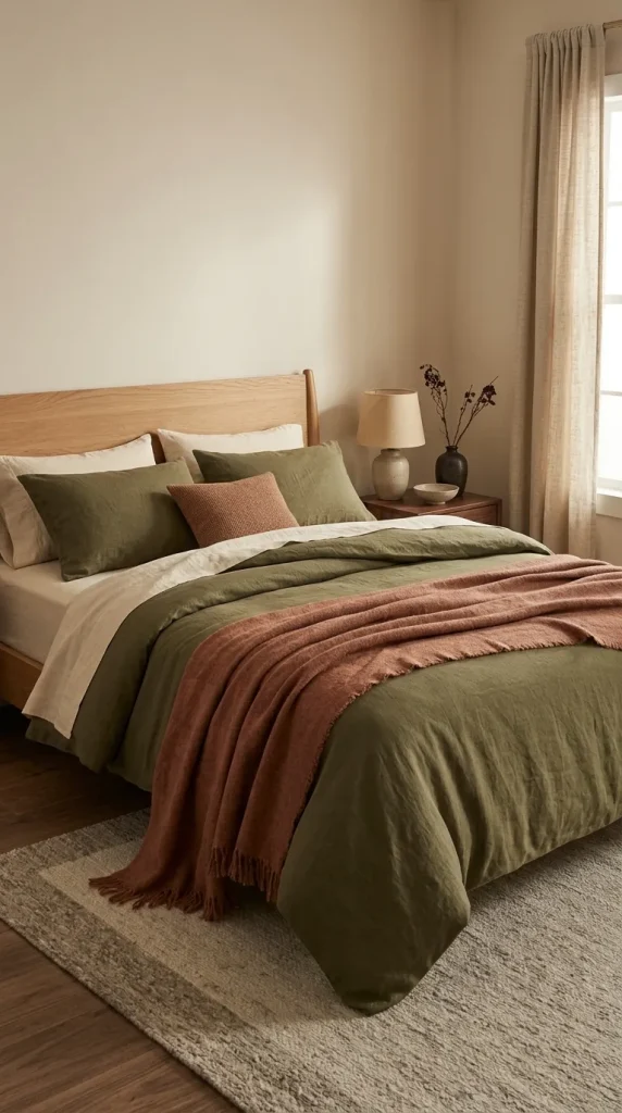
1. Olive duvet + cream sheets + rust throw
This is one of the easiest fall combinations to get right because each color has a clear job.
Let olive be the dominant field through a duvet or quilt. Cream sheets keep the area around the face lighter, while a rust or faded terracotta throw introduces the seasonal warmth.
The contrast should not be extremely sharp. Warm ivory or oatmeal usually feels more connected to olive than brilliant optic white.
Texture can do much of the remaining work. Try washed cotton or linen in the olive layer, smoother cream sheets underneath, and something heavier such as wool, knit, or quilted cotton at the foot.
The palette feels unmistakably autumnal without relying on obvious seasonal motifs.
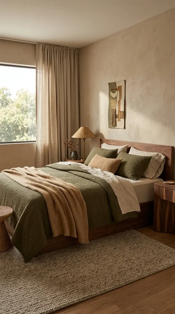
2. Moss green + camel + walnut brown
Moss has enough brown in it to work beautifully with warmer woods.
Use moss on the quilt or duvet, camel through a blanket or lumbar pillow, and let walnut furniture provide the darkest brown.
If your bedroom already contains walnut nightstands or an espresso-toned bed frame, you may not need brown bedding at all. The furniture can act as the grounding color.
Add oatmeal sheets rather than bright white.
This combination works especially well in bedrooms with aged brass lamps, woven shades, linen curtains, or warm plaster-like walls because the materials reinforce the earthy character.
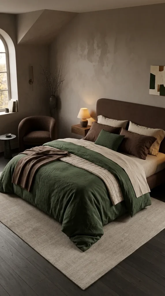
3. Forest green + chocolate + oatmeal
For a moodier fall bedding combo with green, deepen both the green and the neutral.
Forest green makes an excellent duvet color. Chocolate brown can appear through pillowcases, a blanket, or an upholstered headboard, while oatmeal prevents the palette from becoming too dense.
House Beautiful’s 2026 bedroom reporting points to deep moss, chocolate, camel, burgundy, and similarly earthy colors as part of a broader move toward cocooning bedrooms with richer color and layered tactile materials.
The lightest layer matters here. If the walls, bed frame, and flooring are also dark, use enough oatmeal or parchment around the pillows to separate the bed from its surroundings.
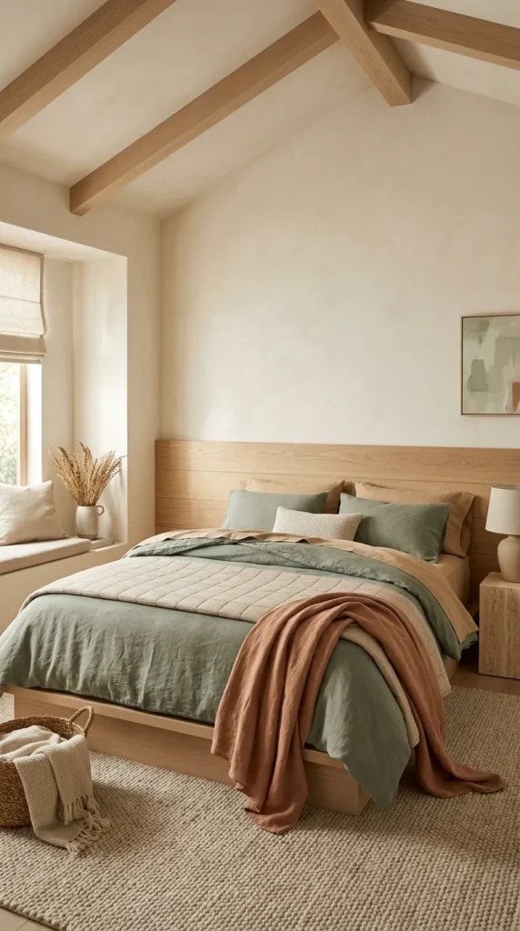
4. Sage + tan + muted pumpkin
Sage can easily feel spring-like if it is paired only with white.
Warm it instead.
Start with sage bedding, introduce tan through sheets or a coverlet, then use muted pumpkin as a smaller accent.
The orange should lean toward clay, faded pumpkin, or soft terracotta rather than bright Halloween orange.
This combination is particularly effective with pale oak furniture because the tan layer connects the bedding to the wood.
If the room already has several warm timber surfaces, keep the pumpkin accent limited to one folded throw or a pair of smaller cushions.

5. Olive + dusty rose + cocoa
This is one of the more unexpected combinations in the article, but the colors make sense together because all three can share muted, earthy undertones.
Olive provides the grounding color.
Dusty rose introduces softness.
Cocoa keeps the pink from feeling sugary or spring-like.
One practical arrangement would be an olive quilt, warm ivory sheets, dusty-rose pillowcases, and a cocoa throw.
Another is a cocoa duvet with olive pillows and one clay-pink blanket.
This is a good example of why seasonal color depends more on undertone than on the name of the hue. A cool pastel pink might feel completely wrong here. A muted rose with brown or clay underneath it feels much more natural. If earthy neutrals like this appeal to you, explore these earthy bedroom ideas.
Brown fall bedding combinations
Brown is one of the strongest colors for fall bedding because it creates warmth without forcing the room into a literal seasonal theme.
Chocolate, cocoa, chestnut, camel, tan, and taupe each behave differently.
Chocolate adds depth. Camel is warmer and lighter. Taupe is quieter. Chestnut carries more red.
Current Fall 2026 interiors are also giving chocolate and cocoa tones substantial attention, including as alternatives to more predictable seasonal orange.
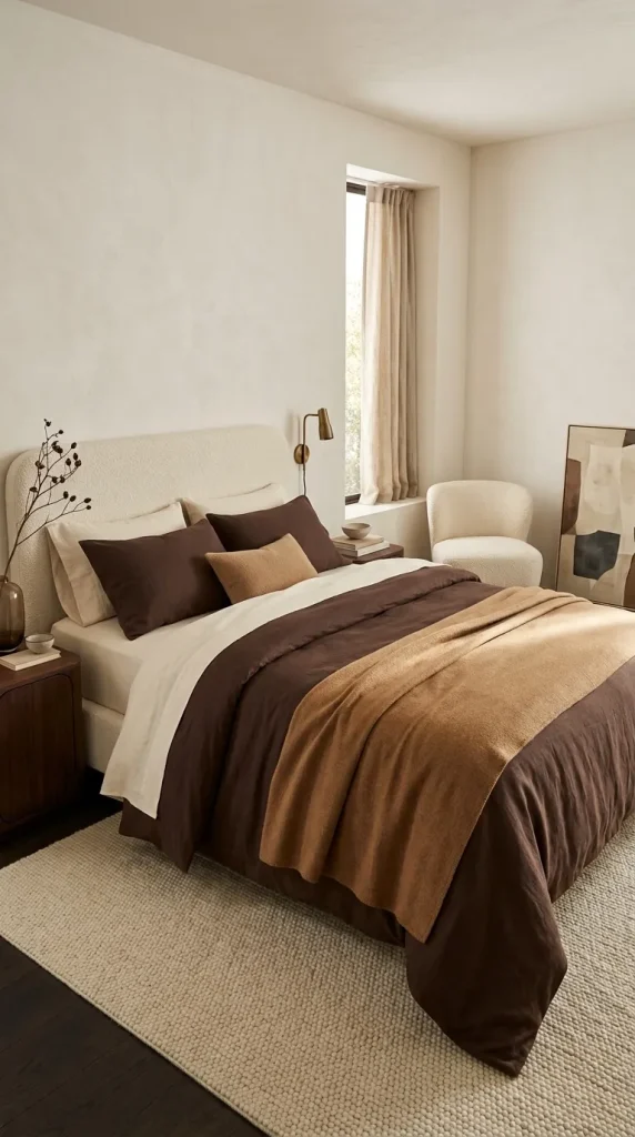
6. Chocolate + ivory + camel
A chocolate duvet can look incredibly rich, but it needs tonal relief.
Use warm ivory sheets rather than gray-white. Fold a camel blanket or coverlet across the lower third of the bed.
The difference between chocolate and camel creates tonal layering without introducing another color family.
This is particularly good in rooms with dark wood, aged brass, cream upholstery, or warm off-white walls.
Avoid making every textile brown. One generous ivory area around the pillows gives the eye somewhere to rest.
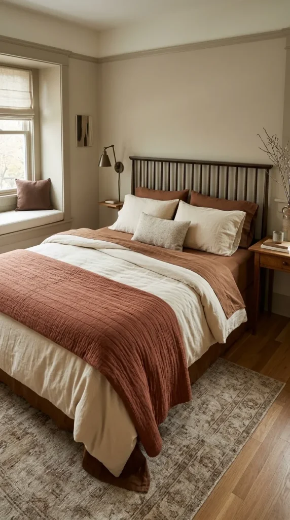
7. Brown sheets + cream duvet + rust quilt
Brown sheets deserve more attention than they usually receive.
They create a much warmer visible border around a cream duvet than standard white sheets and can make a light-colored bed feel more autumnal without requiring a dark comforter.
Try cocoa or chestnut sheets beneath a cream duvet, then fold a rust quilt over the bottom half.
The three layers create a useful value progression:
- Dark brown underneath.
- Light cream in the center.
- Medium rust at the foot.
If you have a dark wood headboard, use a slightly lighter brown sheet so the two surfaces do not merge.

8. Cocoa sheets + olive quilt + oatmeal throw
For another fall bedding combo with brown sheets, let cocoa form the quiet background while olive becomes the visible seasonal color.
Use oatmeal for the softest top layer.
This combination feels particularly comfortable in rooms with black metal beds, medium oak, or walnut because the bedding contains enough variation to bridge both dark and light materials.
A quilted olive layer is useful here because stitching creates shadow and prevents the green from reading as one flat block.
Keep decorative pillows restrained. Cocoa, oatmeal, and perhaps one small patterned olive cushion are enough.
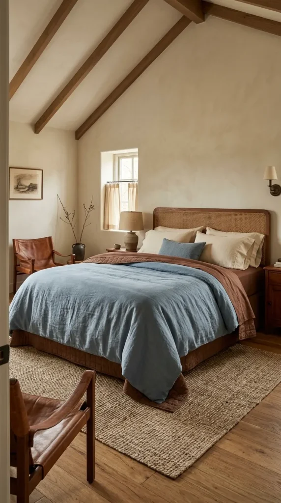
9. Chestnut + dusty blue + warm cream
Brown does not always need to be paired with another warm color.
Dusty blue can make chestnut look richer because the slight temperature contrast allows both colors to register more clearly.
Use chestnut through sheets or a coverlet, dusty blue on the duvet, and warm cream around the pillows.
The blue should be softened, grayish, or denim-like rather than icy.
This combination works particularly well if the room already contains brown leather, wood furniture, or a natural fiber rug.
The warmer surroundings stop blue from turning the scheme summery.
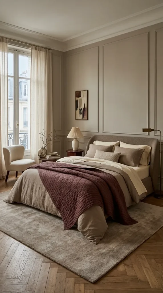
10. Warm taupe + burgundy + parchment
Taupe makes a useful bridge between neutral and dramatic bedding.
Use warm taupe as the largest layer, then introduce burgundy through a quilt, throw, or patterned cushion.
Parchment sheets soften the combination.
Burgundy is powerful, so it does not need to dominate. One folded quilt can change the entire temperature of an otherwise neutral bed.
The resulting palette feels grown-up rather than overtly seasonal and can remain in place throughout winter.
Blue fall bedding combinations
Blue may not be the first color associated with autumn, which is exactly why it can produce some of the most interesting beds.
The key is to remove the coastal cues.
Pair blue with camel, tobacco, rust, chocolate, burgundy, or warm taupe rather than crisp white and pale driftwood.
Current design coverage supports this broader approach to fall color. Homes & Gardens has highlighted sophisticated blue and turquoise tones paired with olive, mustard, maroon, velvet, and other autumnal textures rather than restricting fall palettes to rust and brown.
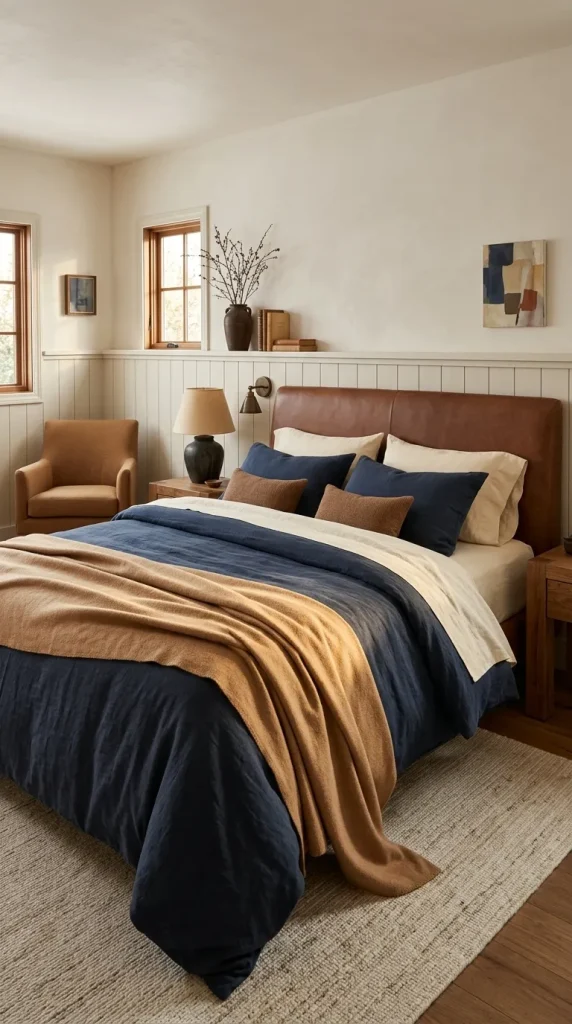
11. Navy + camel + cream
Navy becomes significantly warmer beside camel.
Use navy for the duvet or coverlet, camel for a blanket, and creamy rather than stark white sheets to complete the combination.
There is no need to replace it for one season.
Change the surrounding colors instead.
One camel blanket and perhaps a pair of brown or rust cushions can move the entire bed toward fall.
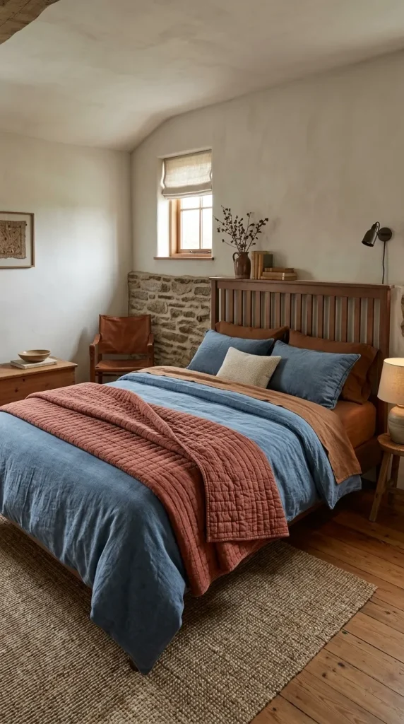
12. Denim blue + rust + tobacco brown
Denim blue has a casual quality that works well with rustic and relaxed bedrooms.
Pair a washed blue duvet with a rust quilt and tobacco-brown accents.
The brown could come from sheets, leather cushions, the headboard, or furniture.
Avoid very bright rust. A slightly faded, brick-like version makes the denim feel more sophisticated.
This palette looks particularly good with quilts because both denim blue and rust suit stitched, washed surfaces better than extremely polished fabrics.
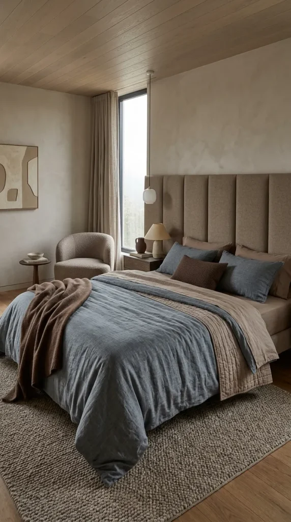
13. Slate blue + warm taupe + chocolate
Slate blue is quieter than navy and works well if you prefer a less colorful bedroom.
Use it with taupe bedding and a small amount of chocolate.
For example:
- Slate-blue duvet.
- Warm taupe sheets.
- Chocolate wool throw.
The muted palette depends heavily on texture, so avoid making every layer smooth cotton.
A slubby linen duvet, quilted cotton blanket, or soft wool throw will create depth through light and shadow.
House Beautiful’s 2026 bedroom coverage similarly emphasizes texture as a major source of depth in cocooning rooms, including mixtures of linen, waffle-like surfaces, tactile upholstery, and wool.
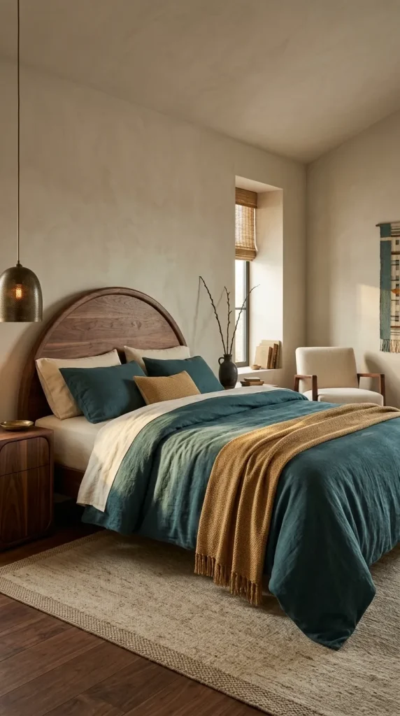
14. Deep teal + ochre + warm ivory
Deep teal is useful if you want something more expressive than navy but still grounded.
Pair it with ochre rather than lemon yellow.
Warm ivory prevents the two saturated colors from becoming overwhelming.
Use teal as the primary bedding color and ochre as a smaller throw or pillow accent.
In a room with walnut furniture or aged brass lighting, this combination can feel particularly rich.
It is also a useful reminder that a fall bedroom can contain clear color without looking themed.
Pink fall bedding combinations
Pink works for fall once it moves away from icy blush and toward dusty, brown-based, clay, mauve, and berry shades.
This is less about adding brown accessories to a spring-pink duvet and more about choosing a pink whose undertone already belongs beside autumn materials.
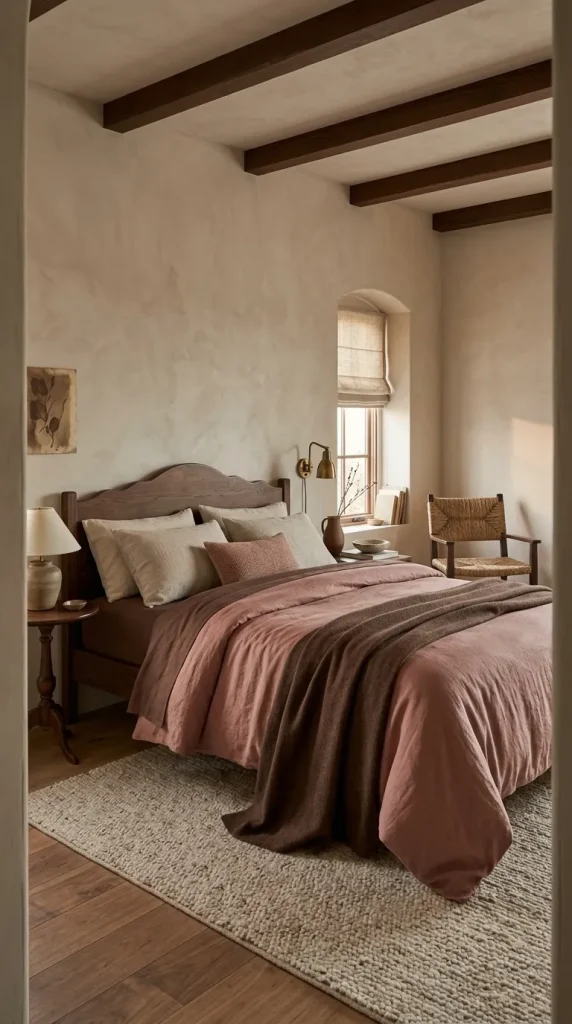
15. Dusty rose + cocoa + oatmeal
Dusty rose becomes much calmer beside cocoa.
Use dusty rose on the duvet, cocoa through sheets or a folded blanket, and oatmeal as the lightest layer.
The oatmeal prevents the palette from feeling overly sweet.
This works especially well with medium and dark wood furniture because the cocoa connects the bedding back to the furniture.
If the bedroom has brass lighting, the metal adds just enough warmth without requiring another textile color.
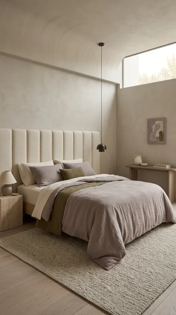
16. Mauve + olive + warm ivory
Mauve and olive create an unusual but very balanced fall combination.
Both are muted enough to coexist without fighting for attention.
Use mauve for the duvet or quilt, olive for the secondary layer, and warm ivory for sheets.
Livingetc’s 2026 bedroom-color reporting shows deeper aubergine and purple tones being paired successfully with tan and khaki, illustrating how purples become more grounded when combined with earthier neutrals and greens.
For a softer version, choose gray-mauve rather than deep plum.
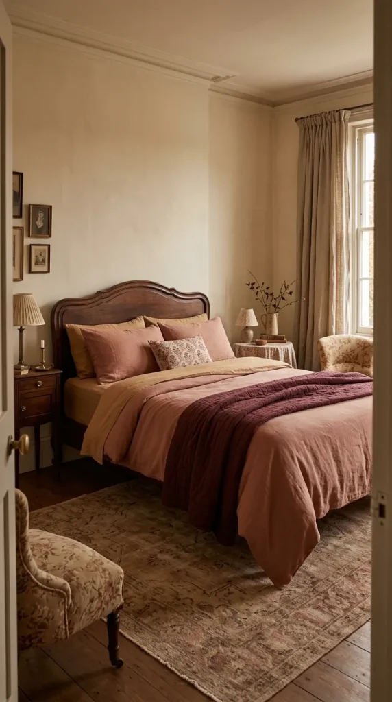
17. Clay pink + burgundy + camel
Clay pink contains enough warmth to work almost like a softened terracotta.
Pair it with burgundy for depth and camel for balance.
One effective hierarchy is:
- Clay-pink duvet.
- Camel sheets.
- Burgundy throw.
Do not divide the three colors equally. Burgundy should normally be the smallest area because its visual weight is much stronger.
This combination works particularly well in traditional, eclectic, or vintage-inspired bedrooms where patterned cushions or floral textiles already introduce several related tones. If you love earthy pink-and-clay pairings, these terracotta and sage bedroom ideas are worth a look.
Orange fall bedding combinations
Orange deserves a place in a fall bedroom, but it is often most effective when treated as one member of the palette rather than the entire concept.
Burnt orange, rust, paprika, terracotta, and muted pumpkin give you far more flexibility than a single bright seasonal orange.
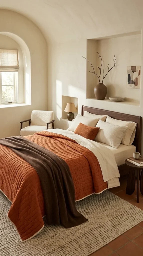
18. Burnt orange + cream + chocolate
This is the classic fall palette in a more considered form.
Let burnt orange carry the duvet or quilt.
Use cream sheets to provide contrast.
Bring chocolate into the lower part of the bed through a throw or bench upholstery.
The darker brown is important because it prevents orange and cream from becoming too bright or decorative.
If the bedroom already has dark wood furniture, you can reduce the amount of chocolate bedding and let the furniture perform that role.

19. Terracotta + sage + oatmeal
Terracotta and sage work because each softens the other.
The terracotta brings warmth.
Sage introduces a cooler botanical note.
Oatmeal links them through a quiet neutral.
Try an oatmeal duvet, terracotta quilt, and sage pillowcases if you do not want either color to dominate.
Or reverse the proportion with a terracotta duvet and smaller sage accents.
This is one of the easiest palettes to carry beyond fall because none of the colors depends on seasonal motifs.
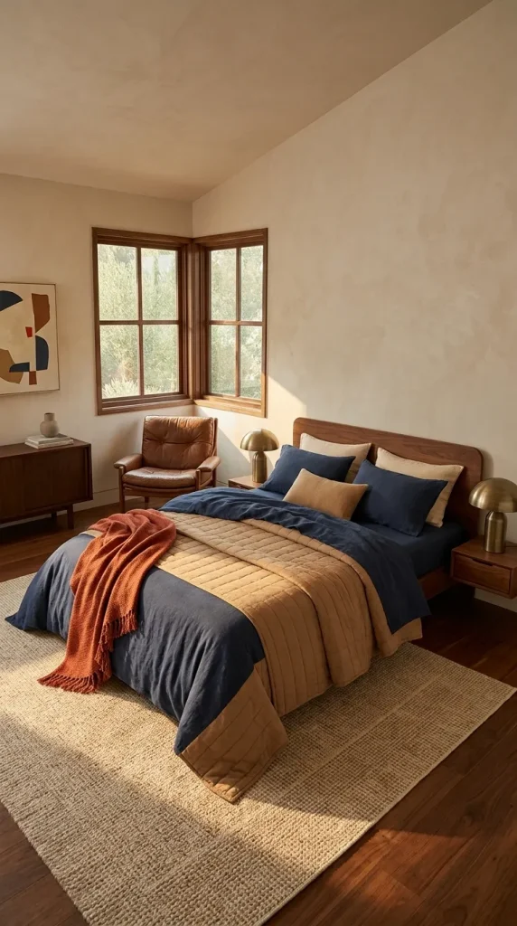
20. Paprika + navy + camel
For a more playful fall bed, combine paprika with navy.
These colors have enough contrast to feel energetic, so camel is useful as a mediator.
Use navy as the largest field, paprika as the smaller accent, and camel in the middle.
For example:
- Navy duvet.
- Camel coverlet.
- Paprika throw.
This is stronger than the usual orange-and-brown formula and works particularly well in rooms with dark wood, brown leather, or brass.
If both navy and paprika are highly saturated, keep the rest of the bedding plain.
Gingham and pattern-led fall bedding
Pattern can make a bed feel more collected without requiring overt leaves, pumpkins, or seasonal slogans.
Gingham is particularly effective because it feels familiar and cozy while remaining geometrically simple.
Patterned bedding is also becoming more prominent in 2026 as designers move away from completely plain, perfectly coordinated beds toward combinations with more personality.

21. Brown-and-cream gingham + chocolate + oatmeal
Use gingham as the one dominant pattern.
A brown-and-cream gingham duvet or quilt can sit over chocolate sheets with an oatmeal throw.
The surrounding solid colors allow the check to remain clear.
Avoid adding equally strong plaid, large florals, and stripes at the same time.
If another pattern enters the room through curtains or a headboard, keep it much quieter or change its scale substantially.
The bed should have one pattern leader.
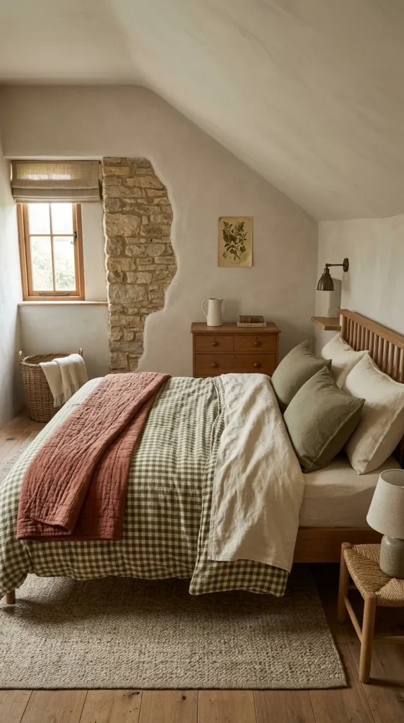
22. Olive gingham + cream + rust
Olive gingham offers a softer route into patterned fall bedding.
Pair it with cream sheets and a rust coverlet or throw.
Because the gingham itself already contains repetition, you need fewer decorative cushions.
Two solid pillow colors are usually enough.
This combination is particularly suitable for cottage, farmhouse, traditional, and relaxed country bedrooms, but it does not require themed farmhouse accessories around it.
Natural wood and woven materials are enough to reinforce the mood.
A combination that moves easily from fall into winter
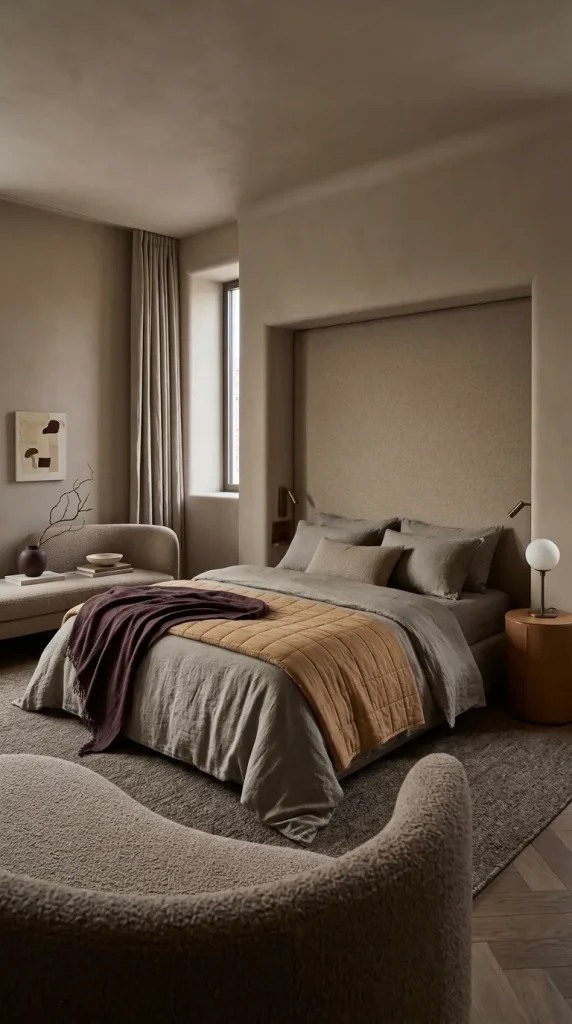
23. Plum + camel + mushroom
If you want bedding that will still feel right in December and January, use colors with enough depth to outlive obvious autumn associations.
Plum, camel, and mushroom are a strong example.
Use mushroom as the quiet foundation, camel for warmth, and plum as the deepest accent.
You can make the fall version lighter with linen, quilted cotton, or a thinner woven blanket.
As winter arrives, replace the lightest throw with wool, velvet, faux mohair, or another heavier tactile material while keeping the underlying palette.
This is a more economical way to decorate seasonally because the color scheme remains intact while the weight and texture change.
That approach also aligns with current bedroom design thinking. 2026 coverage is emphasizing richer, cocooning palettes and tactile layers rather than rigid seasonal decorating formulas.
How to build your own fall bedding combination
You do not need to copy one of these palettes exactly.
A useful formula is to give each bedding layer a different responsibility.
| Layer | Main job | Fall example |
|---|---|---|
| Sheets | Background and subtle color | Cocoa, oatmeal, camel |
| Duvet or quilt | Dominant visual color | Olive, navy, terracotta |
| Coverlet | Secondary tone | Cream, taupe, rust |
| Throw | Contrast and seasonal texture | Chocolate wool, burgundy knit |
| Pillows | Repeat key colors | Olive + cream or rust + camel |
Think of the bed as a small interior scheme.
One color should dominate.
One should ground it.
One can provide the accent.
Texture should keep those colors from looking flat.
That is also why perfectly matched bedding sets are not always the most convincing solution. The current move toward tonal, mixed-but-related bedding is based on subtle shifts in shade, fabric, and texture rather than identical pieces.
What actually makes fall bedding feel cozy?
Cozy is not another word for brown.
A cream bed can feel extremely cozy. A chocolate bed can feel surprisingly flat.
The difference is usually texture, depth, and layering.
Washed linen gives the surface a relaxed irregularity. Quilted cotton introduces shadow. Flannel or brushed cotton can make cooler-weather sheets feel visually and physically softer. Velvet adds a denser reflective texture. Knits and wool introduce a more substantial top layer.
Livingetc’s current bedding reporting describes 2026 beds as increasingly tactile, with designers bringing richly textured materials and more sensory surfaces into bedrooms. Etsy’s 2026 trend reporting, covered by Livingetc, also selected washed linen as its Texture of the Year.
But more texture does not mean piling every material onto one bed.
A useful combination might be smooth cotton sheets, a slubby linen duvet, a stitched quilt, and one wool throw.
Four different finishes are enough to create significant depth.
Do not automatically default to white sheets
White sheets are useful, but they are not mandatory.
Changing the sheet color can alter the entire character of bedding without replacing the duvet.
Brown sheets can make cream bedding warmer.
Camel sheets soften navy.
Oatmeal works with sage, rust, chocolate, and dusty rose.
Warm ivory gives dark green more contrast without creating the harder boundary of brilliant white.
This is particularly useful if you are building several seasonal looks from the same duvet.
A cream duvet over white sheets may feel light and neutral.
Place that same duvet over cocoa sheets with a rust quilt and the bed immediately reads differently.
The sheet is a design layer, even if only part of it is visible.
How to mix gingham, plaid, florals, and stripes
Start with one pattern that has the strongest visual presence.
If the duvet is gingham, keep most of the surrounding bedding solid.
If you want a second pattern, make it different in scale.
For example, medium-scale gingham can sit beside a very fine stripe more comfortably than another medium check.
Traditional florals can also work beautifully in fall, particularly when their colors include burgundy, olive, brown, rust, or faded blue. Larger florals and more expressive patterned bedding are part of the current shift toward characterful bedrooms in 2026.
The mistake is not mixing patterns.
The mistake is giving every pattern equal visual volume.
Match the bedding to the bedroom you already have
Do not choose a fall palette from a bedding photograph without looking at the rest of your bedroom.
A walnut bed already contributes dark brown.
A pale oak room adds honey and tan.
A black metal bed creates a strong dark outline.
A cream upholstered headboard adds a large light neutral.
Green walls may reduce the amount of green bedding you need.
Blue walls can make navy bedding feel much more dominant than it looked in isolation.
Treat those permanent surfaces as part of the palette.
For example, a bedroom with walnut furniture may already contain enough brown for an olive, cream, and rust bed. Adding chocolate sheets, brown cushions, and a dark-brown throw on top could make the composition too heavy.
The room and the bed should cooperate. For a full room approach rather than bedding alone, these cozy bedroom ideas show how to layer an entire space.
How to shop for fall bedding combos without buying an entire new bed
You rarely need to replace every layer.
Identify the color already carried by your largest usable piece.
If you own a navy duvet, build around it with camel, rust, tobacco, or cream.
If you already have cream bedding, change the sheets to cocoa or oatmeal and add an olive or terracotta quilt.
If your existing duvet is sage, introduce camel and muted pumpkin instead of replacing the green.
This is also the best way to approach marketplaces such as Amazon. Search for the specific missing layer rather than trying to find a complete fall bedding set.
For example, you may need only a rust quilt, cocoa sheets, or an olive throw.
The design should determine the shopping list, not the retailer’s preassembled palette.
Fall bedding mistakes worth avoiding
Avoid making every layer equally dark. Forest green sheets, chocolate duvet, burgundy quilt, and black pillows may individually suit autumn, but together they can remove too much contrast.
Avoid introducing five or six fall colors because they all seem seasonal. Three well-related tones usually create a stronger bed than an assortment of rust, orange, yellow, red, brown, olive, and cream.
Avoid using texture as clutter. You do not need velvet, boucle, faux fur, chunky knit, linen, fringe, and quilting all at once.
Avoid choosing bedding without considering the headboard and furniture. They occupy the same composition.
And do not assume fall requires literal fall imagery. A sophisticated olive, camel, and cream bed can communicate the season more convincingly than a duvet covered in pumpkins and leaves.
Try this if your bedding combination feels flat
First, remove the decorative pillows and throws.
Look only at the sheets and main duvet or quilt.
Ask whether there is enough difference between them in either color value or texture.
Next, add one secondary layer at the foot of the bed. Choose a material that behaves differently from the duvet.
Then introduce one accent color through no more than two or three places.
Finally, step back and look at the headboard, wall, nightstands, and floor.
If the bed feels disconnected, repeat one existing room color in a small bedding layer rather than adding a completely new shade.
Often the solution is not another pillow.
It is a clearer relationship between the colors already present.
Frequently Asked Questions
What are the best colors for fall bedding combos?
Olive, moss, forest green, chocolate, cocoa, camel, rust, terracotta, burgundy, plum, navy, dusty blue, dusty rose, mauve, and warm cream can all work well. The strongest combinations usually mix one dominant color with one grounding neutral and one smaller accent rather than relying on a single fall color.
What colors go with green bedding for fall?
Olive and moss work particularly well with cream, rust, brown, camel, and walnut. Forest green can support richer combinations with chocolate, burgundy, oatmeal, and aged brass. Sage becomes more autumnal beside tan, oatmeal, muted pumpkin, or terracotta.
Are brown sheets good for fall?
Yes. Brown sheets can give a light duvet more depth and warmth without making the entire bed dark. Cocoa and chestnut sheets work especially well with cream, olive, rust, oatmeal, dusty blue, and muted pink.
Can blue bedding look autumnal?
Absolutely. The surrounding colors matter more than the fact that the bedding is blue. Navy with camel and cream, denim with rust and tobacco brown, or slate blue with taupe and chocolate can all feel appropriate for fall.
How can I make fall bedding transition into winter?
Keep the underlying palette and increase the material weight. Forest green, chocolate, navy, camel, burgundy, plum, taupe, and oatmeal all transition easily. Replace a lightweight cotton or linen throw with wool, velvet, a heavier quilt, or another more substantial layer as temperatures drop.
Build the palette before adding the layers
The most useful fall bedding combos are not really seasonal sets.
They are well-built color schemes that happen to suit autumn.
An olive duvet feels more autumnal beside rust and cream. Blue changes character next to camel or tobacco. Dusty pink becomes richer with cocoa. Brown sheets can warm an existing light duvet without requiring a complete bedding replacement.
Then texture finishes the job.
A quilt introduces shadow. Linen relaxes the surface. Wool gives the foot of the bed weight. Gingham introduces pattern without relying on novelty graphics.
So before buying another fall pillow, decide on three things: your dominant color, your grounding color, and your accent.
Once those relationships work, the bed can feel warm, layered, personal, and unmistakably suited to fall without looking as though it has an expiration date in November.