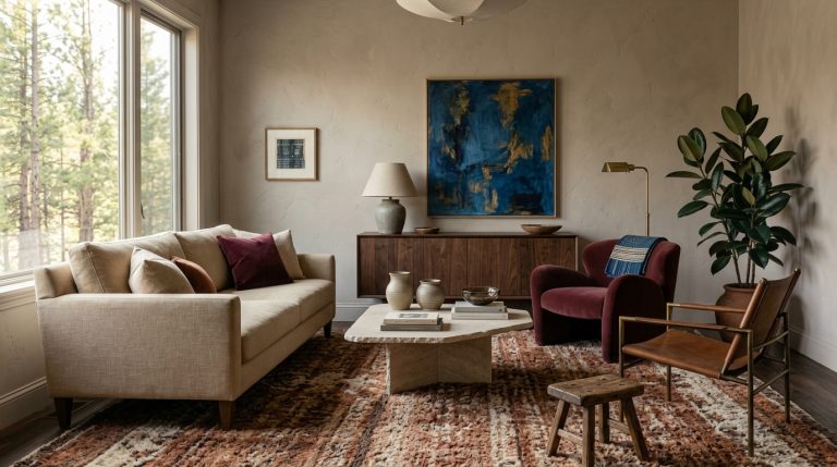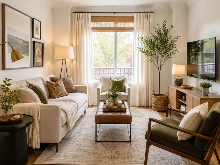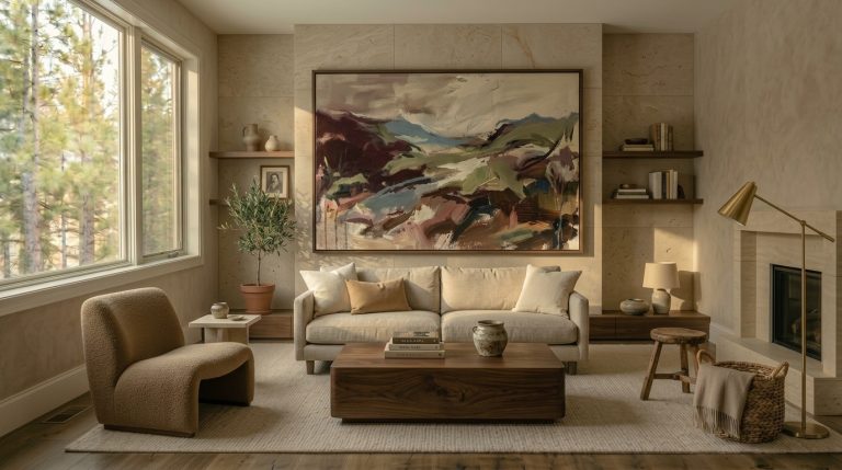
12 Colorful Mid Century Modern Living Rooms Ideas That Feel Fresh in 2026
Color is one of the easiest ways to make mid-century modern design feel personal, and also one of the easiest ways to turn it into a retro costume. Mustard chair, orange rug, avocado cushions, teak sideboard, starburst clock. Suddenly the room looks like a decade rather than a home.
The better 12 colorful mid century modern living rooms ideas for 2026 take the period’s confidence with color but loosen the rules. Designers are combining walnut, vintage silhouettes, saturated upholstery, expressive art, earthy paint, and unexpected color pairings rather than recreating a 1960s palette exactly. Recent mid-century projects are also mixing vintage pieces with contemporary furniture and bold color, which keeps nostalgic references livable.
The secret is giving strong color enough warm wood and quieter material around it.
Build a color palette around the wood
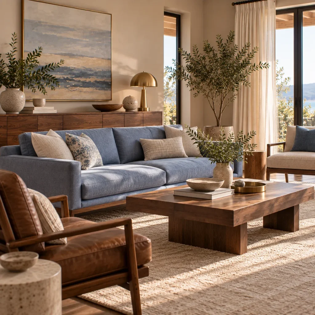
Idea 1: Pair walnut with periwinkle or dusty blue
Walnut already contributes substantial color. Its warm reddish-brown grain means you do not need to surround it with more brown.
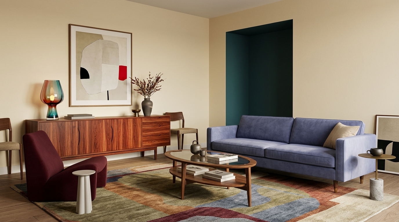
Try walnut beside periwinkle, dusty blue, or a softened cornflower. A blue sofa against a walnut credenza gives you cool and warm contrast without becoming obviously retro.
Periwinkle paired with chocolate brown is one of the more unexpected combinations designers are highlighting for 2026, alongside a broader move toward greater warmth and color confidence.
Keep cream, parchment, or oatmeal somewhere in the scheme so the blue and wood have breathing room, a foundational idea we cover in our mid century modern living room ideas.
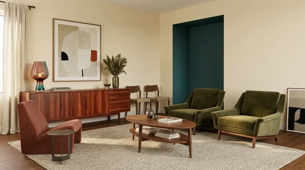
Idea 2: Use olive and rust without recreating the 1970s
Olive and rust naturally suit mid-century furniture, but proportion determines whether they feel current.
Instead of olive walls, rust sofa, mustard rug, and orange cushions, let one shade lead. Try olive upholstery with a rust accent chair, walnut table, and warm ivory walls.
Designers revisiting 1970s colors in 2026 are using ochre, terracotta, and greens more selectively, often through color drenching or unexpected pairings instead of complete period schemes.
That restraint allows vintage furniture to reference the era without making the whole room feel preserved from it.
Put strong color on one substantial surface

Idea 3: Choose a colorful sofa and simplify around it
A colorful sofa gives the room an immediate center.
Forest green, brick red, dusty teal, aubergine, ochre, or deep blue all work well with walnut and teak. If the sofa occupies most of one wall, you do not need to repeat its color constantly.
For many medium living rooms, a sofa around 78 to 88 inches wide provides enough presence without becoming overwhelming.
Current designer projects show that bold upholstery can sit successfully with mid-century architecture when the surrounding materials stay disciplined. House Beautiful’s 2026 tour of designer Theresa Butler’s mid-century home combines period features with vibrant upholstery, large-scale art, pattern, and layered texture.
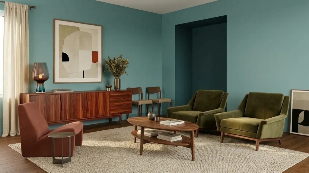
Idea 4: Paint the walls muted teal instead of default white
White walls make colorful furniture easy, but they are not mandatory.
Muted teal gives walnut and brass beautiful contrast while feeling calmer than bright turquoise. Muddy green, dusty rose, and airy blue are also among the living-room colors designers are using in 2026.
If your room faces north, sample teal carefully. Blue-green paint can become noticeably cooler in weak daylight.
And consider painting a large test board rather than making a decision from a small chip.
Use furniture to introduce unexpected combinations

Idea 5: Mix aubergine with acid green in small doses
Some combinations work precisely because they are slightly uncomfortable.
Aubergine upholstery with a small amount of acid or chartreuse green can look remarkably sophisticated beside walnut, cream, and blackened metal.
A recent Bay Area project by designer Leah Ring combined acid green, aubergine, and peacock blue with modern silhouettes to bring personality to previously blank interiors.
You do not need equal amounts of each color.
An aubergine chair plus one green lamp or artwork detail may be enough. The imbalance keeps the combination from looking juvenile.
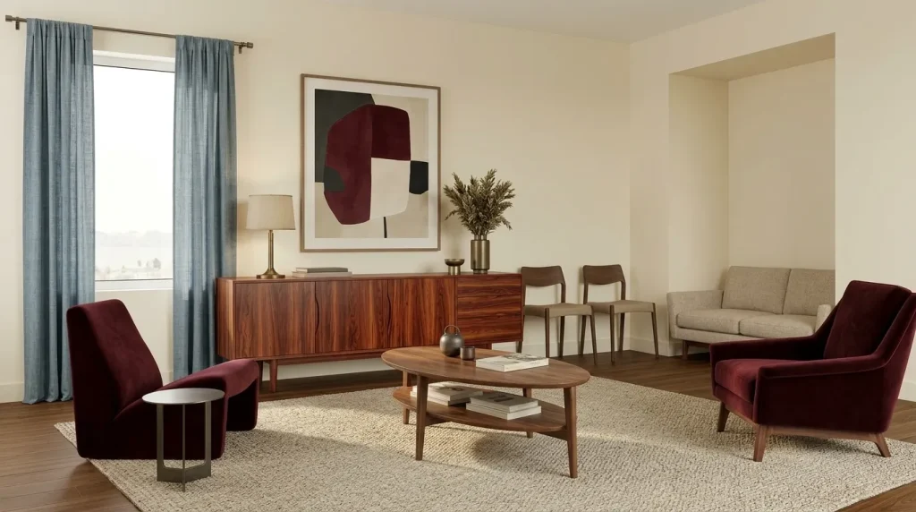
Idea 6: Try burgundy instead of predictable orange
Orange works beautifully with mid-century wood, but it has become one of the most obvious retro shortcuts.
Burgundy or oxblood gives you similar warmth with greater depth.
Try a burgundy lounge chair beside a teak cabinet, or use an oxblood cushion on an oatmeal sofa. Add dusty blue if you want a cooler counterpoint.
One contrarian rule helps here. A colorful mid-century room does not need to use the colors most strongly associated with mid-century design.
A less predictable palette can actually make the furniture look more authentic because you notice its shape rather than the theme.
Let the rug connect several colors
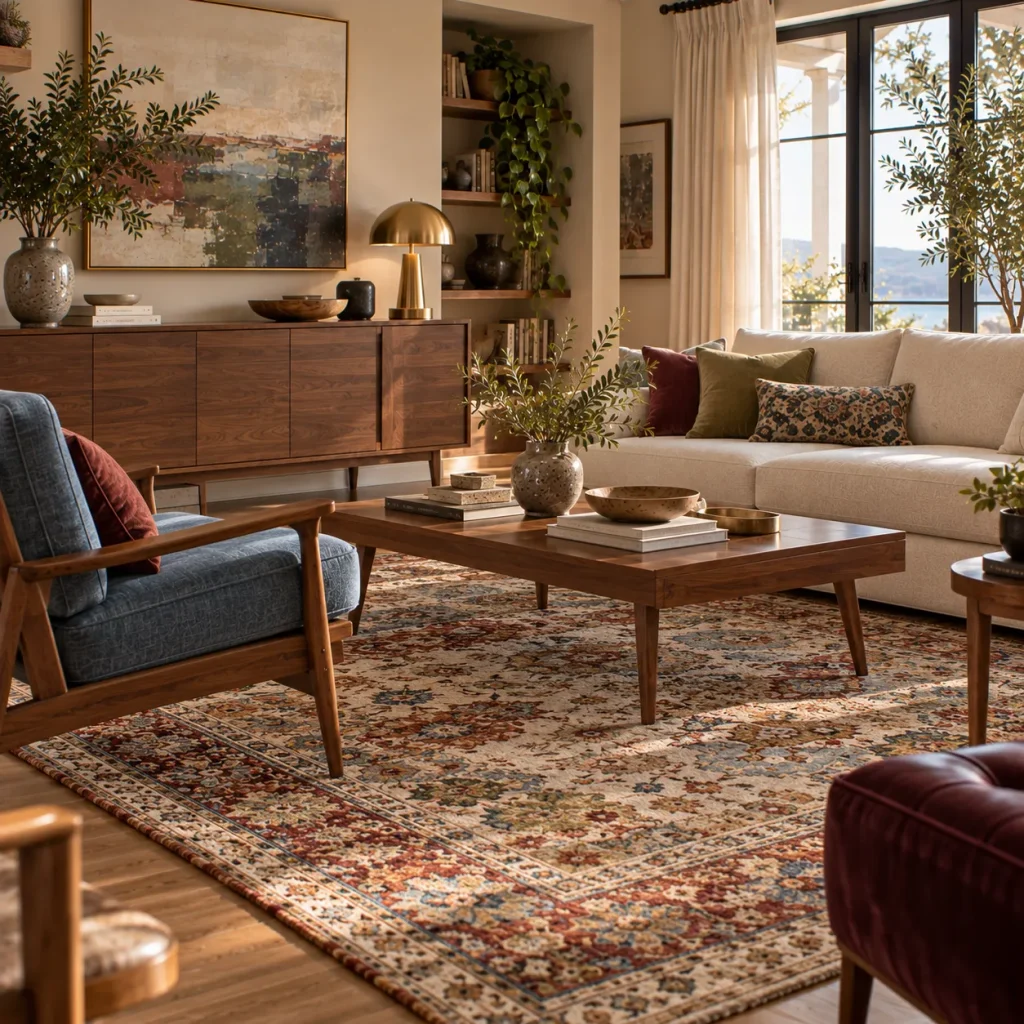
Idea 7: Use a patterned rug as your palette map
If you want four colors in the room, let the rug explain why they belong together.
A vintage-style rug containing rust, blue, olive, burgundy, and cream can link colorful upholstery to warm wood without requiring matching accessories everywhere.
In many average living rooms, an 8-by-10-foot rug works better than a 5-by-7 because it reaches the front legs of the main seating.
Avoid automatically choosing an atomic or geometric retro print. A Persian-style or abstract rug can make the mid-century furniture feel more collected.
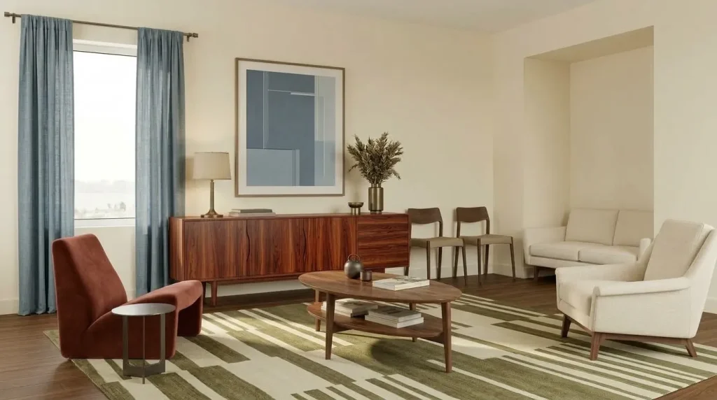
Idea 8: Use geometry in quieter colors
If you do want a geometric rug, reduce either the pattern strength or the color count.
A broad checkerboard in tobacco and cream, broken stripe in olive and parchment, or abstract design in dusty blue and rust can reference mid-century graphics without dominating the room.
Mid-century design already contains strong geometry through furniture legs, cabinetry, and architecture. The rug does not need to repeat every one of those shapes.
I once worked through an illustrative room where the chair, rug, artwork, and cushions all used different geometric patterns. Each piece looked good separately. Together, the room felt busier than colorful.
Removing one pattern made the remaining colors much clearer.
Bring color upward through art and lighting
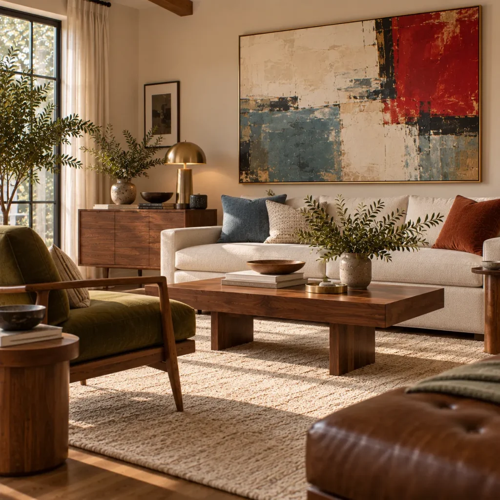
Idea 9: Hang large-scale art with one surprising color
Mid-century furniture creates a strong base for expressive art.
Choose one large painting, textile, or print containing a color that does not appear heavily elsewhere. Cherry red, cobalt, lilac, or vivid green can work particularly well.
Above a sofa, artwork around two-thirds of its width is a useful starting point, depending on the composition and wall.
Do not pull every color from the artwork into cushions afterward. For more on using color with confidence, see our vibrant living room ideas.
Let the art keep something to itself. That slight disconnect makes the room feel collected rather than professionally matched.
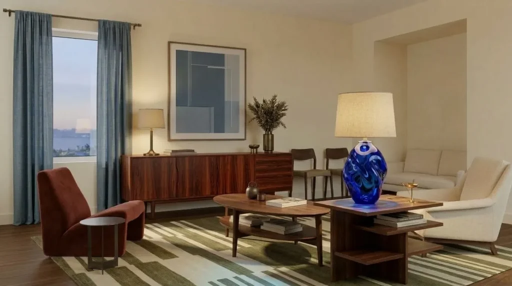
Idea 10: Use a colored lamp as functional sculpture
Lighting is an easy place to take more risk because a lamp does not cover much visual area.
Try a red mushroom lamp, blue glass table lamp, green ceramic base, yellow floor lamp, or colored Murano-style glass.
Mid-century lighting already favors sculptural forms, so combining distinctive shape with color gives one object two jobs.
A recently restored 1960s Bilbao apartment used vintage Murano glass, German ceramics, geometric forms, and a bold palette while preserving the home’s original mid-century character.
Use one memorable lamp, then let the other fixtures stay relatively quiet.
Soften the retro feeling with contemporary color use
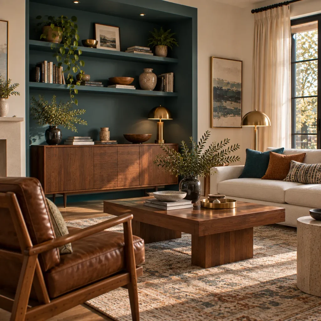
Idea 11: Color-drench one architectural zone
Color drenching can make mid-century furniture feel surprisingly current.
Paint built-in shelves, an alcove, fireplace wall, or an entire smaller living room in one earthy color, then let walnut and upholstered furniture stand against it.
Ochre, muddy olive, terracotta, deep teal, or dusty rose are all good candidates.
This approach differs from the classic single feature wall because the color follows an architectural boundary rather than appearing as an isolated rectangle.
If the room is small, painting trim in the same tone can reduce visual fragmentation — a layering approach we also explore in our ideas for combining boho with mid century modern for living rooms.
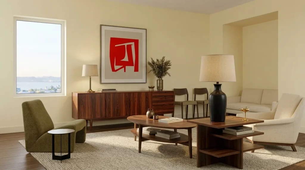
Idea 12: Add one pale pastel to dark wood
Not every colorful room needs saturated color.
Butter yellow, blush pink, powder blue, or pale mint can look especially fresh beside walnut, teak, dark brown leather, and black accents.
The contrast between darker mid-century wood and a softer pastel prevents the room from becoming visually heavy.
Current 2026 interiors are also revisiting softer nostalgic shades alongside richer materials. Recent design coverage shows pastels being used with restraint and contemporary furniture rather than copied directly from earlier decades.
For example, try butter yellow walls, walnut furniture, an olive chair, and a small amount of red artwork.
That is colorful without becoming loud.
A practical colorful mid-century palette guide
| Main color | Strong partner | Grounding material |
|---|---|---|
| Periwinkle | Chocolate brown | Walnut |
| Olive | Rust | Teak |
| Aubergine | Acid green | Dark wood |
| Burgundy | Dusty blue | Brass and walnut |
| Muted teal | Warm ivory | Oak or teak |
| Butter yellow | Olive | Walnut |
| Dusty rose | Forest green | Dark-stained wood |
Use these as starting combinations rather than fixed formulas. Your flooring and existing upholstery should influence the final palette.
What should you skip in a colorful mid-century living room?
The full retro rainbow. Mustard, orange, avocado, turquoise, and brown together can make the room feel more themed than layered.
Every piece having tapered legs. Repetition weakens the silhouettes you want people to notice.
Cold gray as the neutral background. Designers are moving away from cool gray and stark white toward warmer, more characterful backgrounds in 2026.
Matching colorful accessories. A blue chair does not require blue cushions, blue ceramics, and blue art.
Too many iconic reproductions. One recognizable mid-century shape has more impact when contemporary and vintage pieces surround it.
Try this if your mid-century living room is already brown
Do not replace the wood furniture. Use it as the foundation.
Choose one color from outside the usual retro palette, perhaps periwinkle, dusty pink, aubergine, or muted teal. Introduce it through one medium-to-large surface such as a chair, rug, curtains, or wall.
Then add a smaller contrasting shade.
If the room still feels heavy, bring in warm ivory, parchment, or a pale pastel rather than another dark color, some of which we cover in our warm neutral paint colors guide.
Finally, remove two brown accessories. The walnut and teak already provide plenty of brown.
This is often enough to make a traditional mid-century scheme feel much more current.
FAQ
What colors work best with mid-century modern furniture?
Walnut and teak work particularly well with olive, rust, burgundy, dusty blue, teal, forest green, ochre, cream, and muted pink. More unexpected 2026 combinations such as periwinkle with chocolate brown can also make mid-century furniture feel fresher.
Can a mid-century modern living room be very colorful?
Yes. Mid-century design historically embraced color, but a current room usually looks stronger when one or two shades lead and others play supporting roles. Use warm wood and quieter materials to give saturated colors enough visual rest.
How do I make colorful mid-century decor look current?
Mix period-inspired furniture with contemporary pieces, avoid using every recognizable retro color at once, and introduce current shades through paint, art, upholstery, or lighting. The emerging 2027 “newstalgia” direction similarly favors adapting nostalgic elements for modern life rather than recreating one decade exactly.
What wall colors work with walnut furniture?
Muted teal, warm ivory, dusty blue, olive, butter yellow, soft pink, mushroom, and deeper burgundy can all work. Always sample paint beside the walnut because daylight and flooring can change how both colors appear.
Let the wood steady the color
The strongest 12 colorful mid century modern living rooms ideas are not the ones with the most color. They are the rooms where color and furniture give each other something they lack.
Walnut can steady periwinkle. Olive can soften geometric furniture. Burgundy can give teak more depth. Pale yellow can lift a room filled with darker vintage pieces.
Start with the wood or upholstery you already own, then choose one color that genuinely changes how it looks. Build outward from that relationship instead of assembling a checklist of retro shades.
Mid-century modern gives you the clean shapes. Color gives those shapes personality. When neither side overwhelms the other, the room feels connected to the past without becoming trapped there.