Warm Neutral Paint Colors for a Cozy Living Room That Never Feels Flat
There’s a particular kind of disappointment that happens after painting a living room beige.
The sample looked warm in the store. The first wall looked promising. Then the whole room dried and suddenly everything turned yellow, pink, gray, or vaguely like builder-grade rental paint.
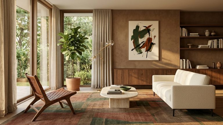
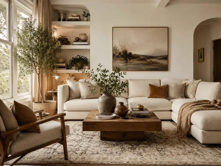
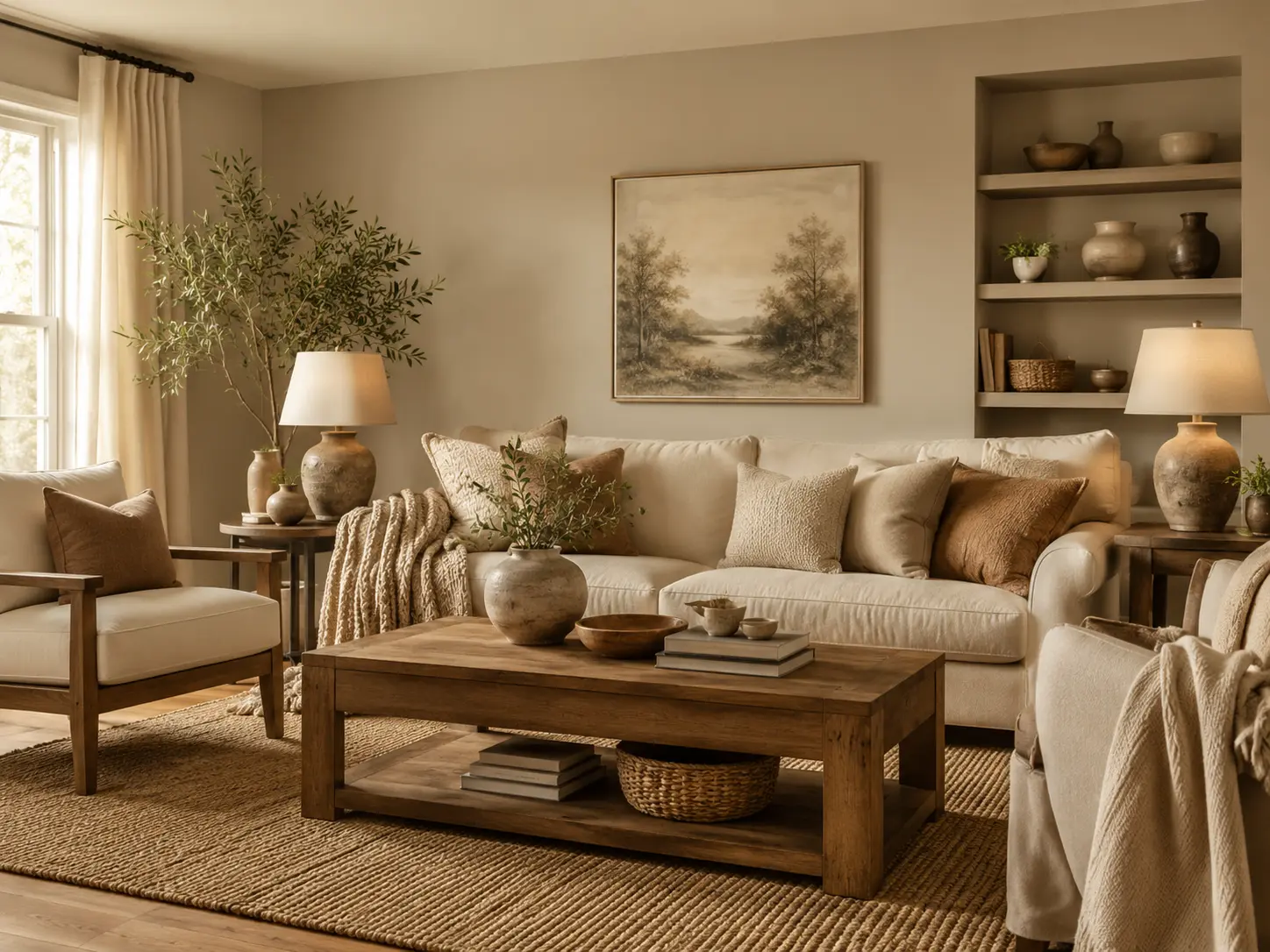
Choosing Warm Neutral Paint Colors for a Cozy Living Room is less about finding the most popular beige and more about understanding undertones, daylight, flooring, and the furniture already in the room.
That matters even more in 2026. Sherwin-Williams chose the earthy Universal Khaki SW 6150 as its Color of the Year, while Benjamin Moore selected the espresso-charcoal Silhouette AF-655. Both choices reflect a broader shift toward warmer, browner, more grounded neutrals rather than cold gray.
Here are the warm neutrals I’d actually test, plus where each works best.
1. Start with a soft warm white if your room needs light
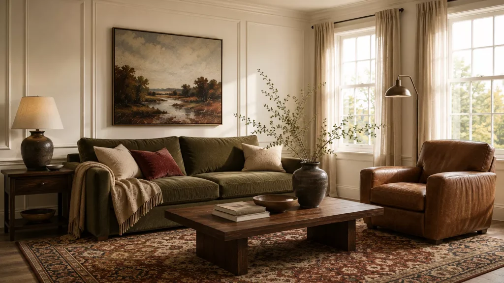
Warm white is often the safest place to begin, but “warm” doesn’t mean obviously yellow.
The best versions have a little cream, beige, gray, or muted warmth underneath them.
Benjamin Moore Swiss Coffee OC-45 is a useful reference point. It appears in Benjamin Moore’s 2026 palette and is being paired with both pale and very dark colors, including the deep brown Silhouette AF-655.
On the Sherwin-Williams side, Creamy SW 7012, Divine White SW 6105, and Natural Choice SW 7011 sit within the brand’s warmer neutral families. Sherwin-Williams specifically recommends looking for sophisticated warm whites with muted beige or greige undertones rather than overly golden ones.
Warm white works especially well if you have:
- dark walnut or medium-oak furniture
- a colorful vintage rug
- terracotta or olive accents
- limited square footage
- lots of artwork
Watch the trim color
This is where people get caught.
A creamy wall beside a very blue-white trim can make the wall look much yellower than expected.
Sometimes I’d rather paint walls and trim in the same warm white, changing only the sheen.
That gives the room a softer envelope and avoids the harsh stripe around every doorway.
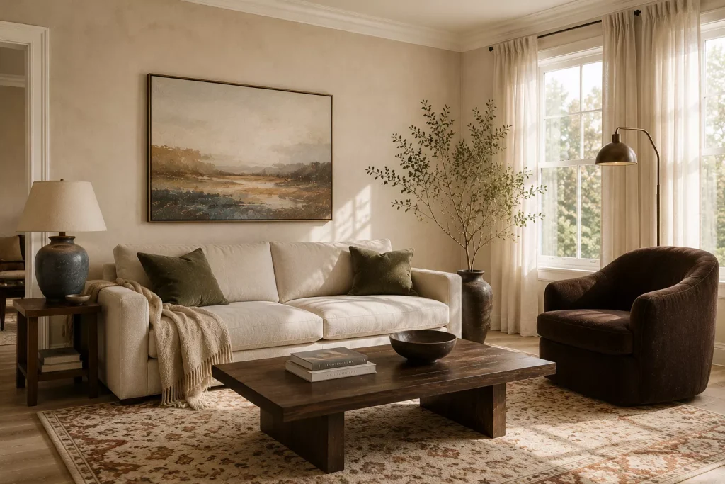
2. Choose natural linen beige when you want warmth without heaviness
If warm white still feels too pale, move one step deeper.
Natural Linen is a particularly useful color family because it sits between cream, tan, and soft beige.
Sherwin-Williams lists Natural Linen SW 9109 among its warm neutral collection, while Benjamin Moore includes Natural Linen 966 among its recommended neutral living room colors.
This is exactly the type of neutral I’d use in a living room with pale oak floors, oatmeal upholstery, and dark brown accents.
It gives white trim enough contrast to look intentional without making the walls the main event.
Pair it with:
Medium oak
Chocolate brown
Olive
Dusty blue
Rust
Cream
One mistake is pairing a linen beige with six other pale beige furnishings.
The wall needs contrast somewhere.
If the sofa is oatmeal and the rug is cream, bring in walnut, burgundy, olive, or blackened bronze.
A cozy neutral room still needs dark notes.

3. Try mushroom when beige feels too yellow
Mushroom is one of my favorite answers for people who say, “I want beige, but I don’t want it to look beige.”
It generally mixes beige with gray and earthy brown, creating more depth and less obvious warmth.
Sherwin-Williams describes Shiitake SW 9173 as a mushroom-like neutral blending muted beige and gray, and its 2026 Colormix forecast also includes Mushroom SW 9587 among its foundational neutrals.
This kind of shade works beautifully with:
- walnut
- black accents
- soft ivory upholstery
- muted plum
- olive green
- brass
Mushroom is particularly helpful when your living room connects to a kitchen with stone counters containing both warm and cool veining.
A straightforward golden beige may fight those cooler gray notes.
Mushroom can often bridge both.
But test it carefully in rooms with low natural light.
Some mushroom shades can become noticeably grayer once the sun disappears.
I’d paint at least a 2-by-2-foot sample rather than trusting a tiny chip.
And move that sample around.
The same color can look different beside the fireplace than beside the window.
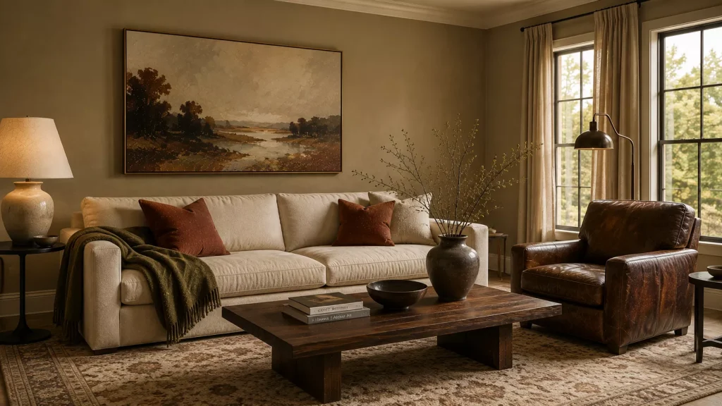
4. Use khaki when you want the room to feel grounded
Khaki has spent years being treated like an unexciting utility color.
That’s changing.
Sherwin-Williams named Universal Khaki SW 6150 its 2026 Color of the Year, describing it as a mid-tone neutral with a slight yellow undertone that works with natural finishes, crisp whites, and stronger colors.
I’d use it in a living room with enough natural light to support a slightly deeper wall.
It’s especially good with:
Dark brown leather
Cream linen
Olive textiles
Rust accents
Blackened metal
Medium and darker woods
The appeal of khaki is that it gives the room structure.
Cream upholstery looks creamier against it.
Dark wood suddenly feels intentional.
And colorful artwork has a quieter backdrop.
Here’s a practical comparison of several warm-neutral families:
| Neutral family | General effect | Works especially well with |
|---|---|---|
| Warm white | Bright and soft | Dark wood, colorful rugs |
| Linen beige | Relaxed and natural | Oak, olive, rust |
| Mushroom | Earthy and balanced | Walnut, plum, brass |
| Khaki | Grounded and tailored | Leather, cream, black |
| Taupe | Soft and sophisticated | Blue, brown, aged metal |
| Deep brown | Cocooning and dramatic | Ivory, rattan, pale stone |
The important word here is family.
A paint name can help you shortlist, but your room decides which exact version works.
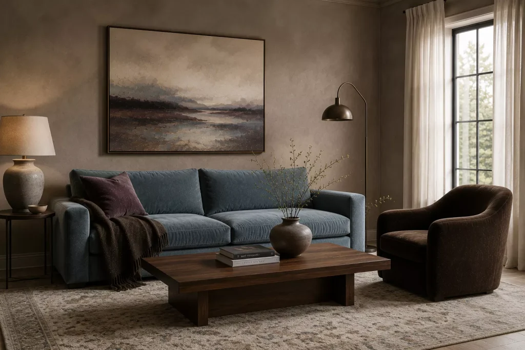
5. Pick smoky taupe if you want something more polished than beige
Taupe sits in that useful space between brown, beige, gray, and sometimes violet.
That complexity is exactly why it can look so good.
House Beautiful recently highlighted smoky taupe as a luxurious neutral because of its soft, almost suede-like effect, particularly when paired with light blue or crisp pale accents.
Benjamin Moore’s living room neutral recommendations include shades such as Pashmina AF-100, Sparrow AF-720, and Carter Gray CW-80, all useful examples of the deeper taupe and gray-brown territory worth exploring.
I’d choose taupe over beige if your living room contains:
cooler stone
gray veining
dusty blue upholstery
dark brown furniture
brushed or aged metal
Be careful with violet undertones
Some taupes can flash purple.
That isn’t necessarily bad.
In fact, a hint of violet can look beautiful beside walnut and cream.
But if your floor has strong orange tones, violet taupe can make both undertones more obvious.
This is why I never choose taupe from a phone screen.
Put the sample beside the actual floor.
Then check it morning, afternoon, and night.
Paint changes. Flooring doesn’t politely adjust to help.

6. Go deeper with tan and camel instead of making everything pale
Everyone talks about warm neutrals as though they have to be light.
They don’t.
Sherwin-Williams’ warm neutral range includes deeper shades such as Double Latte SW 9108, Basket Beige SW 6143, Stone Lion SW 7507, and Chateau Brown SW 7510.
Benjamin Moore’s 2026 palette also includes Sherwood Tan 1054, reinforcing the return of warmer, richer mid-tone neutrals.
A camel or tan living room can feel incredibly comfortable if the room has enough light.
Try it with a cream sofa, walnut coffee table, faded blue rug, and olive cushions.
That combination feels much more layered than beige walls with beige furniture.
I’d especially consider tan in a room with high ceilings.
A very pale wall can sometimes make a large living room feel colder and more cavernous.
A mid-tone neutral visually brings the walls inward.
That’s not a flaw if cozy is the goal.
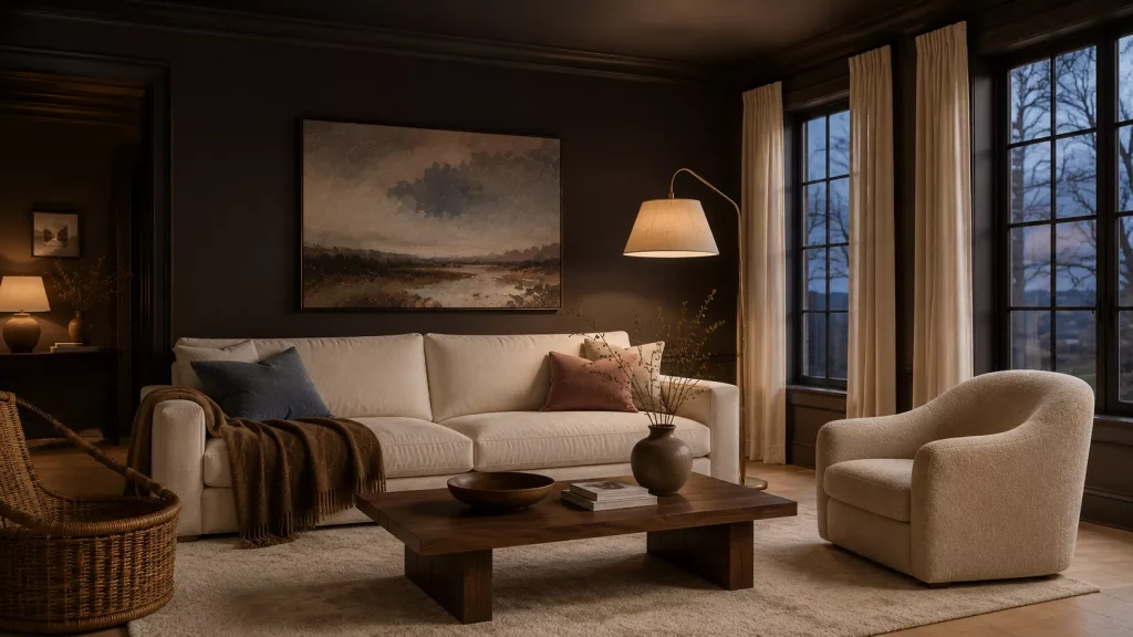
7. Consider deep espresso brown as a neutral
This is my contrarian choice.
A dark living room can be cozy.
And brown can absolutely function as the neutral.
Benjamin Moore’s Silhouette AF-655, its 2026 Color of the Year, combines espresso-like brown with charcoal undertones. Benjamin Moore even shows it across living room walls and ceiling with cream upholstery and lighter flooring.
That isn’t the choice for every room.
But in a living room with good windows, pale furniture, and substantial trim, a brown envelope can look fantastic.
Try deep brown with:
Warm ivory
Rattan
Pale oak
Dusty pink
Muted blue
Aged brass
The common advice is that dark paint makes a room look smaller.
It can.
But smaller isn’t automatically worse.
If you have a living room mainly used in the evening, a slightly cocooning effect may be exactly what you want.
What I wouldn’t do is paint the room dark brown and then fill it with dark brown furniture, dark curtains, and a charcoal rug.
Give the darkness somewhere to stop.

8. Match the neutral to your natural light
This is more important than whatever color is trending.
North-facing rooms generally receive cooler, bluer natural light.
Sherwin-Williams recommends warmer undertones to counter that effect and points toward lighter colors with higher light reflectance for rooms that receive little natural light.
Benjamin Moore makes a similar distinction. Its living room guidance suggests warmer neutrals for north- or east-facing rooms, while sunnier south- and west-facing rooms can tolerate cooler neutral options.
So as a rough starting point:
North-facing living room:
Look at creamy beige, warm linen, soft khaki, or warm white.
South-facing living room:
You have more flexibility. Mushroom and taupe can look especially good.
East-facing living room:
Test for how the color behaves after morning light disappears.
West-facing living room:
Watch for beige becoming intensely golden in late afternoon.
That last one catches people all the time.
A neutral that looks beautifully restrained at 10 a.m. can turn peachy at 5 p.m.
Always test through a complete day.
What should you skip with warm neutral paint?
First, skip choosing a paint solely because someone online called it “the perfect beige.”
Their room is not your room.
Different windows, floors, bulbs, furniture, and surrounding colors can completely change it.
I’d also skip painting tiny sample squares directly next to one another.
Put larger samples on separate boards or different walls. If six colors touch each other, your eye judges them comparatively rather than individually.
Avoid overly yellow beige unless your furnishings support it.
Warm does not require gold.
Current warm-neutral collections include greige, mushroom, taupe, khaki, and brown precisely because warmth can be much more nuanced.
And don’t automatically use brilliant white trim.
A softer off-white may work better with warm walls.
The contrast should feel intentional rather than icy.
Try this if your living room already has gray furniture
Don’t panic and replace the sofa.
Gray furniture can look much warmer when the walls and surrounding materials change.
Try mushroom, warm taupe, or a balanced linen beige rather than golden tan.
Then bring in:
Walnut or medium oak
Chocolate brown cushions
Cream textiles
Muted rust
Olive
Aged brass
This gives the gray something warmer to react against.
I’ve seen rooms where owners blamed a gray sofa for making everything feel cold.
The real problem was gray walls, gray rug, chrome lighting, and white-blue bulbs surrounding it.
The sofa wasn’t the villain.
It was simply outnumbered.
Change the context before replacing the expensive furniture.
How to test a warm neutral before committing
Use this simple process:
- Shortlist three colors, not twelve.
- Get real paint samples rather than judging from a screen.
- Paint large sample boards or generous wall areas.
- Put samples beside the floor, sofa, fireplace, and trim.
- Check them morning, afternoon, and after sunset.
- Turn on the lamps you actually use at night.
- Live with the samples for at least a couple of days.
- Choose the color that behaves best most of the time, not the one that looks perfect for ten minutes.
Both Benjamin Moore and Sherwin-Williams warn that screen representations can differ from actual paint, which is another reason physical sampling matters.
It’s a little less exciting than choosing paint in one afternoon.
It’s also much cheaper than repainting the whole living room.
FAQ About Warm Neutral Living Room Paint
What warm neutral paint colors are popular in 2026?
Warm khaki, mushroom, linen beige, taupe, rich brown, and warm off-white are especially relevant. Sherwin-Williams selected Universal Khaki SW 6150 for 2026, while Benjamin Moore chose the deep espresso-charcoal Silhouette AF-655.
What warm neutral works best in a dark living room?
Start with a lighter warm white, linen beige, or soft greige with enough warmth to counter cool natural light. Avoid assuming a dark room needs stark white, which can sometimes look gray or flat.
Is beige replacing gray?
The current direction is clearly warmer, but that doesn’t mean every gray is outdated. Mushroom, greige, and taupe work because they mix warmth with gray rather than eliminating cooler undertones completely.
Should the ceiling and trim be the same color as the walls?
They can be. Using one color family across walls, trim, or ceiling can create a softer, more enveloping effect. For more contrast, choose a warm off-white rather than a blue-white beside beige or khaki walls.
Choose the neutral that makes your existing room look better
The right Warm Neutral Paint Colors for a Cozy Living Room shouldn’t force you to redesign everything else.
They should make what you already own look more intentional.
Your walnut table should feel richer.
The cream sofa should look warmer.
The rug should suddenly connect to the walls rather than fight them.
That’s why I’d start with your fixed finishes before looking at any trend forecast.
Study the floor.
Look at the fireplace stone.
Notice the sofa undertone.
Then shortlist a warm white, one mid-tone neutral, and one slightly deeper option.
Paint all three samples and watch them for a few days.
The winner may not be the color you expected.
But if it looks good at breakfast, during a cloudy afternoon, and under your lamps at night, you’ve probably found the neutral worth living with.