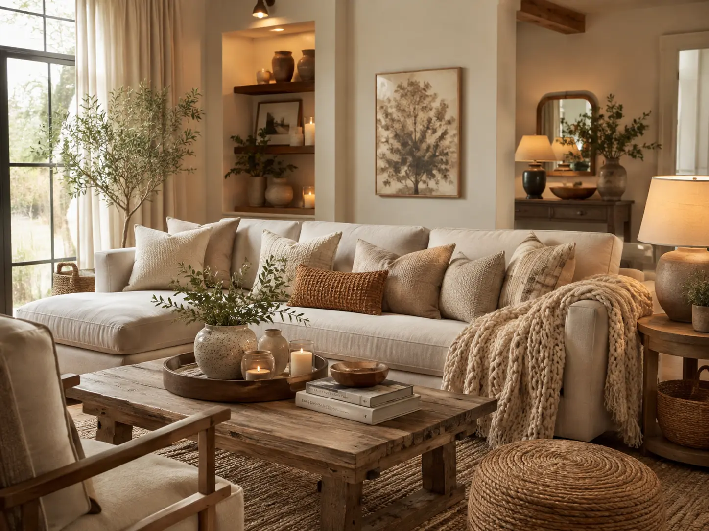
12 Way Add Warmth to a Neutral Living Room Without Losing Its Calm Look
A neutral living room can look beautiful in photographs and still feel strangely cold in real life.
You may already have the cream sofa, pale rug, beige walls, and light curtains. Nothing technically clashes. But when evening arrives, the room feels flat rather than inviting.
The solution usually isn’t adding more beige.
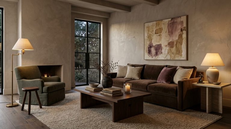
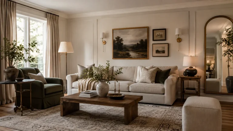
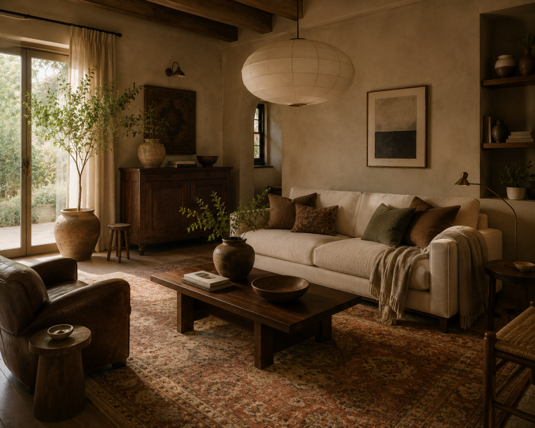
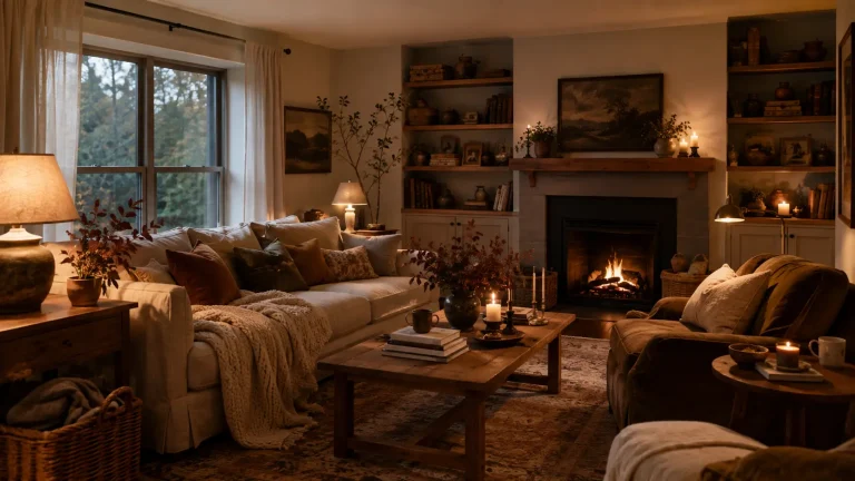
The most effective 12 Way Add Warmth to a Neutral Living Room involve contrast, texture, natural materials, deeper wood, better lighting, and small amounts of richer color. That direction is particularly relevant in 2026, when designers are moving away from sterile neutral schemes and treating texture, warm woods, nuanced color, and personality as essential parts of a successful neutral room.
Here’s how I’d warm up a neutral living room without losing the calm quality that probably attracted you to neutrals in the first place.
1. Add dark wood before adding more beige
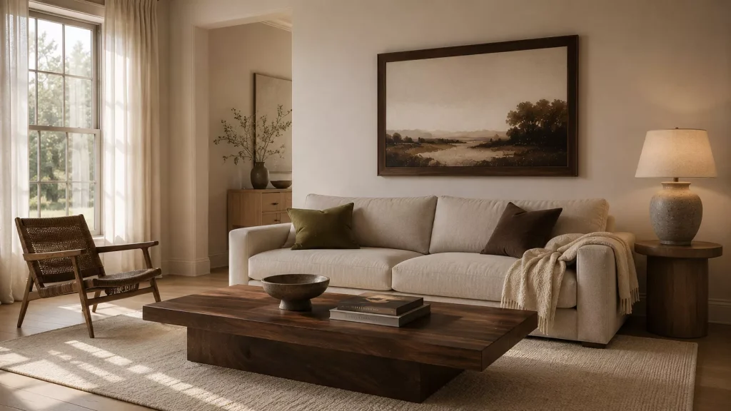
Idea 1: Introduce one noticeably deeper wood tone.
This is where I’d begin in many neutral rooms.
Cream, oatmeal, greige, and warm white need something darker to sit against. Walnut, smoked oak, dark cherry, or a medium espresso stain can provide that contrast without introducing a completely new color.
Dark wood stains are gaining attention again in 2026, while richer wood paneling and natural timber are being used to bring soul and depth back into pale interiors.
You don’t need to replace your furniture.
Try:
- a walnut side table
- a dark wood picture frame
- a vintage stool
- a deeper coffee table
- a wood lamp base
Even one substantial piece can make pale upholstery look warmer.
Stop trying to match every wood
Your pale oak console can sit beside a walnut coffee table.
The woods should relate, not match perfectly.
Repeat the darker finish one more time through a smaller item, perhaps a frame or tray, and the combination will feel intentional.
I’d rather see two interesting wood tones than an entire room filled with identical pale oak.

2. Build a texture scheme, not another color scheme
Idea 2: Make neutral materials feel different from one another.
This is one of the most useful current design ideas.
In 2026, designers are increasingly treating texture with the same importance as color. A neutral room can feel layered when velvet, linen, wool, wood, stone, and woven fiber interact, even if the actual palette stays restrained.
Look at your sofa first.
If it’s smooth linen, add a wool cushion.
If the rug is flat woven, introduce a softer throw.
If your coffee table is polished stone, bring in a rough ceramic vase or woven tray.
A simple combination might be:
| Surface | Warmer material to add |
|---|---|
| Smooth sofa | Wool or velvet cushion |
| Flat rug | Chunkier woven throw |
| Glass table | Wood or stone accessory |
| Painted wall | Linen curtain or framed textile |
| Metal lamp | Fabric shade |
| Pale shelving | Ceramic, books, and wood |
The important thing is contrast.
Five beige fabrics with the same smooth finish still look like one beige surface.

3. Use chocolate brown as a soft alternative to black
Idea 3: Bring in brown through textiles and smaller furniture.
Black is useful in neutral interiors, but chocolate brown often feels softer.
It gives cream and warm white enough definition without creating the hard contrast that pure black sometimes introduces.
Soft brown and chocolate are part of the broader 2026 shift toward warmer “new neutrals,” along with putty, sage, rust, and earthy green.
Try chocolate through:
A throw
Two cushions
A leather chair
A wood bowl
A ceramic lamp
A narrow side table
If your living room currently has lots of black metal, don’t remove all of it.
Just introduce brown beside it.
For example, a black floor lamp beside a walnut table and chocolate cushion looks more layered than replacing every dark object with another black one.
Idea 4: Pair brown with one quiet color.
Pale blue is excellent.
So is olive.
Dusty rose works too.
A room made only from cream and brown can become heavy. One muted color stops the palette from feeling predictable.
4. Make your lighting warmer at eye level
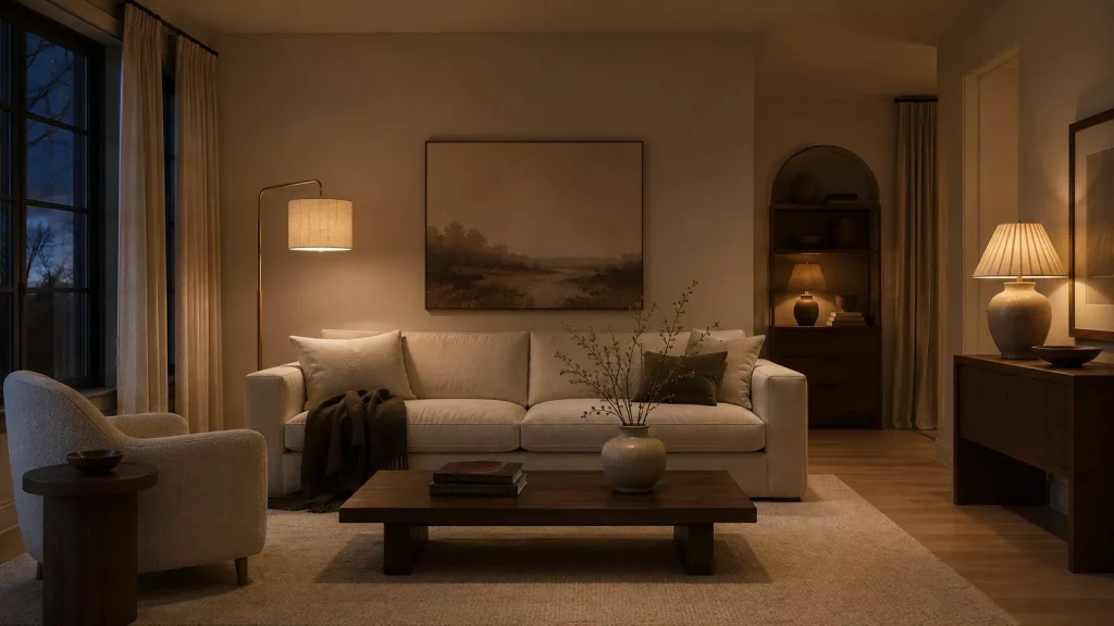
Idea 5: Add lamps before decorative accessories.
A neutral living room can look perfectly comfortable at noon and completely lifeless after sunset.
Often, that’s a lighting problem.
If the room relies on one ceiling fixture, add light lower down.
Put a floor lamp beside the sofa.
Add a table lamp to the console.
Use a small shaded lamp on a bookcase.
Current living room design is moving toward spaces that feel comfortable and personal, while recent practical decorating advice continues to emphasize better fixtures and softer lighting as high-impact updates.
Change the shade before changing the lamp
This is one of my favorite low-cost fixes.
A white synthetic shade can make a lamp feel cool.
Try pleated cream fabric, oatmeal linen, tobacco-colored cloth, or warm parchment.
You may only need to spend $25 to $70 rather than buying a completely new fixture.
And pay attention to bulbs.
Warm light can make wood and beige look richer, but very yellow light can muddy paint colors.
The goal is comfortable warmth, not making the entire room look sepia-toned.

5. Bring in one muted earthy color
Idea 6: Add olive, rust, dusty blue, or clay pink.
A neutral room doesn’t stop being neutral because you add color.
In fact, a small amount of color can make the neutrals look better.
Living room color direction for 2026 is moving toward warmer, nuanced shades rather than flat cool grays. Designers are treating muddy green, soft earthy pink, brown, muted teal, and warm white almost like expanded neutrals.
If your room is cream and beige, try olive.
If it’s greige, add rust.
If the room already has lots of brown wood, dusty blue provides useful contrast.
Clay pink works beautifully with taupe, walnut, and mushroom.
The easiest places to add that color are:
- cushions
- artwork
- one chair
- curtains
- books
- ceramics
Don’t distribute the color equally everywhere.
Use it two or three times.
That repetition is enough to make the palette feel connected.

6. Upgrade the rug before buying another basket
Idea 7: Choose a rug with more visual depth.
A pale neutral rug can work, but if the sofa, walls, and curtains are also pale, the whole lower half of the room may blend together.
Try a rug with faded brown, olive, rust, burgundy, dusty blue, or charcoal woven through it.
It doesn’t need to be bright.
A vintage-style design can bring several subtle colors into the room at once.
I’d also check the size.
A correctly scaled rug warms the room visually because it connects the seating rather than floating under the coffee table.
For many medium living rooms, an 8-by-10-foot rug works better than a 5-by-7.
Your layout may need something different, so measure first.
If you already own a good cream rug, don’t replace it just for color.
Instead, make sure other layers provide contrast.
A cream rug beneath a walnut coffee table and chocolate sofa can be beautiful.
The problem isn’t pale rugs.
It’s pale rugs surrounded by nothing but other pale objects.

7. Add curtains with enough fabric to feel substantial
Idea 8: Use the windows to introduce softness.
Short, thin curtains often make neutral living rooms feel unfinished.
Recent decorating advice is pushing back on undersized curtains and recommending fuller, longer window treatments because they give rooms more presence and softness.
Choose full-length panels if your windows and room allow them.
Try warm ivory linen, mushroom, soft olive, oatmeal, or even a subtle stripe.
You don’t necessarily need dark curtains.
Volume can add warmth on its own.
If your room has a wide window, don’t hang two narrow panels that barely close.
Use enough fabric that the curtains still look generous when drawn.
And hang the rod wider than the window where practical.
That lets more daylight enter when the curtains are open.
You gain softness without making the room darker.

8. Bring in stone, ceramics, and woven material
Idea 9: Add natural materials that aren’t wood.
Wood is powerful, but it shouldn’t do all the work.
Stone, ceramic, linen, wool, rattan, leather, and woven fiber help a neutral room feel connected to natural material rather than simply coordinated by color.
The renewed interest in organic architecture and Frank Lloyd Wright-inspired design is also bringing authentic materials such as wood, stone, and patinated metal back into focus in 2026.
Try a rough ceramic vase on a smooth wood console.
Put stone coasters on the coffee table.
Use a woven basket for blankets.
Bring in a leather magazine holder.
The contrast between materials creates visual warmth.
Keep baskets functional
Neutral rooms have developed a slight basket problem.
One basket storing throws is useful.
Another beside the fireplace holding firewood may make sense.
Seven empty baskets arranged around the room because “natural texture” sounded good are still clutter.
Every material doesn’t need to appear everywhere.
9. Replace generic decor with older, more personal pieces
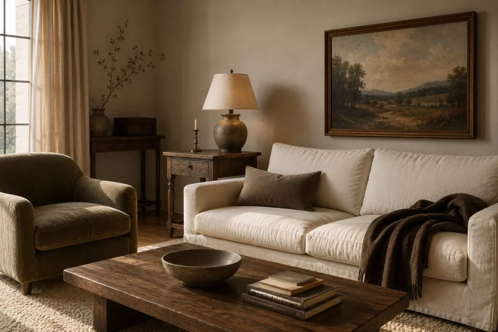
Idea 10: Bring in one vintage or inherited object.
Neutral rooms can feel cold when everything was purchased at roughly the same time from the same style category.
An older piece immediately breaks that perfection.
Try a vintage landscape.
A brass candlestick.
An inherited bowl.
An old wood box.
A slightly worn side table.
A stack of books that somebody actually reads.
Current 2026 living rooms are increasingly focused on personality, eclectic details, and character rather than purely aesthetic coordination.
This doesn’t require expensive antiques.
I’d happily put a $30 thrifted landscape above a $2,000 sofa if the painting gives the room something it was missing.
That contrast makes neutral interiors feel lived in.
And don’t overrestore everything.
A little wear on wood or brass can be useful.
The goal isn’t damage.
It’s avoiding the feeling that every surface arrived yesterday.
10. Use art to introduce warmth without adding clutter
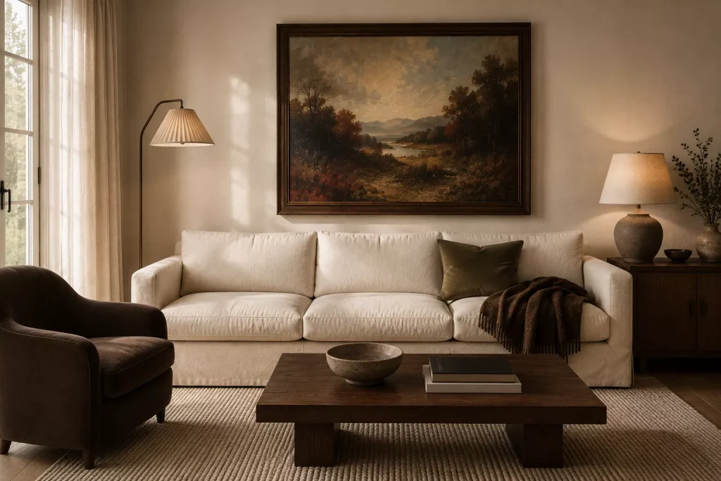
Idea 11: Choose artwork with earthier visual weight.
If your walls are pale, artwork can provide the deeper layer the room needs.
Try:
- warm landscapes
- brown and ochre abstracts
- botanical studies
- dark-framed photography
- textiles
- paintings with burgundy, olive, or dusty blue
One large piece can be more effective than several small objects scattered around the room.
This is especially useful if you like a clean, neutral aesthetic and don’t want more accessories on tables.
Look at the frame too.
Changing a thin silver frame to walnut or aged brass can warm the wall without changing the art itself.
For a sofa around 80 inches wide, artwork somewhere around 40 to 55 inches wide may give you enough scale, depending on the wall and composition.
Don’t choose art by matching its colors to every cushion.
Choose something you genuinely like.
A room becomes warmer emotionally when at least some of the objects mean something.
11. Add one piece with a softer shape
Idea 12: Break up all the rectangles.
Neutral rooms can feel particularly rigid because subtle color makes furniture shapes more noticeable.
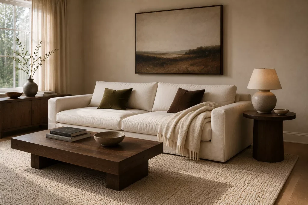
If the sofa, rug, coffee table, windows, console, and artwork are all rectangular, add one curve.
Try a round side table.
An oval mirror.
A barrel chair.
A rounded lamp.
A curving ceramic vase.
Current 2026 interiors are favoring relaxed shapes and softer silhouettes as living rooms become less formal and more comfort-led.
You don’t need to replace the sofa.
A $100 to $250 round side table can break up the geometry enough.
And don’t make everything curved afterward.
The softness works because the straighter furniture stays.
Contrast creates the effect.
12. Let plants and branches add living color
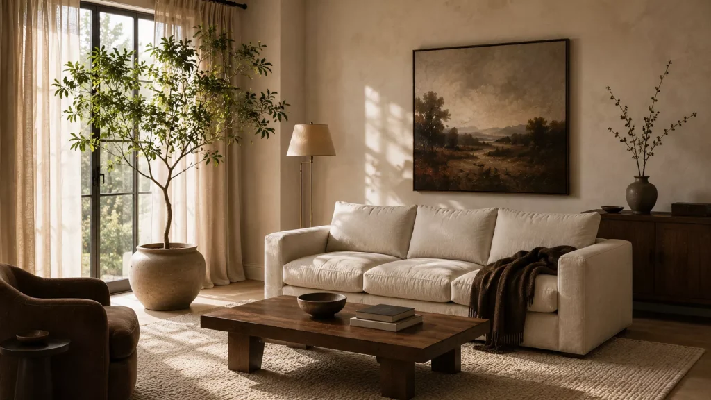
Green is one of the easiest ways to warm neutral rooms without committing to another decorative color.
Use a plant if your room has suitable light.
Or bring in a branch arrangement.
A tall leafy branch in a ceramic vase beside cream upholstery instantly introduces natural variation.
Current earthy interiors continue to lean on organic materials, greenery, natural silhouettes, and the visual relationship between indoor and outdoor spaces.
Choose scale carefully.
A large living room can handle a substantial floor plant.
A small room may look better with one 24-inch branch arrangement on a console.
And don’t fill every empty corner with greenery.
Plants need light, care, and space.
One healthy plant will always look warmer than five struggling ones placed where they can’t thrive.
What should you skip in a neutral living room?
First, skip buying more neutral accessories because the room feels empty.
Another cream vase probably isn’t solving the problem.
Ask what the room lacks.
Contrast?
Texture?
Height?
Darkness?
Color?
Lighting?
Solve that problem directly.
I’d also avoid mixing ten different beige shades without any anchor. Tonal variation can look beautiful, but it needs texture and at least one darker element to keep the room from becoming visually foggy.
Skip matching furniture sets too.
A neutral room needs differences in age, material, and silhouette even more than a colorful room does.
And don’t assume adding black is the only way to create contrast.
Walnut, chocolate, oxblood, olive, dark blue, and bronze can all provide depth with a softer result.
The goal isn’t making the room busier.
It’s making the quiet palette more interesting.
Try this if your neutral living room is a rental
Start with the pieces that cover the most visual area without changing the property.
Bring in a larger rug.
Add full-length curtains.
Change two cushion covers.
Place a walnut or dark wood side table beside the sofa.
Then add one substantial lamp.
Those five changes can alter most of what you see from the doorway without painting a single wall.
If the room still feels cold, use art.
A large landscape or framed textile can add color and warmth without permanent construction.
And if the walls are cool gray, don’t fight them with more gray.
Use cream, brown, olive, rust, and wood around them.
A rental wall color becomes much less important once the rest of the room has enough visual confidence.
FAQ About Warming Up a Neutral Living Room
How do you make a beige living room feel warmer?
Add darker wood, chocolate brown, textured textiles, layered lighting, and one muted accent color such as olive or dusty blue. Beige usually looks flat when everything surrounding it has similar value and texture.
What colors add warmth to a neutral living room?
Chocolate brown, rust, terracotta, olive, burgundy, clay pink, ochre, and warm wood tones all work. Dusty blue can also make warm neutrals feel richer by providing cool contrast.
How do you warm up a neutral living room without adding lots of color?
Focus on texture and material instead. Combine linen, wool, wood, stone, leather, ceramics, and woven fibers while varying light and dark tones. Designers are putting much more emphasis on these texture schemes in 2026.
Can a white living room still feel cozy?
Absolutely. Use a softer warm white rather than a stark blue-white, then introduce natural wood, substantial fabrics, art, warm lighting, and darker accents. Current 2026 living room color guidance continues to support warm white as a useful foundation when it’s layered thoughtfully.
Warmth comes from contrast, not clutter
The most useful lesson from these 12 Way Add Warmth to a Neutral Living Room is that you probably don’t need more decor.
You need more difference.
Put rough linen beside smooth upholstery.
Place dark walnut against cream.
Let a faded landscape interrupt a pale wall.
Add one lamp that makes the room look completely different after sunset.
Then leave some space around those choices.
A neutral living room should still feel calm. That’s part of its appeal.
But calm and flat aren’t the same thing.
Start with one darker wood piece, one tactile fabric, and one lower light source. If those three changes make your existing beige, cream, or warm white suddenly look richer, you’re already moving in the right direction.