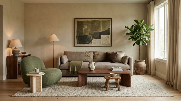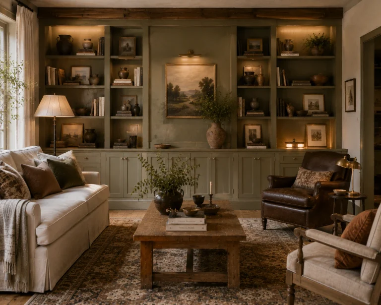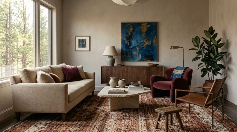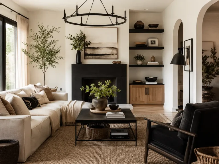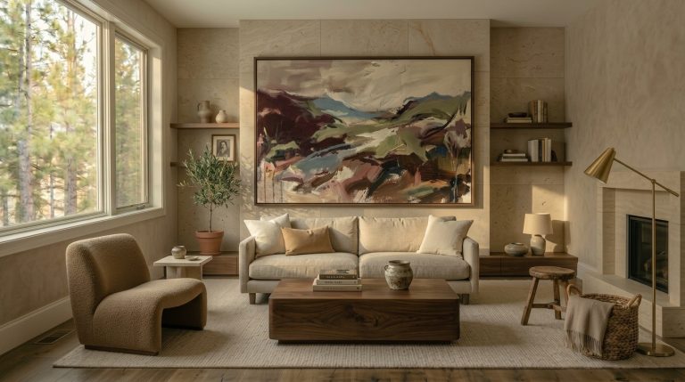
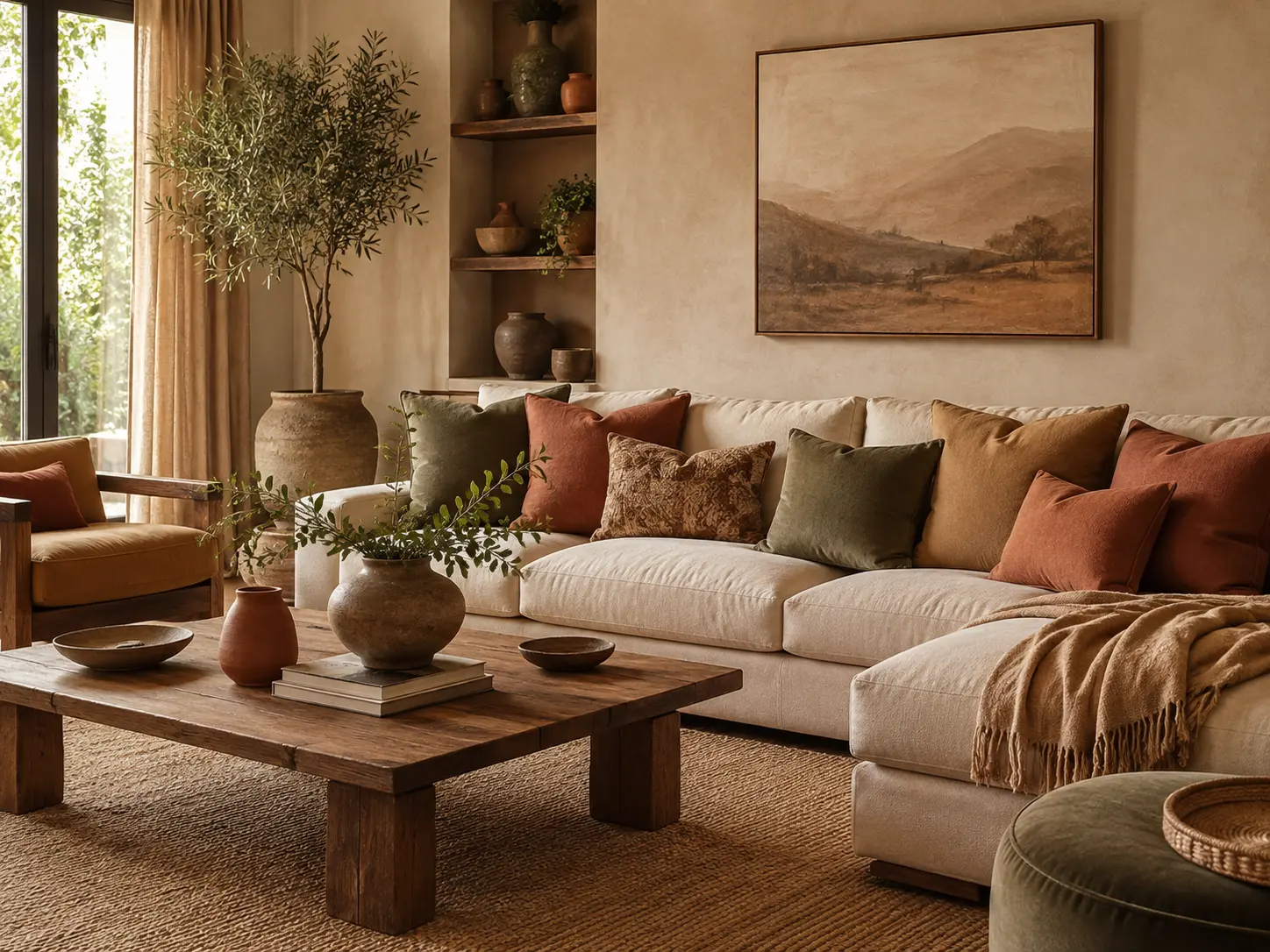
12 Earthy Color Combinations for living room That Feel Warm, Layered, and Current
Earthy living rooms can go wrong in one very specific way. Everything becomes beige.
The sofa is beige. The rug is beige. The walls are beige. Then someone adds a brown cushion and calls the room earthy.
The best 12 Earthy Color Combinations for living room have more contrast than that. They borrow from soil, stone, bark, clay, leaves, faded flowers, and even cloudy skies. That means brown and green, of course, but also dusty blue, muted plum, ochre, terracotta, and soft pink.
That direction feels especially relevant in 2026. Designers are moving away from cool gray and overly pale neutrals toward nuanced browns, muddy greens, muted teals, earthy reds, and warmer whites.
Here are twelve combinations I’d actually use in a real living room, plus exactly where each color should go.
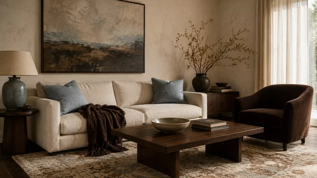
1. Chocolate Brown + Cream + Pale Blue
Combination 1
This is one of my favorite earthy palettes because it gives brown enough contrast to feel fresh.
Use chocolate brown as the grounding color.
That might mean a walnut coffee table, dark brown sofa, painted bookcase, or large wool rug.
Then bring in cream through curtains, walls, or upholstery.
Pale blue should be the surprise.
Try it on two cushions, an armchair, ceramic lamp, or artwork.
Brown has become one of 2026’s strongest alternatives to beige, while designers are pairing it with softer blues and natural materials to keep the result from becoming heavy.
I particularly like this combination in rooms with medium or dark wood floors.
Keep the blue slightly dusty
Avoid icy baby blue.
Look for shades with a little gray or green in them.
A powdery blue beside chocolate feels calm. A bright blue can make the palette look more nautical than earthy.
Try approximately:
- 50% cream
- 30% brown
- 20% pale blue
You don’t need to follow those numbers precisely. They’re simply a useful starting point.
2. Olive Green + Tobacco Brown + Warm White
Combination 2
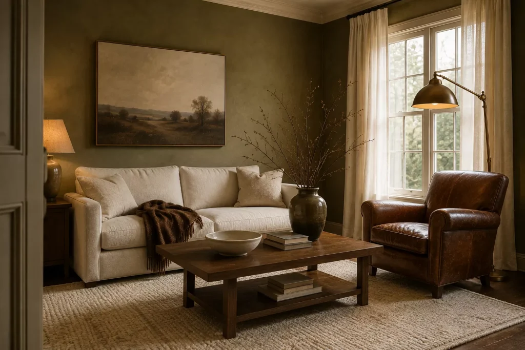
Olive is becoming much more interesting than the pale sage that has dominated interiors for several years.
Designers in 2026 are leaning toward richer yellow-based greens, including olive, moss, khaki, and bronze-green because they feel warmer under both daylight and evening lighting.
That makes olive excellent for living rooms.
Use it on walls if you want a cocooning effect.
For less commitment, try an olive sofa or pair of chairs.
Then add tobacco brown through leather, wood, a rug, or a throw.
Warm white keeps the whole scheme from becoming too dense.
I once worked with a room that had olive walls and dark furniture, but every accessory was also dark. The room felt much smaller than it was.
We replaced the brown curtains with warm ivory linen and brought in a cream rug.
Nothing else changed.
The green suddenly looked richer because it finally had something lighter to sit beside.
3. Terracotta + Mushroom + Walnut
Combination 3
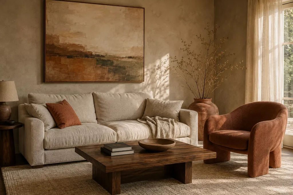
Terracotta is an obvious earth color, but the way you use it determines whether the room feels sophisticated or like a Southwestern theme.
Pair it with mushroom rather than stark white.
Mushroom sits somewhere between beige, gray, and brown, which softens terracotta’s orange undertone.
Then ground both with walnut.
Terracotta remains a major 2026 color because it carries brown, orange, and pink undertones that change naturally with the light.
Use terracotta on:
- an accent chair
- cushions
- a large ceramic vase
- a painted niche
- patterned curtains
Use mushroom on larger surfaces.
Walnut can appear through the coffee table, side tables, frames, or shelving.
Combination 4: Terracotta + Dusty Blue + Natural Oak
If terracotta and beige feel too predictable, add dusty blue instead.
That cool-warm contrast makes both colors more interesting.
Natural oak keeps the combination light enough for a smaller living room.
This is one of the best palettes for someone who wants an earthy room without making it dark.

4. Moss Green + Ochre + Oatmeal
Combination 5
This combination has a slightly 1970s feeling, but it can look completely current if the shapes and materials stay clean.
Moss green and ochre are both part of the current return to richer, nature-driven colors. Designers are revisiting several 1970s shades in 2026, particularly ochre, moss, brown, terracotta, and muted gray-greens.
Use oatmeal as the base.
An oatmeal sofa works perfectly.
Then add moss through an armchair, rug, or curtains.
Ochre should appear in smaller quantities, perhaps through a cushion, lamp, or artwork.
The important detail is material.
Moss velvet feels richer than flat synthetic fabric.
Ochre linen looks softer than bright yellow polyester.
And an oatmeal wool rug gives the room far more depth than another smooth beige surface.
Avoid matching every green
A living room becomes more natural when greens vary slightly.
Moss cushions can sit beside olive foliage.
A deeper green book can appear on the coffee table.
Nature rarely repeats the exact same green everywhere.
Your room doesn’t need to either.

5. Caramel + Deep Teal + Ivory
Combination 6
This is the palette I’d choose if you like earthy interiors but still want stronger color.
Caramel provides warmth.
Deep teal brings cool depth.
Ivory creates enough breathing room around both.
Muted teal is one of the living room colors designers are highlighting for 2026 because it sits between blue and green and can feel bold without becoming overly bright.
Try caramel through a leather chair, woven rug, wood, or camel-colored upholstery.
Use teal more selectively.
A teal sofa can anchor the whole room, but two deep teal armchairs or a painted built-in work just as well.
Then bring ivory through walls, curtains, or a large rug.
This combination works especially well with brass.
Aged brass has enough warmth to connect caramel and teal without adding another major color.

6. Clay Pink + Cocoa + Olive
Combination 7
Pink can be earthy.
It just needs the right undertone.
Skip candy pink and look for dusty rose, clay, plaster pink, or muted salmon.
These shades contain enough brown or gray to behave almost like neutrals.
Designers are using dusky pinks alongside wood, linen, stone, and other natural materials because they give rooms warmth without feeling overly sweet.
Pair clay pink walls with a cocoa sofa.
Then bring olive through cushions or curtains.
Or reverse it.
Use mushroom walls, a clay-pink chair, olive sofa, and brown wood furniture.
Here’s why this combination works:
| Color | Best role | Useful material |
|---|---|---|
| Clay pink | Walls or accent chair | Plaster-look paint, linen |
| Cocoa | Sofa or wood | Velvet, leather, walnut |
| Olive | Secondary upholstery | Linen, wool |
| Cream | Small balancing layer | Cotton, ceramics |
If you’re nervous about pink walls, start with one large clay-colored textile.
A pair of curtains can create almost the same visual shift without paint.
7. Rust + Forest Green + Warm Beige
Combination 8
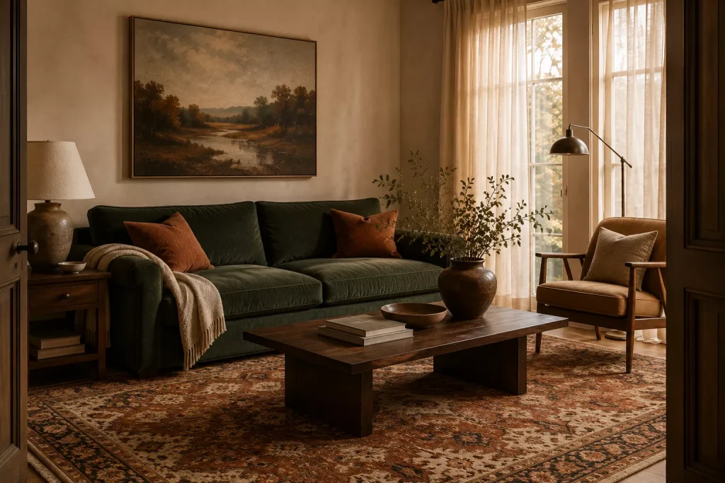
Rust and green naturally belong together, but I’d choose a deep forest or muddy green rather than bright emerald.
Warm beige acts as the bridge.
This palette is particularly good in traditional, farmhouse, rustic, and collected living rooms.
Try beige walls and a forest-green sofa.
Then introduce rust through a faded rug, cushions, and one ceramic object.
Or use a rust sofa against warm beige walls and let green appear through artwork and upholstery.
Current sofa color direction is moving toward both earthier greens and rusty mineral reds, making this pairing especially relevant in 2026.
The mistake here is using equal amounts of rust and green.
One should lead.
If the sofa is green, let rust be secondary.
If your rug is strongly rust-colored, reduce the green to a chair and foliage.
Equal visual weight can start feeling festive rather than earthy.
8. Plum + Camel + Olive
Combination 9
Plum is probably the most unexpected palette on this list.
And that’s exactly why I like it.
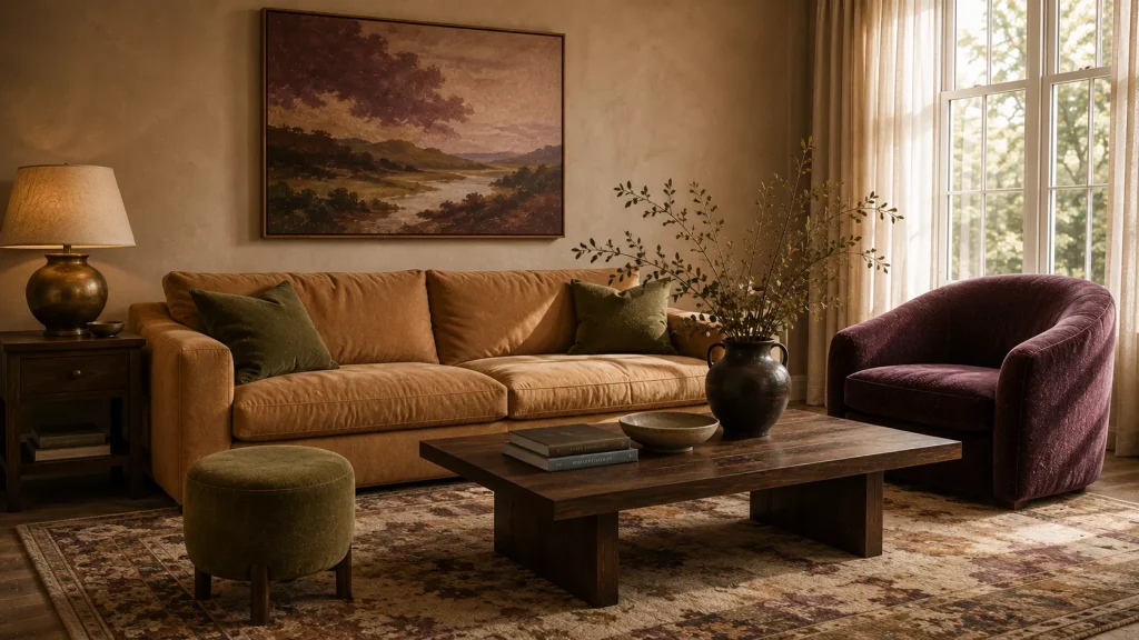
Deep plum is emerging as an earthy alternative to standard fall and jewel tones. Designers are pairing it with olive, camel, blush, wood, brass, and leather because its brown undertones keep it grounded.
For a living room, I’d use camel first.
A camel sofa or rug provides a calm foundation.
Then introduce plum through one upholstered chair, curtains, or a painted cabinet.
Olive can show up through cushions or a small stool.
Don’t add too much black.
Plum already brings substantial depth.
Dark brown wood usually looks softer beside it.
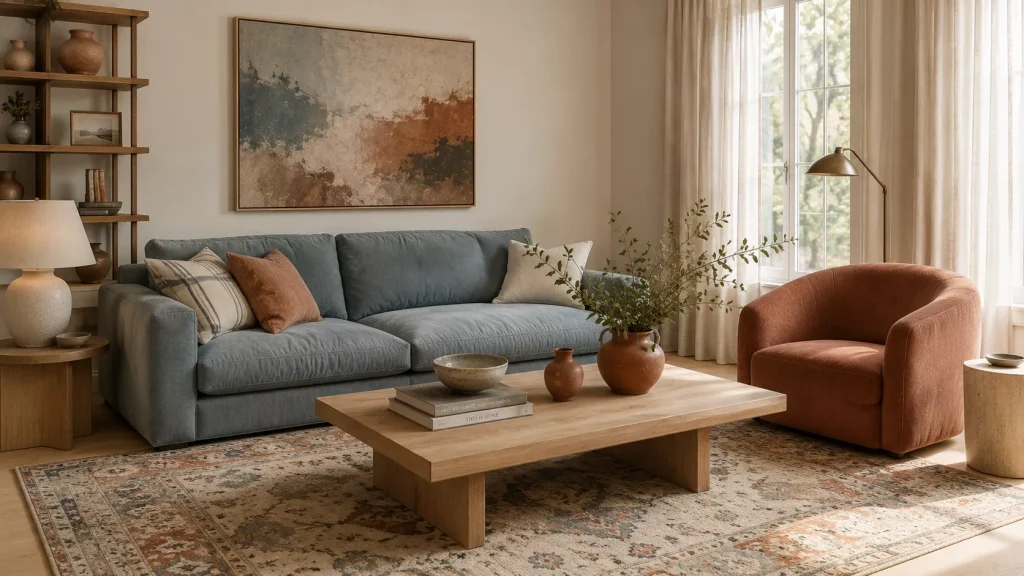
Combination 10: Plum + Dusty Blue + Walnut
For a moodier room, replace olive with dusty blue.
This sounds unusual on paper, but the combination can be beautiful because the blue cools plum while walnut reconnects both colors to the natural palette.
Try it in a room with strong afternoon light.
9. Muddy Green + Soft Pink + Dark Wood
Combination 11
This combination feels collected rather than conventionally earthy.
Start with muddy green walls.
Not mint.
Not cool sage.
Think olive mixed with gray and brown.
Then bring in soft pink through upholstery or textiles.
Deep wood finishes keep the room grounded.
Designers working with muddy greens in 2026 specifically recommend pairing them with shades such as plum, pink, pale blue, and brass because these colors create contrast without fighting the green.
This palette is particularly useful if your living room already contains dark antique furniture.
Instead of trying to lighten every old wood piece, use the dark wood deliberately.
Put it against the muddy green.
Then add something soft, perhaps a faded pink chair or floral curtain.
Older furniture suddenly feels like part of the plan rather than something you haven’t replaced yet.
That’s a much better use of a decorating budget.
10. Warm Taupe + Brick Red + Dusty Blue
Combination 12
This is the most flexible of the 12 Earthy Color Combinations for living room because none of the colors has to dominate dramatically.
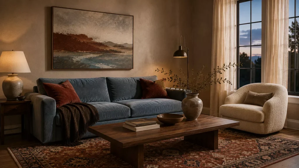
Warm taupe works well on the walls.
Brick red gives the room energy.
Dusty blue prevents the entire palette from leaning too warm.
Current color direction is favoring grounded reds such as brick, terracotta, rust, and tobacco over brighter cherry tones, especially on upholstery and larger textiles.
Try:
Warm taupe walls
Dusty blue sofa
Brick-red patterned rug
Walnut coffee table
Cream curtains
Or reverse the two stronger colors.
A brick sofa with blue cushions can work beautifully.
This palette also handles pattern well.
A rug containing muted blue, brown, cream, and red can connect everything without requiring exact color matches elsewhere.
What should you avoid with earthy living room colors?
The biggest mistake is making everything muted.
An earthy palette still needs contrast.
If the walls, sofa, rug, curtains, cushions, and wood all sit at roughly the same medium-beige value, the room will feel flat regardless of how expensive the furniture is.
Add one deeper shade.
Chocolate.
Forest green.
Plum.
Walnut.
Then include something pale enough to create separation.
I’d also skip automatically pairing every earthy color with black.
Black can work, but dark brown, bronze, aged brass, and walnut often produce a softer result.
Another mistake is assuming earthy means warm-only.
Blue belongs here too.
Water, stone, sky, and shadow are part of nature. Muted blue paired with brown and green is even being described as part of a broader serene-earth palette in current interiors.
Finally, stop choosing colors independently.
Take fabric, rug, wood, and paint samples into the same room.
Color shifts dramatically with daylight, bulb temperature, flooring, and nearby finishes.
A green that looks sophisticated in a store can look surprisingly yellow beside your sofa.
Try this if your living room is already beige
Don’t repaint immediately.
Use beige as the lightest color in a richer palette.
First, add one deep shade.
Try chocolate brown or muddy green.
Then add one middle color such as terracotta, dusty blue, or clay pink.
For example:
Beige walls
Chocolate sofa
Dusty blue cushions
Walnut table
Cream curtains
Or:
Beige sofa
Olive curtains
Terracotta rug
Dark brown side table
That gives the existing beige a purpose.
It becomes contrast instead of the entire personality of the room.
If the result still feels flat, then consider changing the wall color.
But I’d rather test $40 pillow covers and a movable throw before repainting 400 square feet of living room.
FAQ About Earthy Living Room Color Combinations
What colors are considered earthy for a living room?
Brown, olive, moss, terracotta, rust, clay, ochre, mushroom, taupe, and cream are classic choices. Dusty blue, muted teal, plum, and clay pink can also feel earthy when paired with natural wood and softer neutrals.
What earthy colors are popular in living rooms for 2026?
Chocolate brown, muddy green, muted teal, earthy red, terracotta, warm taupe, and richer olive tones are especially current. Designers are moving away from cooler gray-based palettes toward warmer, more nuanced colors.
How many colors should an earthy living room have?
Three main colors are usually enough, plus the existing wood and metal finishes. Let one color dominate, use a second in a supporting role, and keep the third for smaller accents.
Can earthy colors work in a small living room?
Absolutely. Use the lighter shade across larger surfaces and bring deeper colors through furniture, rugs, curtains, or one wall. Small rooms don’t automatically require all-white interiors.
Choose the combination that works with what you already own
The most useful 12 Earthy Color Combinations for living room aren’t palettes you copy exactly.
They’re starting points.
Look at your largest expensive item first.
If you own a cream sofa, build around it rather than fighting it.
If your room has dark walnut furniture, try olive, clay pink, dusty blue, or warm ivory.
If the floor is honey-colored oak, terracotta, muddy green, and teal may all work beautifully.
And test everything in the actual room before committing.
The goal isn’t to collect as many earth tones as possible.
It’s to create enough warmth, contrast, and variation that the living room feels connected to nature without becoming a sea of beige.
Start with one combination that already works with your sofa or floor.
You may only need two new colors to make the whole room finally make sense.