30 Blue and Cream Living Room Ideas That Feel Balanced, Warm and Intentional
Blue and cream living room ideas can range from light and airy to dramatic and sophisticated, but the combination works best when you treat both colours as flexible families rather than one fixed formula. Navy with ivory creates a very different room from dusty blue with warm cream, just as midnight blue against a cream sofa feels completely different from powder blue beside pale oak.
The main challenge is balance. Blue usually brings coolness, depth and definition, while cream adds warmth, softness and visual relief. If the room contains too much dark blue, it can feel heavy. If everything is cream with only a couple of tiny blue accents, the scheme can lose its identity. If every textile repeats the same blue-and-cream pattern, the room can start to feel themed rather than layered.
The most successful rooms decide where the visual weight should live. Sometimes blue belongs on the sofa while cream covers the walls. Sometimes dark blue works better on the walls while a cream sofa becomes the focal point. In other rooms, cream dominates and blue appears through curtains, artwork, rugs or a pair of chairs.
Materials matter just as much as colour. Navy velvet has a richer effect than navy linen. Cream bouclé looks softer and more contemporary than smooth cream leather. Walnut can warm a deep-blue room, pale oak can keep powder blue looking fresh, and aged brass can connect cool blue with warm cream without making the room excessively glamorous.
These 30 ideas show how to adapt blue and cream to different shades, room sizes, furniture forms, styles, layouts and existing finishes.

1. Anchor Cream Walls With a Navy Sofa
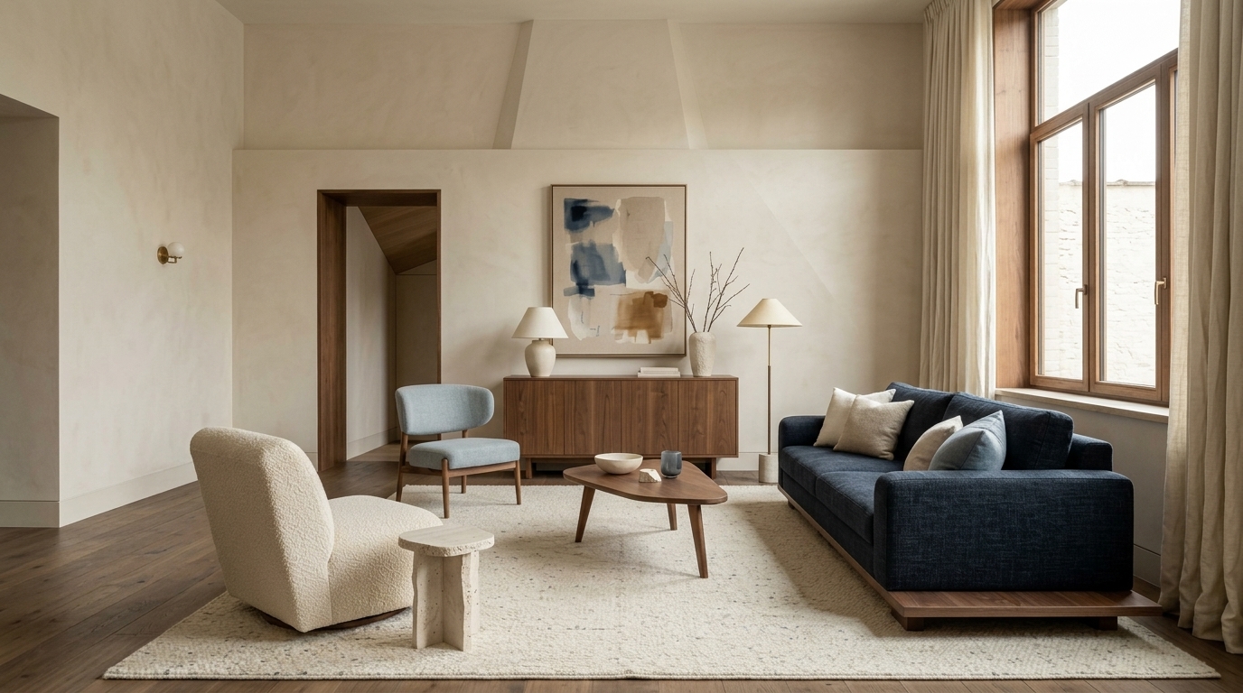
A navy sofa against warm cream walls is one of the most reliable ways to use this palette because each colour has a clear role. Cream provides the light-reflecting background, while navy becomes the visual anchor.
Use walnut or medium-oak furniture rather than automatically adding more blue. A warm timber coffee table prevents the scheme from becoming overly formal or coastal and introduces another material temperature.
A large cream-and-blue rug can connect the two main colours, but it does not need to match the sofa exactly. A faded rug with navy, cream and muted brown will usually look more layered than a perfectly coordinated geometric set.
This arrangement works especially well in medium-sized living rooms because the darker sofa grounds the furniture group without darkening the walls.

2. Put a Cream Sofa Against Dark Navy Walls
Reverse the usual formula by letting the walls carry the blue and the sofa carry the lightest value.
A cream sofa against navy walls creates strong contrast and is especially effective in rooms with good natural light. The cream upholstery keeps the dark wall colour from making the space feel too enclosed.
Introduce walnut, taupe or aged brass between the two colours so the transition does not feel too stark. A warm taupe rug, walnut coffee table or muted gold floor lamp can help.
Keep the ceiling lighter unless the intention is fully cocooning. In many rooms, a cream or warm-white ceiling gives dark blue walls enough visual relief.
3. Use Dusty Blue for a Softer, More Relaxed Room
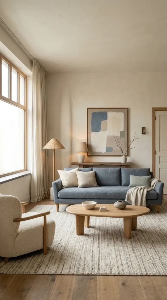
Dusty blue is ideal when navy feels too strong but plain pale blue feels too sweet. Its greyed quality gives it more depth while still keeping the room quiet.
Pair dusty-blue upholstery with cream walls, an oatmeal rug and medium oak or weathered wood. Sage can work as a supporting accent because both colours have muted undertones.
Use linen, wool and woven fabrics rather than glossy finishes. Dusty blue looks particularly natural in matte textures because they reinforce its softer character.
This direction is useful in transitional, cottage and modern-cozy rooms where you want colour without high contrast.
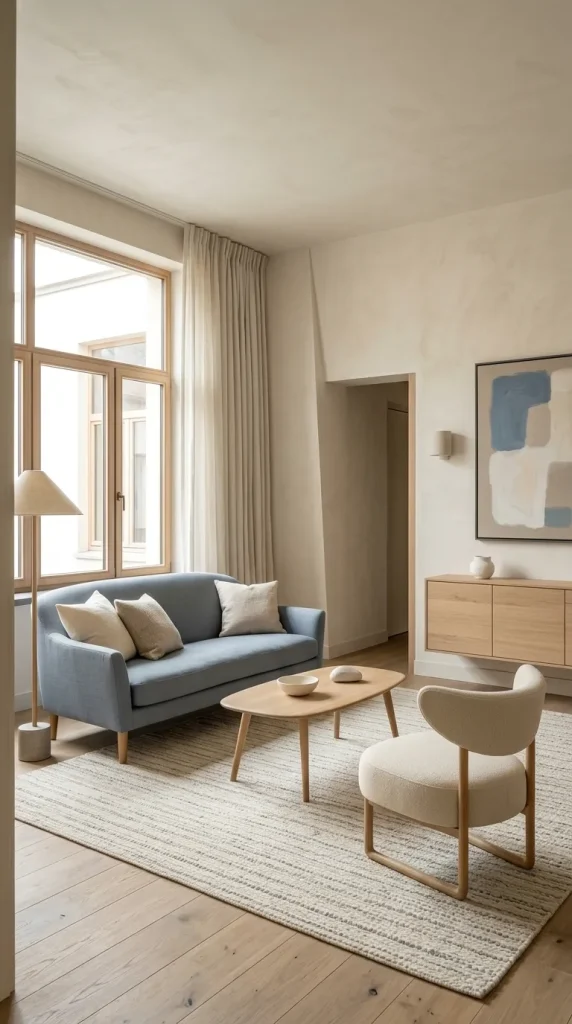
4. Combine Powder Blue, Cream and Pale Oak
For a lighter room, use powder blue with warm cream and pale oak. This gives the palette a fresher, Scandinavian-adjacent feel without becoming stark.
A powder-blue loveseat or pair of armchairs can sit against cream walls with a pale oak coffee table and light flooring. Keep the rug soft ivory or oatmeal so the palette stays visually open.
Avoid adding too many dark accessories. One or two darker accents through artwork, a lamp or thin black frame may be enough.
This combination works particularly well in small apartments because none of the major surfaces carries excessive visual weight.

5. Create Drama With Midnight Blue and Cream
Midnight blue is darker than typical navy and can appear almost black in dim conditions. It can be very sophisticated, but it needs deliberate contrast.
Use midnight-blue walls with a cream sofa, pale rug and warm lighting. Cream lampshades, artwork mats or curtains can create small areas of relief around the room.
Walnut or dark oak works well, but do not let every large surface become dark. If the floor is also dark, a cream or taupe rug becomes essential.
Layer lighting instead of relying on one ceiling fixture. A floor lamp near the seating and another lamp across the room will create dimension on the dark walls after sunset.
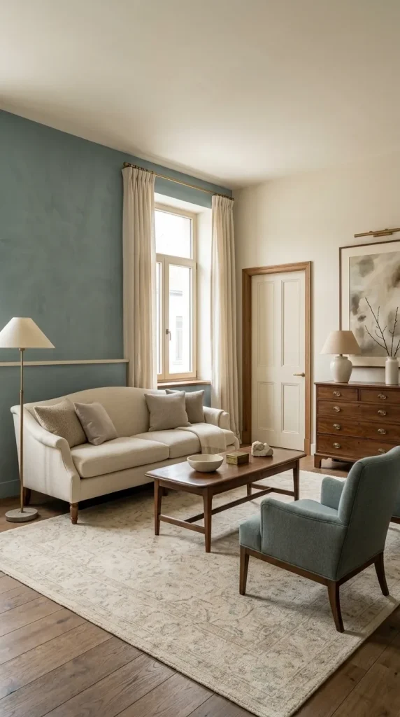
6. Use Duck-Egg Blue With Cream and Antique Wood
Duck-egg blue introduces a subtle green undertone that feels especially comfortable beside warm cream and aged wood.
This is a strong choice for cottage-like or traditional rooms. Use duck-egg blue through walls, an upholstered chair or curtains, then bring cream through the sofa or trim.
Antique or medium-brown wood gives the room warmth and stops the palette from becoming overly pastel. Aged brass also works well because it reinforces the warmer undertones.
Avoid filling the room with matching duck-egg accessories. Let one or two larger elements establish the colour and use cream and wood to give it structure.
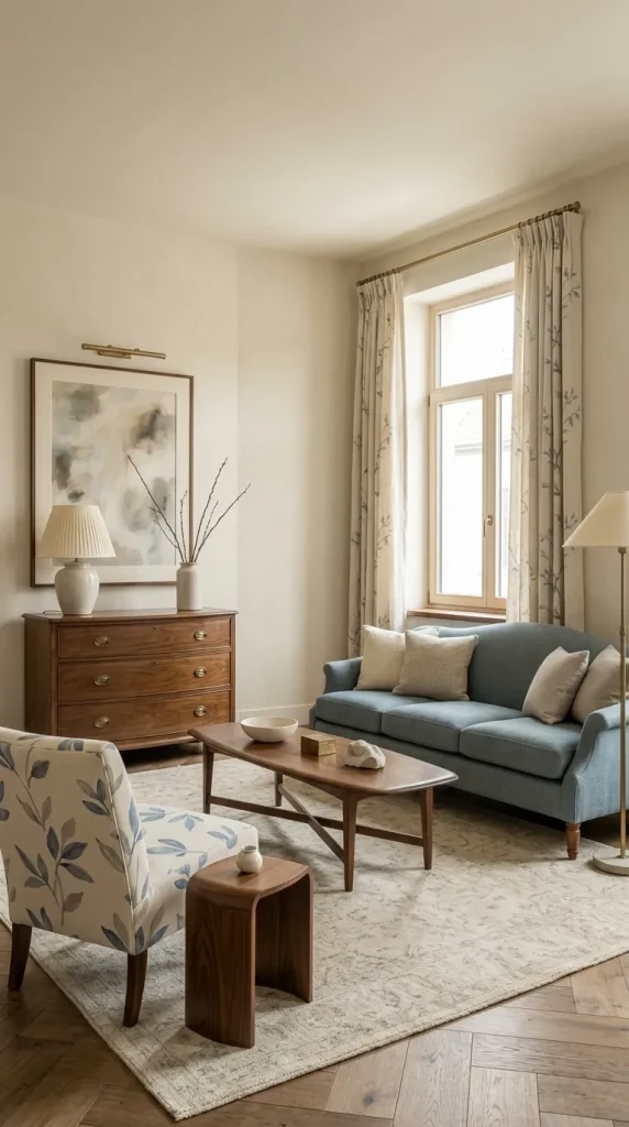
7. Build a French Blue and Cream Living Room
French blue is softer and more decorative than navy but stronger than powder blue. It works particularly well in rooms with classic furniture silhouettes.
Use cream walls, French-blue upholstery, curved wood furniture and aged brass lighting. A patterned rug or traditional textile can add another layer without dominating the room.
If using florals or toile, vary the pattern scale. One larger pattern on curtains or a chair can be enough when the rug already has detail.
The style should come from furniture, drapery, material and proportion rather than relying on decorative clichés.

8. Pair Royal Blue With Cream and Restrained Brass
Royal blue is much more saturated than navy, so it should be used with greater control.
A royal-blue sofa or pair of statement chairs can look striking against cream walls. Keep the rug and larger surrounding surfaces quiet so the blue remains deliberate rather than overwhelming.
Brass can enhance the richness, but use it selectively through lighting, a frame or table detail. Too much polished gold can turn the room into a formulaic glam scheme.
Walnut or dark wood gives royal blue more maturity than all-white furniture would.
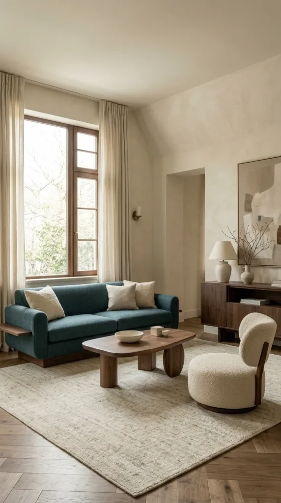
9. Use Peacock Blue for a Richer Contemporary Look
Peacock blue contains more green than navy, which gives it a distinctive richness.
Use it on one major upholstered piece, such as a sofa or curved chair, then surround it with warm cream, walnut and aged brass.
A cream rug and lighter curtains will help maintain balance if the upholstery is saturated.
This is a useful direction for readers who want something more expressive than navy without moving into bright turquoise or teal.
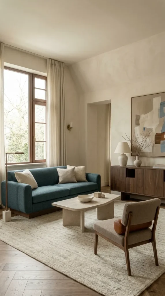
10. Make Slate Blue Feel Warm With Cream
Slate blue often contains enough grey to feel calm and architectural. Cream is useful because it prevents the room from becoming too cool.
A slate-blue sofa works well with cream walls, walnut furniture and taupe textiles. A stone or marble table can add another mineral surface without adding a strong new colour.
Avoid introducing too much separate cool grey. Slate blue already performs that role, and additional grey can flatten the palette.
If the room begins to feel too subdued, one warm material such as cognac leather or brushed brass can restore contrast.

11. Keep Cream Dominant and Add Blue in Larger Accents
Not everyone wants a clearly blue room. If you prefer a neutral living space, let cream dominate and use blue in a few stronger places.
A cream sofa, cream walls and pale rug could be balanced by navy curtains, a large blue artwork and one blue chair.
This is more effective than scattering ten tiny blue accessories around the room. The eye reads larger repeated colour blocks as intentional.
This strategy also makes it easier to change the room later because the most expensive surfaces remain neutral.
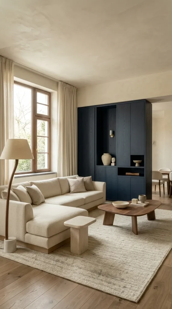
12. Balance a Large Cream Sectional With Strong Blue Elements
A sectional occupies much more visual space than a standard sofa, so two small navy cushions will rarely be enough to create a convincing blue-and-cream scheme.
Balance a cream sectional with one substantial blue element: a navy built-in, blue-and-cream rug, full-height curtains or oversized artwork.
A walnut coffee table can help ground the pale sectional and stop the room from feeling washed out.
This works especially well in open-plan rooms where the sectional already defines the seating zone.
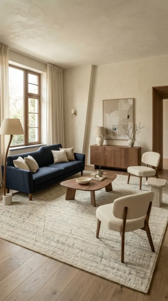
13. Use Blue-and-Cream Rugs to Connect Separate Furniture Colours
A rug is one of the easiest places to combine the two colours directly.
If you have a navy sofa and cream chairs, a rug containing both can visually connect them. If the sofa is cream and the walls are blue, the rug can soften the contrast between floor-level furniture and vertical colour.
Pay attention to the rug’s colour ratio. A cream-dominant rug will lighten a room with dark furniture, while a blue-dominant rug adds grounding in a very pale room.
The rug should be large enough to connect the main seating pieces rather than float under the coffee table alone.
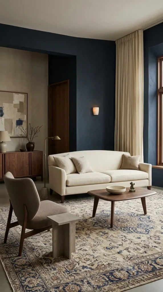
14. Use a Faded Persian-Style Rug for a More Layered Palette
A Persian-style rug can prevent blue and cream from feeling too neat or new.
Choose one that contains muted blue and cream with perhaps rust, brown, taupe or small areas of green. These supporting colours make it easier to introduce wood and aged metal elsewhere.
This works particularly well with a cream sofa and dark blue walls because the rug sits visually between the two extremes.
Avoid matching all the surrounding textiles to the rug. Let its complexity be one of the main decorative elements.

15. Use Cream Curtains to Lighten Dark Blue Walls
Cream or ivory curtains can be extremely effective against navy or midnight-blue walls.
They create tall vertical areas of light around the windows and help reflect daylight deeper into the room.
Linen works well in more relaxed interiors, while fuller lined drapery can suit traditional or elegant rooms.
Do not automatically choose heavy navy curtains just because the walls are blue. If both surfaces are dark, the window area can become visually dense.
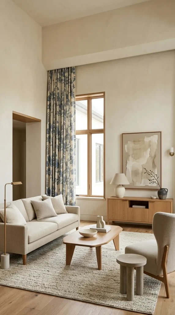
16. Use Blue Curtains in a Cream-Walled Room
When the walls are cream, blue curtains can introduce meaningful colour without committing to blue paint.
Navy curtains create stronger contrast, while dusty or French-blue drapes feel softer. Patterned blue-and-cream curtains can work in traditional rooms but may be too decorative for a minimalist scheme.
Mounting curtains higher, where the architecture allows, can make the blue read as a stronger vertical design feature and can emphasise ceiling height.
Keep nearby furniture relatively quiet if the curtain pattern is elaborate.
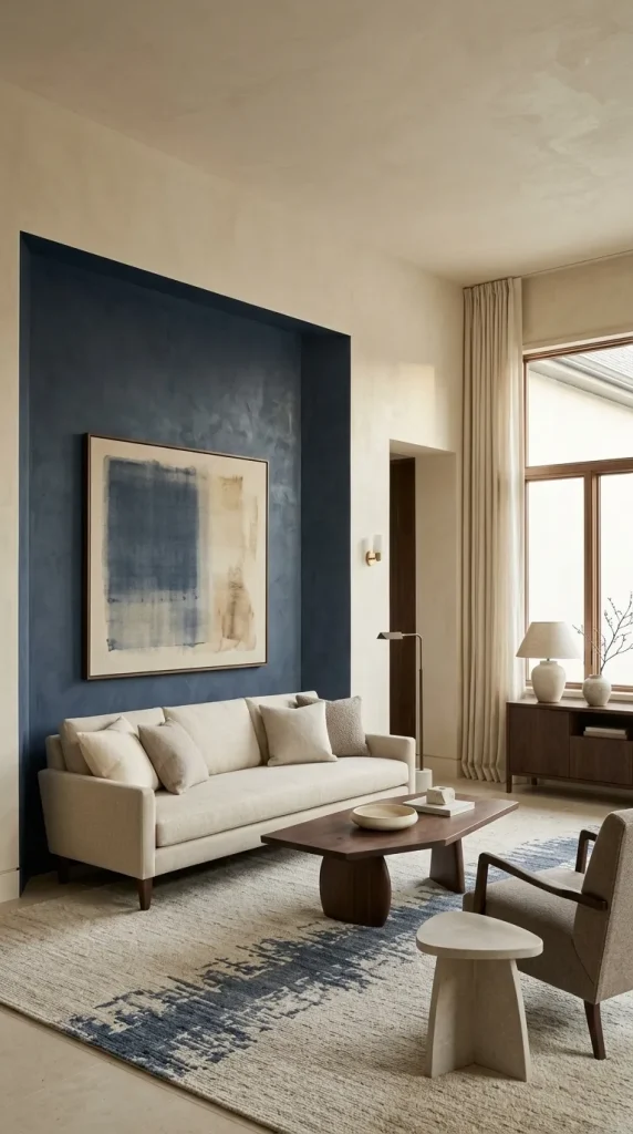
17. Paint a Navy Feature Wall With a Clear Purpose
A blue accent wall works best when it anchors something.
Use navy behind the sofa, fireplace, media area or built-ins rather than selecting one random wall simply because it is available.
Repeat the blue elsewhere in a rug, artwork or chair so the feature wall does not feel disconnected from the rest of the room.
Cream should remain strong enough on adjacent walls, trim or furnishings to keep the contrast clear.

18. Highlight a Cream Fireplace Against Blue Walls
A cream fireplace can become one of the strongest architectural features in a blue room.
Paint surrounding walls navy, dusty blue or French blue while keeping the mantel, plaster surround or stone in a warm cream family.
The cream fireplace naturally becomes a visual focal point and gives the darker colour something to frame.
If the room also contains a television, consider whether both features compete for attention. Furniture placement should acknowledge whichever one is the primary focal point.

19. Warm Blue and Cream With Walnut Furniture
Walnut is one of the best woods for making blue and cream feel more substantial.
Use it through a coffee table, sideboard, shelving or media unit. Walnut pairs especially well with navy, slate, royal blue and cream.
The rich brown grain acts as a warm middle tone between the coolness of blue and lightness of cream.
Avoid filling the room with a complete matching walnut suite. A few substantial pieces usually look more layered.
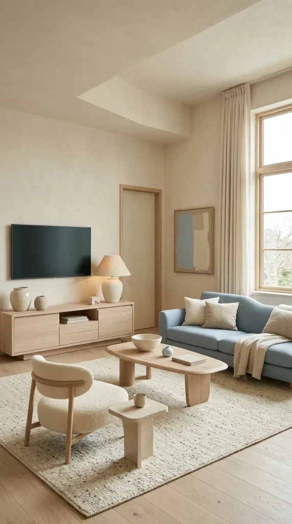
20. Use Pale Oak for Light Blue and Cream Rooms
Pale oak works better than walnut when the blue family is very light.
Pair powder blue, pale blue or soft slate with cream and pale oak for a brighter, lower-contrast result.
A pale-oak media unit or coffee table adds warmth without visually darkening the room. This makes the combination especially useful in apartments and naturally dim spaces.
Use wool, linen and ceramics so the room does not become too visually thin.
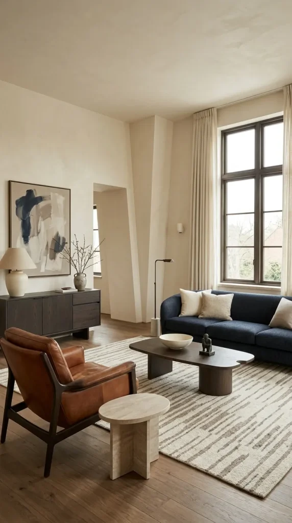
21. Add Tan or Cognac to Stop the Room Feeling Too Coastal
Brown and tan are particularly useful when blue and cream begin to feel too beach-like or formal.
A navy sofa with cream walls and one cognac leather chair feels grounded and contemporary. A cream sofa with blue accents and camel chairs creates a warmer transitional room.
Leather adds not only brown but also sheen, structure and patina, which changes the material balance.
Do not assume the brown needs to match the wood exactly. Related warmth is more important than identical colour.
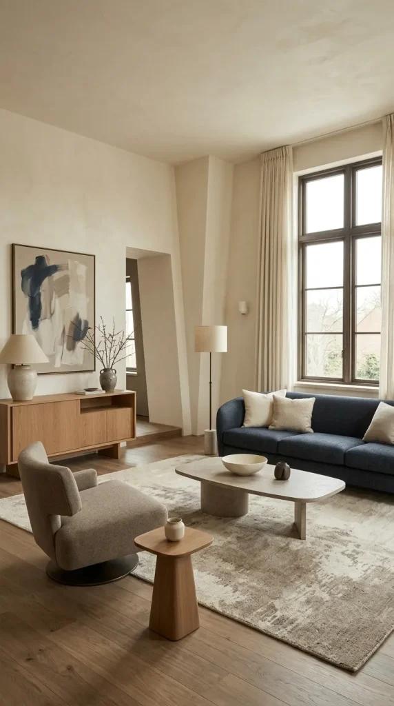
22. Use Taupe as a Quiet Bridge Between Blue and Cream
Taupe sits naturally between cream, grey and brown, making it valuable when blue feels too sharply contrasted against cream.
Use taupe on a rug, curtain, ottoman or secondary chair rather than necessarily adding a third wall colour.
This works particularly well with navy, slate blue and dusty blue.
Be careful with undertones. Some taupes lean pink or violet, so test them beside your chosen blue before committing to a large surface.
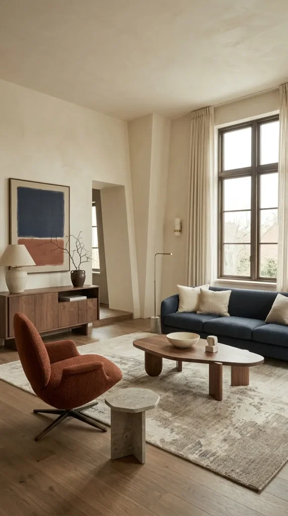
23. Add Rust or Burnt Orange for Energy
Blue and cream can become very safe, and burnt orange is one of the strongest ways to introduce controlled warmth.
Use rust on a chair, rug detail, artwork or a small group of textiles. Navy and rust create especially effective contrast because the colours reinforce each other.
Cream should remain the calming element between them.
Avoid bright citrus orange unless the room is intentionally playful. Burnt orange, clay and rust are generally easier to integrate with wood, brass and neutral textiles.

24. Add Sage to Dusty Blue and Cream
For a softer nature-inspired combination, add sage to dusty blue and cream.
Sage works particularly well because both colours are muted and share an organic quality. Use the green through an armchair, ceramics, artwork or a small section of patterned textile.
Pair the palette with pale or medium oak rather than glossy black furniture.
Do not let green take over. Blue should remain visibly important so the room still reads as a blue-and-cream scheme.
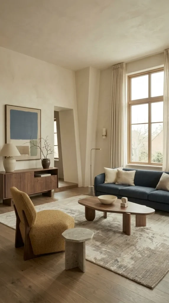
25. Use Mustard With Navy and Cream
Mustard can give navy and cream more energy without becoming overly bright.
A navy sofa, cream walls and one mustard chair or large artwork can create a confident modern room.
Walnut furniture helps the mustard feel integrated because both bring warmth.
Use mustard sparingly in small rooms. One meaningful area of colour is usually more effective than many scattered yellow accessories.
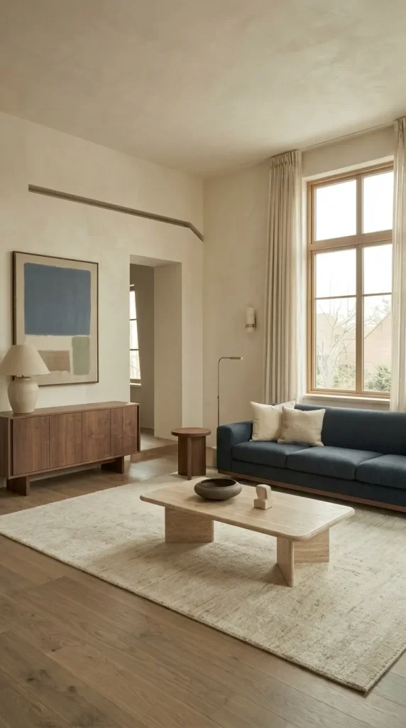
26. Create a Modern Blue and Cream Room With Cleaner Lines
For a modern interpretation, reduce decorative pattern and let larger colour blocks do more of the work.
Use a structured navy or slate-blue sofa, cream walls, a large pale rug and one substantial walnut or travertine table.
Keep accessories limited and use larger artwork rather than many small objects.
Modern does not have to mean cold. Cream, wood and tactile upholstery can keep the room comfortable while preserving cleaner lines.

27. Make Blue and Cream Feel Cozy Through Texture and Lighting
Blue is sometimes treated as a cold colour, but the room does not have to feel cold.
Use cream wool, bouclé, linen and woven textiles alongside blue velvet, linen or brushed cotton. Texture changes the atmosphere more effectively than adding more colours.
Layer the lighting as well. A floor lamp beside the sofa, a table lamp across the room and perhaps a wall light or picture light can create separate areas of warmth.
Warm light is especially important beside dark blue because cool bulbs can make navy feel harder and can turn cream visually grey.

28. Build a Traditional Blue and Cream Living Room
Traditional rooms can carry more pattern and deeper wood than modern ones.
Use a cream rolled-arm sofa, French-blue or navy chairs, a patterned rug, dark wood furniture and fuller curtains.
Aged brass, classic framed artwork and one or two patterned textiles can reinforce the style.
Avoid buying matching blue-and-cream furniture. The room will feel more authentic when pieces relate through colour, material and scale rather than exact duplication.
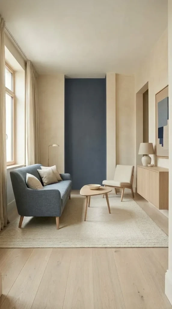
29. Create a Small Blue and Cream Apartment Without Making It Bland
In compact rooms, use cream where it can reflect light and concentrate blue in meaningful areas.
A small dusty-blue sofa, cream walls, ivory rug and pale oak table can keep the room bright while still clearly expressing the palette.
A navy wall can also work in a small room if the remaining major surfaces are lighter. Dark colours are not automatically wrong in small spaces; furniture scale and overall visual weight are often more important.
Keep walkways clear and avoid combining an oversized sectional, heavy navy curtains and a dark rug in one tight space.
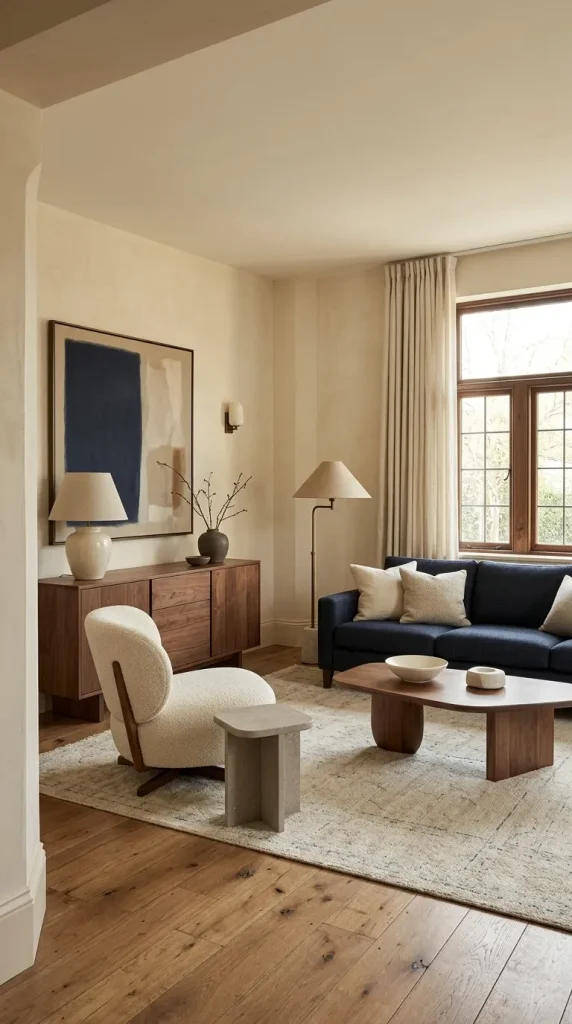
30. Design Around the Blue or Cream Furniture You Already Own
The most practical blue-and-cream living room often begins with an existing piece rather than an empty room.
If you already own a navy sofa, look at what makes it feel too dark or too formal. Cream walls, a lighter rug, walnut furniture and warmer lighting may solve the problem without replacing the sofa.
If you already own a large cream sectional, blue needs enough scale to balance it. A navy chair, substantial rug, tall curtains or painted built-ins may work better than simply adding a couple of blue cushions.
If your room already has cream walls and warm wood flooring, the blue can be introduced through upholstery or art. If it already has blue walls, use cream on larger furniture and textiles to restore lightness.
Start by identifying the fixed surfaces, then choose which colour needs to lead. This is more useful than trying to reproduce a room image exactly.
How to Choose the Right Blue for a Cream Living Room
Different blue families create very different results.
Navy is the strongest all-round choice when you want sophistication, contrast and structure.
Midnight blue is more dramatic and should be balanced with larger cream surfaces, warm lighting and some lighter materials.
Dusty blue feels quieter and more relaxed, making it useful for transitional, cottage and modern-cozy interiors.
Powder blue and pale blue create the lightest effect and pair particularly well with cream, pale oak and natural linen.
Duck-egg blue contains more green and works beautifully with warm cream, aged wood and brass.
French blue suits classic and decorative rooms, especially when paired with traditional furniture forms.
Slate blue is more greyed and works well in contemporary rooms with walnut, taupe or stone.
Royal blue is much more saturated and should usually be used more selectively.
Peacock blue introduces a richer blue-green quality and pairs especially well with cream, walnut and brass.
The darker or more saturated the blue, the more important it becomes to control where it appears.
Should Blue or Cream Be the Dominant Colour?
There is no correct fixed ratio.
A blue-led room might use navy walls or a large blue sofa while cream appears on the rug, curtains and upholstery.
A cream-led room might use cream walls and a cream sofa, with blue appearing through curtains, artwork, chairs or a patterned rug.
A balanced room could use a blue sofa, cream walls and a rug containing both, but there is no need to split the colours mathematically.
The decision should be based on light, room size and the furniture you already own.
If the room is naturally dark, cream can do more of the large-surface work while blue becomes the anchor. If the room has strong daylight, you can usually use darker blue more confidently.
Best Wood Tones for Blue and Cream
| Wood tone | Works especially well with | Effect | Main risk |
|---|---|---|---|
| Pale oak | Powder, pale and dusty blue | Light and relaxed | Can become washed out without contrast |
| Medium oak | Dusty blue, navy, cream | Balanced warmth | Too many similar mid-tones can look flat |
| Walnut | Navy, slate, royal blue | Rich and sophisticated | Can feel heavy if flooring is also dark |
| Dark wood | French blue, navy, cream | Traditional depth | Needs lighter textiles nearby |
| Weathered wood | Duck egg, dusty blue, cream | Cottage or rustic softness | Overuse can push the room too farmhouse |
Wood is one of the easiest ways to warm the scheme without adding another strong accent colour.
Best Metal Finishes for Blue and Cream
Aged brass is one of the most flexible choices because it warms blue and relates naturally to cream.
Brushed brass works well in modern and transitional interiors when used sparingly.
Bronze can suit traditional rooms, particularly with navy, French blue and darker wood.
Blackened metal gives more structure and is useful in modern rooms, but large amounts of black beside navy can become visually heavy.
Chrome or nickel can work in cooler contemporary schemes, particularly with slate blue, but they may reduce the warmth that cream brings.
The room rarely needs one metal repeated on every single object. A consistent primary finish with restrained variation is usually enough.
Best Accent Colours for Blue and Cream
Brown and tan are among the most useful additions because they ground the scheme and prevent it from feeling overly coastal.
Rust and burnt orange bring complementary warmth and work particularly well with navy.
Sage fits naturally with dusty, slate and duck-egg blue.
Mustard can create stronger contrast against navy.
Blush or dusty pink can soften darker blue and works particularly well with brass.
Grey can provide a quieter transition, especially with slate or dusty blue, but too much grey may reduce warmth.
Black is useful as a structural accent in frames, lamps and table bases.
Choose one supporting accent family rather than trying to use every colour that works with blue.
What Should You Avoid in a Blue and Cream Living Room?
Making Every Example Navy and Cream
Navy is important, but blue includes many other useful families.
Powder blue, dusty blue, French blue, duck egg, slate and peacock blue create completely different interiors.
A successful room should choose the shade according to the atmosphere you want rather than defaulting to navy because it is familiar.
Turning the Room Into a Coastal Theme by Accident
Blue and cream naturally have coastal associations, but they are not inherently nautical.
If you want a modern, traditional or elegant room, use materials such as walnut, marble, brass, wool and structured upholstery rather than defaulting to stripes, driftwood and beach accessories.
Using the Same Blue Everywhere
A navy sofa, navy curtains, navy wall and navy rug can make the scheme look overly matched.
Blue shades can vary slightly if their undertones cooperate. A navy sofa can work with a faded blue rug or dusty-blue art.
At the same time, avoid combining several unrelated blues with conflicting green, violet and grey undertones.
Choosing the Wrong Cream
Cream is not one fixed colour either.
A strongly yellow cream may exaggerate the coldness of certain royal or blue-grey shades. A more neutral cream or soft ivory may create a calmer relationship.
Always test the blue and cream together in the room rather than selecting them separately.
Using Too Much Dark Blue in a Dim Room
Dark blue can absolutely work in a low-light room, but every other surface should not also be dark.
Use cream upholstery, lighter rugs, warm lighting, pale ceilings and selective reflective surfaces so the room still has dimension.
Relying on Two Blue Cushions
If the room is otherwise beige or cream, two small blue cushions may not be enough to make the palette feel intentional.
Repeat blue through at least one more substantial element such as artwork, curtains, a chair, rug or painted surface.
Overmatching Patterns
A blue-and-cream rug, matching curtains, matching pillows and matching ceramics can make the room feel themed.
Let some large surfaces stay plain and vary pattern scale where several patterns are present.
Overusing Gold
Brass and gold can look excellent with blue and cream, but more metal does not automatically make the room more luxurious.
Use it as punctuation through lamps, frames, table details or hardware.
Allowing Grey to Take Over
Grey works well as a supporting neutral, but too much grey can shift the palette into a blue-and-grey room where cream becomes incidental.
If slate blue, grey upholstery and cool flooring are already present, use cream, warm wood, taupe or brass to restore warmth.
How to Make a Blue and Cream Living Room Feel Cozy
Start with textile scale.
A correctly sized rug should visually connect the seating group rather than sit like an island under the coffee table. Curtains can soften large window areas, while throws and cushions should vary in material rather than simply repeat the same fabric.
Use tactile combinations such as cream bouclé with navy velvet, linen beside walnut or wool against smooth stone.
Lighting is equally important. Instead of relying on one overhead source, use several lower lights across the room. Warm bulbs make cream look richer and prevent blue from feeling cold after sunset.
Coziness comes from layers and illumination, not simply from making the blue darker.
How to Make Blue and Cream Look Modern
Use larger, simpler colour blocks.
A navy sofa against cream walls, one walnut or travertine table and a large neutral rug can look more modern than dozens of coordinated blue-and-cream accessories.
Choose clean furniture profiles, more negative space and larger artwork.
Keep pattern under control. One patterned rug can provide enough complexity if the upholstery and curtains remain quieter.
Introduce warmth through timber, cream textiles or brushed brass so the room does not become excessively cool.
How to Use Blue and Cream in a Small Living Room
Small rooms need proportion more than they need strict colour rules.
A compact blue sofa can work very well if the walls and rug remain light. A dark navy wall can create depth if the rest of the room has enough cream and light-reflecting surfaces.
Furniture with visible legs can preserve more visual floor area than heavy blocky pieces.
Wall-mounted lighting can reduce the need for extra floor lamps and side tables.
One stronger blue move is usually more effective than many tiny blue accents scattered through the space.
How to Use Blue and Cream Across an Open-Plan Space
Do not copy the same colour ratio into every zone.
The living area might use a blue sofa while the adjacent dining area repeats blue through upholstered chairs, art or ceramics.
Cream walls or curtains can provide continuity across both zones.
Wood and metal finishes are also useful connecting elements. A walnut dining table and walnut living-room console can make the zones relate even if the blue appears differently in each.
Use rugs to define the separate functions without visually cutting the space apart.
Frequently Asked Questions
Do blue and cream go together in a living room?
Yes. Blue adds depth and coolness while cream introduces warmth and visual relief. The pairing works best when the undertones, material choices and proportion are considered rather than simply matching any blue with any cream.
What shade of blue works best with cream?
Navy is one of the most flexible choices, but dusty blue, powder blue, duck egg, French blue and slate blue can all work beautifully. The best choice depends on the room’s light level, style and desired contrast.
What colour sofa works with cream walls?
Blue sofas work particularly well. Navy creates strong contrast, dusty blue feels softer, powder blue feels lighter and royal blue creates a more saturated statement.
What colour rug works with a blue sofa and cream walls?
A cream-dominant rug with muted blue details is a reliable option. Faded Persian-style rugs containing blue, cream, brown or rust can also connect the palette to wood and other accent colours.
Can I use dark blue in a small living room?
Yes. Small rooms do not automatically require pale colours. Keep furniture scale appropriate and balance the dark blue with lighter cream surfaces, good lighting and enough tonal separation.
What colour curtains work with navy walls?
Cream, ivory or oatmeal curtains are particularly useful because they create light vertical areas beside dark walls. In larger bright rooms, tonal navy curtains can also work if other major surfaces remain lighter.
Does brown wood work with blue and cream?
Yes. Brown wood is one of the most useful balancing materials because it warms the scheme. Pale oak works well with light blue, while walnut and darker woods are especially effective with navy, slate and French blue.
Is blue and cream only suitable for coastal decor?
No. The palette can work in modern, traditional, minimalist, French-country, cottage, farmhouse, contemporary, elegant and moody interiors. Style is determined by architecture, furniture, material and composition rather than the colours alone.
Final Thoughts
The most important principle in a blue and cream living room is deciding where the blue should carry visual weight and where the cream should provide relief.
A navy sofa may need cream walls and a lighter rug. Midnight-blue walls may need cream upholstery and layered lighting. A cream sectional may need a blue element large enough to balance its scale. Powder blue may need pale oak to stay light, while navy may benefit from walnut or brass to feel warmer.
Blue and cream should not be treated as one ready-made aesthetic. The success of the room depends on shade, undertone, material, proportion and light.
Once those decisions are intentional, the same two-colour framework can become dramatic, cozy, traditional, contemporary, minimal, cottage-like or refined without ever feeling like the same room repeated.