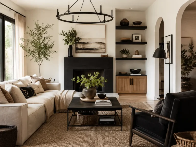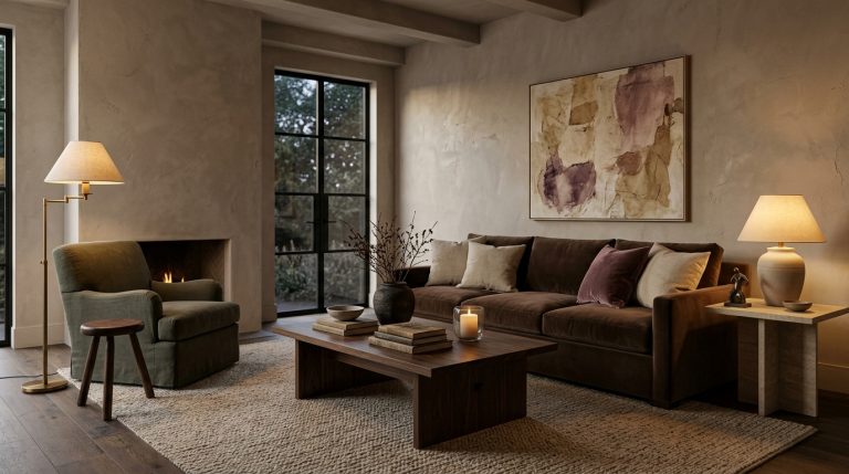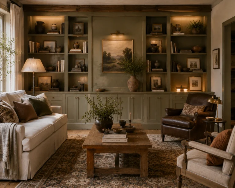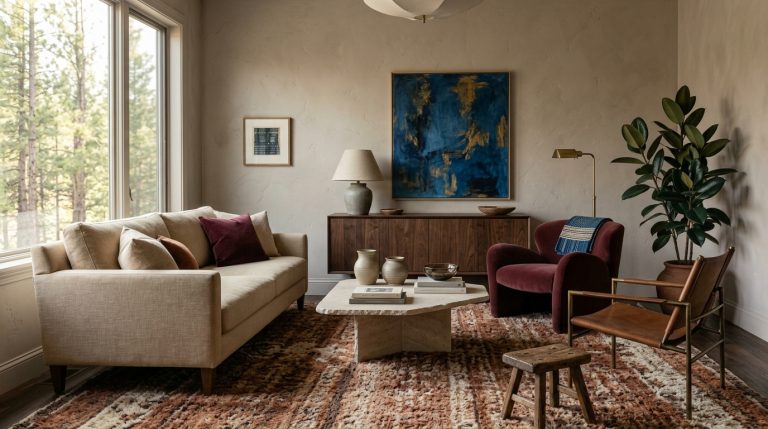

12 Living Room Color Combinations Ideas for Fresh Feel That Make a Room Look New
A living room can feel tired even when none of the furniture is actually outdated.
Sometimes the real problem is color. Beige blends into beige, gray furniture sits against gray walls, or every accent was chosen separately without anything tying the room together.
The best 12 Living Room Color Combinations Ideas for Fresh Feel solve that problem without requiring a complete redesign. A new wall color can help, but so can changing cushions, curtains, rugs, artwork, and the way existing colors are distributed.
For 2026, living room palettes are becoming warmer, more nuanced, and more personal. Designers are using muted teal, muddy green, powder blue, dusky pink, chocolate brown, warm white, and richer natural shades instead of relying on cool gray as the default.
Here are twelve combinations I’d genuinely consider, including where to put each color so the finished room feels fresh rather than simply more colorful.
1. Powder Blue + Deep Coral + Warm Cream
Combination 1
Powder blue is one of the easiest ways to refresh a living room without making it visually loud.
Current 2026 design coverage is treating pale blue almost like a neutral because it creates a calm background while accepting much stronger secondary colors. Designers are pairing dusty blues with warm green and coral rather than keeping them within predictable coastal schemes.
For a practical version, try:
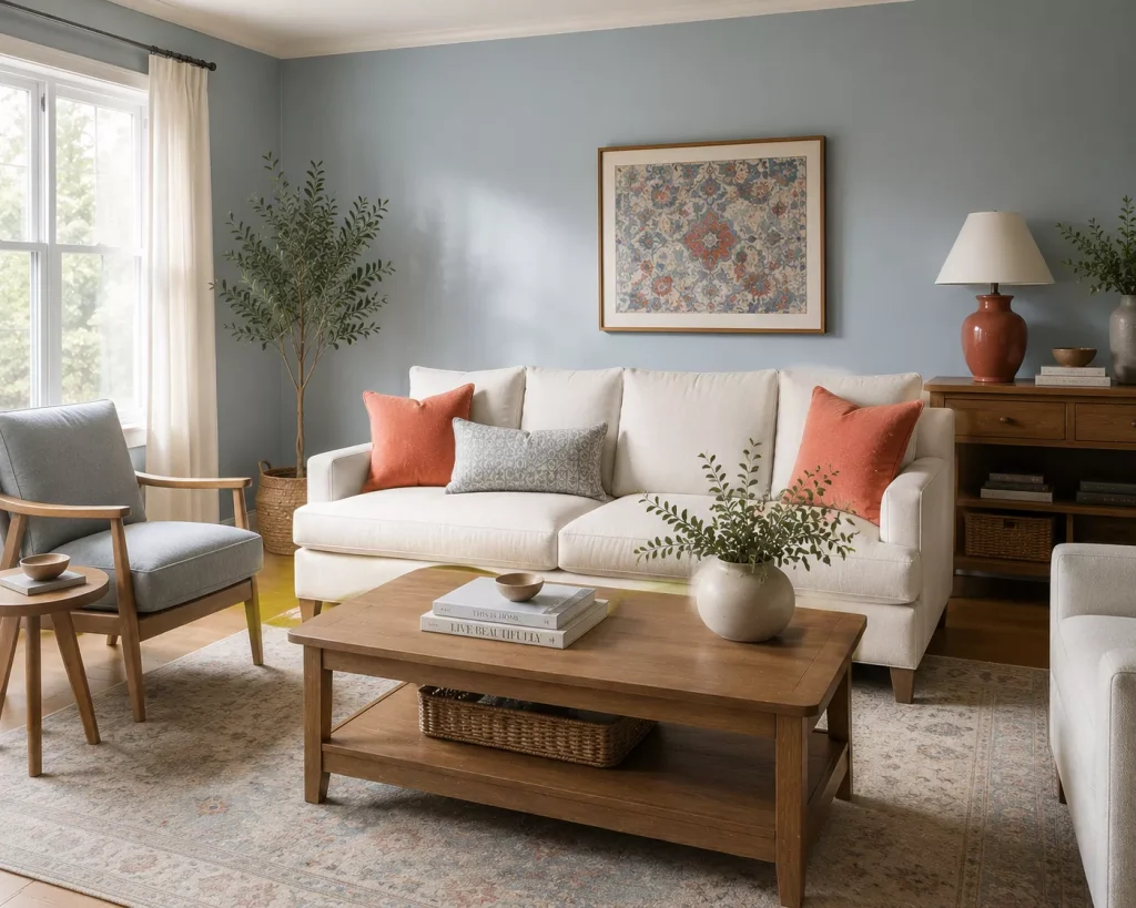
Powder-blue walls
Warm cream sofa
Deep coral cushions
Medium-oak furniture
Aged brass details
Coral should stay secondary.
You might use it in two cushions, a ceramic lamp, and a small section of patterned artwork.
The cream sofa prevents the blue and coral from fighting for attention.
Keep the blue slightly muted
A very bright sky blue can feel juvenile or strongly coastal.
Look for blue with a touch of gray.
Then let coral lean slightly earthy rather than fluorescent orange-red.
This is a particularly good combination for a living room with lots of daylight because powder blue changes beautifully throughout the day.
If you already have cream walls, reverse the arrangement. Keep the walls cream and bring dusty blue onto curtains or a chair.
2. Chocolate Brown + Pale Blue + Ivory
Combination 2
This is one of the strongest living room palettes for 2026.
Brown has moved back into the center of interior design, especially deeper chocolate shades. Designers are treating it as a rich neutral and pairing it with blue to keep the overall room from becoming too warm or heavy.
Try:
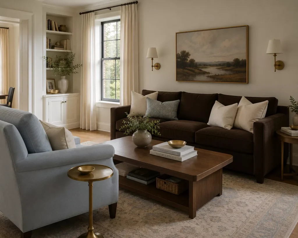
Chocolate sofa
Ivory walls
Pale blue armchair
Walnut coffee table
Cream curtains
If you already own a beige sofa, bring chocolate through a rug, coffee table, cushions, or painted shelving instead.
The blue should be noticeably lighter than the brown.
That contrast is what makes the combination feel fresh.
I’d also use aged brass rather than bright chrome here. Brass relates naturally to the warmth of brown while still standing out against pale blue.
Everyone says a fresh living room needs light colors.
Actually, one strong dark color often makes the lighter colors feel cleaner.
Without chocolate, ivory and pale blue can become too delicate.

3. Muddy Green + Dusty Pink + Dark Wood
Combination 3
This is a much more interesting evolution of the sage-green living room.
Instead of pale sage with beige, move toward muddy olive-green tones and pair them with dusty pink.
Muddier greens are among the living room colors designers are using in 2026 because they carry enough gray and brown to function almost like neutrals. Dusky pink is also being used as a relaxed earthy backdrop rather than an obviously feminine accent.
Use muddy green on the walls.
Bring dusty pink into:
- one armchair
- cushions
- artwork
- a patterned rug
Then add dark walnut or brown-stained wood.
The dark wood matters.
Without it, green and pink can become too soft.
Try this with antique furniture
This palette is excellent if you already own darker inherited furniture.
Instead of trying to make an old walnut chest disappear against white walls, put it against muted green.
The furniture starts looking intentional.
Add a faded pink textile nearby and suddenly the whole combination feels collected rather than old-fashioned.
That’s much cheaper than replacing furniture simply because the existing color scheme wasn’t helping it.
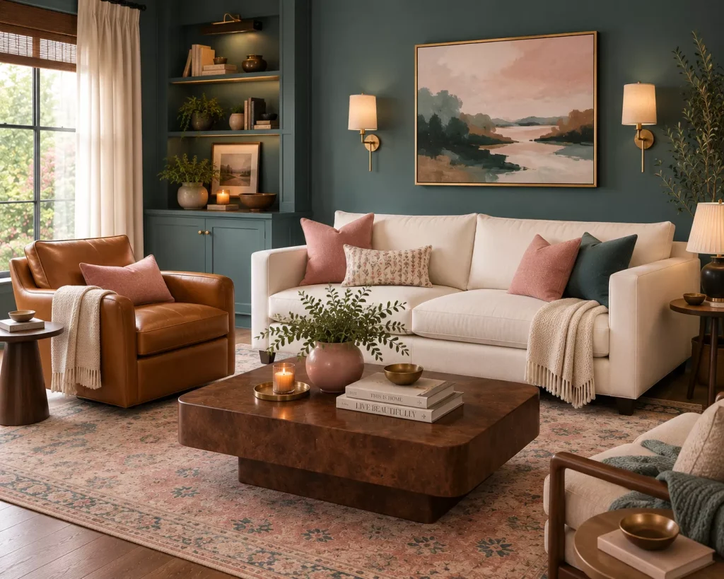
4. Muted Teal + Caramel + Soft Pink
Combination 4
Teal is one of the more exciting 2026 living room colors because it sits between blue and green.
It can feel fresh without becoming bright.
Designers currently recommend muted teal with warm caramel, emerald, and soft pink. Those warmer accents prevent teal from feeling cold.
I’d use teal on one of the larger surfaces.
Perhaps:
Muted teal walls
Camel leather chair
Warm ivory sofa
Soft pink cushions
Burl or walnut coffee table
Or keep the walls warm white and use a teal sofa.
Caramel can come through leather, warm wood, or a tobacco-colored rug.
Pink should be the lightest accent.
A dusty rose ceramic vase or two cushions may be enough.
This combination works particularly well if you want color but are tired of forest green and navy.
Teal gives you some of the calmness of both while feeling less expected.

5. Warm White + Olive + Rust
Combination 5
If you love neutral living rooms, you don’t need to abandon them.
You just need more color around the neutral.
Warm whites remain relevant in 2026 because they provide a softer alternative to bright white and allow furniture, artwork, and stronger accents to carry the personality.
Try:
Warm-white walls
Oatmeal sofa
Olive curtains
Rust-patterned rug
Walnut furniture
This palette is especially good in a small living room because the largest surfaces can remain pale.
Olive provides enough grounding.
Rust provides energy.
And natural wood connects the two.
Combination 6: Warm White + Burgundy + Dusty Blue
For something slightly less earthy, replace olive and rust with burgundy and dusty blue.
Burgundy gives the room weight.
Blue gives it freshness.
Warm white keeps both manageable.
This combination works beautifully through textiles, so renters don’t need to paint anything.
Use burgundy cushions, blue curtains, and artwork containing both colors.

6. Plum + Camel + Olive
Combination 7
Plum sounds dramatic until you see how earthy the right version can be.
For fall 2026, deeper plum is being treated almost like a neutral because of its brown and red undertones. Designers are pairing it with olive, camel, blush, natural wood, leather, and brass.
For a living room, I’d let camel lead.
Try:
Camel sofa
Warm cream walls
Plum armchair
Olive cushions
Dark wood side tables
Or use plum curtains instead of a chair.
That gives the room a significant block of color without changing expensive furniture.
The important part is choosing a muted plum.
Think dried fig or aubergine rather than bright purple.
A very saturated violet will completely change the character of the palette.
Use brass sparingly
Plum and brass look excellent together.
But you don’t need brass on every table, lamp, frame, and cabinet handle.
Repeat it two or three times.
One brass floor lamp and a small frame may be plenty.
The color itself is already doing a lot of visual work.

7. Terracotta + Dusty Blue + Mushroom
Combination 8
Terracotta and blue work because they sit on opposite sides of the warm-cool divide.
Mushroom gives them somewhere neutral to meet.
This is one of the most useful 12 Living Room Color Combinations Ideas for Fresh Feel if you have an existing beige or greige room and don’t want to repaint.
Keep the walls mushroom or warm taupe.
Bring dusty blue onto the sofa or curtains.
Then add terracotta through cushions, pottery, and a patterned rug.
Terracotta remains one of the richer earth-based shades being used in current interiors, while pale and dusty blues are growing as softer alternatives to standard beige.
Here’s a simple distribution:
| Color | Where to use it | Approximate visual role |
|---|---|---|
| Mushroom | Walls or large rug | 50% |
| Dusty blue | Sofa or curtains | 30% |
| Terracotta | Cushions, art, ceramics | 15% |
| Dark wood or brass | Furniture and details | 5% |
Don’t treat those percentages as a mathematical rule.
They’re just a reminder that three colors shouldn’t all compete equally.
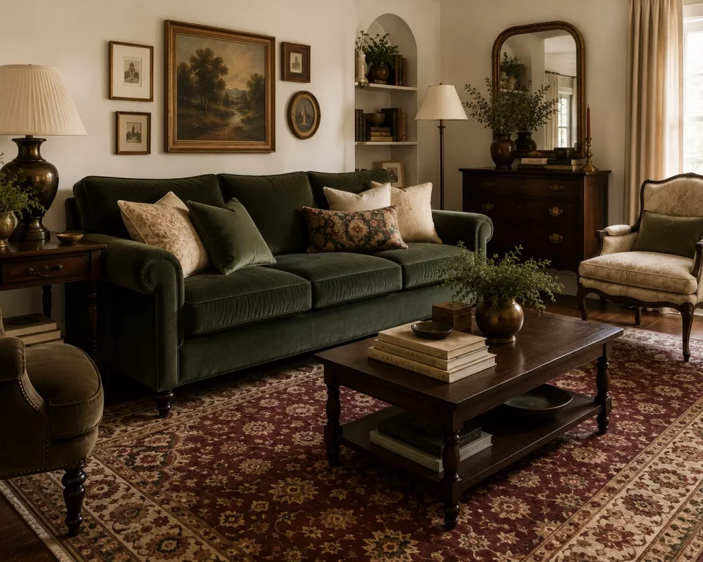
8. Bottle Green + Maroon + Cream
Combination 9
This is a richer option for traditional, eclectic, or vintage-inspired living rooms.
Bottle green and maroon are both showing up strongly in current 2026 seasonal palettes because they provide depth without depending on black.
Use cream as the relief.
For example:
Cream walls
Bottle-green sofa
Maroon patterned rug
Dark wood furniture
Cream curtains
If that feels too dark, switch the sofa to cream and use green on one chair.
The maroon should appear in a pattern rather than a giant solid block unless you want a very dramatic room.
A vintage-style rug is ideal because it can contain green, red, brown, and cream all at once.
That reduces the pressure to find perfectly matching accessories.
And don’t add lots of black.
Dark brown wood gives this combination enough depth while feeling softer.
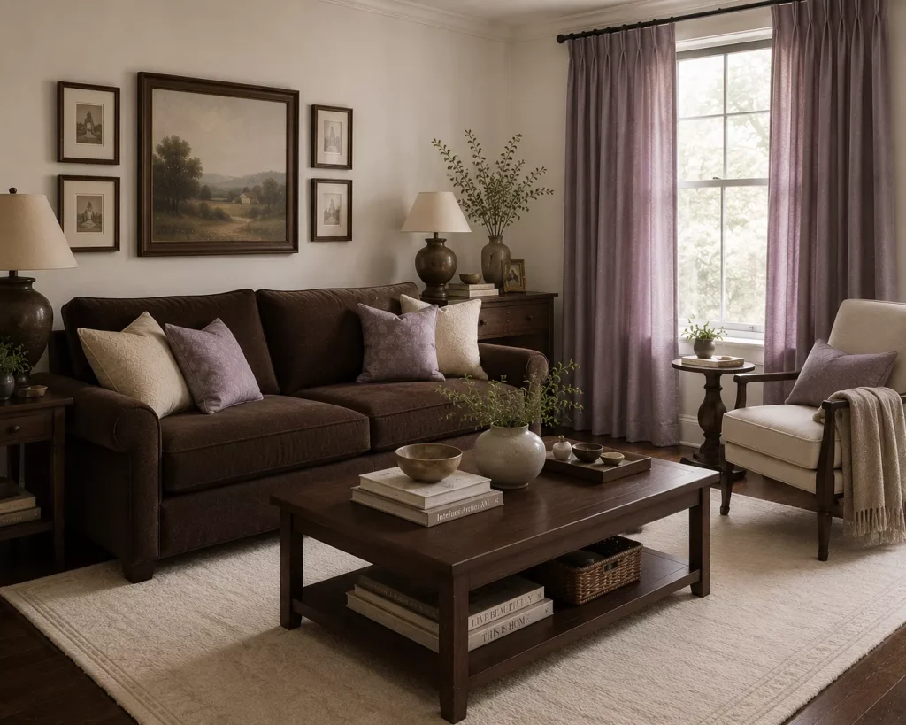
9. Lilac + Chocolate Brown + Warm White
Combination 10
This one sounds unusual, which is why it can make a living room feel genuinely different.
Lilac has emerged as an unexpected 2026 color beyond its traditional spring associations. Designers are using it as a soft year-round shade rather than treating it as purely pastel decor.
The trick is pairing it with something substantial.
Chocolate brown does that perfectly.
Try:
Warm-white walls
Chocolate sofa or coffee table
Lilac curtains
Cream rug
Dark wood frames
Or use a lilac chair in an otherwise brown-and-cream room.
Keep the lilac slightly dusty.
A gray-lilac or mauve-lilac will generally sit more comfortably beside natural wood than a sugary pastel purple.
This is a good palette for someone who wants a fresh room without automatically using green.
It feels softer than blue but still gives brown enough contrast to keep the room lively.
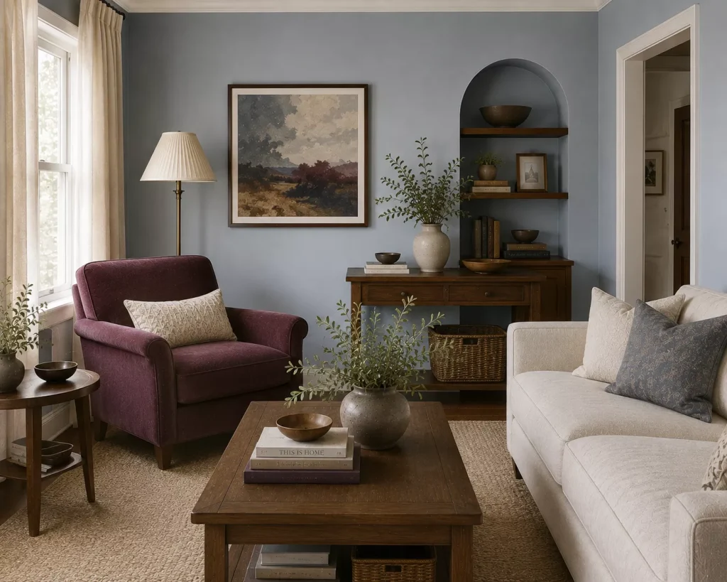
10. Powder Blue + Plum + Warm Off-White
Combination 11
This palette gives you both calm and depth.
Powder blue is already emerging as a strong 2026 and 2027 direction. Valspar’s 2027 Color of the Year, Cottage Door, is a powdery blue with gray undertones, reflecting a wider move toward blue shades that work almost like colorful neutrals.
Pair that softness with plum.
Try blue walls with a plum chair.
Or use warm-white walls, blue curtains, and a plum sofa.
Natural walnut works well with both.
This is one of those combinations that sounds much bolder when written down than it feels in a room.
The blue is quiet.
The warm white gives it space.
Plum appears only as the grounding note.
For artwork, look for a piece containing blue, burgundy, brown, and cream rather than trying to introduce another new color.
The room already has enough to say.
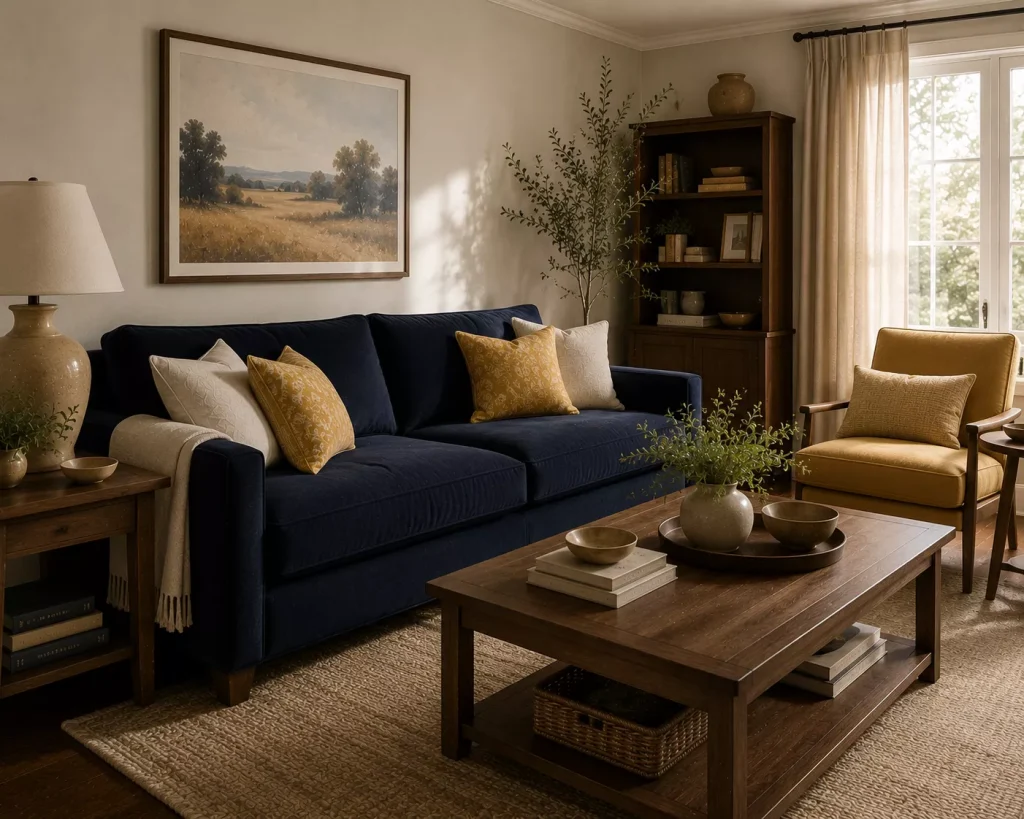
11. Navy + Straw Yellow + Walnut
Combination 12
Navy is familiar.
Straw yellow makes it feel new.
Current 2026 palettes include dusty harvest yellows rather than bright mustard, giving yellow a softer, more natural character. Navy continues to work as a dependable deep blue that can anchor those warmer shades.
I’d use navy in the largest colored piece.
Perhaps a sofa.
Then add straw yellow through:
- two cushions
- an armchair
- a throw
- artwork
- a ceramic lamp
Walnut brings warmth between them.
Use cream or mushroom on the walls rather than stark white.
That slight warmth matters.
Bright white can make straw yellow appear dirtier than intended, while cream helps it feel deliberate.
This combination is particularly useful if you already own a navy sofa and think your only decorating options are coastal blue-and-white.
You have far more interesting choices.
How do you choose between these color combinations?
Start with the item that is hardest or most expensive to change.
Usually that means:
The sofa
Flooring
Large rug
Fireplace stone
Built-in cabinetry
Then choose a palette that makes that item look better.
If you have a brown leather sofa, don’t begin with a color trend and fight the sofa afterward.
Consider pale blue, olive, cream, plum, or warm white because they already work naturally with brown.
If your sofa is gray, try muddy green, dusty pink, rust, or warm white.
If it’s navy, introduce straw yellow, terracotta, burgundy, or pale pink.
And test colors together.
A paint sample viewed alone doesn’t tell you much.
Hold it beside your actual upholstery and flooring.
The room decides whether the combination works.
What should you skip when choosing living room colors?
Skip choosing every color at exactly the same intensity.
A dark green sofa, equally dark burgundy curtains, strong navy rug, and deep brown walls may all be beautiful individually.
Together, they can become exhausting.
Give one color the leading role.
I’d also avoid choosing a palette solely because it photographs well.
Your living room needs to work in morning light, cloudy weather, and artificial light at night.
Current 2026 designers repeatedly emphasize nuanced colors because shades with gray, brown, or earthy undertones tend to layer more comfortably than overly pure colors.
And don’t assume “fresh” means pale.
Chocolate, teal, plum, muddy green, and maroon can all make a room feel newly considered when balanced with lighter colors.
Freshness is about contrast and clarity.
Not brightness alone.
Try this if you don’t want to repaint
Choose one of the 12 Living Room Color Combinations Ideas for Fresh Feel that already includes your wall color.
Then introduce the other two shades through movable pieces.
Suppose your walls are warm white.
You could try olive plus rust.
Or chocolate plus pale blue.
Or burgundy plus dusty blue.
Start with two cushion covers.
Then add one larger piece, perhaps curtains, a throw, or an armchair.
Finally, repeat one color in artwork.
That’s enough to test the palette.
If you still love it after several weeks, you can decide whether a painted cabinet, wall, or larger furniture investment makes sense.
This is much safer than buying an entire room based on three tiny paint chips.
FAQ About Living Room Color Combinations
What living room colors are popular in 2026?
Muted teal, muddy green, dusky pink, powder blue, warm white, chocolate brown, plum, bottle green, maroon, and terracotta are all prominent current directions. Designers are favoring nuanced colors with earthy or muted undertones rather than cold gray-based schemes.
What three colors work well together in a living room?
Chocolate brown, pale blue, and cream are especially flexible. Other strong combinations include muddy green with dusty pink and walnut, or terracotta with dusty blue and mushroom.
Should every living room have three colors?
No. Two main colors plus natural wood and a neutral may be plenty. The point is to create enough variation and repetition that the room feels connected rather than matching a specific number.
How do I add a new color without making my living room too busy?
Introduce it in two or three places at different scales. For example, use dusty blue on one chair, repeat it in artwork, then bring a smaller amount into a cushion. You don’t need to scatter the color across every surface.
Start with the color you already own
The most useful 12 Living Room Color Combinations Ideas for Fresh Feel aren’t instructions to replace everything.
They’re ways to rethink what’s already there.
A brown sofa may need pale blue rather than more beige.
Sage walls may need plum or dark walnut.
A navy sofa may look completely different once straw yellow and warm cream arrive.
Start with your most permanent color.
Then choose one supporting shade and one contrasting shade.
Live with those three before introducing anything else.
A fresh living room doesn’t need twelve colors.
It needs two or three colors that finally look as though they belong in the same conversation.