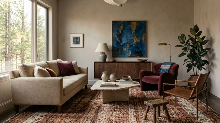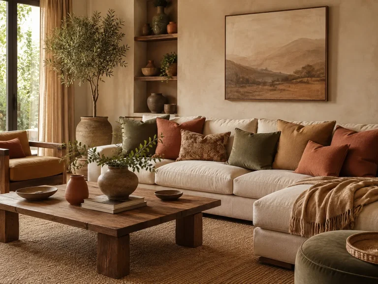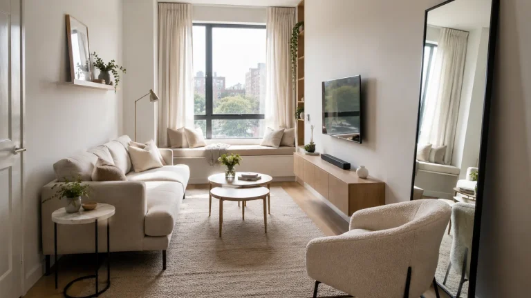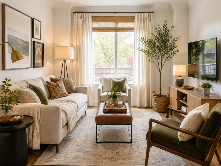
15 Vibrant Living Room Ideas That Use Color With Confidence
A colorful living room does not need five bright walls and a rainbow of accessories. In fact, that approach often makes choosing the next piece harder because every new color has to compete with something already there.
The strongest 15 vibrant living room Ideas for 2026 use color with more discipline. Designers are embracing expressive rooms again, but the emphasis is shifting toward thoughtful combinations, richer materials, pattern, and personality rather than brightness for its own sake. Current living-room coverage points to playful color, eclectic details, relaxed furniture, and more individual interiors.
The goal is not to make every surface loud. It is to know where strong color will have the most impact and what should stay quiet around it.
Start with a color palette that has structure
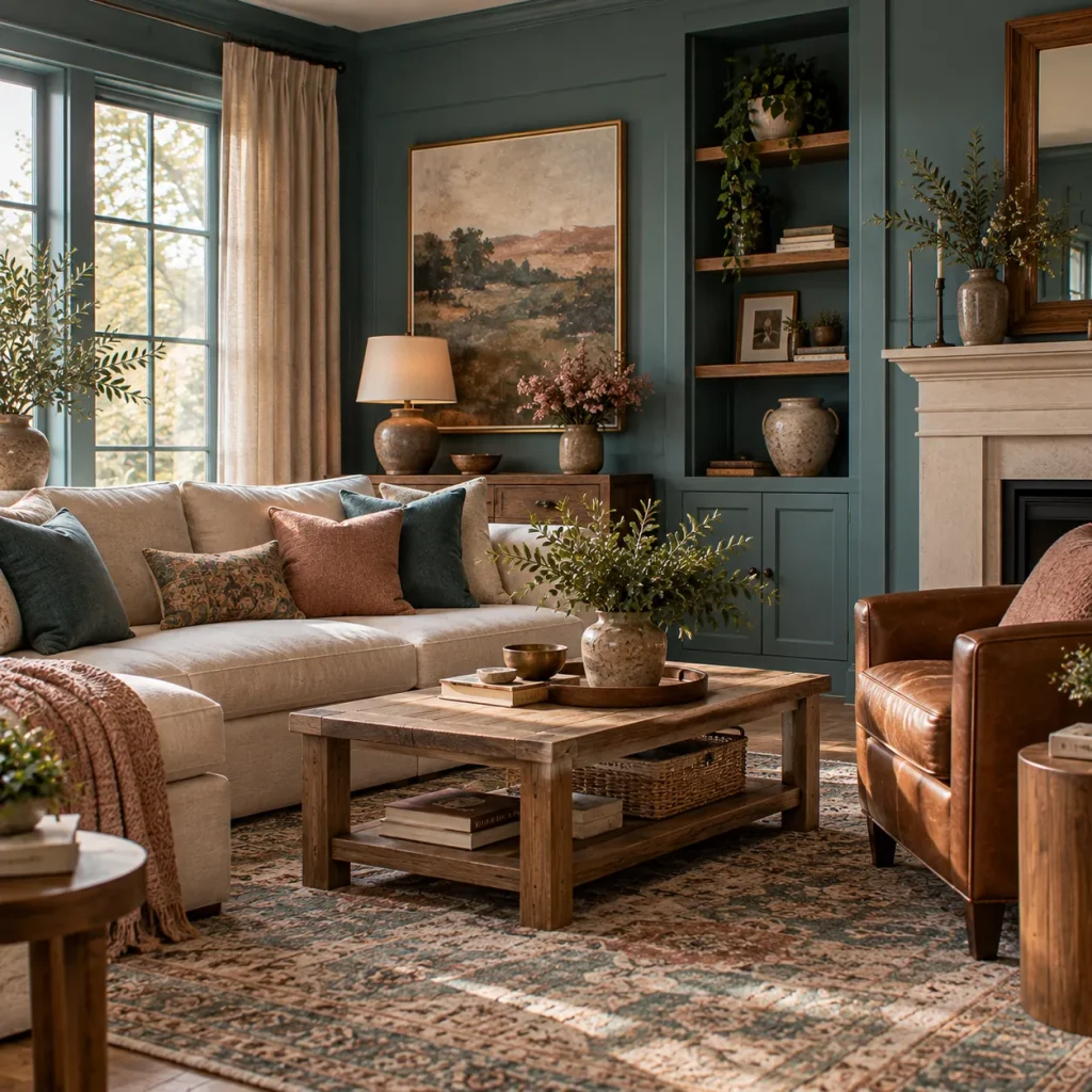
Idea 1: Choose one dominant color before adding five accents
Vibrant rooms feel easier on the eye when one color clearly leads.
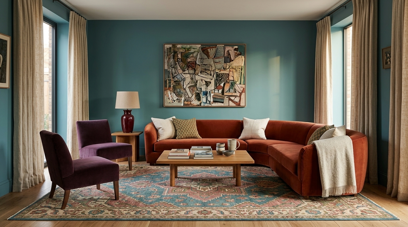
That might be muted teal walls, a plum sofa, dusty pink cabinetry, or a large rust rug. Once you have the dominant shade, choose two supporting colors rather than buying colorful objects one by one.
For example, start with teal, then add tobacco brown and dusky rose. Or combine olive with burgundy and warm ivory. If you want a broader palette reference first, browsing living room color combinations that feel fresh can help you settle on a direction before buying anything.
Current 2026 living-room color trends include muted teal, dusky pink, muddy green, and lighter blue, showing that colorful interiors can still feel grounded.
A useful starting ratio is roughly 60 percent dominant or neutral background, 30 percent secondary color, and 10 percent sharper accent. Treat that as guidance, not a rule.
Idea 2: Pair an unexpected color with chocolate brown
Chocolate brown is one of the most useful colors for making brighter shades feel grown-up.
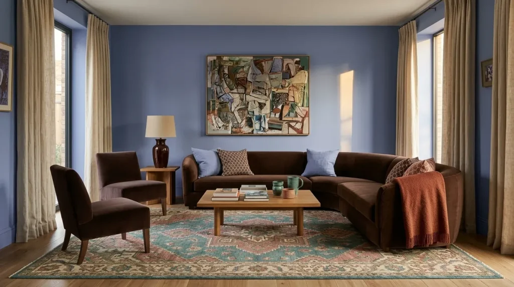
Try periwinkle with chocolate, coral with walnut, jade with espresso, or powder blue with tobacco leather. The brown gives the brighter color visual weight while feeling softer than black.
Designers interviewed about 2026 color trends are using combinations such as periwinkle with chocolate brown, alongside terracotta, dusty emerald, and deeper reds.
This is especially helpful if your living room already contains dark wood furniture. Instead of trying to hide it, use that depth as the anchor for a more colorful palette, the same way a black accent living room uses dark tones to ground brighter colors.
Put color on larger surfaces
Idea 3: Paint the walls a real color
If you want a vibrant room, painting four walls warm white and relying entirely on cushions can make the color feel temporary.
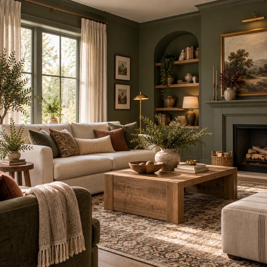
Try muddy green, muted teal, clay red, dusty pink, light blue, or a softened plum. These shades have enough complexity to cover a large area without becoming exhausting.
Before committing, paint large sample boards and move them around the room. A teal that feels balanced beside a sunny window may become much darker in a north-facing corner.
And do not judge paint beside an empty white wall. Test it next to your flooring, sofa, curtains, and major furniture.
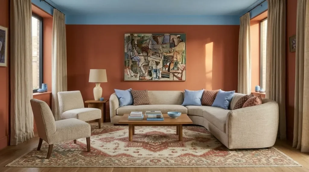
Idea 4: Carry color onto the ceiling
The ceiling is often ignored, which makes it an excellent place for a more unexpected color decision.
You can paint it a lighter version of the wall color, continue the same shade for a cocooning effect, or use a contrasting tone. A soft sky blue ceiling above terracotta walls can feel lively without filling the room with small colorful objects.
Pinterest’s 2026 FunHaus trend specifically highlights growing interest in striped ceilings and bold, playful interior treatments, although its circus-inspired aesthetic is intentionally more eccentric than most homes need.
For everyday living, the lesson is simpler. The ceiling can participate in the palette without becoming the main attraction.
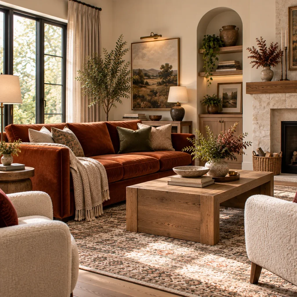
Let furniture carry stronger color
Idea 5: Choose one colorful sofa instead of ten colorful accessories
A sofa in rust velvet, forest green, dusty blue, burgundy, or soft aubergine can provide more coherence than scattering color through twenty objects.
Velvet works especially well with saturated color because the pile changes as light moves across it. Linen and textured cotton make the same shades feel more relaxed.
If you are nervous about a brightly colored sofa, choose a slightly muddier version of your preferred color. Dusty emerald is easier to combine with wood, cream, and stone than a very clear emerald green.
Then keep at least some nearby furniture quieter. A strong sofa does not need equally strong chairs.

Idea 6: Use colorful occasional chairs to rescue a neutral room
If you already own a beige, gray, or cream sofa, do not replace it just to make the room more vibrant.
Add two chairs in a richer color or pattern. A pair of olive velvet chairs, one coral lounge chair, or a blue-and-cream striped armchair can redirect the entire scheme.
Positioning matters. In a conversational seating arrangement, aim for roughly 6 to 10 feet between people across the seating zone where room size allows.
The furniture should still work as furniture. A spectacular chair stranded in a distant corner does little for either conversation or color balance.

Idea 7: Paint a built-in, cabinet, or media unit
Colorful cabinetry is particularly useful because it combines storage with a large block of color.
Try deep teal bookshelves, burgundy cabinetry, muted blue-gray built-ins, or olive around a television wall. Current 2026 living-room reporting specifically highlights colorful cabinetry as part of the move toward more personality-led rooms.
Painting one substantial architectural element often looks more considered than distributing the same color across small vases, cushions, and candles.
Use pattern as a color connector
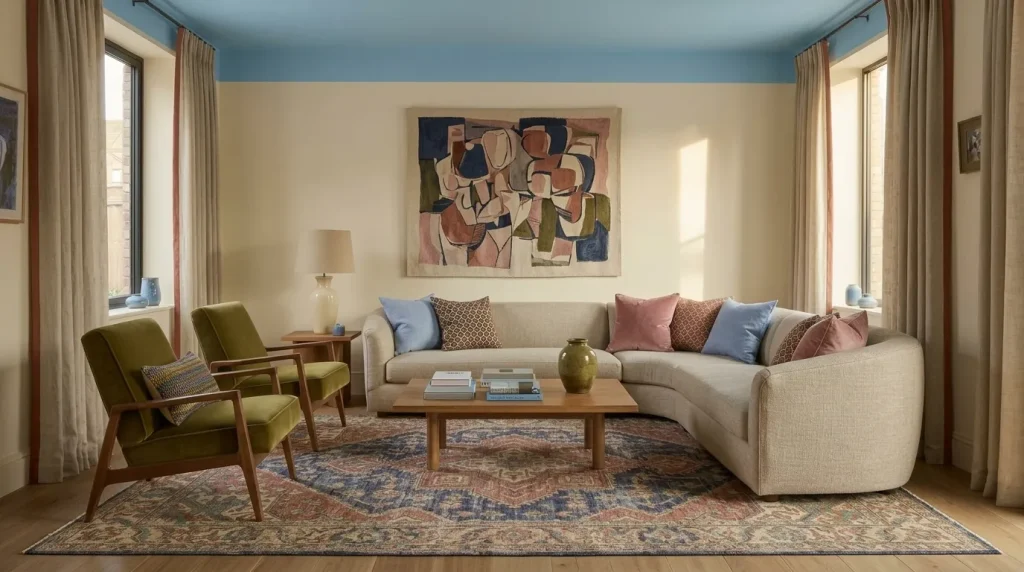
Idea 8: Choose a rug that contains the whole palette
A patterned rug can solve the question of how several colors belong together.
Look for a rug containing three or four shades you want elsewhere in the room. A faded design might combine indigo, rust, pink, olive, and cream. Repeat those colors in smaller amounts through upholstery, art, and curtains.
In many medium living rooms, an 8-by-10-foot rug connects the seating much better than a 5-by-7. Ideally, at least the front legs of the primary seating reach the rug.
Avoid choosing a tiny brightly colored rug simply because it feels safer. Small rugs can make both the color and the seating arrangement look disconnected.
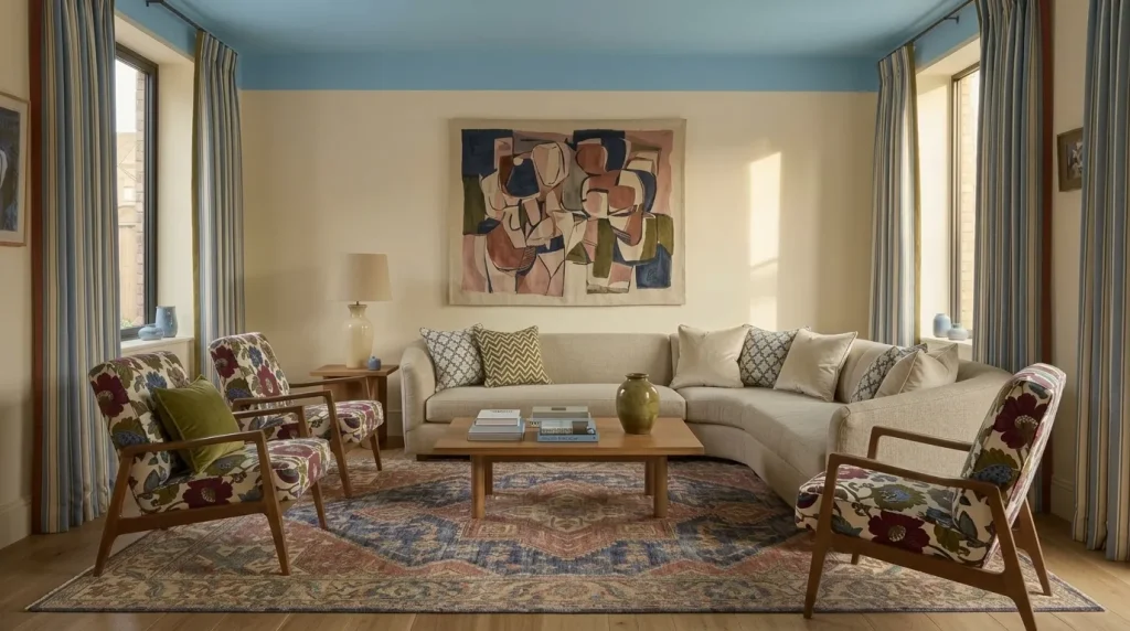
Idea 9: Mix stripes, florals, and geometry through repetition
You do not have to choose one pattern family.
A floral chair can sit beside striped curtains and a geometric cushion if the same two or three colors repeat across them.
The trick is changing scale. Use one large pattern, one medium pattern, and one smaller motif rather than three similarly sized prints fighting for attention.
Pattern is increasingly important in current interiors, along with more expressive upholstery and layered rooms. The movement is less about maximalism for its own sake and more about creating spaces with recognizable personality.
Bring color in through art and objects
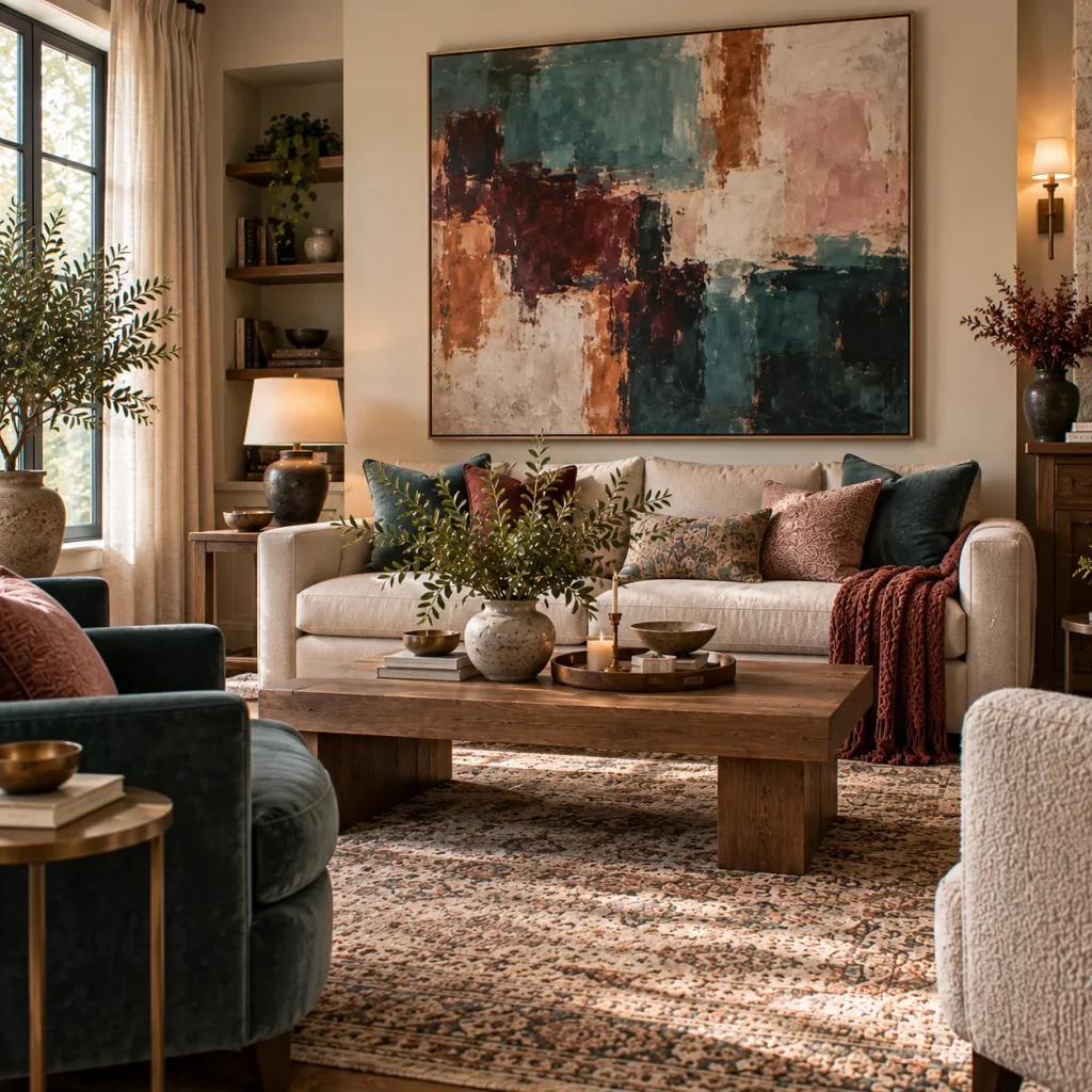
Idea 10: Let oversized art establish the palette
If painting the walls feels too permanent, use art as your largest color source.
A piece roughly two-thirds the width of the sofa is a useful starting point above seating. One large abstract or figurative work often creates more impact than several tiny colorful prints.
Pull only one or two colors from the artwork into the rest of the room. Matching every shade makes the scheme feel overly coordinated.
I once worked through an illustrative living-room scheme where every cushion matched a different color in the artwork. It technically coordinated, but the painting lost all its authority. Removing half the matching accessories made both the art and the room stronger.
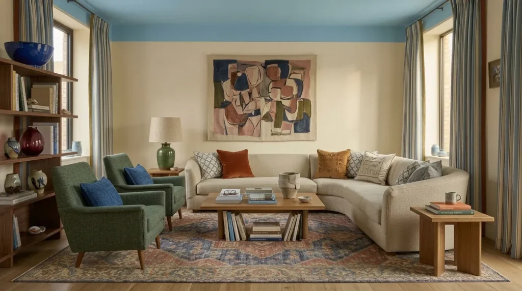
Idea 11: Use books and ceramics instead of decorative color clutter
Colorful books, glazed ceramics, glass, and handmade objects give a room color and personality at the same time.
A cobalt bowl, burgundy glass vase, green stoneware lamp, and stack of art books can do more than a collection of objects bought only because they match the palette.
This matters in 2026, as interiors continue moving toward collected, imperfect, personal rooms rather than surfaces styled to look untouched.
Leave some empty space around stronger objects. Vibrant does not have to mean full.
Make textiles work harder

Idea 12: Use curtains as a genuine color decision
Curtains cover a large amount of visual space, so treating them as an afterthought wastes an opportunity.
Try dusty blue linen, olive cotton, burgundy velvet, or patterned drapery containing several colors from the room.
Hang the rod several inches above the window where architecture permits, and extend it beyond the frame. Curtains should generally reach the floor rather than ending awkwardly above it.
If the walls are already saturated, patterned curtains with some breathing room in the background can soften the effect better than another solid block of strong color.
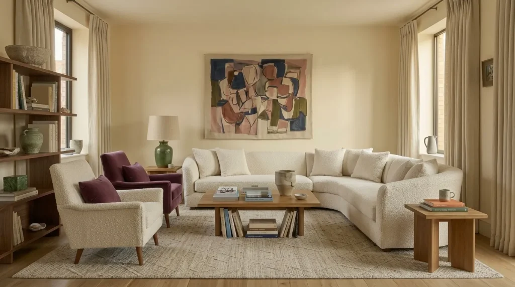
Idea 13: Combine colorful upholstery with tactile neutrals
A vibrant living room needs quiet textures too.
Place a plum velvet chair beside an oatmeal wool rug. Use a coral sofa with parchment linen curtains. Pair teal walls with medium oak and cream boucle.
Designers are paying more attention to complete texture schemes in 2026 because texture can provide depth without requiring another color.
This is one reason colorful rooms often work better with natural wood, wool, linen, stone, and aged metal than with more brightly colored glossy surfaces, an approach also explored in these earthy color combinations for a living room.
Add the final color through lighting and contrast
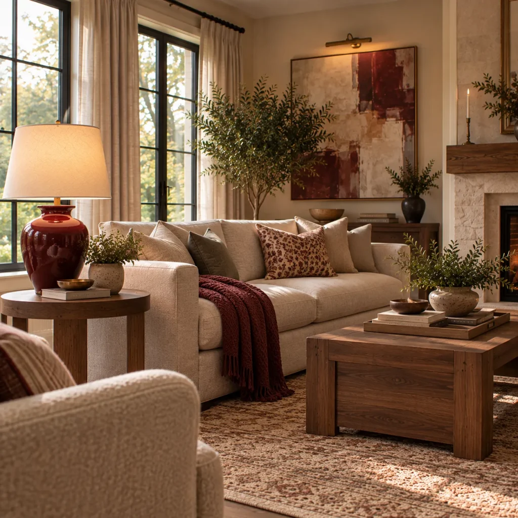
Idea 14: Make one lamp deliberately colorful
Lighting does not have to disappear.
Try a burgundy ceramic lamp, blue glass base, lacquered yellow floor lamp, or pleated patterned shade. A small but visually strong light works especially well in a room where most large furniture pieces are neutral.
Pinterest’s 2026 color forecast includes Cool Blue, Jade, and Plum Noir among its major hues, reflecting a wider appetite for colors that range from icy to botanical to deeply moody.
Do not buy five colorful lamps. One distinctive fixture is usually enough.

Idea 15: Add a surprising final color instead of matching harder
The most memorable colorful rooms often contain one shade that technically should not be necessary.
A teal-and-brown room might receive a tiny amount of tomato red. Pink and burgundy can take a sharp olive accent. Powder blue can benefit from rust.
This is where strict matching becomes less useful.
I would rather see one surprising red lamp in a blue room than six perfectly coordinated blue accessories. The slight friction makes the palette feel personal rather than prepackaged.
A simple formula for balancing vibrant color
| Element | Strong approach | What can go wrong |
|---|---|---|
| Walls | One dominant saturated or softened color | Several unrelated feature walls |
| Sofa | Strong color or quiet neutral | Matching every chair to it |
| Rug | Connect 3 to 4 palette colors | Too small or overly busy |
| Pattern | Mix scales with repeated colors | Equal-strength patterns everywhere |
| Wood | Walnut, oak, dark stain | Removing all natural warmth |
| Lighting | One distinctive colorful fixture | Every lamp competing |
| Accessories | Books, art, ceramics | Rainbow clutter |
What should you skip in a vibrant living room?
Too many equal-strength colors. If everything is shouting, nothing leads. Give one or two colors more importance.
Random accent cushions. Five unrelated bright cushions rarely create a successful palette. Connect them through colors already present in the rug, art, or upholstery.
A different paint color on every wall. Unless the architecture strongly supports it, this can fragment the room.
Ignoring wood and neutral materials. Walnut, oak, linen, wool, stone, and warm ivory give brighter colors somewhere to rest.
Following a trend palette too literally. Use 2026 colors as inspiration, not instructions. Your flooring, daylight, furniture, and personal preferences matter more.
Try this if your living room is completely neutral
Keep the expensive pieces.
Choose one color you genuinely like and introduce it at three different scales. For example, use a large dusty-blue rug, a medium blue lamp, and a small amount of blue in artwork.
Then add one contrasting color, perhaps rust or burgundy.
Next, bring in darker wood or chocolate brown if the room lacks weight. Finally, remove two or three beige accessories rather than adding more objects.
You can make a neutral room feel dramatically more colorful without repainting or replacing the sofa.
FAQ
What colors are popular for vibrant living rooms in 2026?
Muted teal, muddy green, dusty pink, terracotta, plum, light blue, burgundy, and richer brown-based palettes are all appearing in current 2026 design coverage. Designers are generally favoring nuanced shades rather than purely bright primary colors.
How many colors should a living room have?
There is no strict limit, but three main colors plus neutrals is a manageable starting point. You can introduce smaller supporting shades through art and pattern once the dominant palette feels clear.
Can a small living room handle strong color?
Yes. Strong color does not automatically make a small room feel smaller. A continuous saturated wall color can actually make boundaries feel more unified, especially when furniture and clutter remain controlled.
How do I make a colorful living room feel sophisticated?
Use complex shades, natural materials, varied texture, and enough visual breathing room. Combining bold color with walnut, wool, linen, stone, aged brass, or dark wood usually feels more considered than pairing bright colors only with other bright finishes.
Choose one brave decision first
The best 15 vibrant living room Ideas are not about putting as many colors as possible into one room. They are about making a few confident choices and giving them enough space to work.
Start with the largest colorful element you are willing to commit to. That could be paint, a rug, sofa, curtains, built-ins, or a large artwork. Then build the rest of the palette from that decision rather than shopping for isolated colorful objects.
And keep something quiet. Warm wood, cream linen, natural stone, or an empty section of wall can make the brighter parts look even better, especially when paired with a softer backdrop like these warm neutral paint colors for a cozy living room.
A vibrant room feels successful when the color looks intentional, not when you can count how many shades it contains.