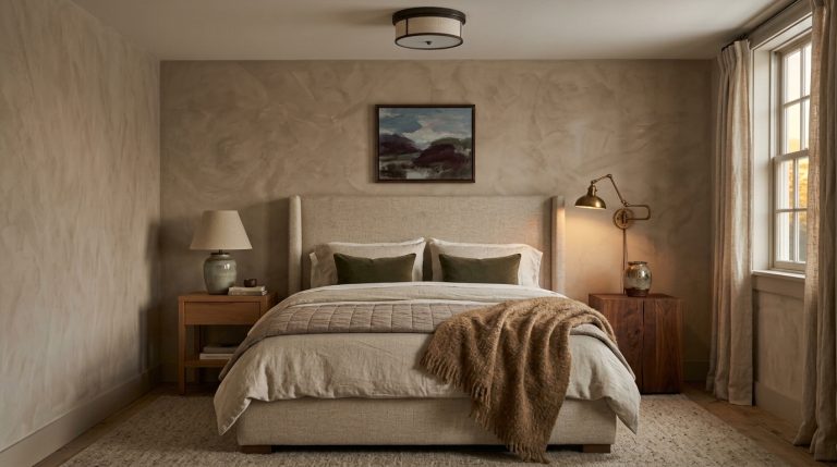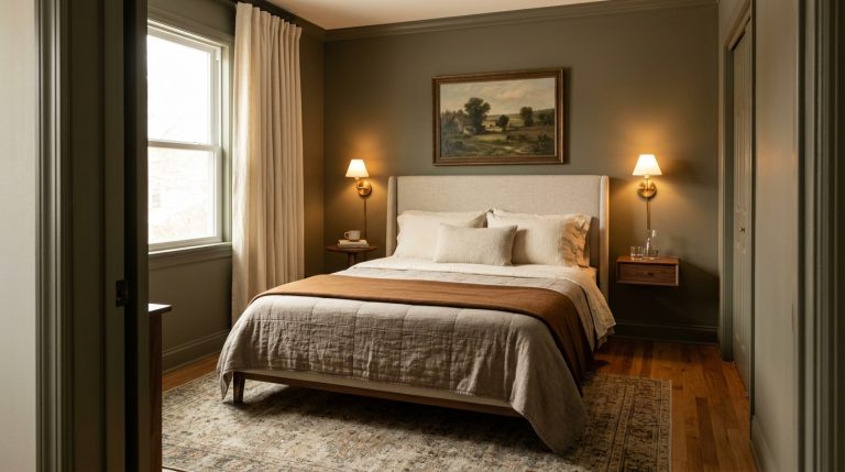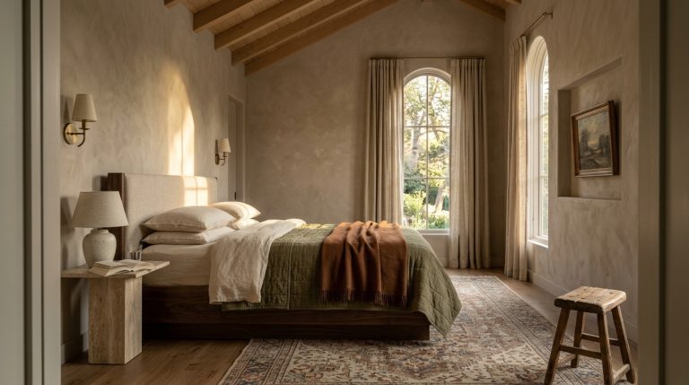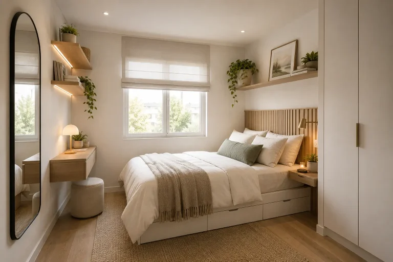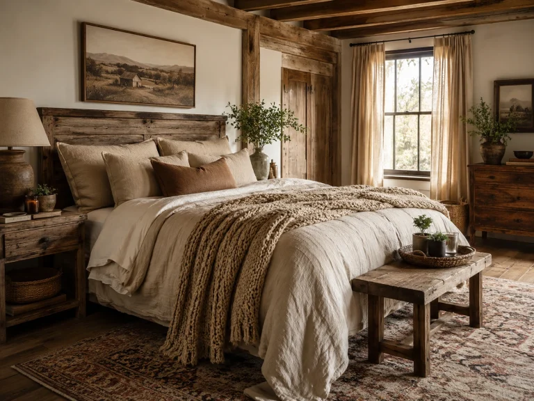
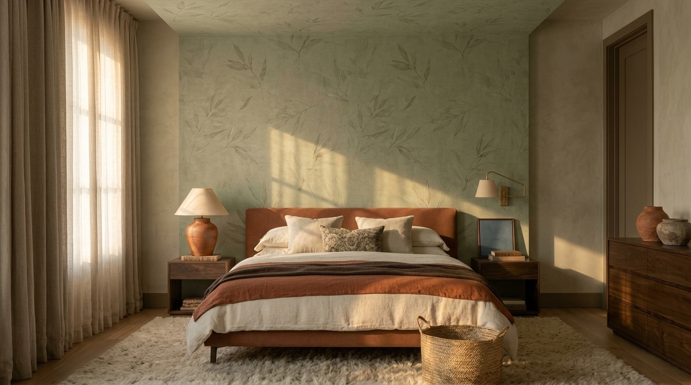
13 terracotta and sage bedroom tips for a Warm, Earthy Retreat
Terracotta and sage make one of those bedroom color combinations that feels almost instinctively right. One brings the warmth of sun-baked clay; the other has the muted softness of herbs and foliage. Together, they create a bedroom that feels earthy without becoming rustic, colorful without becoming loud, and cozy without relying on endless beige.
The combination also feels particularly relevant right now. Terracotta remains part of the richer, earthier color direction appearing in 2026 interiors, while sage continues to be used as a soft, nature-connected alternative to conventional neutrals.
But there is one catch: simply buying a sage duvet and adding two rust-colored pillows rarely creates a convincing room.
The best schemes control proportion, undertone, texture, light, and contrast. These 13 terracotta and sage bedroom tips show you how to do exactly that.
Why Do Terracotta and Sage Work Together?
Terracotta sits somewhere between burnt orange, clay, muted red, and earthy brown, depending on the shade. Sage is similarly complex—a softened green that may contain gray, yellow, or brown undertones.
That complexity is precisely why the two colors work.
Green and reddish-orange tones provide natural contrast, yet muted versions feel much gentler than pairing clear red with bright green. Designers also frequently combine sage with terracotta because the warmer clay tone adds energy while the subdued green keeps the palette grounded.
The result can lean several ways: Mediterranean with plaster, aged wood, and woven pieces; contemporary with clean-lined furniture and sculptural lighting; bohemian with patterned textiles and handmade ceramics; organic modern with linen, oak, and restrained accessories; cottage-inspired with antique wood and small floral patterns.
You do not need to commit to one of those labels. A successful bedroom can borrow from several.
Choose the Right Color Balance First
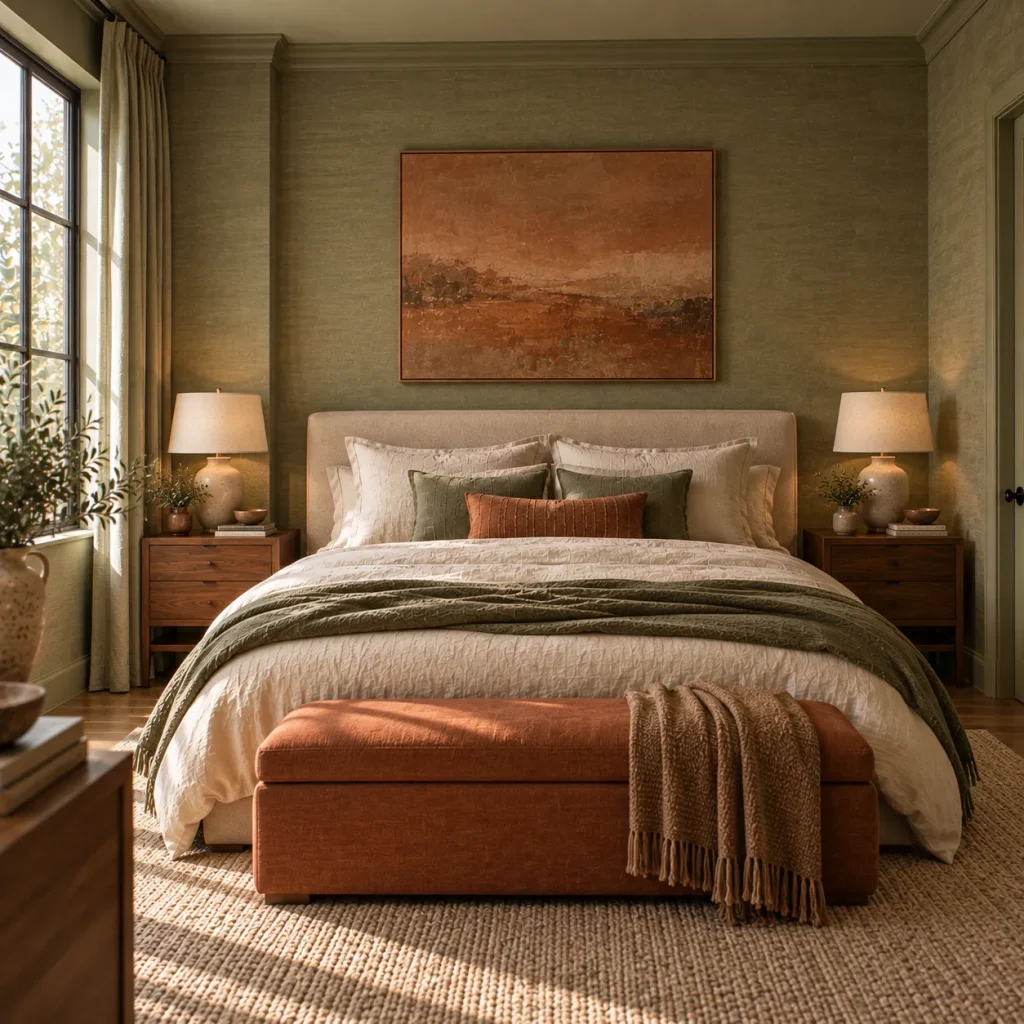
1. Let one color lead instead of using both equally
A 50/50 terracotta-and-sage split sounds logical, but visually it can make the bedroom feel divided.
Instead, choose a dominant shade.
For a quieter bedroom, make sage the backdrop and introduce terracotta through bedding, artwork, lamps, or a rug.
For a warmer, more enveloping space, reverse the formula: use clay-toned walls or a terracotta headboard, then introduce sage through textiles and smaller furnishings.
Think closer to 60–70% dominant color, 20–30% supporting tones, and a small amount of contrast rather than trying to distribute every color evenly.
This is one of those cases where slightly less coordination actually produces a more sophisticated room.
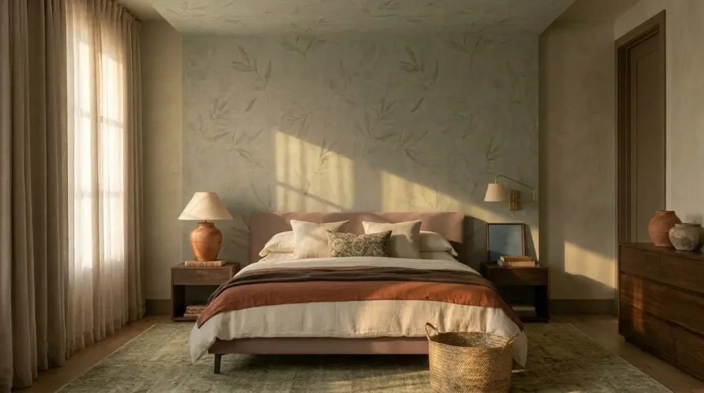
2. Choose dusty versions of both colors
The easiest terracotta and sage bedrooms usually use colors that appear as though a little earth or gray has been mixed into them.
Skip bright orange next to crisp botanical green.
Instead, picture terracotta as clay, cinnamon, adobe, burnt sienna, dusty rust, or muted brick, and sage as olive-sage, gray-green, dried herb, eucalyptus, or soft moss.
These slightly muddied colors relate more naturally to timber, linen, woven fibers, and other bedroom materials.
3. Test the colors in your actual light
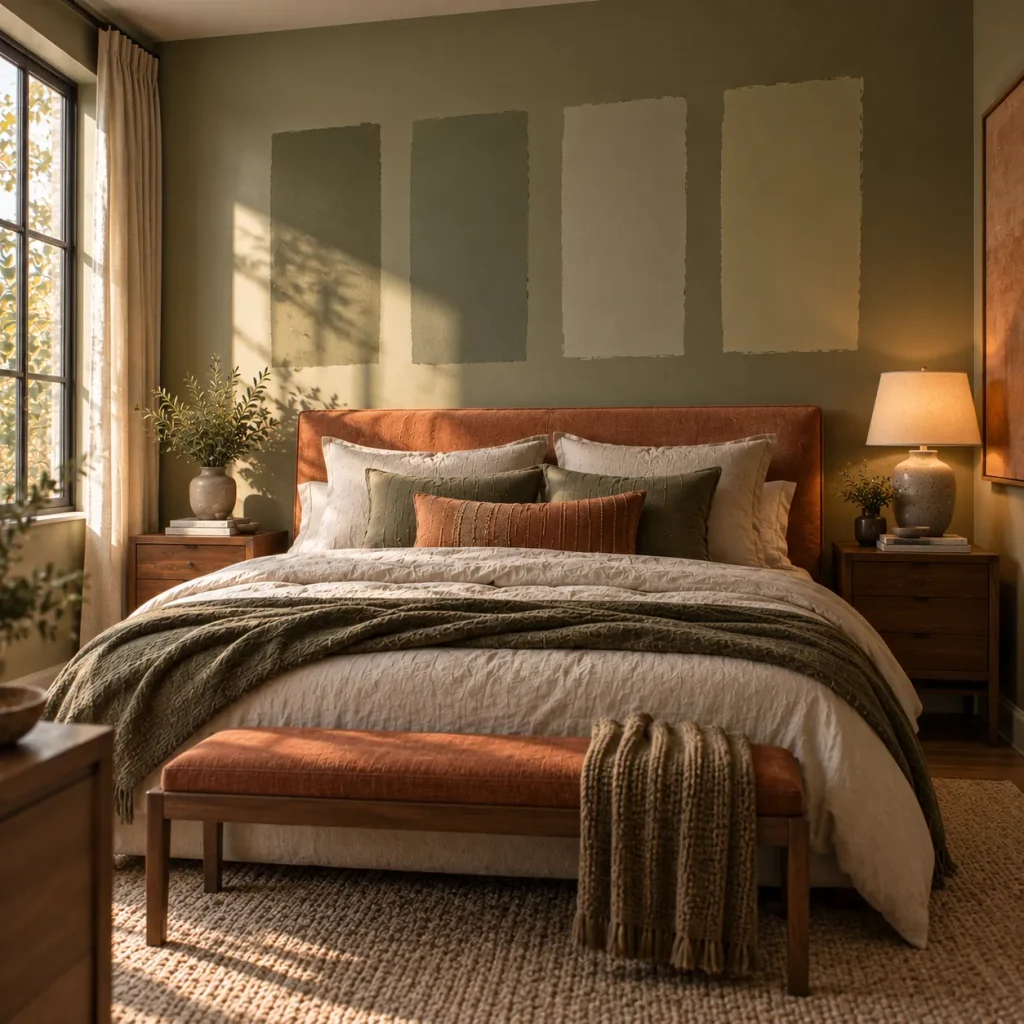
Never select a sage paint because it looked perfect on someone else’s wall.
Light can change its undertone dramatically.
North-facing bedrooms generally receive cooler light, so extremely gray sage can sometimes appear flatter or colder than expected. Warmer greens or warm companion shades can help counter that effect. South-facing rooms receive warmer light, which can intensify already-warm terracotta tones.
Paint large samples and look at them in the morning, afternoon, and after your lamps are switched on.
That extra day of testing can prevent an expensive repaint.
Use Both Colors Beyond the Walls
4. Try sage walls with a terracotta focal point
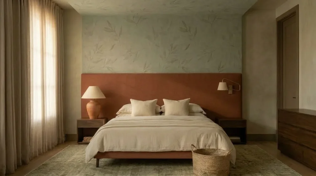
If you want the safest starting point, this is probably it.
Paint the walls a muted sage and introduce one substantial terracotta element—a linen headboard, upholstered bench, quilt, large lumbar pillow, or piece of art.
The terracotta needs enough visual weight to look intentional.
Three tiny rust-colored accessories scattered around the room often feel more contrived than one confident piece.
A wide terracotta headboard against quiet sage walls looks intentional rather than accidental.
5. Reverse the balance for a bolder combination
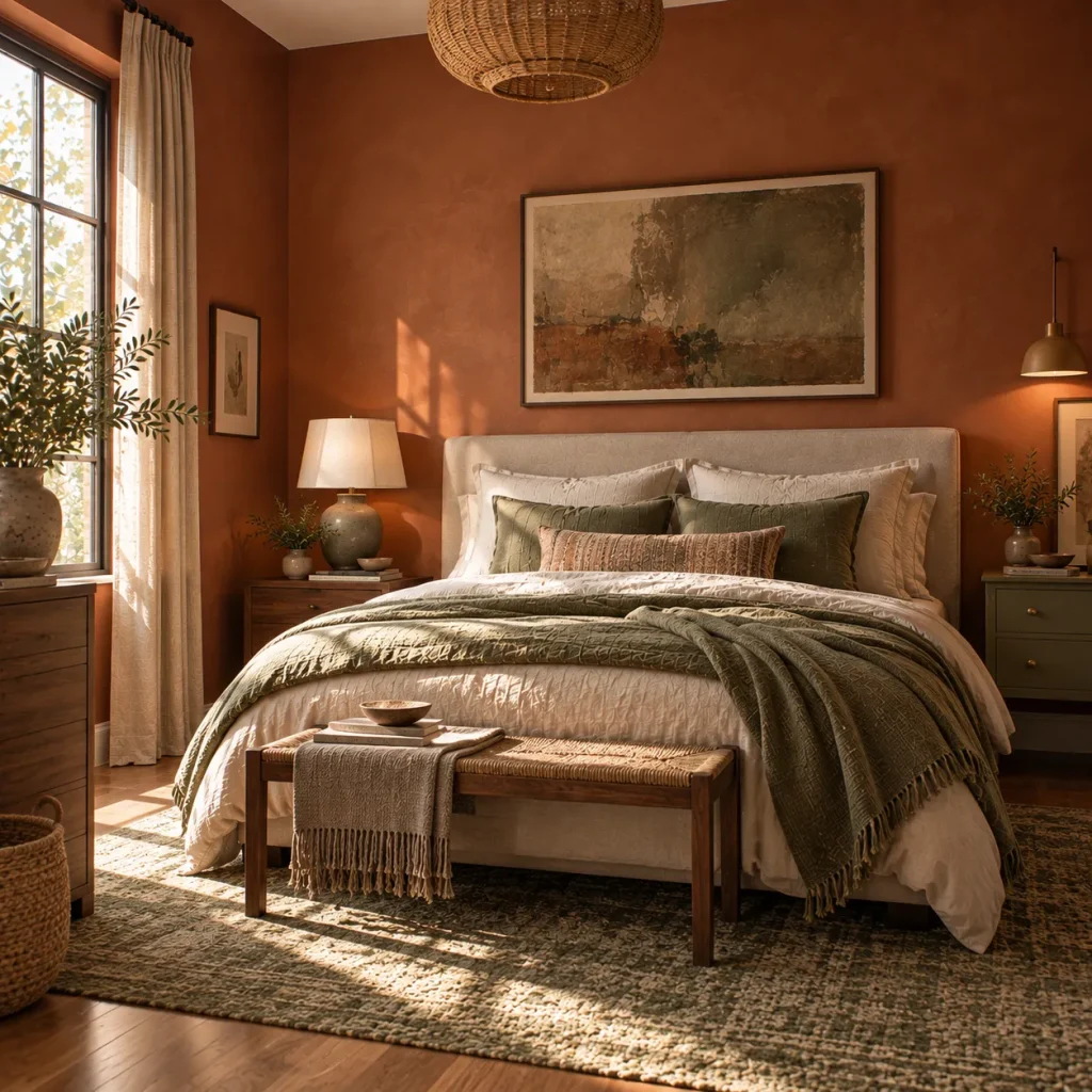
Here is the more adventurous option: use terracotta as the room’s architectural color and sage as the accent.
Terracotta can create an especially cocooning bedroom, and designers have successfully used the shade on walls as well as upholstery rather than limiting it to accessories.
Try clay walls with sage linen bedding, a faded green rug, an olive bedside table, sage-striped curtains, and green ceramic lamps.
This works especially well if you want a warmer bedroom than the typical sage-led scheme.
6. You do not have to paint anything
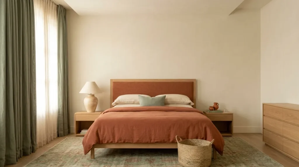
A rental—or simple fear of paint commitment—does not rule out this palette.
Begin with neutral walls and create larger blocks of color through fabric.
Try sage curtains with terracotta bedding, or a sage duvet with a large rust-colored rug beneath the bed.
Architectural Digest has highlighted bedrooms where terracotta gets much of its impact from linens and furnishings rather than wall paint, which is a useful reminder that color does not need to come from the walls.
This is also easier to update later.
Layer Natural Materials Between the Colors
7. Use wood as the bridge
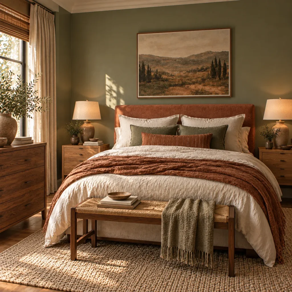
If terracotta and sage are the two headline colors, wood should probably be the quiet third member of the palette.
Warm oak, walnut, medium-toned vintage wood, and even darker stained pieces can connect earthy orange-red with muted green beautifully.
For an airy room, choose pale or medium oak.
For something moodier, try walnut or an antique dresser with visible grain and age.
I would avoid filling the room with identical wood finishes. A perfectly matching bed, dresser, and nightstands can make an earthy palette feel surprisingly manufactured.
A slightly collected mix gives it more life.
8. Layer linen, wool, cotton, and woven texture
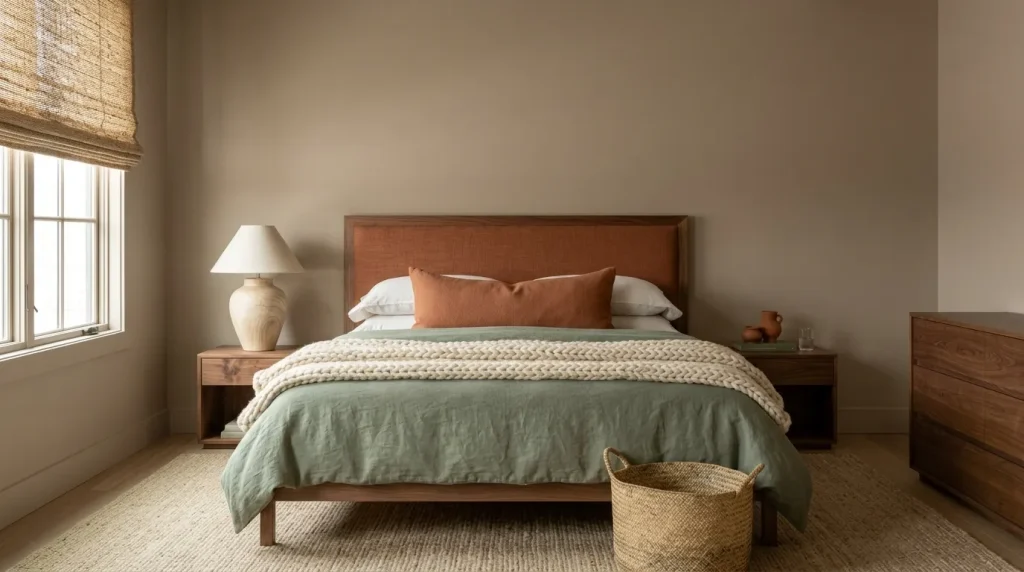
Terracotta and sage both come from colors we associate with the natural world, so highly synthetic-looking surfaces can undermine the effect.
Use tactile materials instead.
A washed sage linen duvet beside a chunky cream wool throw and a clay-colored cotton cushion creates more depth than adding five additional colors ever could.
Also consider woven Roman shades, a jute-blend rug, cane details, boucle, or a simple wool carpet.
Texture is what turns the scheme from a paint palette into a room.
9. Add an imperfect clay element
This sounds obvious with terracotta, but it is worth doing literally.
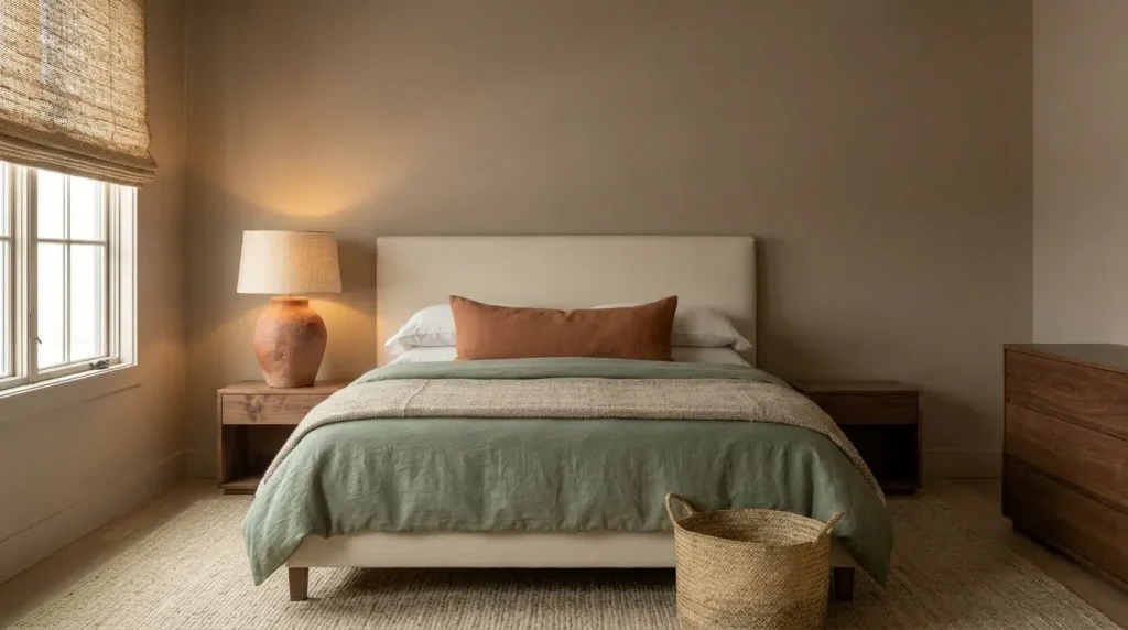
A handmade ceramic lamp, unglazed vase, small sculptural vessel, or actual terracotta pot introduces irregular color and texture that manufactured fabrics cannot quite reproduce.
You do not need a collection.
One substantial ceramic piece with visible variation can be more effective than an entire shelf of tiny decor.
Imagine waking up in a small sage bedroom where the only strong terracotta note is a handmade clay lamp on an old wooden nightstand. The room would still clearly communicate the palette, but it would feel collected rather than themed.
That is the level of restraint I would aim for.
Control the Lighting and Contrast
10. Use cream instead of automatically reaching for white
Bright white is often recommended as the obvious third color, but I would not make it the default.
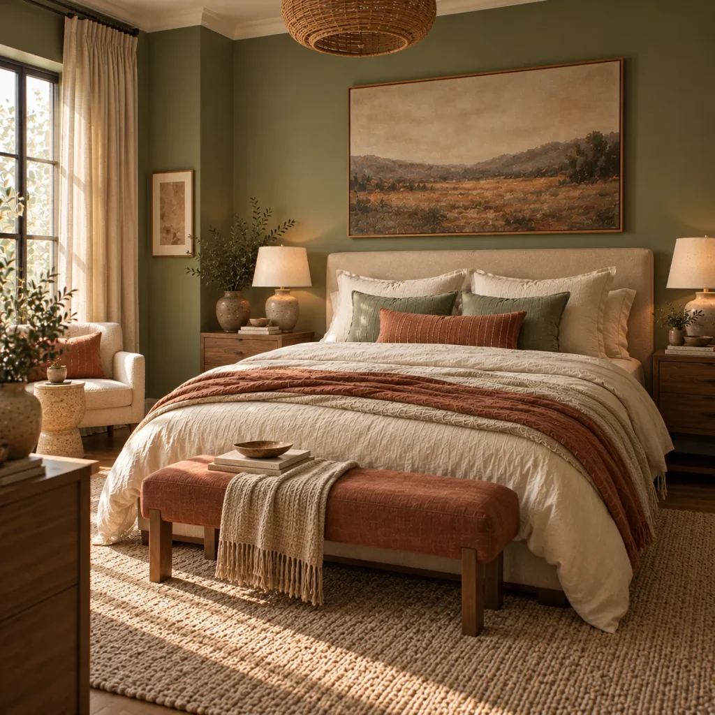
Soft cream, parchment, oatmeal, flax, warm stone, and mushroom usually connect terracotta and sage more gently.
Sage itself works especially well with cream and other warm earthy neutrals.
Use those neutrals for sheets, ceilings, curtains, rugs, lampshades, and upholstered furniture.
If your room already has crisp white trim, there is no need to repaint it. Just make sure the rest of the palette contains enough warmth to balance it.
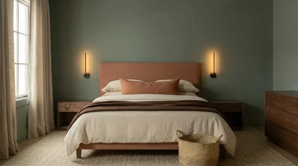
11. Do not forget one darker note
Terracotta + sage + cream can become so soft that everything starts blending together.
Introduce a limited amount of deeper contrast.
Chocolate brown is particularly good here, but charcoal, blackened bronze, dark walnut, deep olive, or aged brass can work too.
You might need only a thin black picture frame, dark bedside sconce, brown throw, and walnut stool.
The idea is not to create another dominant color. It is to give the eye somewhere to stop.
Warm artificial light matters as well. Benjamin Moore notes that lightbulb temperature changes how warm and cool paint colors appear, with lower color temperatures producing a warmer effect. Around 2700K is often an effective starting point when you want a cozy bedroom atmosphere.
Add Character Without Turning It Into a Theme
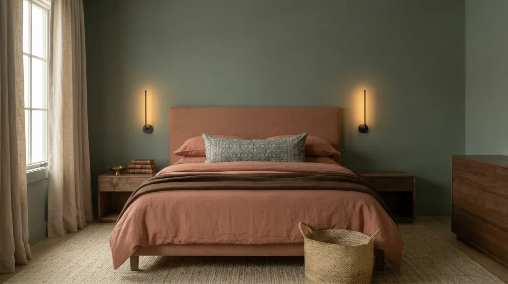
12. Bring in pattern—but make it small
You do not need leaf-print bedding simply because the room is green.
Try a faded stripe, small check, block print, abstract botanical, vintage floral, or geometric textile that contains only one of your main colors.
A patterned lumbar pillow might combine sage with brown and cream while the rest of the bed carries the terracotta.
Or use a vintage-style rug where muted green and rust appear among several other faded shades.
That indirect repetition feels more sophisticated than matching every object perfectly.
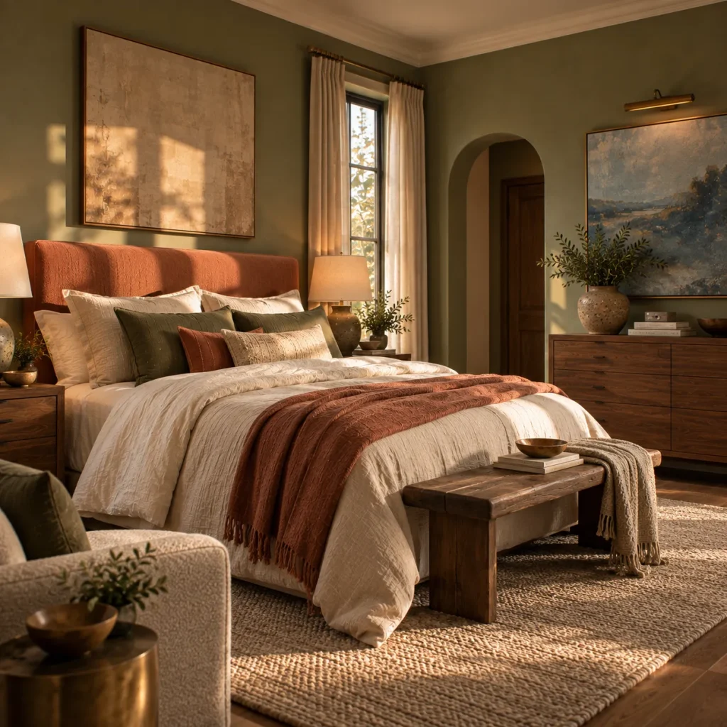
13. Add something that does not match
This may be the most important styling tip.
Once you have sage, terracotta, cream, wood, and perhaps brown established, introduce one small element that sits slightly outside the expected palette.
Try dusty blue artwork, a pale butter-yellow lamp, burgundy piping, an antique brass mirror, or a soft blush cushion.
Why? Because real rooms are rarely built from four perfectly coordinated swatches.
A little tension makes the palette feel personal.
The current design movement toward earthier, character-rich colors is becoming less about assembling trend-perfect rooms and more about pairing colors like sage with rustic bedroom ideas-style collected pieces for a room that feels genuinely lived in.
Terracotta and Sage Bedroom Mistakes to Skip
Do not use equal amounts of both colors everywhere. Pick a leader. Otherwise, every styling decision starts looking like an attempt to keep score.
Do not assume every sage works with every terracotta. A very blue sage beside a highly orange clay can create far more contrast than you expected. Compare actual swatches together.
Do not buy every accessory in sage or rust. Lamps, candles, cushions, art, throws, baskets, and vases do not all need to repeat the same palette.
Do not forget your existing flooring. Honey oak, gray carpet, walnut flooring, and cool tile will each change how the colors read.
Do not make everything bohemian by default. Terracotta and sage can be elegant, modern, minimal, cottage-like, or tailored. Macramé and rattan are options—not requirements.
And finally, do not keep adding decor when the room needs better lighting or larger-scale pieces instead. One well-sized headboard or rug often fixes a scheme faster than another shopping bag of accessories.
Try This If Your Bedroom Is…
| Your situation | Best terracotta-and-sage approach |
|---|---|
| Small | Light sage walls + cream bedding + limited terracotta accents |
| Dark or north-facing | Warmer sage + light-reflective neutrals + clay textiles rather than very dark terracotta walls |
| Bright and sunny | Dustier sage + richer terracotta + walnut or brown contrast |
| A rental | Neutral walls + sage curtains + terracotta duvet or rug |
| Too beige | Add a substantial sage element first, then smaller clay accents |
| Too colorful | Use cream and wood between sage and terracotta |
| Modern and cold | Add clay pottery, linen, warm wood, and one vintage piece |
| Boho and cluttered | Reduce accessories and let large blocks of color do the decorating |
This is why I would decide what your bedroom actually needs before choosing which of the two colors should dominate.
A dark bedroom may need sage to be lighter and warmer. A very sunny room may handle deep clay walls beautifully. A cluttered room probably needs fewer objects—not another shade. For more room-specific direction, see our small bedroom ideas.
Frequently Asked Questions
Does terracotta really go with sage green?
Yes. Muted sage and terracotta are complementary in the sense that one adds cool, calming green while the other adds earthy red-orange warmth. Designers often pair sage with terracotta and other earthy shades to create warmer, more inviting interiors.
Choosing softened versions of both colors makes the combination easier to live with in a bedroom.
What neutral color goes best with sage and terracotta?
Cream is my first choice.
Warm white, oatmeal, flax, mushroom, taupe, and pale beige also work well. For deeper contrast, introduce chocolate brown, walnut, charcoal, or a small amount of black.
Gray can work, but test it carefully. A cool gray combined with gray-heavy sage can remove much of the warmth that makes this palette appealing. If you lean toward a cooler neutral scheme instead, our neutral bedroom ideas cover that direction in more depth.
Should sage or terracotta be the main bedroom color?
Choose based on the mood you want.
Make sage dominant for a lighter, quieter, more relaxed room.
Make terracotta dominant for a warmer, richer, more enveloping room.
If you are uncertain, start with sage as the larger color and use terracotta more selectively. It is generally easier to increase the amount of terracotta later through bedding, rugs, and furniture.
What to Do Next
What to do next: look at the colors already in your bedroom — flooring, wood furniture, bedding, and wall paint.
Then select one sage and one terracotta that actually look good beside those materials.
Choose which color will dominate.
After that, build the room in this order: main color, secondary color, warm neutral, natural material, dark contrast, then decoration.
That order matters.
It prevents you from trying to solve an unfinished color scheme with accessories. If you want a calmer, more restrained take on the palette, our Scandinavian bedroom tips pair well with this approach.
And remember that the goal of these 13 terracotta and sage bedroom tips is not to create the most obviously terracotta-and-sage bedroom possible. The best version may contain surprisingly little of either color.
What matters is the relationship between them: sage bringing freshness and calm, terracotta contributing warmth and depth, and the materials around them making everything feel believable.
Get that balance right, and the room will feel earthy and inviting without looking like it was designed around a trend board.