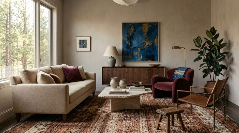
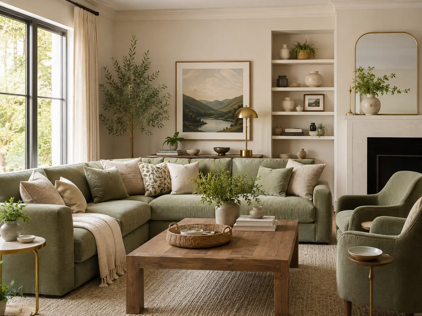
12 Sage Green Living Room Ideas for a Calm, Collected Space
Sage green has a reputation for being the safest green in the paint deck.
That can be its strength and its problem.
Use it with cream furniture, pale oak, and nothing else, and the room can drift into a washed-out look surprisingly quickly. Give sage darker wood, warm metals, pattern, richer greens, dusty pink, or chocolate brown, and it becomes much more interesting.
That distinction matters in 2026. Designers haven’t abandoned sage, but the fresher versions are warmer, muddier, and more herb-like rather than the cool blue-gray sages that dominated a few years ago. Warm eucalyptus, muddy greens, olive-leaning sage, and deeper shades are being treated almost like neutrals.
These 12 Sage Green Living Room Ideas show how to use the color without making your room feel predictable.
1. Choose a warmer sage for the walls
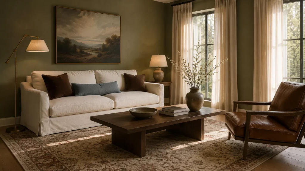
Idea 1: Look for sage with olive, yellow, or earthy undertones.
The undertone matters more than the word “sage” on the paint card.
Cool sage contains more blue or gray. It can look beautiful in sunny rooms, but in weaker light it may become dull or slightly chilly.
Warmer sage contains more olive, yellow, or brown.
That’s the direction I’d explore first for a living room in 2026.
Current color guidance is moving toward warmer greens. House Beautiful points to colors such as Valspar Warm Eucalyptus, while designers interviewed by Homes & Gardens are increasingly favoring muddier greens over cooler blue-based sage.
Try your sample beside the sofa, flooring, and curtains rather than choosing it from a paint chip.
And check it at night.
A sage that looks quietly green at noon can become noticeably gray under artificial lighting.
Go slightly deeper than you think
Very pale sage can disappear beside cream furniture.
A medium sage often gives you more contrast while still behaving like a soft background.
Farrow & Ball’s Calke Green shows how a deeper, herby version of sage can work beautifully with antiques, art, and warmer materials.
You don’t need that exact paint.
Use the depth as inspiration.
2. Pair sage green with chocolate brown
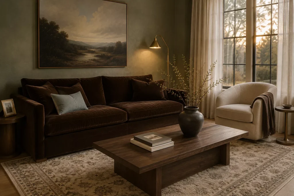
Idea 2: Give soft green something darker to sit against.
This may be my favorite update for sage.
Chocolate brown instantly removes some of the sweetness that pale green can develop.
Try sage walls with:
- a chocolate velvet sofa
- walnut coffee table
- dark brown leather chair
- cocoa-colored throw
- deep wood frames
Brown is having a particularly strong moment in 2026, but this pairing works because of basic color balance too.
Green and brown already make sense together visually.
The trick is adding enough lightness around them.
Use cream curtains, an oatmeal rug, or warm white upholstery to stop the room becoming too dark.
For a living room with sage walls and a cream sofa, I’d bring in chocolate at least twice.
Perhaps a dark wood coffee table and two brown cushions.
That small repetition can make the whole palette feel grounded.
Idea 3: Add pale blue to sage and brown.
This is less expected.
A dusty blue cushion, patterned rug, or ceramic lamp can cool the combination just enough.
Current designers are pairing muddier greens with pale blue, pink, and plum because those colors create more character than simply surrounding green with beige.
Keep the blue faded rather than bright.
You want quiet contrast.
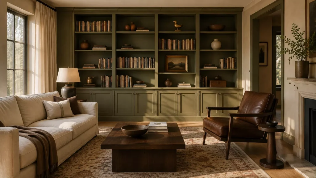
3. Use sage green on built-ins instead of every wall
Idea 4: Paint bookcases, cabinetry, or millwork sage.
If you like sage but don’t want an entirely green room, concentrate it on architecture.
A pair of bookcases painted in warm sage can turn a plain white wall into a focal point.
Try it on:
Built-in shelving
A media cabinet
Window trim
A fireplace surround
Freestanding bookcases
A vintage cabinet
Homes & Gardens has highlighted sage repeatedly in designer homes during 2026, including on cabinetry and architectural elements rather than only as a full-room wall color.
This works particularly well in open-plan homes where you want the living area to have an identity without painting every connected wall green.
Use the same green somewhere else once.
Perhaps in a stripe on a cushion or a small section of the rug.
That repetition stops the painted cabinetry from looking isolated.
Try color-drenching the built-in
If the shelving has trim or molding, paint all of it the same sage.
Fewer color changes create a stronger shape.
Then fill the shelves with books, brown pottery, art, brass, and a few cream objects.
Avoid styling every shelf with green accessories.
The cabinetry is already doing enough.
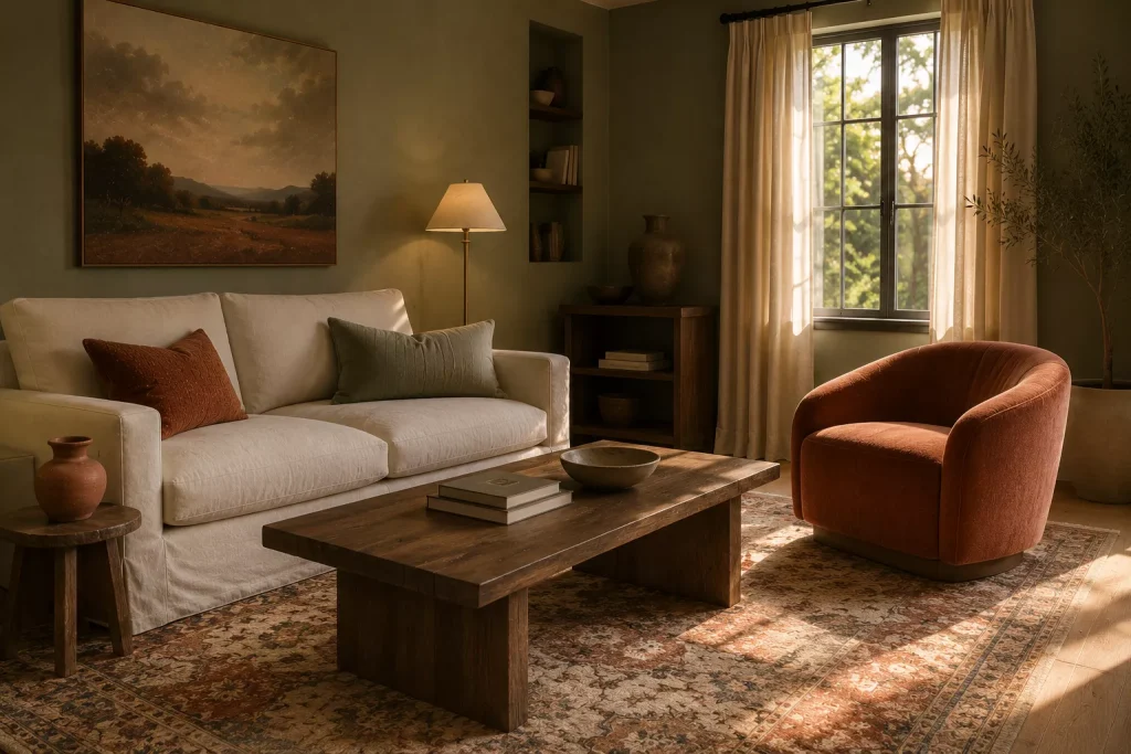
4. Combine sage with terracotta and clay
Idea 5: Warm the room through red-brown earth tones.
Sage and terracotta are an easy pairing because one is muted green and the other sits in the red-orange family.
They provide contrast without looking aggressive.
Try sage walls with:
A clay-colored armchair
Rust cushions
Terracotta pottery
A faded brick-red rug
Warm brown artwork
Terracotta remains part of the richer earth-based palette designers are using in 2026. Current seasonal color forecasts place it beside chocolate brown, maroon, bottle green, and other deeper natural shades.
The mistake is using too much terracotta.
If the walls are sage, let clay and rust take perhaps 15 to 25 percent of the visible color.
Cream, natural fiber, or brown can fill the rest.
Here’s a simple comparison:
| Sage pairing | Overall feeling | Best materials |
|---|---|---|
| Sage + chocolate | Grounded and cozy | Walnut, velvet, leather |
| Sage + terracotta | Warm and earthy | Linen, pottery, wool |
| Sage + dusty pink | Soft and collected | Cotton, floral textiles |
| Sage + pale blue | Calm and airy | Linen, ceramics |
| Sage + plum | Richer and moodier | Velvet, brass, dark wood |
You don’t need several of these combinations at once.
Pick one main supporting color.
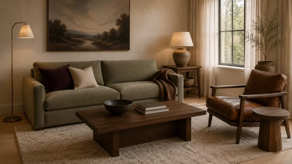
5. Use a sage sofa in a neutral room
Idea 6: Let upholstery carry the color instead of paint.
A sage sofa can be a very practical choice if you want color without changing the walls.
It’s quieter than emerald and usually easier to live with than a bright green.
Keep the room warm around it.
Try:
Warm white walls
Sage sofa
Walnut coffee table
Cream rug
Rust or plum cushions
Aged brass lamp
Sage upholstery has long worked well with stone, blush, yellow, charcoal, and natural materials because gray-green behaves almost like a neutral.
For a more current 2026 feel, I’d reduce the pale accessories and add something deeper.
Chocolate.
Plum.
Dark oak.
Blackened bronze.
One strong dark value makes the green look more substantial.
And test upholstery fabric in your actual room if possible.
A sage velvet will look deeper than sage linen because the pile absorbs and reflects light differently.
Same color family, very different effect.

6. Pair sage with dusty pink or plum
Idea 7: Use pink to stop sage feeling too rustic.
Green and pink can sound overly sweet.
They don’t have to be.
Choose dusty rose, clay pink, faded raspberry, or muted blush.
Avoid sugary pastel pink if you want the room to feel grounded.
Sage walls with a dusty pink chair can look particularly good beside walnut furniture and cream curtains.
For an even richer version, try plum.
Current 2026 green palettes are moving into combinations with plum, pink, and pale blue, especially as designers look for ways to make muddy greens feel less predictable.
Idea 8: Let the color arrive through pattern.
A patterned rug or floral chair can combine sage and pink without forcing you to buy several solid-colored pieces.
Patterned upholstery is also becoming more visible again in 2026, with designers mixing florals, checks, and stripes through shared colors rather than perfectly matching patterns.
For example:
Sage wall
Cream sofa
Floral chair with green and dusty rose
Striped cushion using similar green
Brown wood table
That feels collected.
A matching sage sofa, sage rug, sage curtains, and sage cushions usually doesn’t.
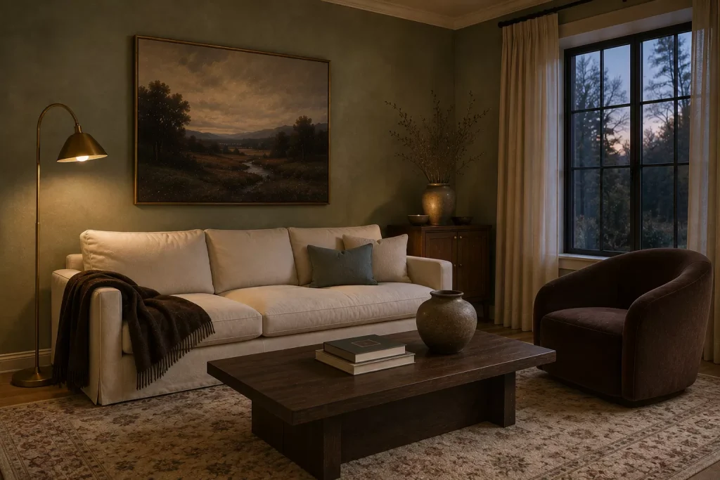
7. Bring in brass instead of cool silver
Idea 9: Use warm metal as the small contrast.
Sage often contains enough gray that cool metal can exaggerate its colder side.
Brass does the opposite.
Try aged or unlacquered-looking brass on:
- picture frames
- lamps
- candlesticks
- cabinet hardware
- small side tables
Homes & Gardens specifically recommends warm brass alongside muddier green living room colors because it emphasizes their warmer undertones.
You don’t need to replace every metal finish.
If your curtain rod is black, leave it.
If the floor lamp is nickel and you like it, keep it.
Bring in brass two or three times and let the metals mix.
I prefer that to turning the room into a coordinated brass collection.
One practical note, highly polished gold can look much brighter than aged brass.
For a softer sage room, brushed or aged finishes are easier to blend with wood and linen.

8. Layer sage with stripes, checks, and botanical pattern
Idea 10: Don’t make every green surface plain.
Sage gained popularity partly because it was used in very restrained rooms.
That formula can now feel a little predictable.
Pattern is one way to move it forward.
Try a striped armchair in green and cream.
Use checked curtains.
Bring in a small floral cushion.
Add a rug that contains sage but also burgundy, blue, or rust.
Even older sage-green decorating guidance shows how graphic stripes can make chalky sage feel fresher and less obvious than simply repeating botanical motifs.
The key is scale.
If the curtains have a large botanical print, keep the sofa relatively simple.
If the rug is detailed, use a narrow stripe or small check elsewhere.
Don’t choose three patterns with the same visual size.
That’s where pattern mixing starts to feel accidental.
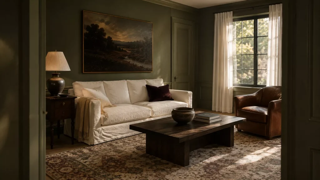
9. Try a deeper sage if pale sage feels dated
Idea 11: Move from gray sage toward herby green.
There’s a useful contradiction happening in 2026.
Sage is still appearing in designer homes, but the cooler, blue-gray version is losing some momentum while warmer, deeper greens are getting more attention.
So if you love sage, don’t abandon it.
Adjust it.
Look toward:
Herbal green
Olive sage
Muddy green
Deep eucalyptus
Gray-olive
Muted moss
These shades have more life beside brown, brass, cream, and vintage furniture.
Benjamin Moore Gloucester Sage is one current designer recommendation in this muddier territory, while Farrow & Ball Bancha is another deeper green reference suggested for living spaces.
Always sample before buying.
Paint names are useful for research, not guarantees.
Lighting and your existing finishes will decide what the color actually looks like.
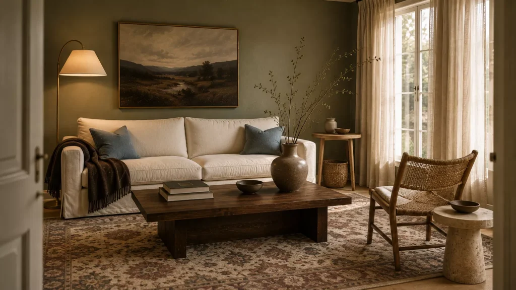
10. Keep some cream and natural texture in the room
Idea 12: Give sage enough breathing room.
A green room still needs relief.
Use warm cream through a sofa, curtains, lampshade, or large rug.
Then add natural texture.
Linen.
Wool.
Rattan.
Oak.
Walnut.
Stone.
Ceramics.
This keeps sage connected to material rather than turning it into a theme.
Warm, nature-rooted greens are being treated as comfort colors in 2026 precisely because they work so naturally beside tactile materials and warmer neutrals.
One of my favorite combinations would be:
Medium sage walls
Cream linen sofa
Walnut coffee table
Faded burgundy rug
Two dusty blue cushions
Aged brass lamp
Large ceramic vase
Notice that only the walls are strongly sage.
That’s enough.
The supporting materials let the green feel intentional rather than repetitive.
What should you skip in a sage green living room?
First, skip automatically pairing sage with white, pale oak, beige, and more sage.
That was a popular formula, but it can now feel washed out.
Introduce something darker.
Chocolate brown is easy.
Plum is more adventurous.
Walnut works in almost any version.
I’d also be cautious with very cool blue-gray sage in north-facing rooms. Designers are specifically moving toward warmer greens because cooler sage can sometimes feel flat in spaces where warmth is the goal.
Skip artificial greenery chosen solely because it matches the walls too.
You don’t need green plants everywhere to prove the room is nature-inspired.
And avoid matching every textile to the paint.
A room with sage walls, sage curtains, sage cushions, and a sage rug loses depth.
Repeat green selectively, then let brown, cream, pink, blue, rust, or plum create separation.
Try this if you already have sage green walls
Don’t repaint yet.
If your sage room feels dated, the paint may not actually be the problem.
Remove the pale beige accessories temporarily.
Then add:
- One dark brown or walnut piece.
- Two cushions in plum, rust, or dusty blue.
- A warmer lamp or brass detail.
- One patterned textile.
- Cream rather than stark white where you need a light neutral.
Live with that before deciding.
A sage wall surrounded by 2021-style pale oak and gray-beige textiles can feel very different once deeper wood, richer color, and pattern arrive.
That’s much cheaper than repainting.
And if you still dislike the wall afterward, you’ll have a clearer idea of what the room needs next.
FAQ About Sage Green Living Rooms
Is sage green still popular for living rooms in 2026?
Yes, but the direction is changing. Sage continues to appear in designer homes, while warmer, muddier, and deeper greens are gaining ground over cooler blue-gray versions.
What colors look best with sage green?
Chocolate brown, warm cream, terracotta, dusty pink, pale blue, plum, walnut, and aged brass all work particularly well. The best pairing depends on whether your sage leans warm or cool.
What color sofa goes with sage green walls?
Cream, chocolate brown, camel, dusty blue, muted pink, or a deeper green can all work. A neutral sofa is easier to change around, while brown or colored upholstery creates stronger contrast.
Does sage green make a living room look smaller?
Not automatically. Pale and medium sage can feel soft and open, while deeper sage creates a more enclosed mood. Lighting, furniture scale, and contrast usually affect perceived space more than the green itself.
Give sage more contrast, not more sage
The most useful lesson from these 12 Sage Green Living Room Ideas is that sage rarely needs help becoming calm.
It needs help becoming interesting.
Pair it with walnut instead of another pale wood.
Put plum beside it.
Use terracotta rather than another beige cushion.
Let brass catch the evening light.
Bring in one stripe or floral instead of keeping every textile plain.
And if you’re choosing paint now, look at warmer, more herb-like versions rather than automatically reaching for the palest gray-green sample.
Sage can still make a beautiful living room in 2026.
It just looks better when the rest of the room has enough confidence to keep up with it.