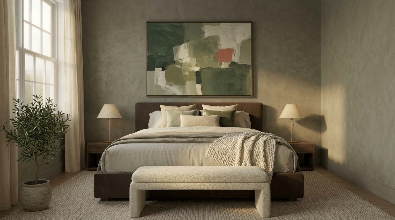
14 sage green and cream bedroom decor tips for a Soft, Layered Retreat
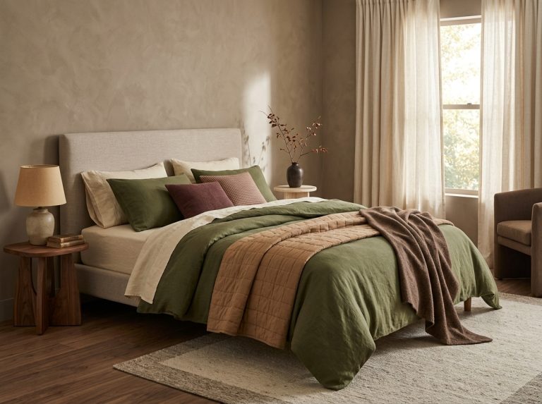
Sage green and cream is one of the most reliable bedroom palettes for 2026 because it balances a calming, natural green with a warm, soft neutral that keeps the room from feeling cold or flat. Done well, it reads collected and current rather than themed. Done poorly, it can feel washed out, overly pastel, or like two colors that never quite blend. These 14 sage green and cream bedroom decor tips focus on the details that make the pairing feel intentional: the right undertones, layered textures, warm wood, brass accents, pattern, rugs, and lighting that ties it all together.
Getting the Foundation Right
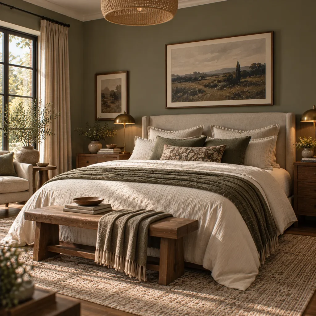
1. Choose a muddy, grayed-down sage over a bright green
A true sage has gray and brown undertones, not blue or yellow. Bright or minty greens fight with cream instead of complementing it. Test swatches in your actual room light before committing to a wall color.
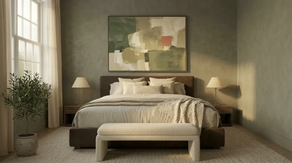
2. Pick a warm cream, not a cool white
Cream should read slightly yellow or beige next to sage green, never stark white. A cool white will make the sage look colder and the whole room feel clinical instead of cozy.

3. Use warm wood tones to bridge the two colors
Oak, walnut, or rattan furniture pulls warmth out of both the sage and the cream, keeping the palette from feeling flat. Avoid gray-washed or cool-toned wood, which can make the room feel muted and lifeless.

4. Layer at least three shades of green and cream together
A single sage wall paired with one cream bedspread can look thin. Layer a deeper sage in a throw blanket, a lighter sage in a rug, and multiple cream tones across bedding and curtains for depth. For more layering ideas, these sage green and blush bedroom tips show how tonal layering keeps a soft palette from feeling one-note.
Texture and Fabric
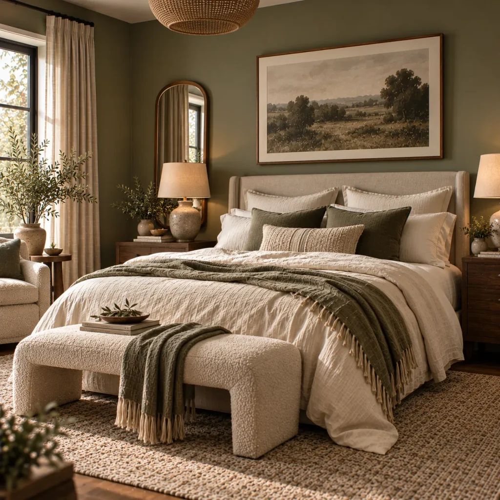
5. Mix linen, boucle, and cotton for tactile depth
Because sage and cream are both muted colors, texture becomes the main source of visual interest. Combine a linen duvet, a boucle bench, and cotton throw pillows so the eye has variation to move across even without strong color contrast.
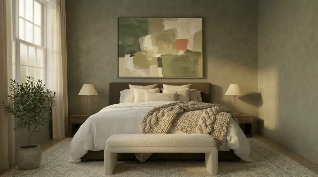
6. Add a chunky knit or wool throw
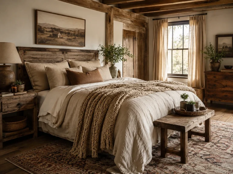
A heavier textured throw at the foot of the bed keeps the palette from feeling too soft or precious. It also grounds the room for cooler months without needing to introduce a new color.

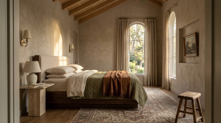
7. Choose a natural fiber rug in a cream or oatmeal tone
Jute, sisal, or a low-pile wool rug in a warm neutral anchors the room and adds grounding texture underfoot. Avoid a stark white rug, which can feel out of place against the warmer palette.
Pattern and Accent Color
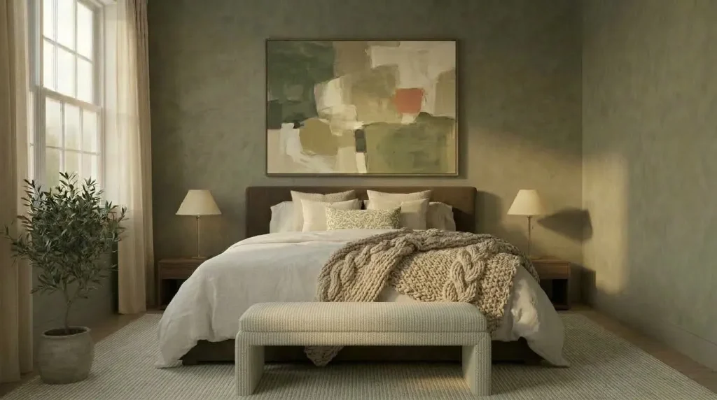
8. Introduce a small-scale botanical or stripe pattern
A subtle leaf print or a soft stripe in sage and cream keeps the room from feeling too solid or matchy. Keep pattern confined to one or two textiles, like a lumbar pillow or a window valance, so it accents rather than overwhelms.
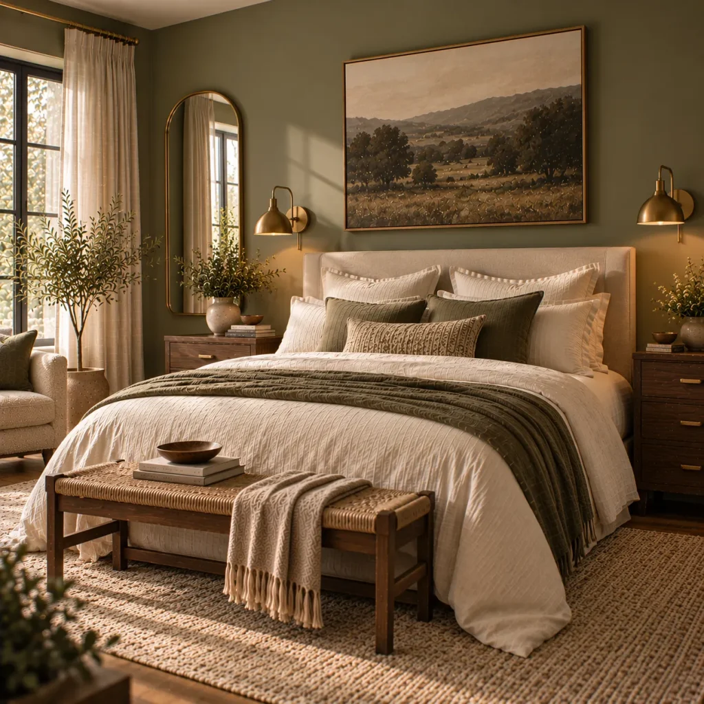
9. Add brass or warm gold hardware and lighting
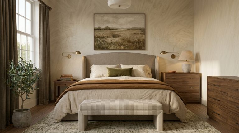
Brass sconces, drawer pulls, or a gold-rimmed mirror add a warm metallic note that keeps sage and cream from feeling too soft or muted. Cool metals like chrome or nickel tend to fight with the palette’s warmth.
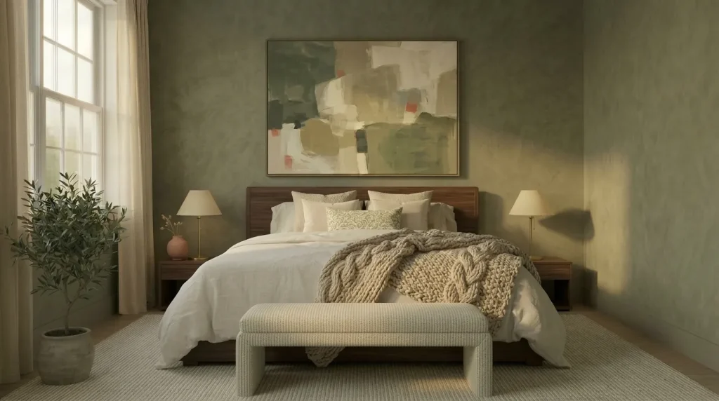
10. Use a muted terracotta or dusty rose as a third accent
A small dose of warm terracotta or dusty rose in a vase, artwork, or single pillow keeps the room from feeling monochromatic. Keep this third color to no more than 10 percent of the room so it stays an accent, not a competing scheme.
Layout and Lighting
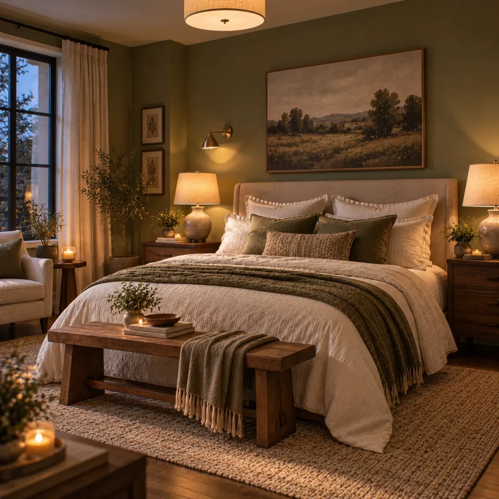
11. Use warm, layered lighting instead of one overhead fixture
A single bright overhead light flattens the softness of sage and cream. Layer a warm-toned bedside lamp, a dimmable overhead fixture, and if possible a plug-in sconce so the room can shift from bright and functional to warm and relaxed.
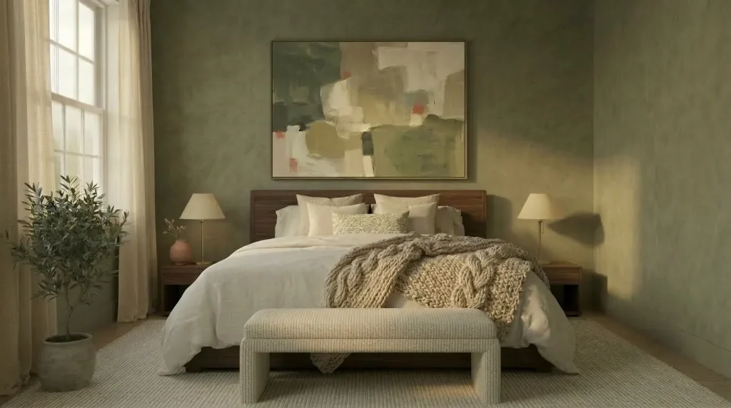
12. Keep window treatments soft and semi-sheer
Heavy blackout curtains in a stark color can feel out of step with the airy quality of sage and cream. A semi-sheer linen curtain lets in filtered light and keeps the layered, soft look consistent through the room.

13. Ground the palette with one deeper anchor piece
A deep walnut headboard, a dark bedside table, or a black-framed mirror gives the eye a place to rest and keeps the room from feeling like it’s floating. Without at least one deeper tone, an all-soft palette can start to feel washed out. This is the same grounding principle used in these master bedroom decor tips, where a single deeper anchor piece keeps a soft room from feeling flat.

14. Bring in real greenery to echo the sage tone
A trailing pothos or a potted olive tree echoes the wall color naturally and keeps the room feeling alive rather than static. Real plants also soften hard edges around furniture and window frames.
A Practical Sage Green and Cream Bedroom Palette Guide
| Element | Recommended Tone | Avoid |
|---|---|---|
| Walls | Muddy, gray-green sage | Bright or minty green |
| Bedding | Warm cream, oatmeal | Stark white |
| Wood tones | Oak, walnut, rattan | Gray-washed wood |
| Metals | Brass, warm gold | Chrome, nickel |
| Rug | Jute, sisal, wool oatmeal | Stark white or cool gray |
| Accent color | Muted terracotta, dusty rose | Bright or saturated hues |
What Should You Skip
- Skip bright, minty, or blue-toned greens that clash with cream’s warmth.
- Skip cool white bedding or trim, which flattens the palette.
- Skip an all-soft room with no deeper anchor piece for contrast.
- Skip cool metals like chrome, which fight the warm undertones.
Try This If Your Sage and Cream Bedroom Feels Flat
Add one deeper, saturated layer, whether that’s a darker green throw, a walnut bed frame, or a black-framed piece of art. A single grounding element keeps the softness from tipping into blandness. If you’re drawn to this palette but want more pattern and layered neutrals, these neutral bedroom ideas offer additional ways to build depth without adding bold color.
FAQ
Does sage green and cream work in a small bedroom?
Yes. Because both tones are soft and light-reflective, this palette can actually help a small room feel more open, as long as you keep the deeper accent pieces to one or two spots rather than covering every surface.
What curtain color works best with sage green walls?
A warm cream or oatmeal linen curtain keeps the look cohesive. Avoid a pure white curtain, which can create too much contrast against a muddy sage wall.
Can I use this palette in a farmhouse-style bedroom?
Yes, sage and cream pair naturally with farmhouse textures like rattan, linen, and reclaimed wood. For a more farmhouse-specific take on this palette, see these ideas for a sage green farmhouse bedroom.
Final Thoughts
A sage green and cream bedroom works best when warmth, texture, and at least one deeper anchor piece keep the palette from feeling too soft or pastel. Get the undertones right, layer your materials, and add warm metal accents, and the combination reads calm, current, and intentional rather than trendy.