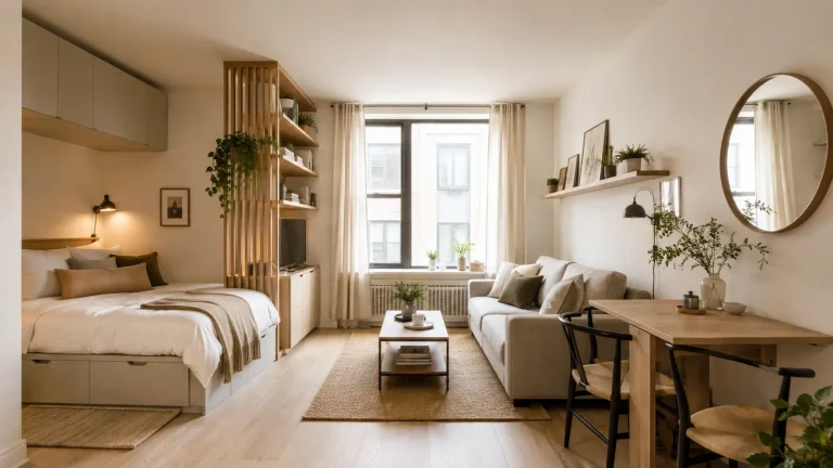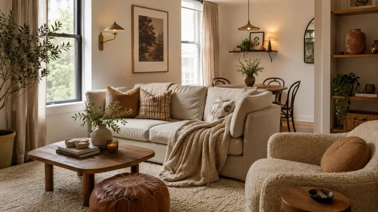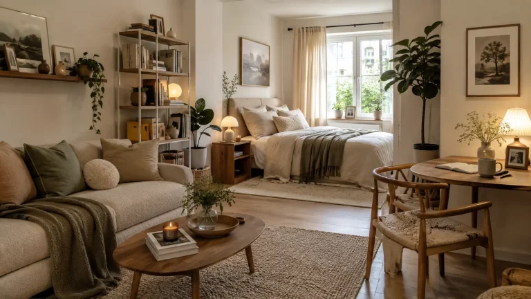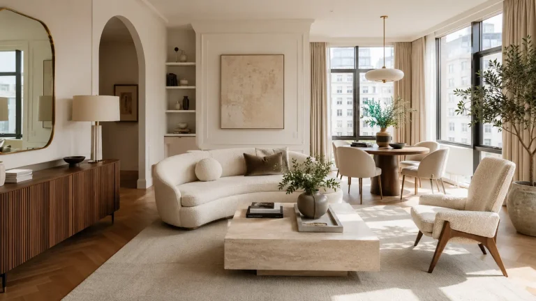
10 apartment decorating ideas that look designer approved, Without the Designer Price Tag
There’s a particular kind of apartment that looks expensive even when very little inside actually was.
The sofa might have cost $700, the curtains came ready-made, and the artwork is a mix of flea-market finds and inexpensive prints. Yet the room still feels considered. Nothing is shouting for attention, and nothing looks accidentally placed.
That’s the real secret behind apartment decorating ideas that look designer approved. It isn’t about filling your home with recognizable furniture or copying a showroom. It’s about scale, repetition, lighting, texture, and knowing when to stop.
I once helped restyle a rental where the biggest improvement cost less than a new coffee table. We changed the curtain height, moved two lamps, removed several undersized accessories, and grouped the artwork properly.
The room immediately looked more finished.
Here are ten ways to get that effect in your own apartment.
1. Start with fewer, larger pieces instead of lots of small decor
Designers tend to think about visual weight before they think about quantity.
That’s something many apartments get wrong.
A small room doesn’t automatically need small accessories. In fact, twenty tiny objects can make a compact living room feel more crowded than three substantial pieces.
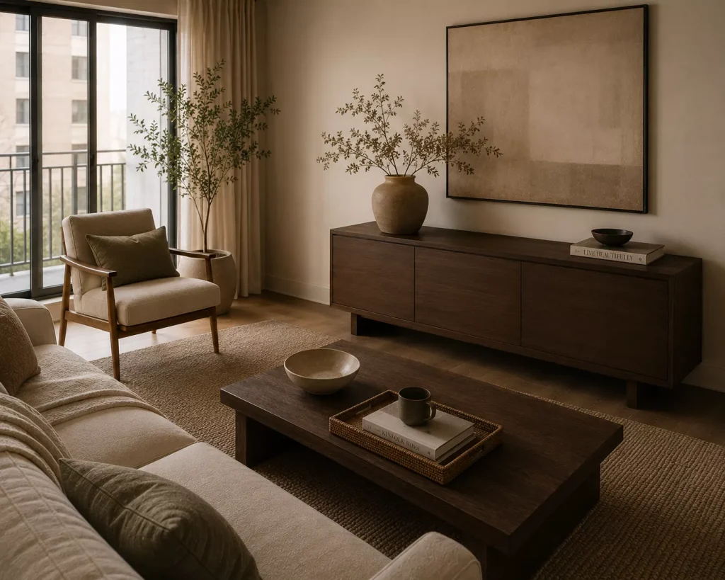
Try a large ceramic vase instead of five little ones. Choose one 30-by-40-inch artwork rather than several scattered prints. Put a generously sized table lamp on a console instead of filling it with small decorative objects.
This works because larger pieces give your eye somewhere to land.
A room starts feeling intentional rather than accumulated.
I’m especially careful with coffee tables. A tray, one stack of books, and a sculptural bowl are usually enough. You still need space for a drink, laptop, or Friday-night takeout.
One of my pet peeves is styling every square inch until the furniture can’t perform its actual job.
If you already own lots of small objects, don’t throw them away. Group similar pieces together and rotate the rest.
Three small brass candlesticks displayed as one collection will look stronger than those same candlesticks spread around the apartment.
2. Hang curtains like they belong to the room, not just the window
Few affordable changes make an apartment look more polished than properly hung curtains.
And yet rental curtains often stop awkwardly at the bottom of the window or hang from a rod barely wider than the frame.
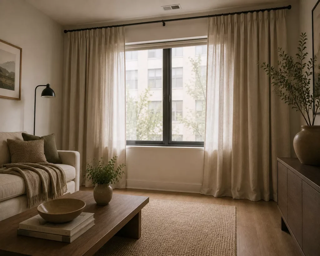
Instead, mount the rod several inches above the window and extend it beyond each side where space allows. Let the fabric fall almost to the floor.
The wall instantly feels taller.
For fullness, aim for curtain panels that collectively measure around 1.5 to 2 times the window width. Flat, stretched fabric rarely looks generous.
Warm white linen blends are an easy choice, but they aren’t your only option. Soft mushroom, muted olive, dusty blue, and oatmeal can add color without dominating the room.
Ready-made panels can cost around $30 to $80 per pair. Better linen blends and extra-long sizes can climb higher, but you don’t need custom drapery to get a refined result.
Watch the hem length
Curtains that stop several inches above the floor often look accidental.
Either let them skim the floor or create a deliberate slight break at the bottom. Avoid dramatic pooling in busy apartments unless you enjoy vacuuming fabric.
That’s the trade-off nobody puts in the pretty photos.

3. Repeat finishes so the apartment feels connected
Designer rooms rarely look coordinated because every piece matches.
They look coordinated because certain materials and colors appear more than once.
Suppose your living room has a walnut coffee table. Repeat that medium-brown wood in a picture frame, lamp base, or dining chair.
If your kitchen has black cabinet hardware, carry a little black into the adjoining room through a floor lamp or narrow console.
The repetition should be subtle.
You’re building visual connections, not creating a matching set.
A useful apartment palette might include:
- warm white walls
- medium oak
- soft olive
- aged brass
- charcoal accents
That’s enough variety to keep things interesting while giving the room a clear language.
This is one of the easiest apartment decorating ideas that look designer approved because you can often do it with objects you already own.
Walk around your apartment and count your main finishes.
If you have pale oak, dark espresso wood, chrome, brass, matte black, white lacquer, gray wash, and copper all competing in one room, that may explain why the space feels unsettled.
You don’t need to eliminate everything. Just decide which finishes should lead and which ones should quietly step back.

4. Use lighting at different heights
A single ceiling fixture is functional.
It’s rarely flattering.
Well-designed apartments usually have light coming from several levels. That creates depth and makes the room feel better after sunset.
Start with three basic types of lighting:
Ambient lighting
This is your general room light. It might come from a ceiling fixture, track lighting, or a large floor lamp.
Task lighting
Use this where you actually do something. A reading lamp beside the sofa, a desk lamp, or under-cabinet kitchen lighting belongs here.
Accent lighting
This is the small lamp on a bookshelf, wall sconce beside artwork, or rechargeable lamp on a dining table.
You don’t need expensive fixtures.
A $40 lamp with the right proportions can look far better than a $300 lamp that’s too small for the furniture beneath it.
For most living spaces and bedrooms, warm bulbs around 2700K create a softer atmosphere.
And use dimmers where practical.
Being able to lower the lights in the evening makes an apartment feel dramatically more comfortable without changing a single piece of furniture.
The one downside is cords. In rentals, plug-in sconces and floor lamps can create cable clutter. Use simple cord covers or route wires behind furniture where possible.
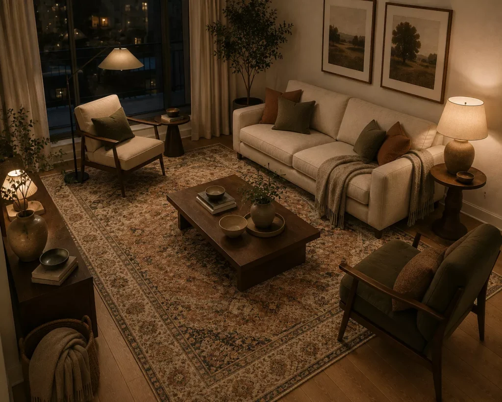
5. Size your rug to the furniture, not the empty floor
An undersized rug is one of the fastest ways to make an otherwise lovely room feel slightly off.
The common mistake is buying a 5-by-7-foot rug because the apartment is small.
But a rug that floats beneath only the coffee table can make the entire seating area look smaller.
In many apartment living rooms, an 8-by-10 works better because at least the front legs of the sofa and chairs can sit on it.
For tighter spaces, a 6-by-9 may be enough.
The furniture should look connected to the rug rather than gathered nervously around it.
Pattern matters too.
A low-contrast vintage-style rug in rust, cream, faded navy, or olive can hide everyday wear while adding depth. Solid pale rugs look beautiful, but they tend to advertise every coffee drip and muddy shoe.
Here’s a quick comparison:
| Rug choice | Why it works | Main drawback |
|---|---|---|
| Large neutral rug | Makes furniture feel connected | Usually costs more |
| Vintage-style pattern | Adds depth and hides wear | Can compete with busy upholstery |
| Flatwoven rug | Easy in dining areas | Less plush underfoot |
| Wool rug | Durable and substantial | Higher upfront cost |
| Washable rug | Practical for pets and spills | Some feel thinner |
The right rug acts like architecture. It defines an area without adding another wall.
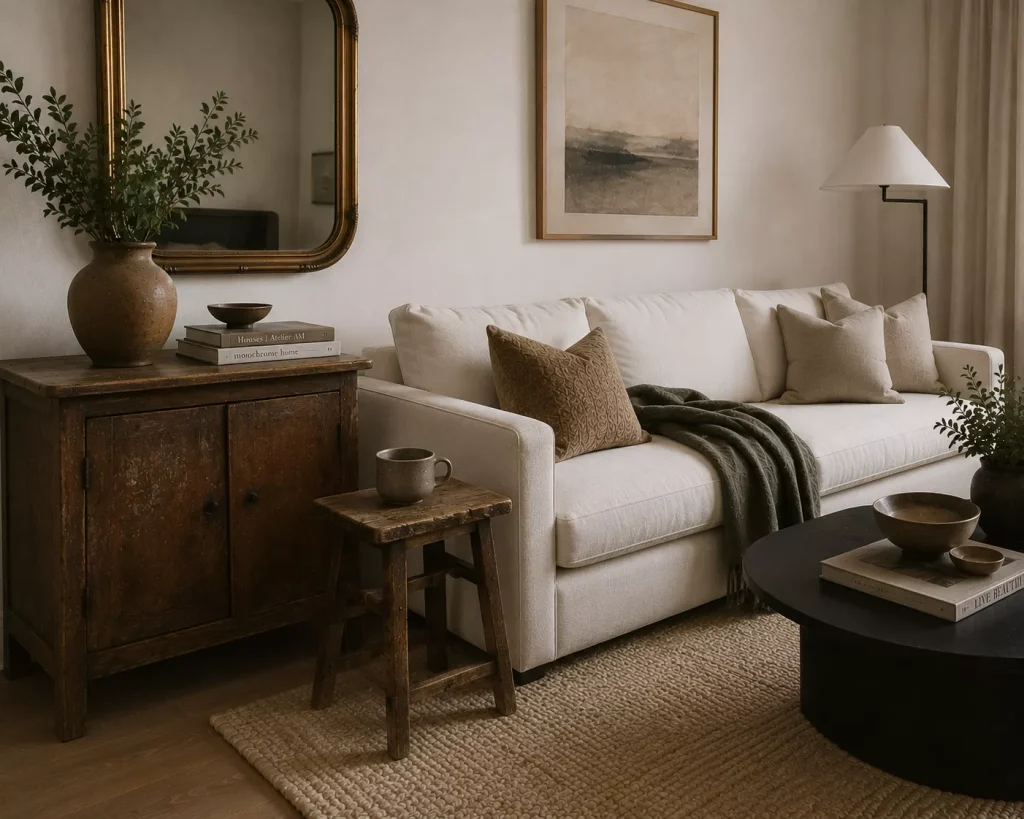
6. Mix old and new so the room doesn’t look bought in one afternoon
A room filled entirely with new furniture often feels strangely flat.
Everything has the same level of wear, the same retail polish, and sometimes the same generic personality.
One vintage or secondhand piece can fix that.
Try an old oak side table next to a modern cream sofa. Put an antique brass mirror above a basic white dresser. Use a worn wooden stool as a plant stand beside a contemporary bed.
You don’t need actual antiques.
Facebook Marketplace, thrift shops, flea markets, and family hand-me-downs are enough.
I once saw a plain rental dining area change completely after a scratched vintage cabinet was added beside a very ordinary table. The cabinet wasn’t perfect. That was precisely why it worked.
There’s character in a surface that isn’t fresh from a box.
The trick is contrast.
If your sofa is soft and rounded, a more angular vintage table can provide structure. If everything is wood, introduce stoneware, metal, glass, or woven fiber.
And don’t aggressively refinish every secondhand piece.
Sometimes the slightly faded finish is the whole point.

7. Give artwork the scale and placement it deserves
Good art hung badly still looks wrong.
The most common problem is scale.
A 12-inch print centered above an 80-inch sofa doesn’t feel delicate. It feels lost.
For one large piece, aim for artwork that takes up a meaningful portion of the furniture width below it. Something around half to two-thirds the width of a sofa, bed, or console often works well.
Gallery walls can also look polished if the spacing stays consistent.
Keep roughly 2 to 3 inches between frames and treat the entire arrangement as one visual shape.
Hang art closer to the furniture
Artwork is often mounted too high.
Over a sofa, dresser, or headboard, leaving roughly 6 to 10 inches between the furniture and artwork usually creates a stronger connection than placing the frame halfway up the wall.
You don’t need expensive art either.
Vintage posters, personal photography, downloadable prints, textile pieces, framed sketches, and flea-market finds can all work beautifully.
Spend attention on framing.
A basic print with a generous mat and a substantial oak or black frame often looks more considered than an expensive print squeezed into a flimsy frame.
This is one area where proportion matters more than price.
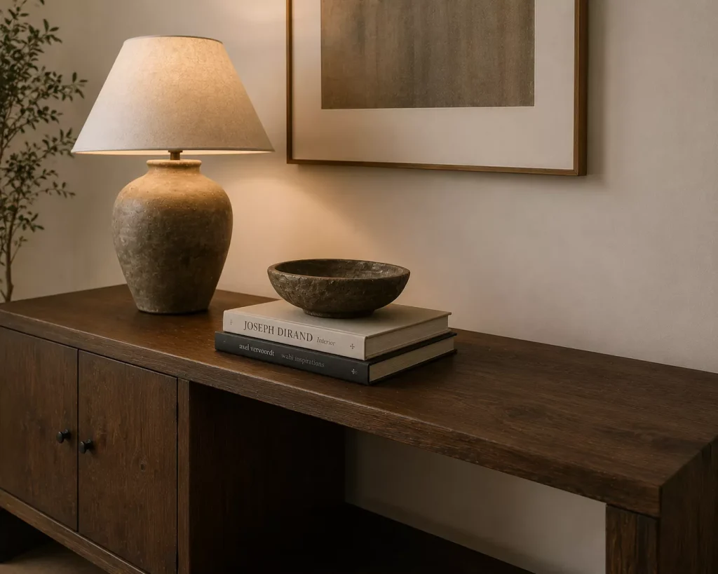
8. Style surfaces with shape, height, and breathing room
Styling a console or coffee table shouldn’t look like filling a shelf at a gift shop.
The goal is variation.
Combine something tall, something lower, something with texture, and a little empty space.
For example, a console might hold a 24-inch table lamp, a short stack of books, and one handmade ceramic bowl.
Done.
You could add a small framed photo, but the arrangement doesn’t need seven more objects.
Another useful trick is grouping accessories in odd numbers, especially three. The pieces don’t need to match. They just need enough variation to feel related without becoming repetitive.
Think:
A tall smoked-glass vase
A medium ceramic object
A low stack of books
Varying heights gives the eye movement.
But restraint matters more.
One of the easiest ways to make apartment decorating ideas that look designer approved actually work in real life is leaving usable space on every surface.
Your dresser still needs somewhere for your watch.
Your coffee table still needs somewhere for a mug.
And your kitchen counter definitely doesn’t need a decorative cutting board collection occupying the only useful prep area.

9. Add one controlled statement instead of several competing ones
Every room benefits from something memorable.
The problem starts when everything wants that job.
A striped rust-and-cream rug can be the statement. So can a deep green velvet chair, oversized abstract painting, sculptural pendant light, or dark blue bookcase.
Choose one major moment.
Then let the supporting pieces be quieter.
Suppose you buy a burnt-orange sofa. You probably don’t also need patterned curtains, a multicolor rug, six colorful cushions, and graphic wallpaper in the same room.
A bold sofa looks more expensive when it has space around it.
The same applies to inexpensive pieces.
A basic dining table can look far more interesting beneath a large paper pendant light. A simple bed becomes memorable with a deep burgundy upholstered headboard.
This is where confidence matters.
Designer-looking rooms aren’t afraid of personality. They’re simply edited.
If you love strong color, use it.
Just decide what gets to speak first.

10. Finish the overlooked areas, especially the entry and corners
A room often feels unfinished because the obvious furniture is done but the awkward areas aren’t.
The entry has shoes scattered around.
A corner has a lonely cable.
The wall beside the sofa is completely bare while every other wall is crowded.
These small gaps matter.
A narrow entry shelf around 8 to 12 inches deep can create a place for keys and mail without blocking circulation. Add a mirror above it and a small tray below.
An empty corner might need a slim floor lamp instead of another chair.
A strange wall section beside the kitchen could hold one framed artwork or a narrow run of hooks.
The goal isn’t to decorate every gap.
It’s to make overlooked areas feel intentional.
Try this quick order before buying anything new:
- Stand at the apartment entrance and notice what immediately looks unfinished.
- Check whether furniture placement blocks a natural walkway.
- Look for surfaces overloaded with small objects.
- Identify one wall where artwork is too small or too high.
- Fix those issues before shopping for additional decor.
Most apartments need editing before they need more stuff.
That’s probably the most useful designer habit you can borrow.
FAQ About Designer-Looking Apartment Decor
How can I make my apartment look expensive on a budget?
Focus on scale, lighting, curtain height, and consistent finishes before buying decorative accessories. Secondhand furniture, larger artwork, and properly sized rugs often have more impact than trendy objects.
What colors make an apartment look professionally decorated?
There isn’t one correct palette. Warm whites, mushroom, olive, muted blue, clay, walnut, and charcoal work well because they’re easy to repeat across materials and rooms. Consistency matters more than the exact colors.
Do all furniture pieces need to match?
No. Matching everything can actually make an apartment feel less personal. Repeat a few materials or colors, but mix shapes, ages, and textures so the room develops some character.
What makes an apartment look unfinished?
Undersized rugs, badly hung curtains, small artwork, harsh lighting, visible clutter, and furniture without clear relationships are common causes. Often the solution is rearranging or removing something rather than buying more.
Make one room look intentional before buying anything else
That rental I mentioned at the beginning didn’t suddenly look better because we replaced the furniture.
We simply corrected the proportions.
The curtains moved higher. The small accessories became a few deliberate groups. A floor lamp filled an awkward corner, and the artwork finally related to the sofa beneath it.
That’s the best place to start with these apartment decorating ideas that look designer approved.
Choose one room, then fix the scale, lighting, and visual clutter before opening another shopping tab.
You may find that the apartment already owns most of what it needs.
Good decorating is often less about finding the perfect thing and more about placing ordinary things with enough confidence that they finally make sense together.