
16 pink kitchen tips for a Warm, Sophisticated Space
Pink kitchens are having another moment, but the color looks very different in 2026 than it did during the millennial-pink years. The most convincing rooms are not coated in candy blush and bright white. They use plaster pink, dusty rose, muted peach, clay pink, and pink-beige almost as neutrals, then ground them with walnut, dark stone, burgundy, brass, terracotta, or olive.
That is the key behind these 16 pink kitchen tips. Pink can make hard kitchen surfaces feel warmer, but it needs enough contrast and material variation to stop the room becoming sugary. This is part of the same broader shift covered in the latest trends in kitchen design, where nuanced, neutral-leaning color is replacing louder, more obvious palettes.
The best pink kitchen should feel colorful without forcing you to notice the color every second.
Find a pink that behaves like a neutral
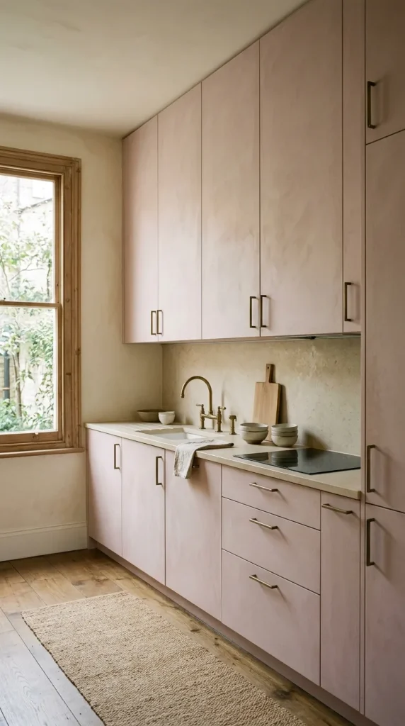
Tip 1: Start with plaster pink instead of obvious blush. A muted, chalky pink reads as sophisticated rather than sweet, and it works as a genuine alternative to the softer whites explored in white kitchen cabinet ideas.
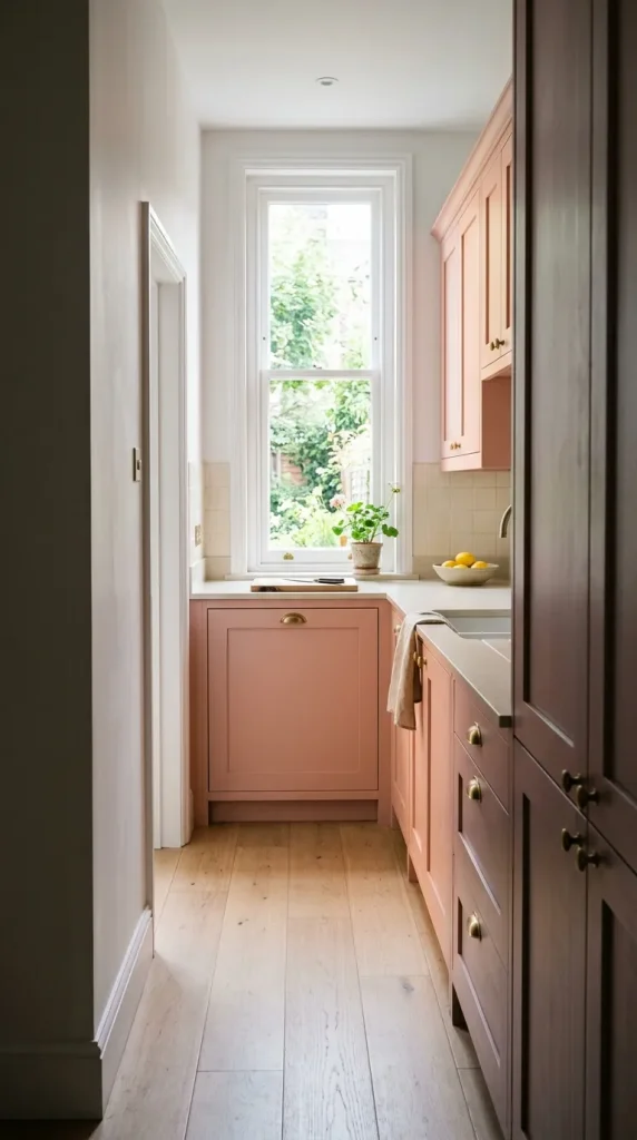
Tip 2: Test undertones carefully. Some pinks lean peach, others lean mauve or gray. The undertone determines whether the color reads as warm or cool once it is on real cabinetry.

Tip 3: Consider clay pink for a more grounded look. Clay-toned pinks sit closer to terracotta than to blush, giving them an earthier, more architectural feel.
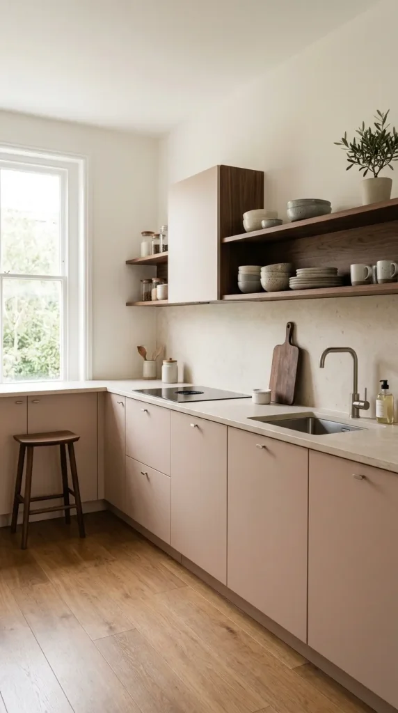
Tip 4: Use pink-beige as a bridge color. If a full pink kitchen feels risky, pink-beige gives most of the warmth with much of the neutrality of a true beige.
Choose where the pink goes

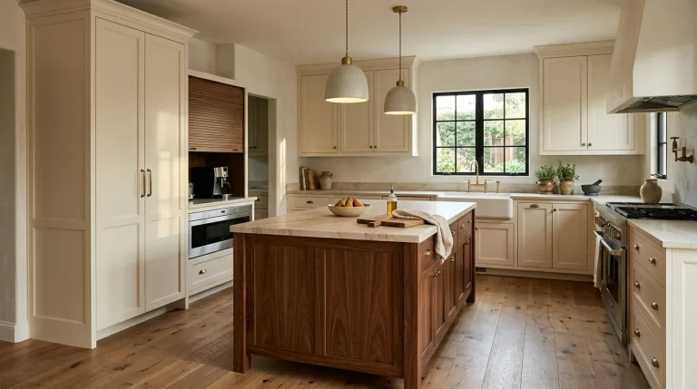
Tip 5: Use pink selectively rather than on every cabinet. A pink island against cream or walnut perimeter cabinetry is one of the most effective ways to use the color intentionally instead of automatically applying one shade everywhere. A pink island is especially effective with cream cabinetry and burgundy-veined stone, walnut cabinetry with a plaster-pink island, or warm white with a pink island and bronze hardware. It is also relatively easy to repaint later.
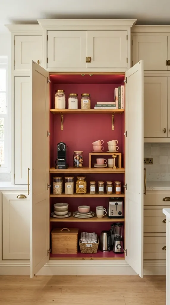
Tip 6: Use pink inside a pantry or breakfast cupboard. A concealed pantry is a great place for a stronger pink. Try rose, coral-pink, salmon, or even a warmer raspberry inside cabinetry that remains closed much of the day. When the doors open, the color feels intentional and surprising. This is also useful if the main kitchen needs to remain more neutral for resale or household preferences.
Give pale pink something darker to react against
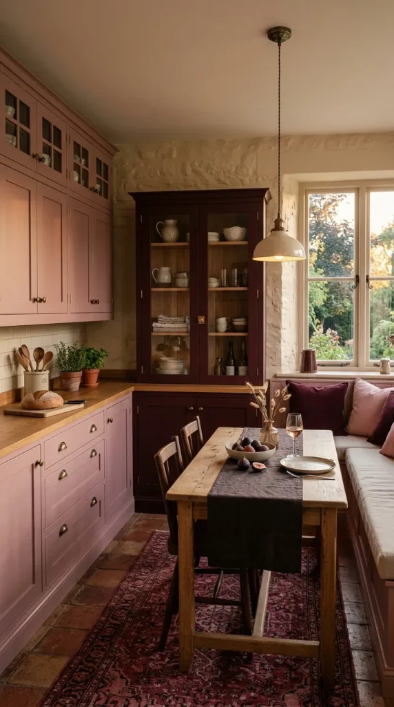
Tip 7: Pair pink with burgundy or oxblood. Pink and burgundy belong to the same color family, which makes the pairing feel cohesive rather than clashing, while still adding real depth.

Tip 8: Add dark stone countertops. A dark, veined, or honed stone counter keeps a pink kitchen from feeling flat or overly sweet, similar to the high-contrast pairings covered in blue kitchen cabinet ideas, where a darker surface gives a lighter cabinet color much more definition.
Choose hardware with intention
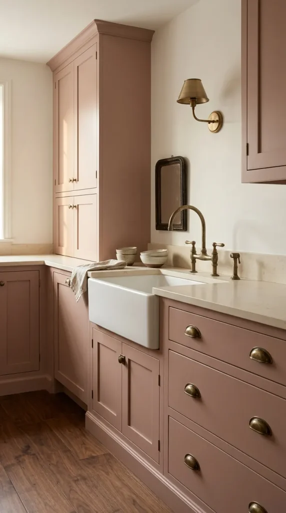
Tip 9: Use warm brass for a richer, collected look. Brass hardware amplifies the warmth already present in most pinks, creating a cohesive, layered feel.
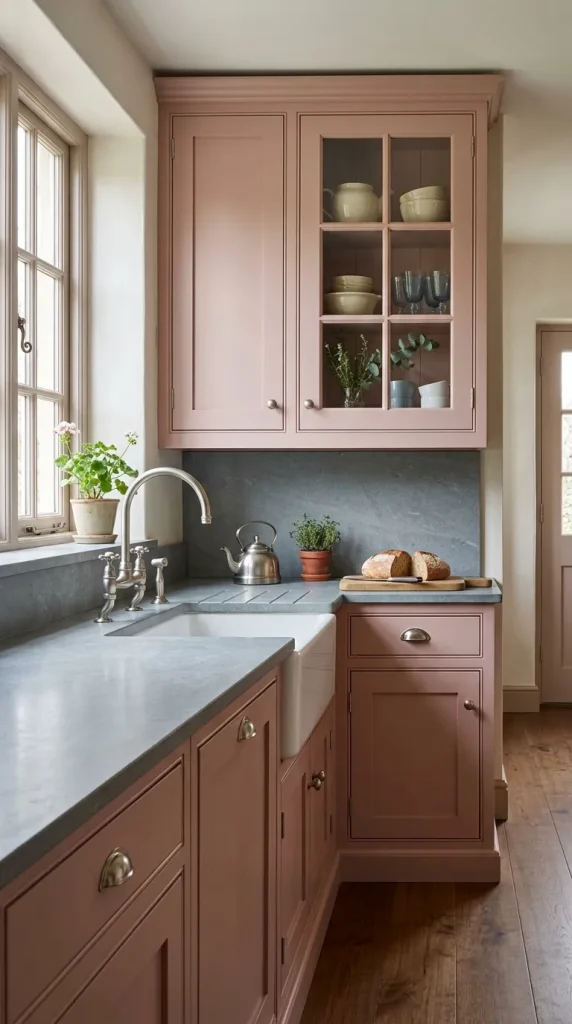
Tip 10: Use nickel for a cleaner, more tailored character. Polished or brushed nickel gives dusty rose and plaster pink a cleaner, slightly more tailored character. This works particularly well with blue-gray stone, traditional cabinetry, or a more English-inspired kitchen. Nickel also helps if the room already contains substantial warm wood and you do not want every material leaning yellow or brown. The overall goal is balance: pink provides warmth already, so sometimes a cooler metal is exactly what the room needs.

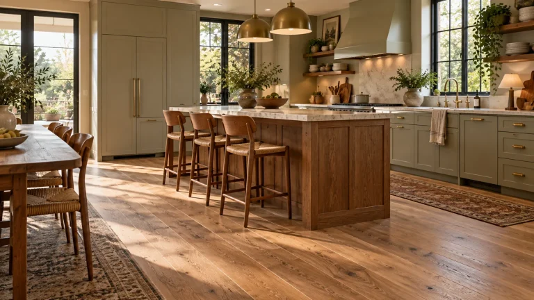
Tip 11: Ground the room with the right flooring. A floor chosen using the same reasoning covered in kitchen flooring ideas keeps a pink kitchen from floating; warm wood or a checkerboard tile floor gives the room enough structure to carry a bolder cabinet color.
Tip 12: Repeat one accent metal throughout the room. Consistency in hardware, faucets, and lighting keeps a colorful kitchen from feeling scattered.
Bring in a second color that changes the personality

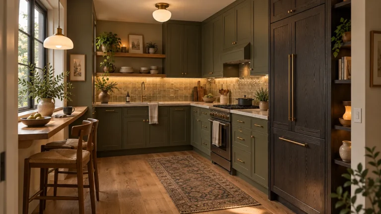
Tip 13: Combine pink with olive or moss green. Pink and green work because they offer clear color contrast while both can be softened into earthy versions. Try dusty pink with olive rather than bright pink with emerald: pink cabinets with an olive pantry, plaster-pink walls with a moss-green island, or dusty rose with green marble and walnut. This creates a kitchen that feels garden-inspired without becoming floral. Keep the shades slightly muddy rather than saturated.

Tip 14: Try pink with chocolate brown for richness. A deep chocolate brown grounds pink in a way that feels current and slightly moody, without losing the warmth pink brings to the room.
What should you avoid?
Tip 15: Avoid choosing pink from a tiny paint chip. Undertones become especially obvious beside flooring and stone, so always test a larger sample in the actual room.
Tip 16: Do not assume pale pink has to feel feminine or sweet. Material pairings determine the character. Pink with blackened wood and stone feels completely different from pink with white marble and gold.

Try this if your pink kitchen feels too sweet
Do not repaint the cabinets immediately. First, remove most of the pink accessories. Bring in one substantial dark element through wood, stone, stools, or lighting. If the backsplash and countertop are both very pale, add visual weight through one of them. Replace some polished gold with bronze, nickel, wood, or ceramic. Then add a third color, preferably olive, burgundy, chocolate, or mushroom.
Finally, reassess the pink itself. Very often the cabinetry is perfectly usable. It simply needs stronger materials around it.
Are pink kitchens in style in 2026?
Yes. Soft pink kitchen cabinetry is specifically returning in 2026, particularly muted, neutral-leaning shades used alongside natural materials to keep the overall palette grounded.
If you make one change first, place something dark and natural beside your pink surface. A walnut board, chocolate stool, burgundy textile, or piece of warm stone can quickly reveal how much richer the color becomes with contrast.
Pink kitchens are particularly compelling in 2026 because they offer something white kitchens cannot quite provide: brightness with warmth already built in.