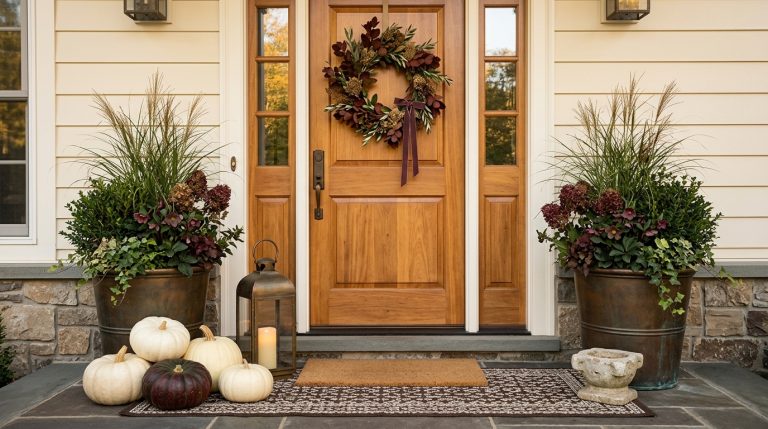
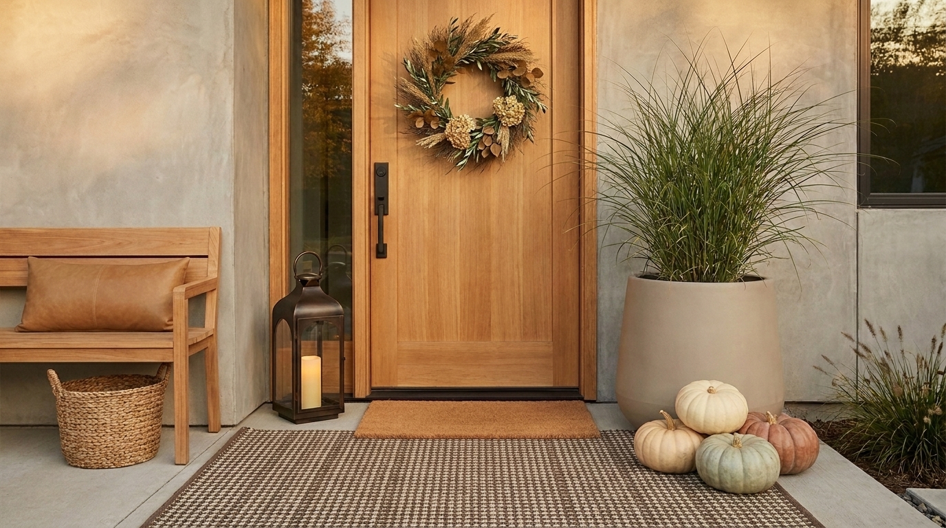
22 Neutral Fall Front Porch Ideas for a Warm, Calm Autumn Entrance
Neutral fall decorating works best when it does not look like someone simply removed the orange. Cream pumpkins, beige cushions, and a tan rug can still feel flat if every surface has the same temperature and texture.
The stronger approach is to build neutral fall front porch ideas around layered warm whites, mushroom, taupe, caramel, weathered wood, olive, chocolate brown, stone, woven fibers, and dried foliage. That direction also fits 2026 design well, and pairs naturally with modern minimalist styling. Current fall trend coverage is moving beyond flat beige toward richer caramel, mushroom, chocolate, creamy white, muted green, and warm wood.
The goal is calm, not colorless. These 22 ideas show how to create a neutral porch that still has enough contrast, scale, and autumn texture to feel finished.
Build a warmer neutral color palette
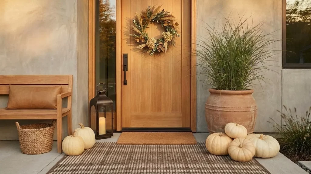
Idea 1: Start with cream instead of stark white
White pumpkins are an obvious choice for a neutral porch, but bright optic white can look surprisingly cold outdoors. Cream, ivory, parchment, and warm off-white usually blend more naturally with:
- Wood
- Brick
- Terracotta
- Straw
- Brown coir
- Weathered stone
Current 2026 design reporting favors creamy whites and warmer earth-based neutrals over cool gray and sharp white.
If your house exterior is already white, use pumpkins that are slightly warmer than the siding so they do not disappear against it.

Idea 2: Use mushroom and taupe as your middle tones
A neutral porch needs something between pale cream and dark brown. Mushroom and taupe are useful because they have more depth than conventional beige without becoming obvious accent colors.
Bring those shades in through:
- Planters
- Outdoor cushions
- A rug
- Painted crates
- Dried foliage
These middle tones stop cream pumpkins from floating against the porch.
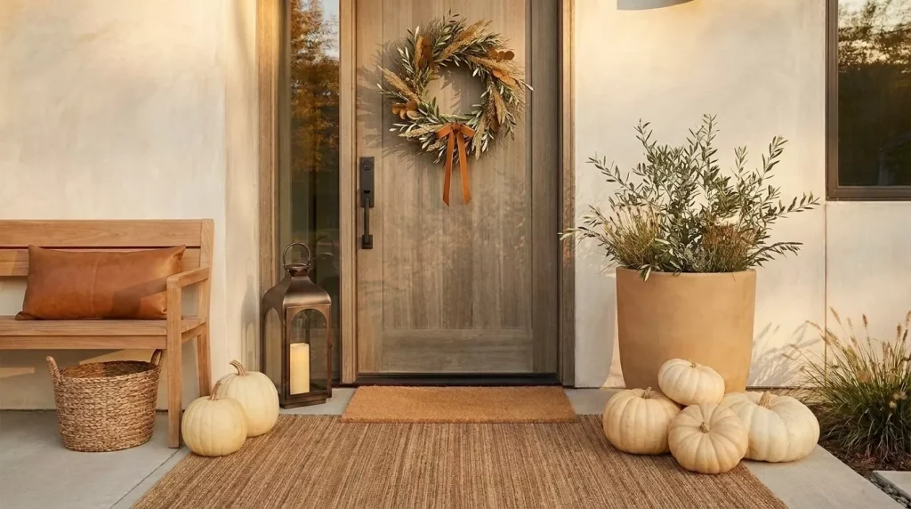
Idea 3: Add caramel instead of another layer of beige
A neutral palette needs warmth. Caramel, camel, honey, and tan can provide it without taking the porch into obvious orange.
Try a caramel bench cushion against a cream wall. Or pair a tan planter with white pumpkins and olive foliage. It feels autumnal without becoming a conventional orange-and-yellow display.
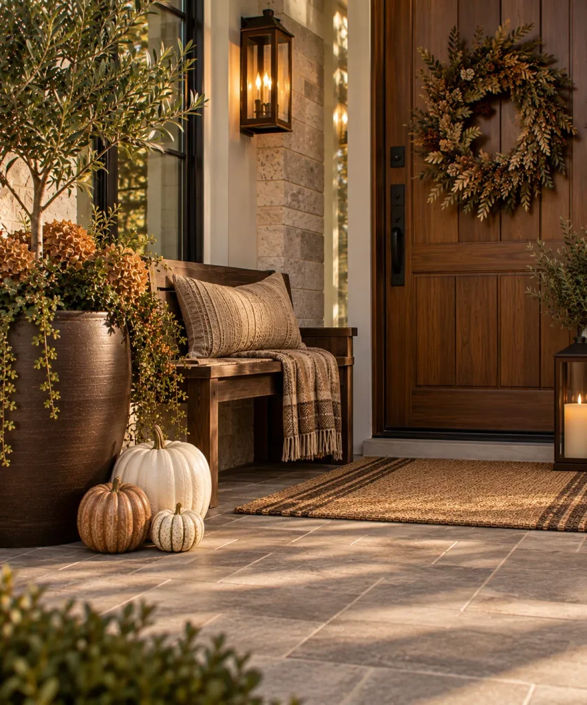
Idea 4: Use chocolate brown as the darkest anchor
Every neutral scheme needs contrast. Instead of defaulting to black, try chocolate, espresso, walnut, or deep tobacco brown.
Use the dark brown sparingly:
- One planter
- A bench
- A lantern
- A striped rug
- A dark wood door
That is usually enough to give the lighter pieces definition.
Use neutral pumpkins with better scale

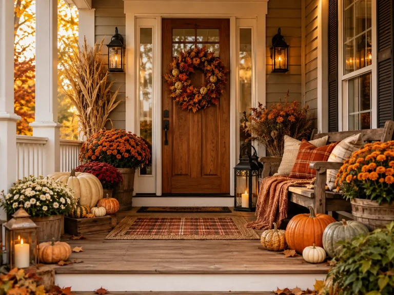
Idea 5: Group cream pumpkins in three different shapes
Avoid lining up six identical white pumpkins. Use a tighter cluster containing: one tall pumpkin, one wide flattened pumpkin, one small gourd.
The difference in form creates interest even when the colors are similar. Neutral porch styling works particularly well when shape replaces color as the main source of variation.
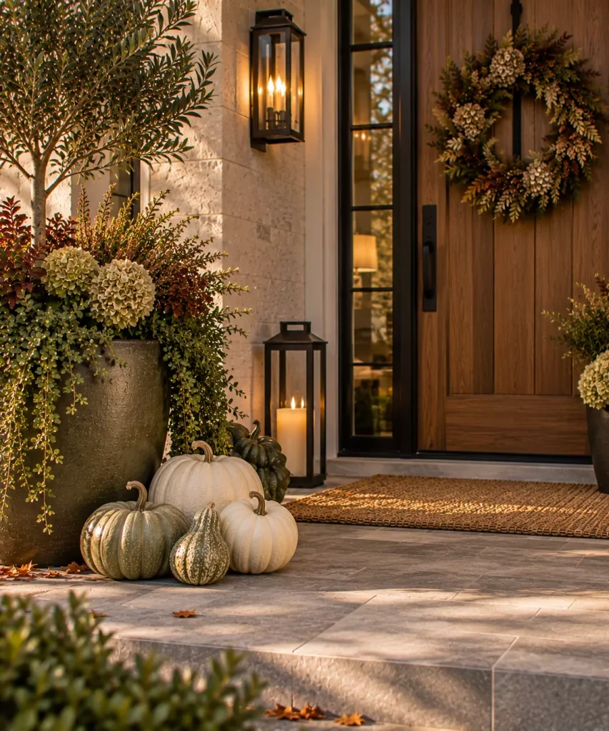
Idea 6: Mix white pumpkins with pale green gourds
Neutral does not have to mean beige-only. Soft sage and muted green behave almost like neutrals outdoors because they connect naturally to foliage.
A simple combination might be: three cream pumpkins, two pale green gourds, one dark olive planter. That is enough color variation without losing the quiet palette.

Idea 7: Add one muted orange pumpkin if the display looks too pale
Neutral does not require banning orange. If the porch looks washed out, add one muted rust, clay, or terracotta pumpkin.
The point is to soften the traditional fall palette, not erase every recognizable autumn color. Place it among cream pumpkins so the warmer note looks intentional rather than accidental.
Let texture do the work
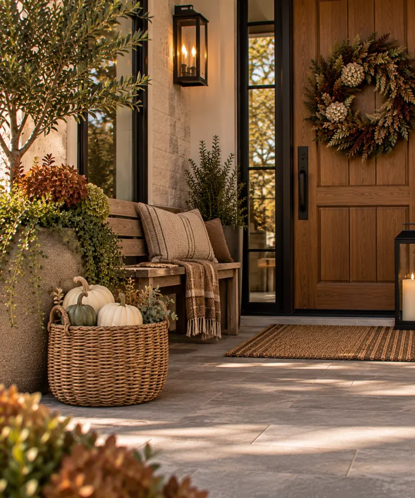
Idea 8: Use a woven basket to soften hard surfaces
A basket introduces several things at once:
- Warm brown
- Texture
- Irregularity
- A softer outline
Use one on a covered porch to hold a nursery pot, pumpkins, or folded outdoor textiles. If the porch is exposed, choose a weather-resistant woven container rather than an indoor natural-fiber basket.
Neutral decor depends heavily on texture because there is less color contrast available to create depth.

Idea 9: Keep natural wood visible
Wood may be the easiest neutral autumn material of all. A medium-oak bench, weathered crate, walnut-toned stool, or natural timber door creates warmth without adding another seasonal decoration.
Do not paint a useful wood piece cream simply because the rest of the porch is neutral. The grain is doing important visual work.
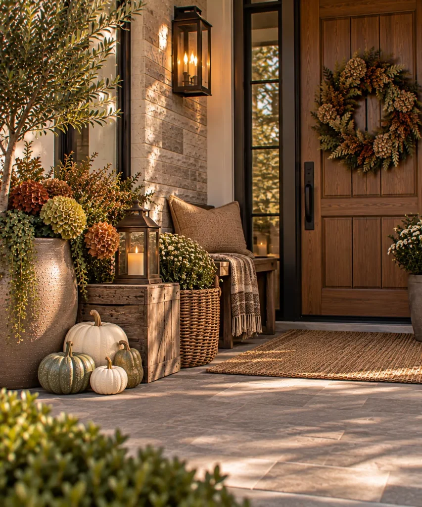
Idea 10: Mix rough and smooth materials
If everything is soft beige fabric and matte pumpkins, the porch may still feel flat. Combine surfaces, for example:
- Rough wood crate
- Smooth ceramic planter
- Woven basket
- Matte cream pumpkin
- Aged metal lantern
- Soft outdoor cushion
That principle is particularly helpful in low-color schemes.
Build the porch around neutral plants
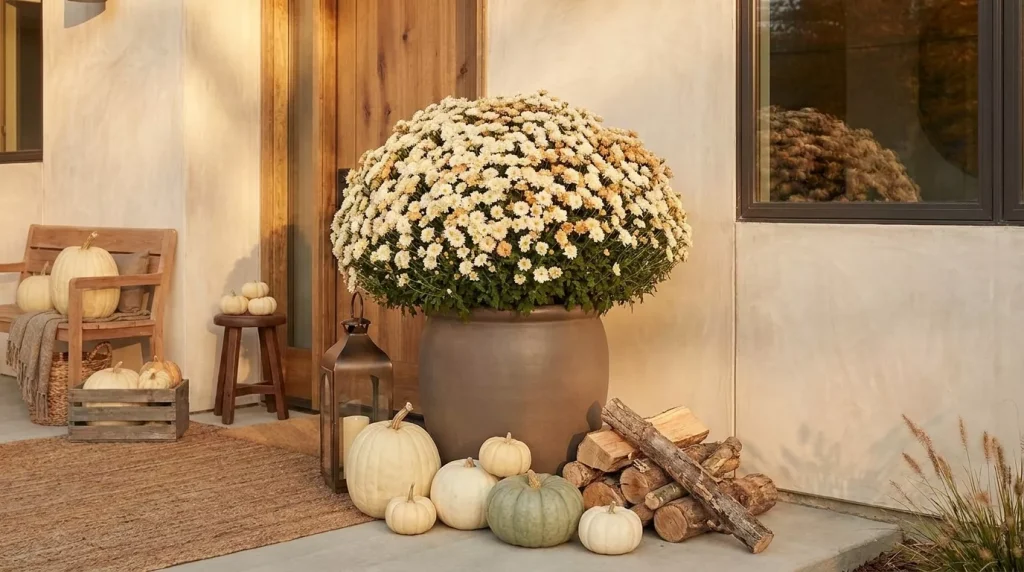
Idea 11: Use cream mums instead of bright yellow
Cream or white mums give you seasonal fullness without pushing the porch into a strong traditional palette. Place one large plant in a brown, mushroom, or dark taupe container. Then add pale pumpkins around the base.
One substantial mum often works better than several small pots because the arrangement remains visually calm.
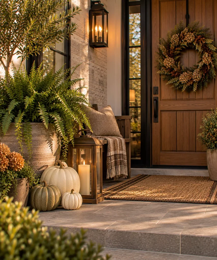
Idea 12: Keep ferns for a green neutral layer
A healthy fern can prevent a pale neutral porch from feeling lifeless. Deep green acts almost as a natural neutral outdoors. Keep the fern from summer and surround it with:
- Cream pumpkins
- A taupe pot
- Wood
- One bronze lantern
This is also more economical than replacing healthy seasonal plants simply to change color.

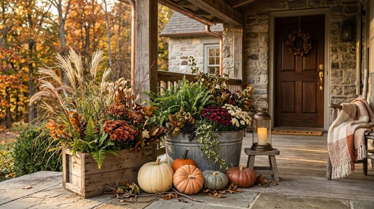
Idea 13: Use ornamental grasses for a drier neutral look
Ornamental grasses can introduce straw, oat, and wheat tones naturally. Place one tall grass in a dark brown or stone-colored pot and keep the rest of the display low.
This works especially well for modern neutral porches because grasses have strong shape without requiring flowers.
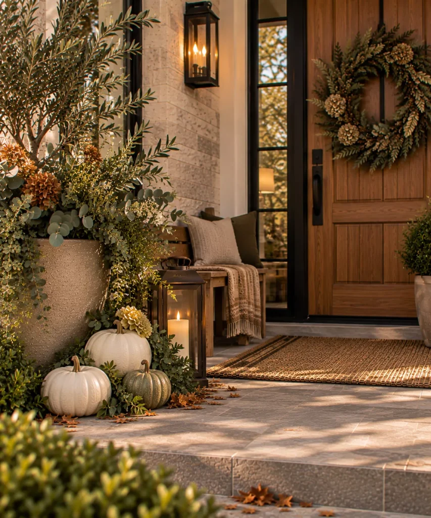
Idea 14: Add olive through foliage rather than decor
Instead of buying an olive-colored cushion, consider introducing the color through actual plant material. Olive, eucalyptus-like foliage, muted evergreen branches, or other suitable greenery can provide a quiet bridge between cream and brown.
Keep the doorway simple
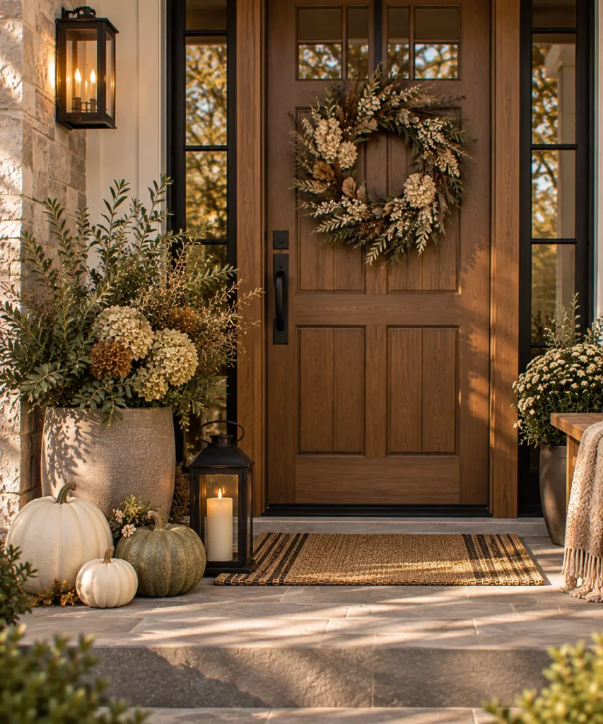
Idea 15: Hang a restrained neutral wreath
Choose a wreath with a narrow palette. Good options include:
- Dried grasses
- Olive foliage
- Muted brown leaves
- Cream berries
- Twigs
- Pale hydrangea
A neutral wreath should complement the door rather than cover most of it.
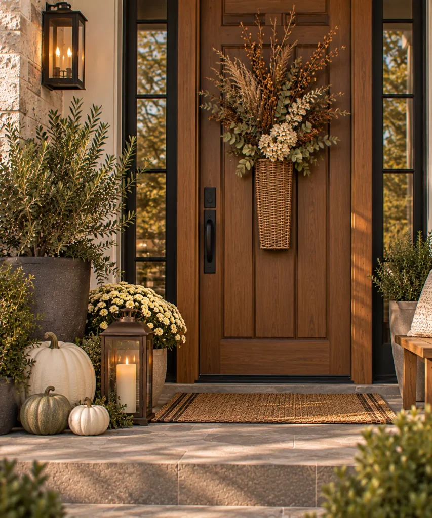
Idea 16: Use a branch-filled door basket instead of a wreath
A narrow door basket can look particularly good on warm white, black, brown, or olive doors. Fill it with:
- Dried grasses
- Branches
- Seed heads
- Neutral faux foliage
Keep the arrangement relatively vertical. This is a useful alternative if a round wreath feels too traditional for the rest of your porch.
Add neutral pattern at floor level
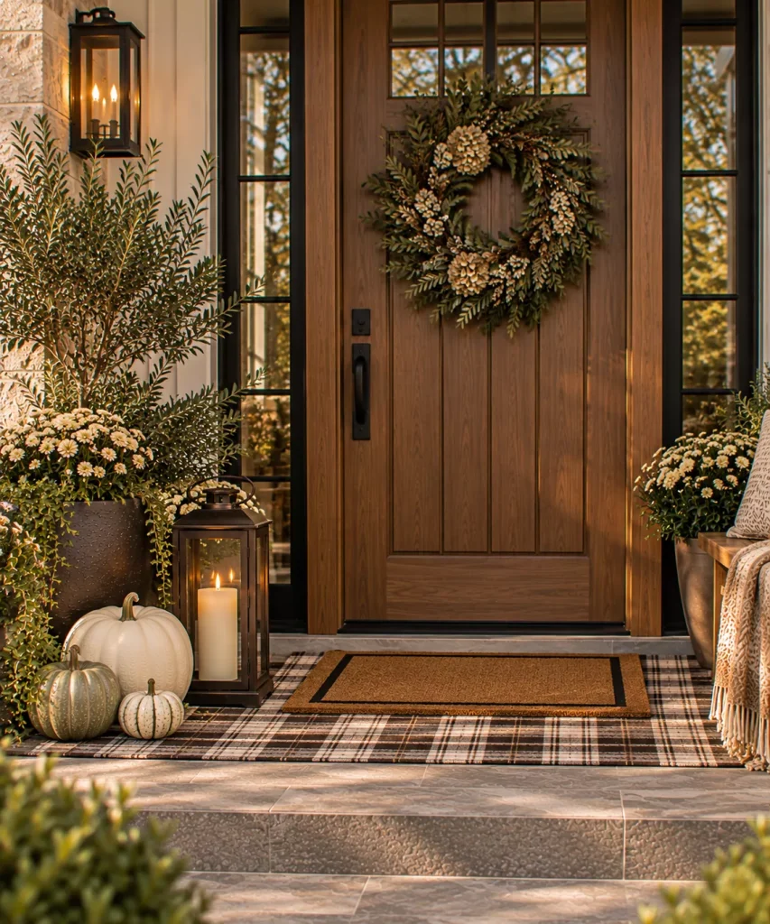
Idea 17: Layer a brown-and-cream rug under the doormat
One of the easiest ways to make a neutral porch feel less flat is to introduce pattern rather than color. Try:
- Brown + cream plaid
- Taupe + ivory stripe
- Olive + oatmeal check
- Charcoal + camel geometric
Make sure both layers sit flat and the door opens cleanly over them.
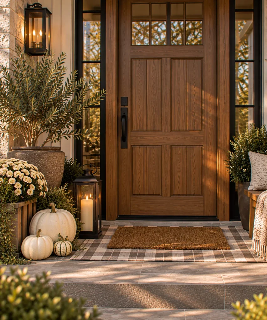
Idea 18: Use a plain coir mat if the rug already has pattern
You do not need words on every surface. If the lower rug has a visible stripe or check, use a simple natural coir mat above it.
The rough brown fiber gives you texture and warmth while the lower rug provides the pattern. That combination is usually calmer than pairing a plaid rug with a heavily illustrated fall doormat.
Add seating without making it beige-on-beige

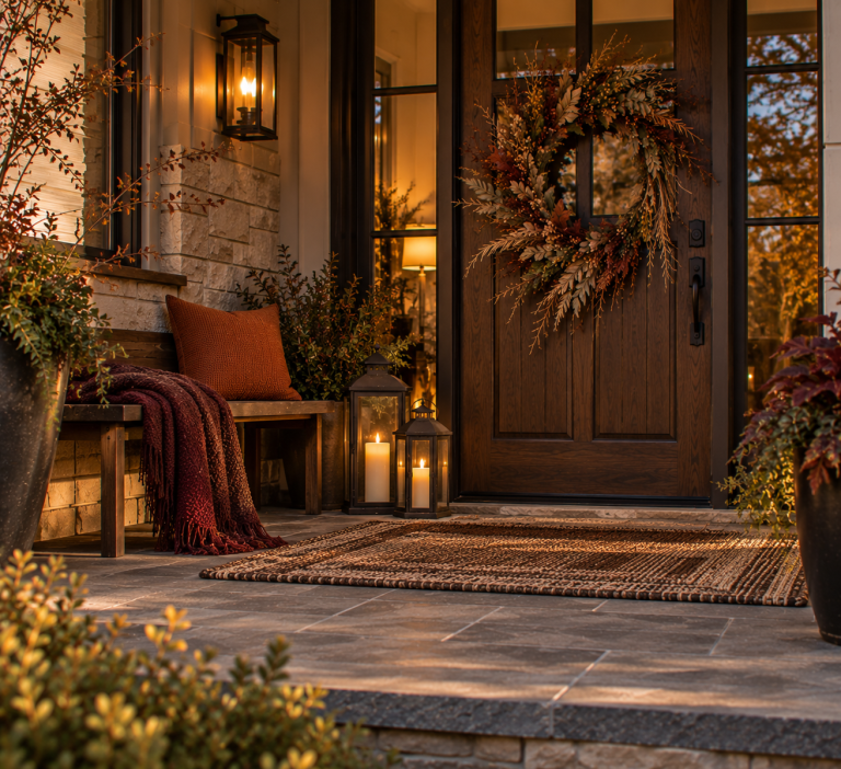
Idea 19: Use one mushroom or camel cushion on a wood bench
A neutral bench setup does not need five pillows. Use one substantial cushion in:
- Mushroom
- Camel
- Taupe
- Olive-gray
- Chocolate stripe
Leave most of the bench usable. Put pumpkins and baskets on the floor instead.

Idea 20: Add one patterned textile for contrast
A neutral porch still needs rhythm. Try one:
- Brown plaid cushion
- Subtle stripe
- Small-scale herringbone
- Muted botanical print
Keep everything else quiet. One restrained pattern usually does more than five beige pillows.
Finish with deeper metal and light
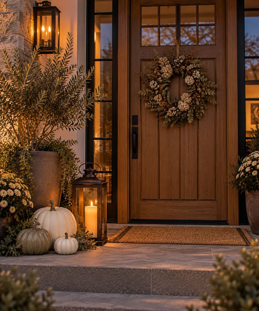
Idea 21: Use bronze or dark brown lanterns
Black lanterns work, but aged bronze or deep brown metal can feel softer in a neutral scheme. Place one near a pumpkin cluster or beside a planter. Use a warm flameless candle.
The dark frame creates enough contrast to stop cream and taupe decor from blending together after sunset. Avoid adding lanterns purely to fill empty corners.
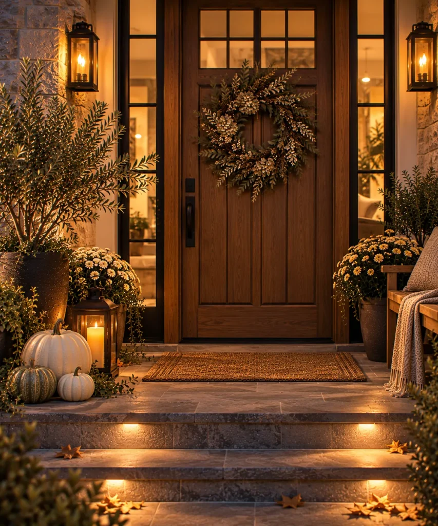
Idea 22: Use warm evening light to keep neutrals from looking gray
Neutral porches can change dramatically after dark. Cool, blue-white porch light can make warm cream and mushroom shades look dull.
Use appropriately warm exterior lighting while maintaining enough brightness for steps, locks, visitors, and deliveries. Decorative lighting should remain secondary to safe functional illumination.
Four neutral fall porch palettes that actually have contrast
| Palette | Light tone | Middle tone | Dark anchor | Natural accent |
|---|---|---|---|---|
| Warm Classic | Cream | Camel | Chocolate | Olive |
| Modern Neutral | Ivory | Mushroom | Charcoal | Sage |
| Rustic Neutral | Oatmeal | Weathered wood | Espresso | Dried grass |
| Soft Farmhouse | Warm white | Taupe | Bronze | Fern green |
Notice that none of these palettes contains six shades of beige. A successful neutral scheme still needs light, middle, and dark values.
What should you avoid?
- Do not make everything the same beige. Neutral rooms and porches still need contrast.
- Do not buy every pumpkin in white. Mix cream with pale green, tan, or one muted rust piece.
- Do not rely entirely on color. Use wood grain, woven fibers, metal, ceramic, grasses, and foliage.
- Do not cover furniture with decor. Keep benches and chairs usable.
- Do not confuse neutral with sterile. Warmth should come from material, texture, shape, and light.
Try this if your neutral porch looks washed out
Take a photograph of the porch. Now look for three values: light, medium, dark.
If everything is light, add a chocolate planter, bronze lantern, dark wood stool, or olive plant. If everything is medium beige, introduce cream pumpkins for highlight and espresso or charcoal for contrast.
Then check texture. If the surfaces all look smooth, bring in a woven basket, rough wood, dried grass, or coir.
Usually a neutral porch needs contrast more than it needs another decorative object.
FAQ
How do you decorate a front porch for fall with neutral colors?
Start with cream or pale pumpkins, then introduce warm middle tones such as mushroom, taupe, camel, or weathered wood. Add contrast with chocolate brown, bronze, olive foliage, or charcoal.
What colors work for neutral fall porch decor?
Cream, ivory, mushroom, taupe, camel, caramel, chocolate brown, olive, sage, warm gray, and weathered wood all work well. The key is mixing different values so the porch does not become one continuous beige surface.
Can I decorate a neutral fall porch without orange pumpkins?
Yes. White and cream pumpkins, pale green gourds, foliage, grasses, wood, baskets, wreaths, and warm lighting can create an unmistakably autumnal entrance. You can also add one muted terracotta or rust piece if the display needs warmth.
How do you stop neutral fall decor from looking boring?
Use contrast and texture. Combine smooth pumpkins with rough wood, woven baskets, grasses, ceramic planters, coir, dark metal, and foliage. Also include one darker anchor such as chocolate brown or bronze.
Neutral should feel layered, not empty
The strongest neutral fall decor ideas for a front porch are rarely the palest ones. They use cream beside mushroom, mushroom beside walnut, walnut beside olive.
And those colors are carried through materials that feel different in your hand, not just different on a paint chart.
If you make one change first, stop asking whether every object is neutral and ask whether the porch has enough contrast.
A cream pumpkin looks better beside dark wood. A taupe planter looks richer against green foliage. A beige cushion becomes much more interesting next to a bronze lantern and a striped rug.
That is what keeps a quiet fall entrance from becoming bland.