24 Elegant Fall Front Porch Ideas for a Polished, Glam Autumn Entrance
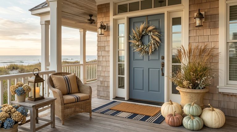
Elegant fall porch decorating works best when the entrance feels considered rather than crowded. You can absolutely use pumpkins, mums, lanterns, wreaths, and seasonal foliage, but the difference comes from proportion, material, and editing.
The strongest elegant fall front porch decorating ideas for 2026 are moving beyond glitter-heavy “glam” decor toward richer materials and more sophisticated color, a direction that pairs naturally with neutral and modern minimalist styling. Oxblood, plum, deep teal, terracotta, warm wood, brass-like metals, blackened finishes, and creamy neutrals all feel more current than covering everything in metallic spray paint.
Here are 24 practical ways to create a polished fall porch that feels luxurious without becoming theatrical.
Start with a sophisticated color palette
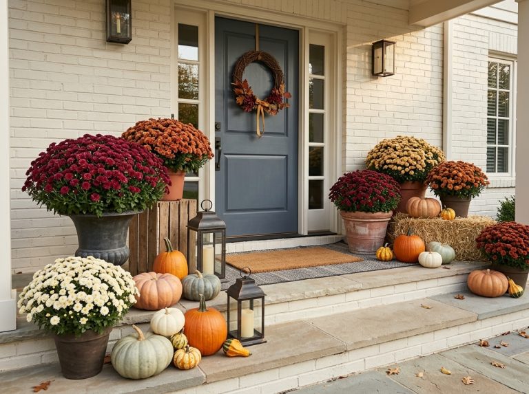
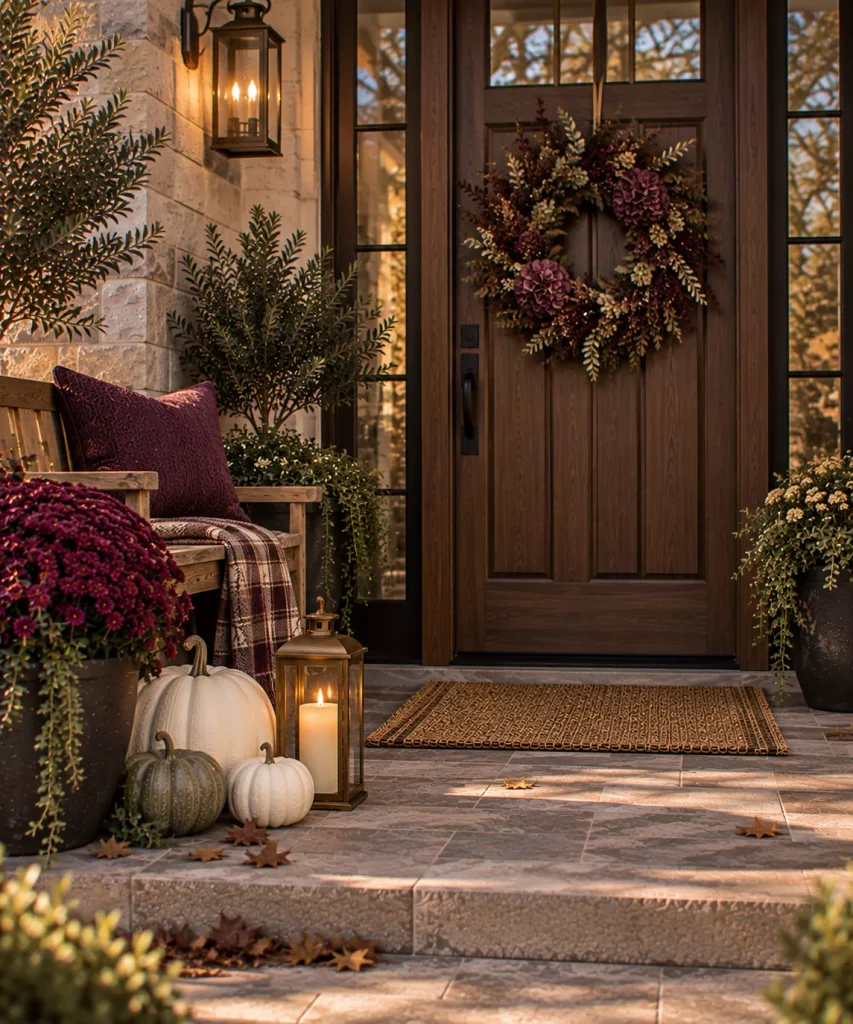
Idea 1: Build the porch around oxblood, cream, and dark green
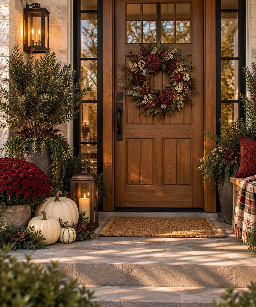
Oxblood is one of the easiest ways to make traditional fall decor feel richer. Use it sparingly through:
- Mums
- Ribbon
- One cushion
- A wreath accent
- A painted planter
Then balance it with cream pumpkins and dark green foliage. The combination feels seasonal without relying on bright orange and yellow.
Idea 2: Try plum with chocolate brown
Plum can give a porch the drama people often want from glam decor without introducing sparkle. Pair a plum-toned floral or textile with chocolate brown, warm stone, and aged brass. Use one plum element as the anchor rather than repeating it everywhere.
Idea 3: Use ivory, bronze, and olive for understated elegance
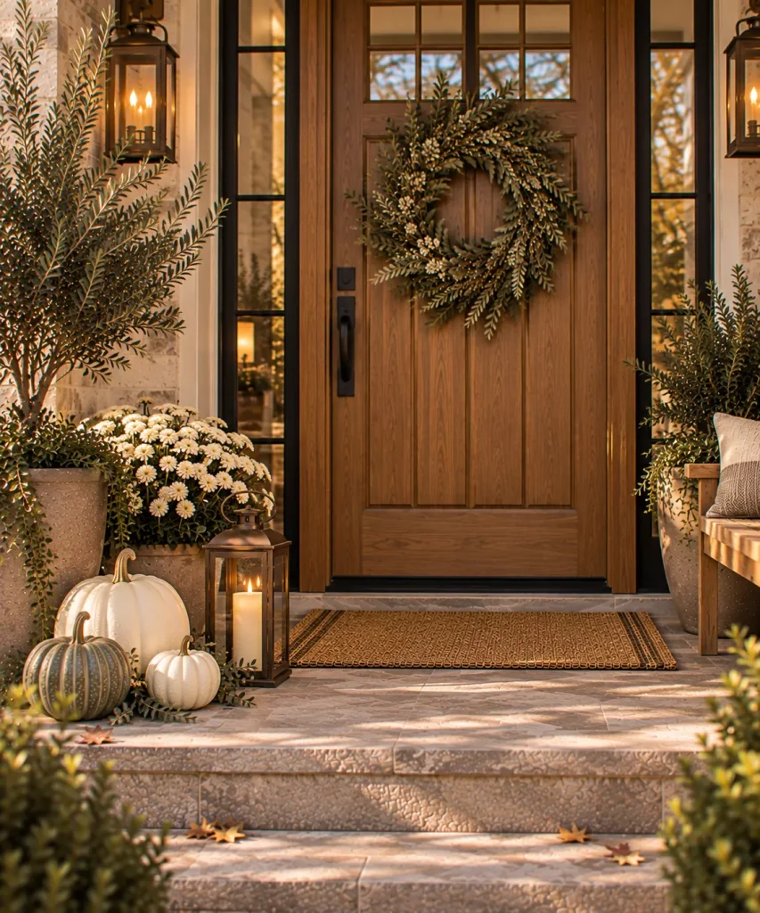
If you prefer a lighter porch, combine warm ivory with aged bronze and olive foliage. That could mean:
- Cream pumpkins
- Bronze lanterns
- Olive wreath
- Warm white mums
- Natural wood door
The palette stays neutral but avoids looking pale or unfinished because the bronze gives the lighter pieces a darker edge.

Idea 4: Add deep teal as one unexpected accent
Deep teal is a strong option if burgundy and rust feel too traditional. Use it in one controlled place, perhaps a planter, cushion, or ribbon. Pair it with cream pumpkins and dark bronze. It can look particularly striking against red brick or warm wood.
Create elegance through symmetry
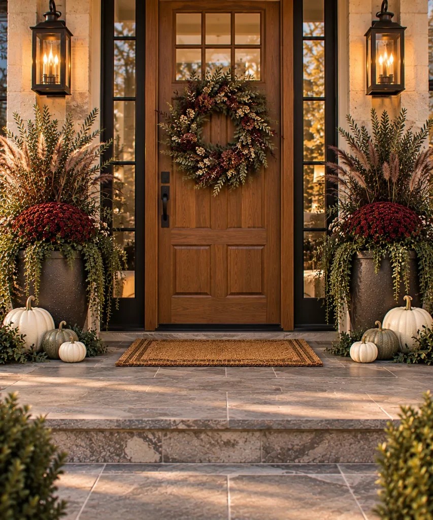
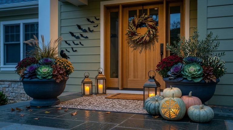
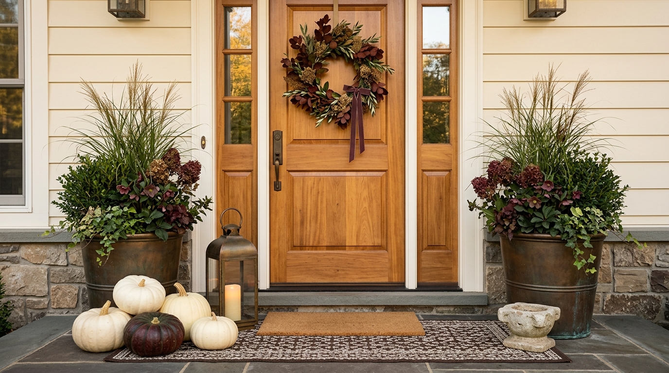
Idea 5: Flank the front door with matching planters
A symmetrical pair of substantial planters immediately gives the entrance structure. Use matching pots containing:
- Mums
- Ornamental grass
- Ferns
- Branches
- Mixed foliage
Keep the plants similar in overall scale even if they are not perfectly identical.
Idea 6: Mirror the pumpkin groupings loosely
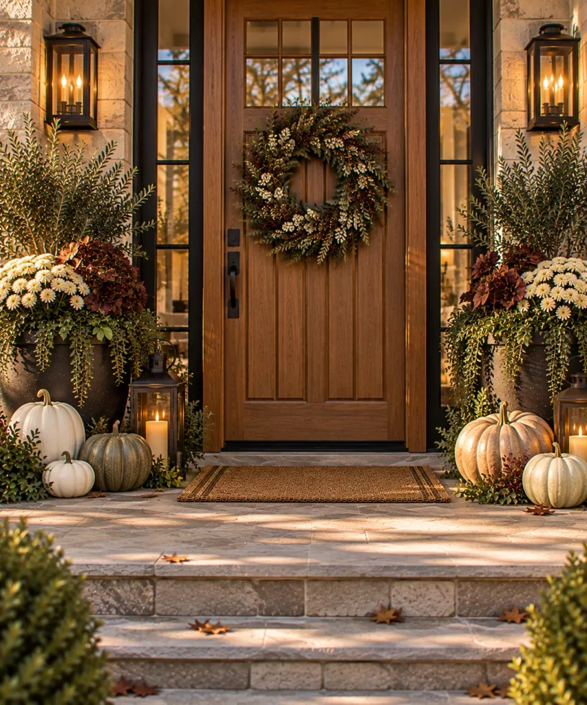
You do not need mathematically identical arrangements. Instead, use similar visual weight. For example: three pumpkins on the left, two larger pumpkins on the right. The number differs, but the total size feels balanced. That keeps symmetry from looking stiff.

Idea 7: Match lantern heights around the doorway
Place one substantial lantern near each planter. If the lanterns are identical, position them at roughly the same level. The repeated dark frame creates a stronger architectural line around the doorway.
Upgrade the planters
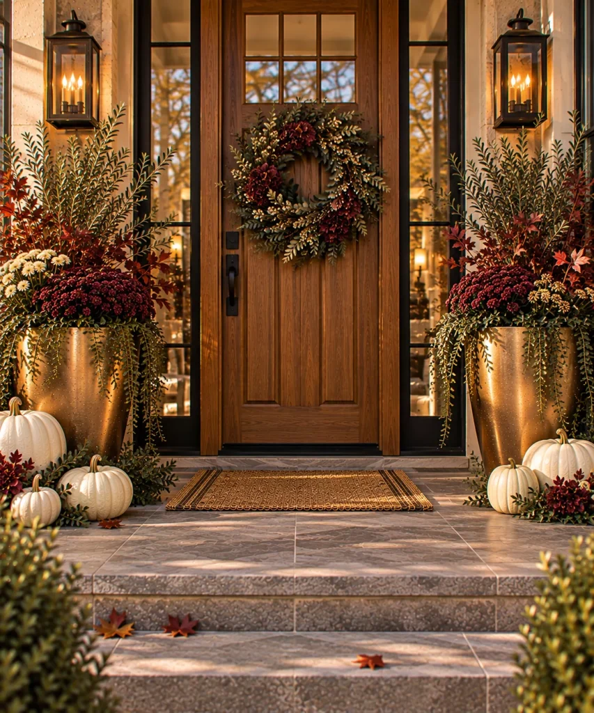
Idea 8: Use metallic-look planters as the glamorous accent
You do not need metallic pumpkins, ribbon, signage, and lanterns all at once. Let the planter carry the polished finish. A warm brass, antique gold, bronze, or copper-colored planter can be enough.
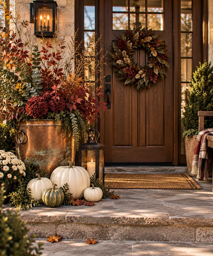
Idea 9: Use copper and allow it to develop patina
Copper feels particularly appropriate in fall because its warm color already resembles the season. Use one copper bucket or planter filled with branches or flowers. Real material with age usually looks more refined than several imitation metallic objects.
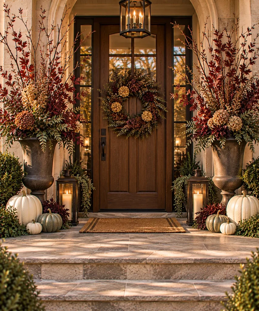
Idea 10: Fill tall urns with sculptural branches
Flowers are not required for an elegant entrance. Put long seasonal branches in a pair of tall urns. Use:
- Burgundy leaves
- Bare branches
- Dried hydrangea
- Olive foliage
- Seed heads
Weight the containers properly if the porch is windy.

Idea 11: Combine foliage rather than using only mums
A mixed planter can feel more tailored than a single round mum. Try ornamental grass for height, plum or burgundy foliage for depth, cream flowers for contrast, and trailing green at the edge.
Make pumpkins look more refined
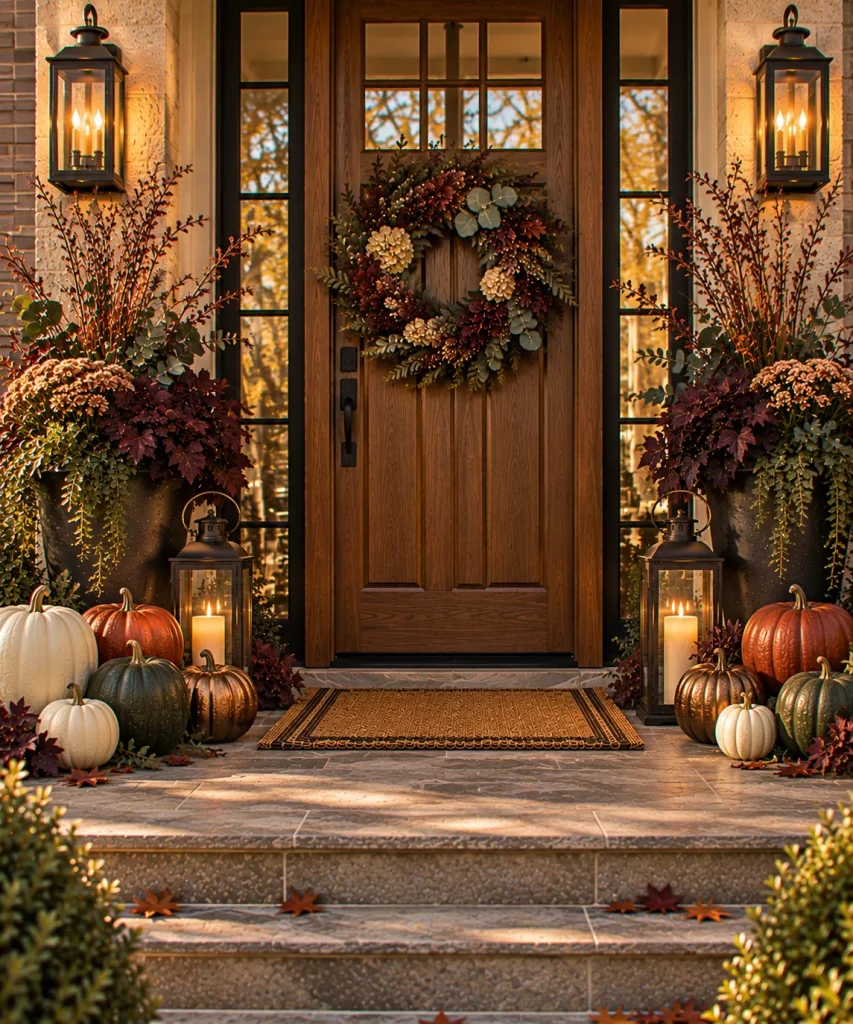
Idea 12: Mix real and metallic-look pumpkins sparingly
If you enjoy glam fall decor, keep the metallic finish to one or two pumpkins. The key is mixing finishes. A whole porch of metallic pumpkins can become theme-party decor very quickly.
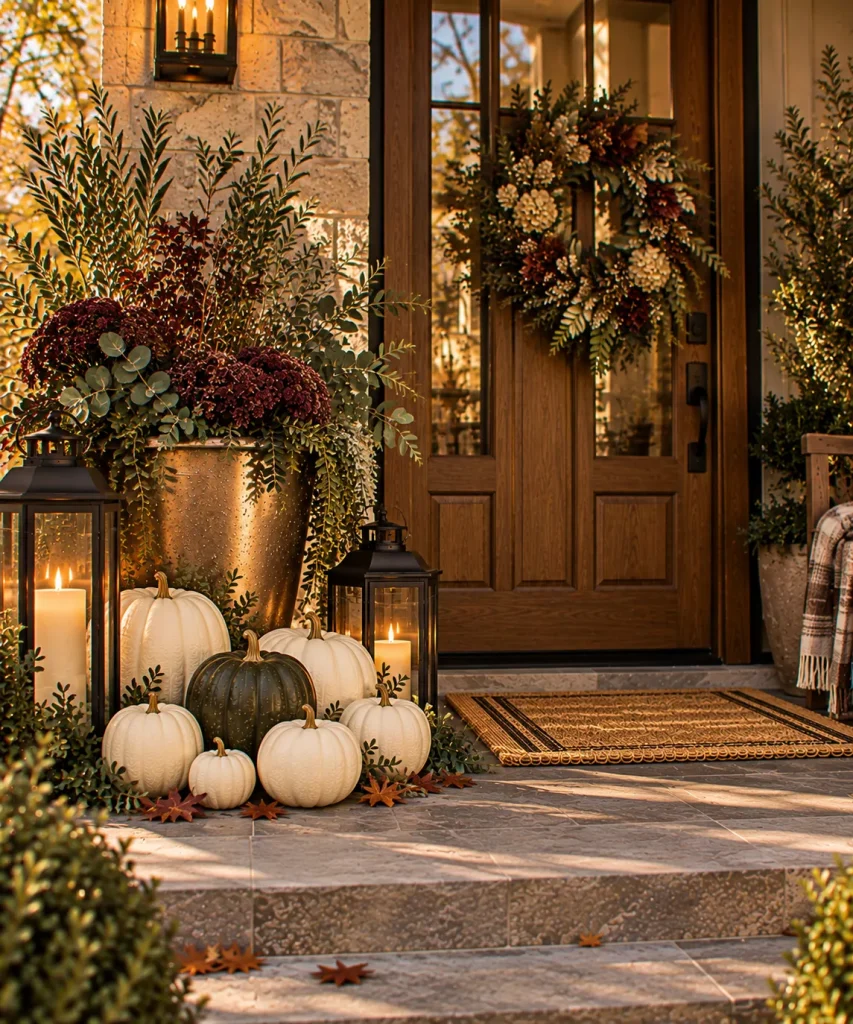
Idea 13: Use mostly ivory pumpkins with one dark accent
A cluster of ivory pumpkins looks especially good beside black lanterns or bronze pots. Add one pumpkin in dark green, muted orange, chocolate, or deep burgundy. That darker shape stops the arrangement from becoming visually flat.
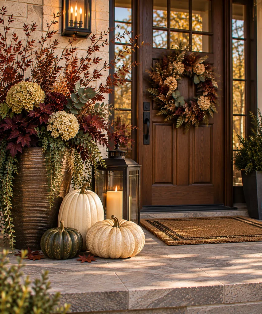
Idea 14: Choose fewer pumpkins in better proportions
Elegant does not mean abundant. Three larger pumpkins can look more polished than fifteen miniatures. Use one tall pumpkin, one broad pumpkin, and one smaller accent. Place them close together rather than scattering them across the porch.
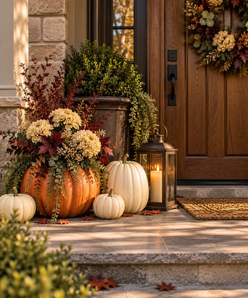
Idea 15: Use pumpkin planters for one special detail
A real pumpkin can become a temporary flower container. Use this as one focal detail rather than making every pumpkin a planter. Because cutting shortens the pumpkin’s lifespan, save the project for the period when you want the porch looking its best.
Make the doorway itself more polished
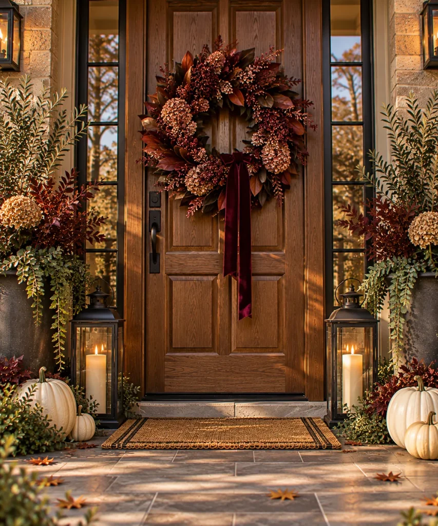
Idea 16: Choose a wreath with one strong material story
A glamorous wreath does not need glitter. Try:
- Burgundy foliage
- Dried hydrangea
- Dark berries
- Magnolia leaves
- Olive foliage with velvet ribbon
A single material direction feels more sophisticated than combining every fall motif into one wreath. Keep the scale proportional to the door.

Idea 17: Use velvet ribbon as the luxe detail
Velvet is one of the easiest ways to introduce glamour without adding more objects. Use a single generous ribbon on a wreath or door basket. Good colors include oxblood, plum, chocolate, olive, and deep teal. The richness comes from texture, not shine.
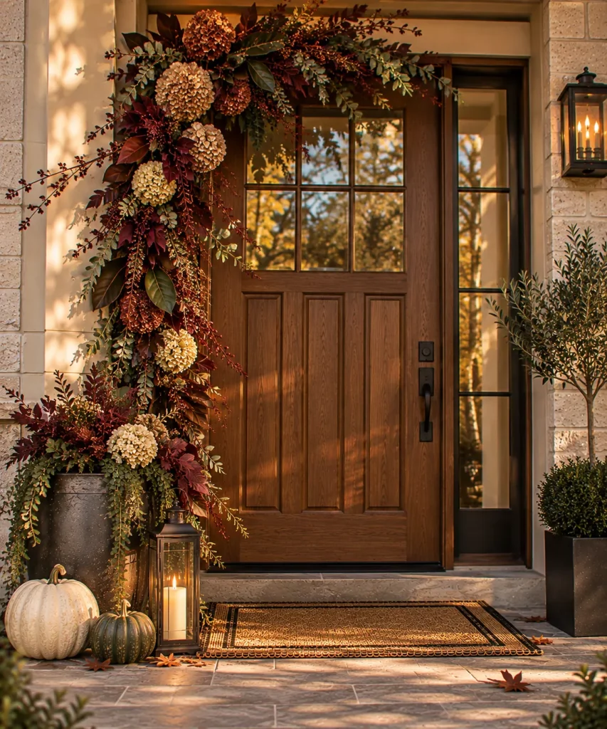
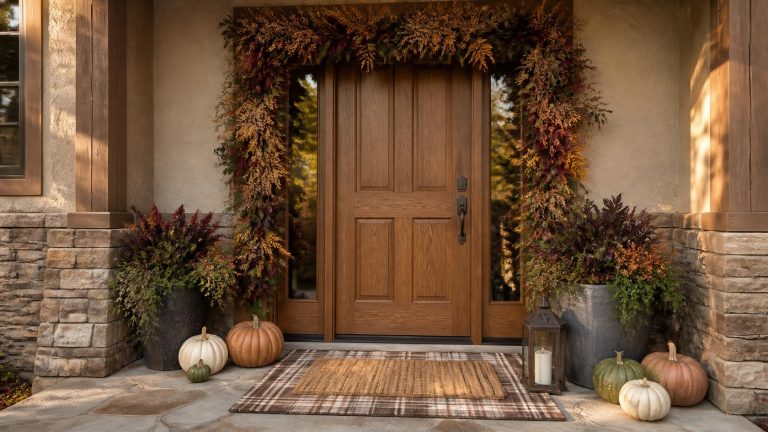
Idea 18: Keep the garland asymmetrical
If you want a more dramatic doorway, use a garland concentrated around one upper corner. Let it descend along one side of the frame. Then place a large planter beneath the lower end. This gives you visual movement without making the whole doorway feel heavily decorated.
Make lanterns look intentional
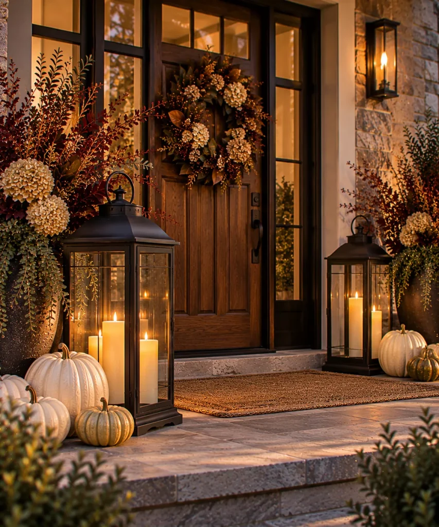
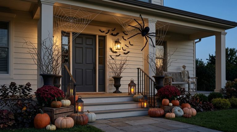
Idea 19: Use oversized dark lanterns
A substantial black or antique-bronze lantern often looks more expensive than several small decorative ones. Use warm flameless candles inside.
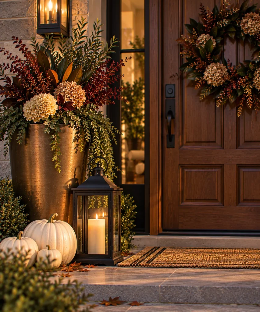
Idea 20: Put lanterns below polished planters
This high-and-low contrast works particularly well for elegant porches. Place the planter at eye level. Then use one lantern and a small pumpkin cluster at the base. It creates layers without requiring a large number of objects.
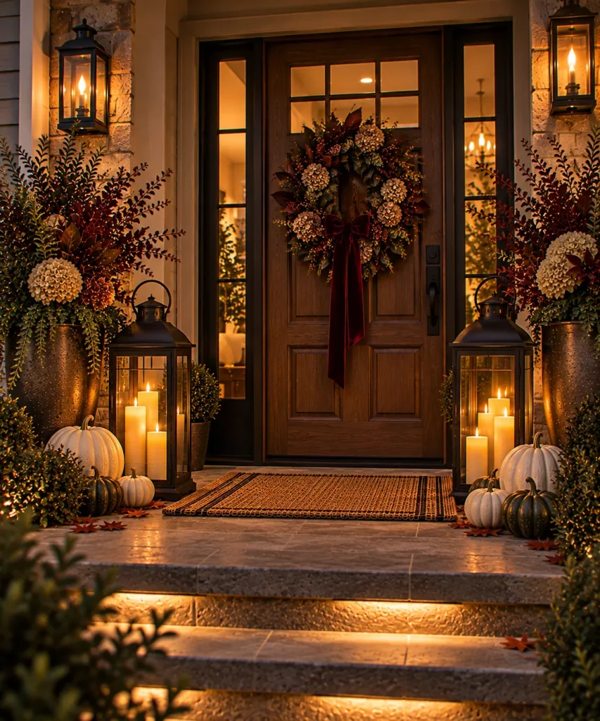
Idea 21: Keep decorative light warm and subdued
Glamour looks better in soft light than beneath an extremely bright cool bulb. Let the main exterior fixture provide the functional illumination required for the door and steps. Then use lanterns with warm LED candles as the secondary layer.
Add softness without making the porch fussy
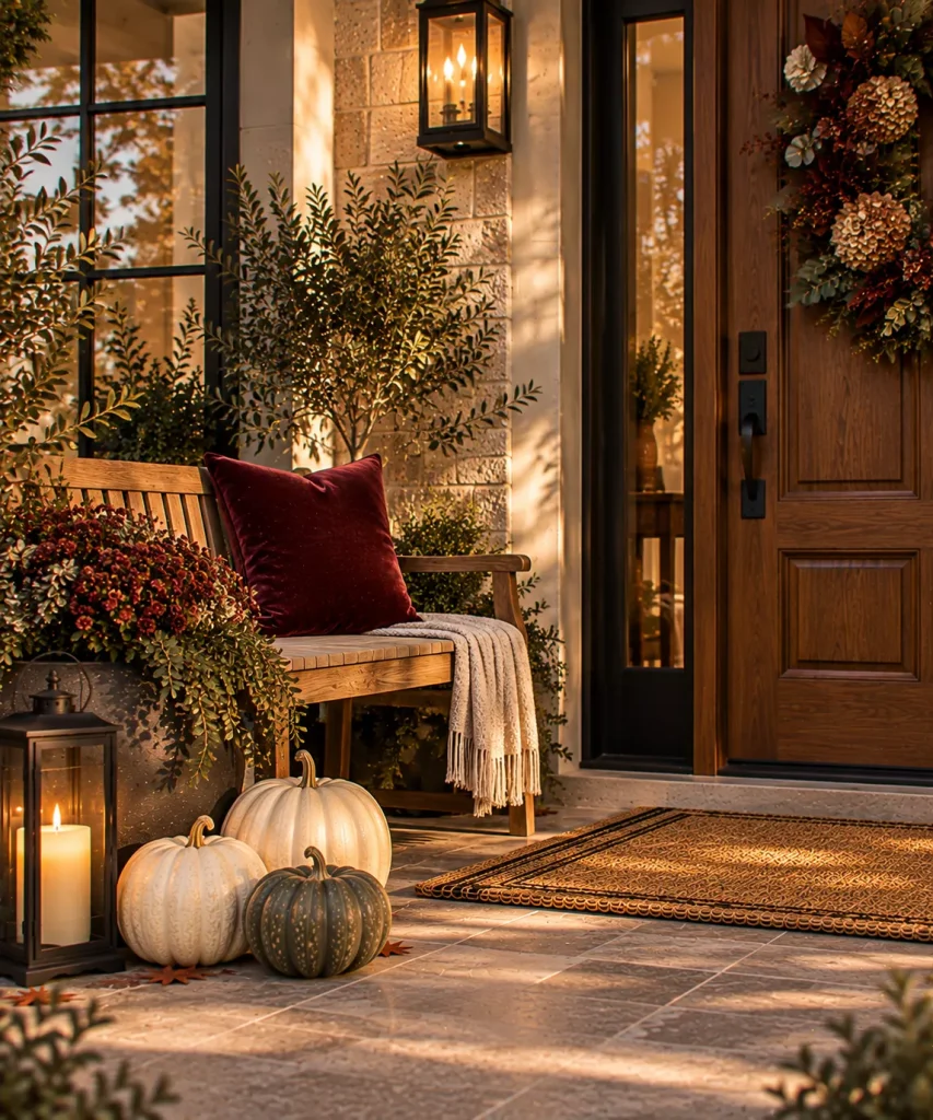
Idea 22: Use one velvet-look or patterned cushion
If the porch has a bench or chair, add one substantial outdoor-suitable cushion. Try oxblood velvet-look fabric, plum stripe, dark green botanical, or cream-and-brown geometric. A single textile can introduce luxury more effectively than adding another decorative accessory.

Idea 23: Layer a restrained outdoor rug beneath the doormat
Use floor pattern to finish the entrance. Good elegant combinations include black and cream, chocolate and ivory, burgundy and taupe, or olive and parchment. Keep the top mat relatively simple if the lower rug has a strong pattern.

Idea 24: Finish with one vintage-looking object
A truly elegant porch often benefits from one piece that does not look newly purchased for the season. That might be an old stone urn, a weathered brass planter, a vintage stool, a ceramic crock, or an aged lantern. One authentic-looking aged piece can make an otherwise polished arrangement feel less showroom-like.
Four elegant fall porch palettes
| Style | Main color | Supporting neutral | Metal | Green |
|---|---|---|---|---|
| Classic Glam | Oxblood | Cream | Aged brass | Olive |
| Moody Elegant | Plum | Chocolate | Bronze | Deep green |
| Light Luxe | Ivory | Mushroom | Champagne gold | Sage |
| Modern Glam | Deep teal | Warm white | Blackened metal | Olive |
Notice that each palette has one rich color, one quiet neutral, one metal, and one natural green. That is usually enough.
What should you avoid?
- Too much glitter. Shine is more convincing through metal, glass, and candlelight.
- Matching every object. Perfectly coordinated pumpkins, lanterns, planters, and ribbon can make the porch feel staged rather than sophisticated.
- Using metallic spray paint on everything. One metallic accent reads as intentional. Ten can feel artificial.
- Sacrificing the walking path for symmetry. A one-sided arrangement is better than a perfectly balanced entrance that is difficult to use.
- Confusing elegance with abundance.
Try this if your glam porch looks too flashy
Remove every shiny piece. Then put back only the best metallic object. It may be a bronze lantern, brass-toned planter, or copper bucket.
Next, add one rich color through flowers, ribbon, or foliage. Use cream pumpkins and greenery to calm everything around it.
Finally, introduce one aged or natural material such as wood, stoneware, or woven texture. The porch should have contrast between polished and organic surfaces.
If everything shines, nothing feels luxurious.
FAQ
How do you decorate an elegant fall front porch?
Start with a controlled color palette, then use substantial planters, grouped pumpkins, a restrained wreath, and oversized lanterns. Symmetry can make a formal entrance feel polished, but the individual pieces should still vary in texture and scale.
What colors work for glam fall porch decor?
Oxblood, plum, deep teal, burgundy, olive, cream, chocolate, terracotta, bronze, and aged brass all work well. Current 2026 color forecasts particularly favor oxblood, deep teal, smoky sage, olive, and terracotta, while plum is gaining attention as a sophisticated autumn accent.
How can I make fall porch decor look expensive?
Use fewer but larger pieces, prioritize material quality, and mix polished surfaces with natural texture. One substantial planter, one oversized lantern, three good pumpkins, and a well-scaled wreath can look more refined than a porch filled with many inexpensive novelty decorations.
Can elegant fall decor still use orange pumpkins?
Yes. Use orange as part of a richer palette rather than the only color. Muted orange looks especially good with cream, dark green, bronze, chocolate, or burgundy.
Let glamour come from material, not sparkle
The strongest glam fall decor ideas for a front porch have more in common with good interior styling than party decorating. There is contrast. There is scale. There is a controlled palette. And there is usually one polished element beside something natural or aged.
A brass-toned planter looks richer beside weathered wood. A plum wreath feels more sophisticated beside cream pumpkins. A black lantern becomes more dramatic when it is allowed to glow beneath a restrained arrangement rather than competing with dozens of accessories.
If you make one change first, choose the material or color that should feel luxurious and let everything else support it. That restraint is what makes an elegant autumn entrance feel intentional.