12 fall kitchen decor Ideas for a Warm, Cozy Home
The kitchen is probably the worst room in the house for decorative clutter.
A cute pumpkin lands beside the toaster. Then another appears near the sink. Soon, autumn leaves are competing with the coffee machine and you’ve lost the only clear stretch of counter where you can actually chop an onion.
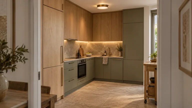
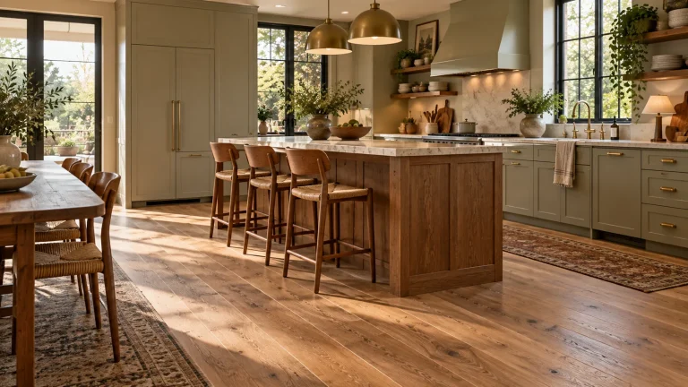
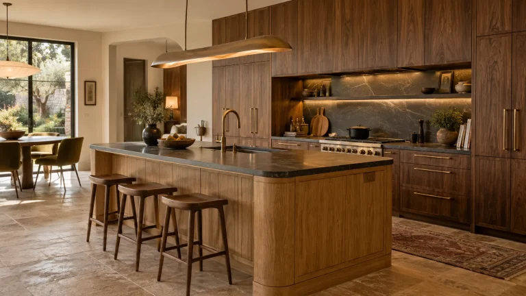
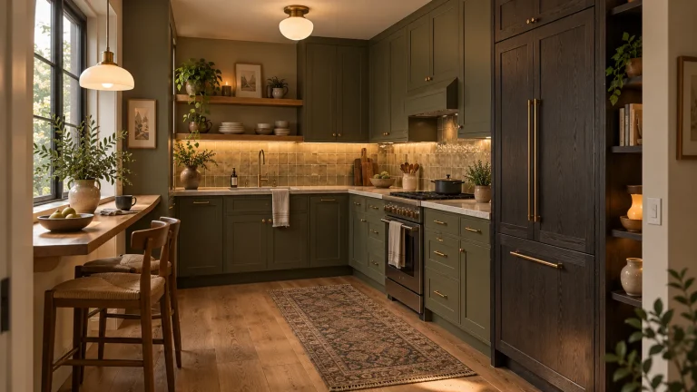
The best 12 fall kitchen decor Ideas take a more useful approach. Fall should show up through richer color, warmer light, natural texture, seasonal food, and a few details that already belong in a kitchen.
That approach fits fall 2026 particularly well. Chocolate brown, maroon, terracotta, bottle green, oxblood, and dusty yellow are replacing the predictable orange-only palette.
So keep the pumpkins if you love them. Just don’t make your kitchen work around them.
1. Bring in chocolate brown and cream before reaching for orange
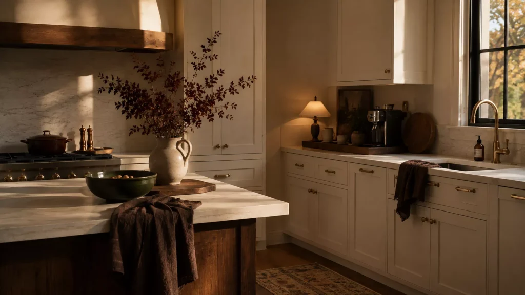
Idea 1: Treat chocolate brown as your fall neutral.
Brown is especially useful in kitchens because it already connects naturally to wood, cutting boards, woven baskets, coffee, pottery, and darker metals.
For fall 2026, chocolate brown is one of the strongest seasonal colors, often paired with cream, pale blue, aged brass, natural timber, and softer earthy shades.
You don’t need brown cabinetry to get the effect.
Try chocolate-colored linen tea towels against a cream kitchen. Add a dark wood tray beside the coffee machine. Put a brown ceramic pitcher on an open shelf.
Idea 2: Add one less predictable fall shade.
Bottle green, maroon, smoky violet, navy, and straw yellow can all make an autumn kitchen feel more interesting.
I particularly like bottle green with medium oak and cream.
Maroon works beautifully with walnut and aged brass.
And a muted yellow bowl or textile can bring warmth into a white kitchen without looking obviously seasonal.
This is one of those situations where everyone says fall means orange, but actually, orange is easier to appreciate when it isn’t doing all the work.
2. Turn food into your easiest seasonal centerpiece
Idea 3: Style the island with something you can actually eat.
Kitchen decor gets better when it has a reason to be in the kitchen.
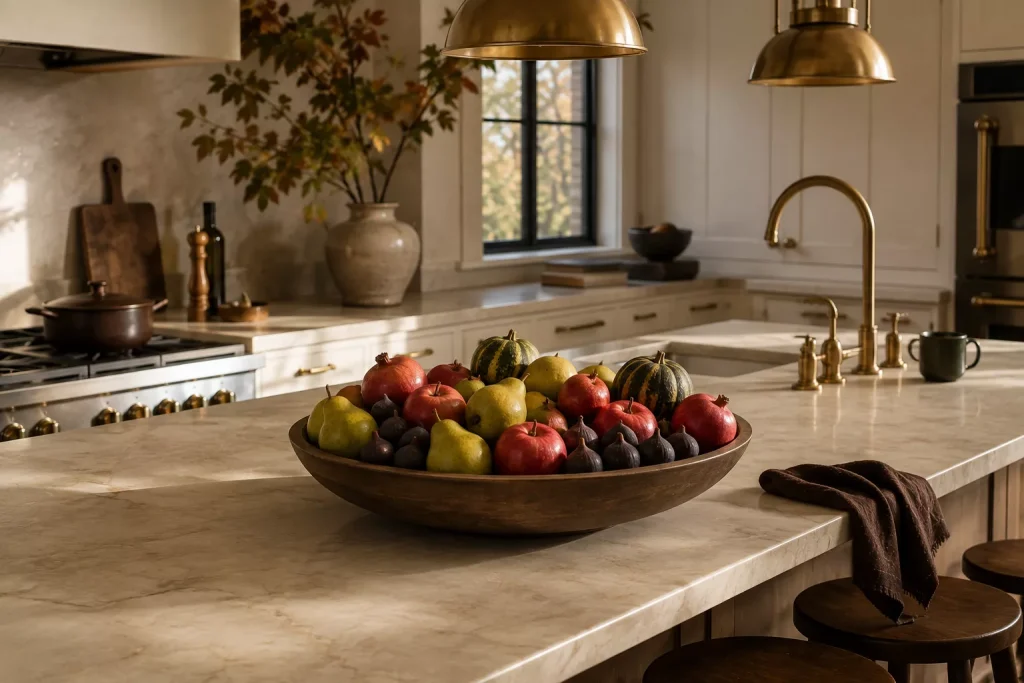
Instead of filling a bowl with decorative mini pumpkins, try pears, red apples, figs, pomegranates, or small winter squash that your household will use.
A shallow wood bowl filled with deep red apples can look surprisingly rich on a pale stone island.
For something looser, place pears and a couple of small squash in a wide stoneware bowl.
Better Homes & Gardens has long recommended using seasonal produce and simple harvest arrangements as practical fall kitchen decor, partly because they bring autumn color without requiring a separate collection of accessories.
Keep the centerpiece low
A kitchen island is usually a working surface.
Keep the arrangement below roughly 12 to 16 inches if people regularly sit or talk across it.
And don’t fill the entire island.
On a 6-foot island, one bowl around 14 to 18 inches wide can be plenty.
You still need somewhere to unpack groceries.
I’d rather have one beautiful bowl of food than a decorative arrangement everyone has to relocate before making dinner.
3. Use one tall branch arrangement instead of lots of small decorations
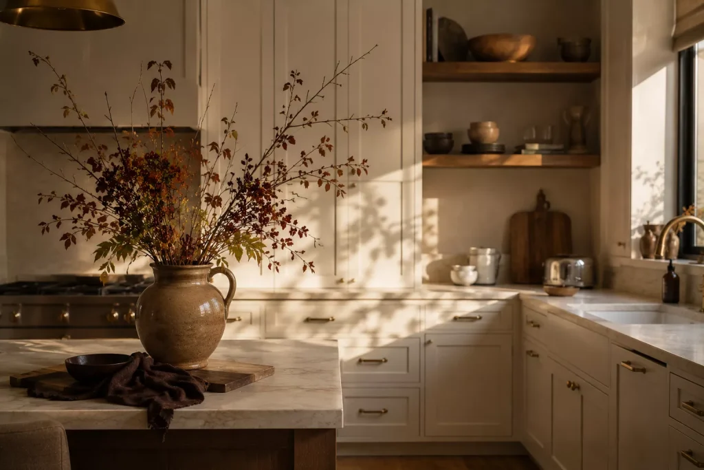
Idea 4: Bring autumn branches into the kitchen at a larger scale.
This is one of my favorite ways to decorate for fall because it creates impact without cluttering several surfaces.
Clip branches with changing leaves where it’s appropriate and permitted, or use dried branches, berry stems, seed heads, or a convincing faux version.
Put them in a heavy stoneware pitcher, amber glass vessel, or ceramic vase.
Something around 24 to 36 inches tall can look wonderful on the end of an island, breakfast table, or unused section of counter.
Keep branches well away from the range, toaster, candles, and other heat sources.
And make sure they don’t block cabinets.
That beautiful branch arrangement becomes much less charming the fifth time you move it to get a cereal bowl.
I once made exactly that mistake with a huge vase beside upper cabinetry. It lasted three days before being relocated.
Scale matters, but so does access.

4. Change the kitchen textiles you already use
Idea 5: Swap everyday towels for heavier fall color and texture.
Tea towels are cheap, useful, and easy to store when the season changes.
Try linen or cotton in rust, olive, chocolate, burgundy, ochre, or cream.
A good tea towel may cost roughly $10 to $25, so you don’t need a whole new kitchen budget to make a visible change.
Skip towels printed with twelve pumpkins and a long seasonal slogan unless you genuinely love that look.
A simple brown stripe or olive check will stay useful much longer.
Idea 6: Warm up the breakfast nook with fabric.
If your kitchen has a bench, window seat, or dining chairs, this is a much better place for seasonal textile layers.
Add two cushion covers in muted plaid, block-print floral, small checks, or textured solids.
Fall 2026 decor is leaning strongly toward richer materials and more tactile combinations, including velvet, leather, wool, woven fibers, and deeper earthy colors.
Choose washable fabric near food
This isn’t the room for precious upholstery.
A cream boucle bench beside spaghetti night sounds brave.
Use washable covers or fabrics with enough pattern and mid-tone color to forgive everyday spills.
Fall decorating should make the kitchen more comfortable, not more stressful.
5. Let cutting boards, copper, and old utensils become the decor
Idea 7: Display hardworking wood pieces vertically.
Wooden cutting boards add exactly the warmth people often try to create with decorative signs.
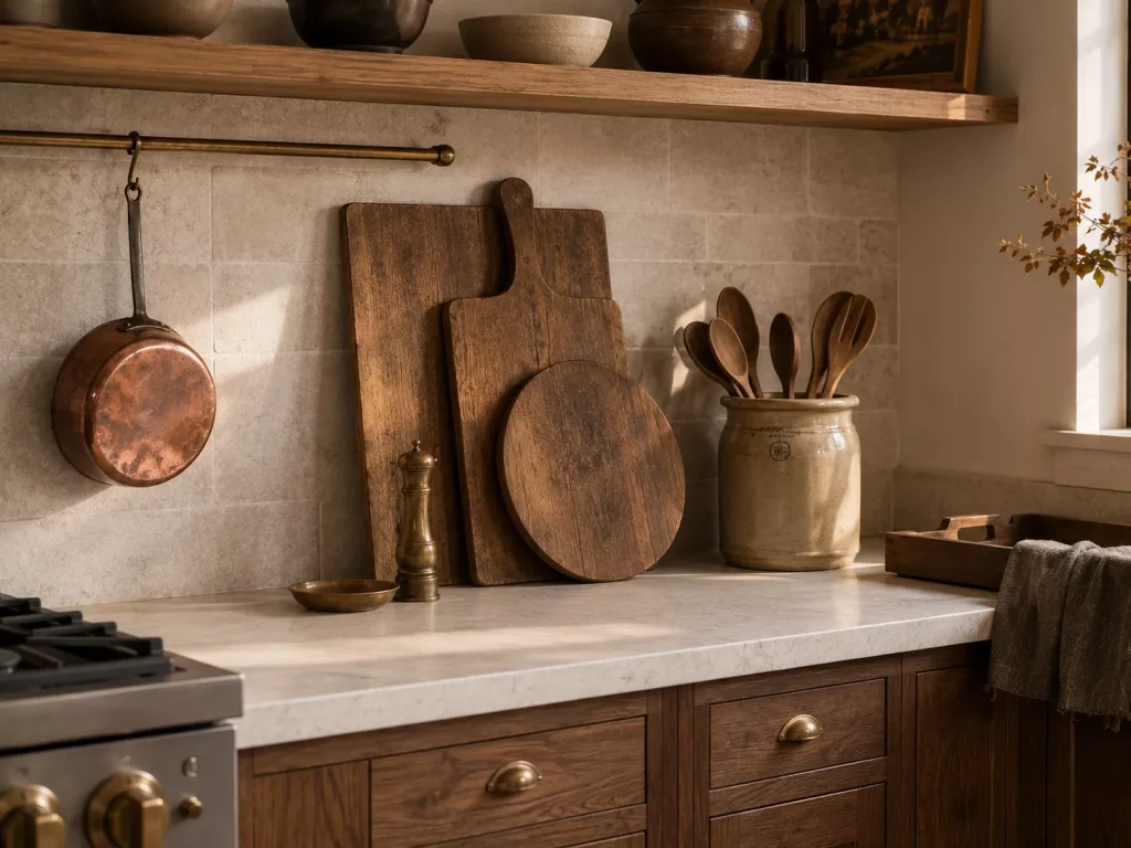
Lean two or three boards against the backsplash in an area where they won’t interfere with preparation.
Mix shapes.
A large rectangular board, one handled board, and a smaller round board are enough.
Current kitchen design is moving toward natural timber, visible grain, stone, patina, and materials with more warmth rather than flat, overly polished finishes.
Use the boards.
That’s important.
An entire collection of boards nobody is allowed to cut on starts becoming decorative clutter again.
Idea 8: Bring in copper or aged brass through useful objects.
A copper saucepan hanging from a rail, an aged brass pepper mill, or a small metal tray can add autumn warmth without introducing another seasonal motif.
Patinated metals also fit the wider move toward kitchens that feel less pristine and more collected. Designers looking toward 2027 are expecting stone, aged metals, furniture-like cabinetry, and finishes that develop character over time to remain important.
You don’t need to replace all your hardware.
One or two useful pieces are enough.

6. Put a small lamp in the kitchen for darker fall evenings
Idea 9: Add low evening light somewhere dry and safe.
This may be the most useful fall update on the list.
Kitchen lighting is often excellent at helping you slice vegetables and terrible at making the room feel comfortable after dinner.
The 2026 “soft kitchen” direction is addressing exactly that problem, with designers introducing warmer tones, table lamps, wall lights, relaxed seating, and more residential layers.
Try a small ceramic lamp on a dry stretch of counter, sideboard, open shelf, or breakfast nook.
A lamp around 12 to 18 inches tall is usually enough.
Look at olive ceramic, tobacco brown, cream stoneware, dark wood, or pleated shades.
And be sensible about location.
Keep portable lamps away from sinks, active prep areas, heat, and anywhere the cord becomes a hazard. Follow the fixture’s safety guidance.
You still need bright task lighting while cooking.
The small lamp is for the part of the evening when the knives are away and someone is standing in the kitchen eating leftover pie directly from the container.
That’s a legitimate lighting scenario.
7. Style shelves and counters with kitchen things, not seasonal filler
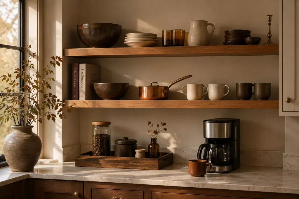
Idea 10: Give open shelves a fall edit rather than adding more objects.
You probably already own things that fit an autumn palette.
Brown stoneware.
Cream mugs.
Amber glass.
Wood bowls.
Cookbooks with darker covers.
A brass candlestick.
Bring a few of those forward and temporarily move brighter summer pieces elsewhere.
That changes the palette without buying anything.
For glass-front cabinets, you can do something similar with dishes and serving pieces.
Put darker ceramics and wood at eye level. Group cream pottery together. Let a copper pan or glass vessel break up the arrangement.
Here’s how I’d decide where fall decor belongs:
| Kitchen zone | Good fall addition | What I’d avoid |
|---|---|---|
| Island | Low bowl of seasonal produce | Tall cluttered centerpiece |
| Open shelf | Brown ceramics and warm glass | Lots of tiny pumpkins |
| Coffee station | Wood tray and fall-colored mug | Too many signs |
| Breakfast nook | Cushions and low branches | Fragile decorative objects |
| Counter | Cutting boards or small lamp | Loose leaves near food prep |
| Window | Simple herb or seasonal branch | Anything blocking useful light |
The important principle is containment.
Pick a few zones.
Leave the hardworking ones alone.

8. Use a darker runner to soften the kitchen floor
Idea 11: Add fall color underfoot instead of covering the countertops.
A runner can change a kitchen dramatically because it creates one long band of color.
In a galley or sink run, something around 2.5 by 6 feet may work. Longer kitchens might handle an 8-foot runner.
Measure first.
Look for faded burgundy, brown, olive, rust, navy, or a vintage-inspired pattern.
A washable low-pile rug is usually the easiest choice for kitchens because crumbs and spills are inevitable.
Expect roughly $30 to $120 for many washable or synthetic options, with wool and higher-end constructions going beyond that.
Keep rugs safely away from edges that curl or slide.
Use an appropriate rug pad where needed.
And don’t choose the palest rug in the shop because it looks clean and expensive.
A kitchen floor meets tomato sauce, coffee, flour, pet hair, and somebody coming inside with wet shoes.
Medium tones are your friend.
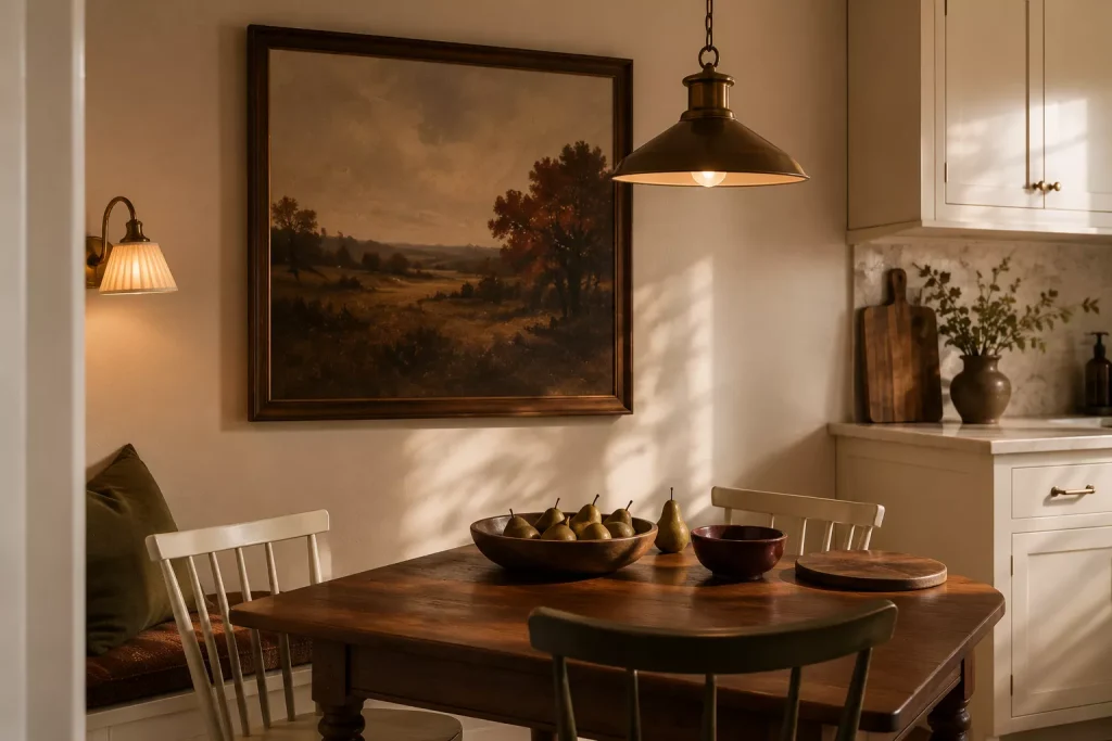
9. Bring fall onto the walls with art instead of word signs
Idea 12: Hang one small landscape or still life with autumnal color.
Kitchen artwork doesn’t need to be pictures of food.
A vintage landscape with brown fields, a dark floral still life, a botanical study, or an abstract piece with ochre and burgundy can bring in fall without feeling temporary.
This works especially well near a breakfast nook, pantry wall, or open area beside cabinetry.
Choose something you’d happily leave up in February.
That’s the test.
I’d skip mass-produced signs telling everyone to gather, eat, harvest, or drink pumpkin spice.
A kitchen already communicates most of those activities fairly clearly.
The broader 2026 kitchen direction is toward personality, craftsmanship, expressive materials, and rooms that feel more like living spaces than sterile work zones.
Art belongs in that shift.
A $25 thrifted landscape in a $40 wood frame can bring more character than a shelf full of seasonal accessories.
What should you skip when decorating a kitchen for fall?
First, skip decor beside the stove.
Dried foliage, fabric garlands, paper decorations, and baskets don’t belong close to open flame or high heat.
Keep working and heat zones clear.
I’d also skip covering the refrigerator in seasonal magnets or filling every cabinet handle with hanging ornaments.
The kitchen already has plenty of visual information.
Current designers are actively pushing back on countertop clutter, excessive open shelving, word art, fake rustic finishes, and decorative choices that interfere with the kitchen’s proportions and function.
And don’t automatically buy a set of orange accessories.
The strongest fall colors for 2026 include brown, maroon, terracotta, green, mauve, navy, and yellow, so you have plenty of options that can stay in the kitchen long after Thanksgiving.
Finally, skip anything that steals prep space.
That includes attractive decor.
A clear countertop can be one of the most luxurious-looking things in a busy kitchen.
FAQ About Fall Kitchen Decor
How can I decorate my kitchen for fall without using pumpkins?
Use deeper tea towels, brown or burgundy ceramics, a dark runner, seasonal branches, warm wood, copper, and a bowl of apples or pears. The room will feel autumnal through color and material rather than obvious symbols.
What colors are good for fall kitchen decor in 2026?
Chocolate brown, maroon, terracotta, oxblood, bottle green, smoky violet, straw yellow, and navy are all part of the current fall palette. Cream and natural wood make easy supporting neutrals.
How do I decorate a small kitchen for fall without clutter?
Focus on surfaces that already exist visually, such as towels, a runner, artwork, dishes, and lighting. Add only one countertop arrangement, then keep the main preparation area clear.
What is the cheapest way to make a kitchen feel cozy for fall?
Shop your cabinets first. Bring out brown pottery, wood boards, amber glass, darker cookbooks, and warm-colored linens you already own. Then add inexpensive branches or one new tea towel if the room needs more seasonal color.
Make the kitchen feel warmer before making it look seasonal
The most useful 12 fall kitchen decor Ideas don’t ask you to find storage space for a giant box of decorations in December.
They work with things a kitchen already needs.
A better towel. A warmer lamp. A bowl of pears. Wood boards beside the backsplash. One dark runner underfoot.
That’s where I’d begin.
Clear the counters first, then add one fall layer at a time. If you have to move a decoration every morning to make coffee, that piece has already failed the test.
Your kitchen should still feel like the busiest, most useful room in the house.
It should just feel a little warmer while you’re there.