25 Fall Chalkboard Ideas for Easy, Cozy and Creative Autumn Decor
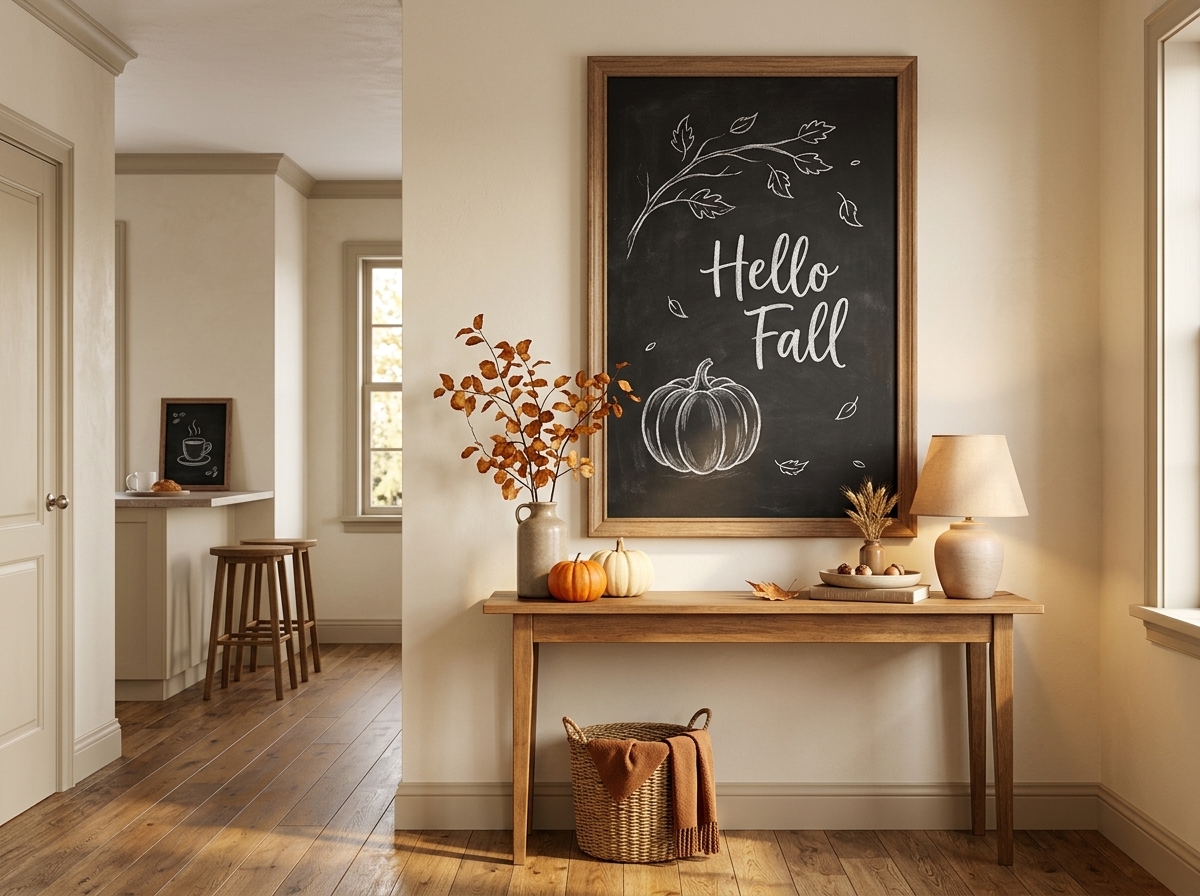
A fall chalkboard does not need elaborate hand lettering or an illustrated harvest scene to look finished.
In fact, one pumpkin drawn slightly off-center, a loose branch of leaves, and two well-spaced words can often look more intentional than a board filled from edge to edge. Chalkboards already have strong visual contrast, so the challenge is usually not adding enough. It is deciding what deserves attention and leaving enough empty space around it.
That is what makes fall chalkboard ideas so flexible. A large chalkboard wall can carry an October calendar or an oversized autumn tree, while a six-inch board on a coffee station may need only a steaming mug and the words “Cozy Season.” The same basic medium can feel farmhouse, minimalist, vintage, playful, elegant, or café-inspired depending on the lettering, spacing, motifs, and amount of color.
Chalkboards also make sense for seasonal decorating because the surface is designed to change. Apartment Therapy has shown them functioning as calendars, household message centers, creative walls, and even chalkboard doors, while HGTV and Country Living have used chalkboard elements for fall menus and seasonal displays.
These 25 ideas range from very easy pumpkin and leaf designs to coffee-bar signs, calendars, Halloween transitions, Thanksgiving displays, reading-nook boards, vintage harvest art, and polished signs that could also work in cafés or boutiques.
Easy fall chalkboard ideas for beginners
The simplest boards often work best when one element is clearly dominant.
Think of the surface as a composition rather than a page that must be filled. Decide what someone should notice first, then let the smaller leaves, dots, flourishes, or words support that element.
1. Draw one pumpkin with a simple “Hello Fall”
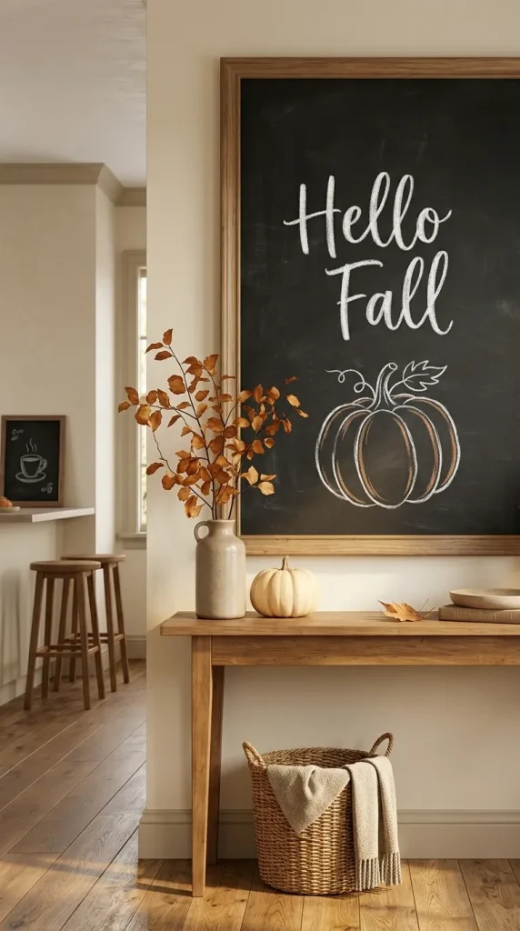
This is one of the easiest places to begin because the pumpkin does most of the visual work.
Draw a single loose pumpkin below or beside Hello Fall, keeping the lettering large enough to remain the main message.
Do not worry about making the pumpkin perfectly symmetrical. Slightly uneven lobes usually look more natural in chalk.
For a farmhouse or rustic board, add a curling stem and two leaves.
For a cleaner modern version, keep the pumpkin outline simple and leave the interior unfilled.
White chalk alone can be enough.
If you want color, use muted orange only on a few contour lines rather than coloring the entire pumpkin solid.
The restraint gives the board more breathing room and makes it easier for a beginner to produce something polished.
2. Create a loose autumn-leaf corner
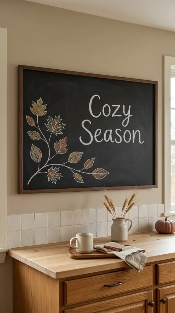
Instead of drawing around the entire board, decorate only one corner.
Begin with a thin branch and add five or six leaves in different shapes.
Maple-inspired leaves can be mixed with simpler oval forms so you do not have to reproduce complicated botanical shapes repeatedly.
Let the leaves spread slightly toward the center without surrounding the message completely.
Then add a short phrase such as:
Happy Fall
Welcome Autumn
Cozy Season
This asymmetrical layout works especially well on boards above consoles, kitchen counters, or entry tables because it looks styled without becoming busy.
It is also forgiving. If one leaf is imperfect, the variation simply makes the cluster feel more hand drawn.
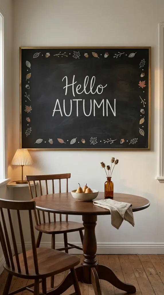
3. Use a simple leaf border around a short phrase
A border is useful when you already know what you want the chalkboard to say but the message feels visually unfinished.
Draw a thin line of alternating leaves, acorns, dots, or tiny branches around the edge.
Keep the border narrower than you think.
A thick decorative frame can reduce the useful writing area and make even a short phrase feel cramped.
For a more refined look, leave small gaps around the corners rather than creating one continuous line.
Try pairing the border with:
Harvest Time
Hello Autumn
Happy Fall
Gather Here
A border is particularly helpful on horizontal boards because it visually contains a phrase that might otherwise float awkwardly in the center.
Use pumpkins in more than one way
Pumpkins are the obvious fall motif, but that does not mean every pumpkin chalkboard has to look identical.
Scale, grouping, color, and lettering can move the same motif from rustic to modern or playful.
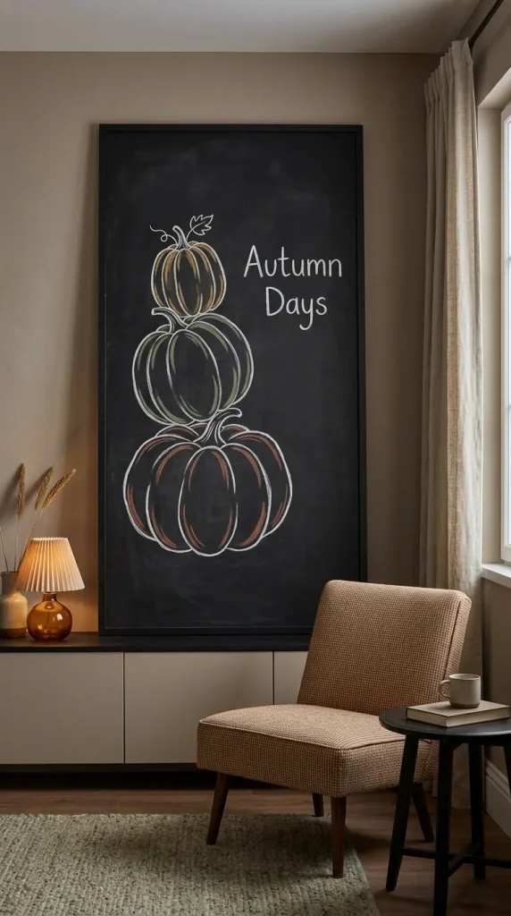
4. Stack three pumpkins vertically
Draw three pumpkins in slightly different shapes, one above another.
A flatter pumpkin on the bottom gives the stack stability. Put a medium round pumpkin in the middle and a smaller one on top.
The drawing itself can occupy one side of the board while the opposite side carries a short phrase.
This composition is especially useful on taller portrait-format chalkboards.
For a neutral look, keep everything in white chalk.
For more seasonal color, give each pumpkin a few lines of muted rust, olive, or ochre rather than fully filling it.
The important design move is variation. Three identical round pumpkins look diagrammatic. Different silhouettes create a more natural arrangement.
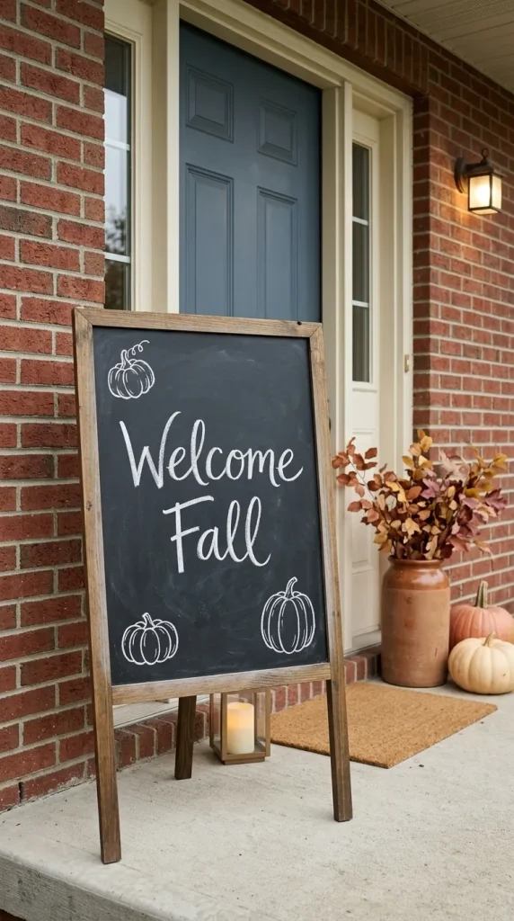
5. Frame a welcome message with small pumpkins
Rather than drawing one dominant pumpkin, use several mini pumpkins as supporting elements.
Place two near the bottom corners and perhaps one near the top.
Then let the message remain the focal point.
For example:
Welcome Fall
could be written in a loose script, while the pumpkins remain simple outline drawings.
This approach works particularly well for a chalkboard near the front door because it behaves more like seasonal signage than wall art.
Country Living has featured chalkboard-style welcome signage as part of autumn entrance decor, showing how a changeable sign can sit naturally beside branches and other fall materials.
If the surrounding porch already contains real pumpkins, keep the chalkboard drawing simpler so the two layers do not compete.
Bring apples into early-fall chalkboard decor
Fall does not begin with Halloween.
September especially can feel fresher when apples, branches, wheat, and late-summer flowers appear before pumpkins take over the entire seasonal palette.

6. Draw a simple basket of apples for September
A loosely sketched basket of apples gives a kitchen or breakfast area an early-fall feel without rushing directly into October imagery.
Draw a shallow basket first.
Then add overlapping circles for the apples and a few small leaves near the stems.
The drawing does not need detailed shading. A few curved contour lines and small highlights can make the fruit readable.
Pair it with:
Apple Season
Hello September
Fresh Picked
Autumn Begins Here
This works particularly well in kitchens because the motif already belongs naturally near food, fruit bowls, wooden cutting boards, and pantry shelves.
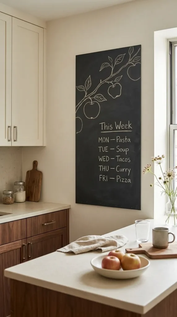
7. Use one apple branch instead of a full illustration
For a more minimal board, draw a single branch crossing one corner with two or three apples attached.
This gives you a different silhouette from the more common loose-leaf branch.
Use warm white chalk for the branch and perhaps a small amount of faded red or muted green if you are using markers.
The design can sit beside a handwritten weekly menu, grocery list, or short seasonal phrase.
That combination of practical and decorative use is one of the strengths of kitchen chalkboards. Apartment Therapy has highlighted chalkboard walls and small surfaces specifically as useful places for calendars, notes, menus, and reminders rather than treating them only as decorative art.
Give the chalkboard a cozy coffee-bar role
Coffee bars are one of the easiest places to use seasonal chalk art because the board can be relatively small and the imagery already has a clear theme.
A mug, steam, cinnamon stick, or pumpkin is enough to establish the setting.
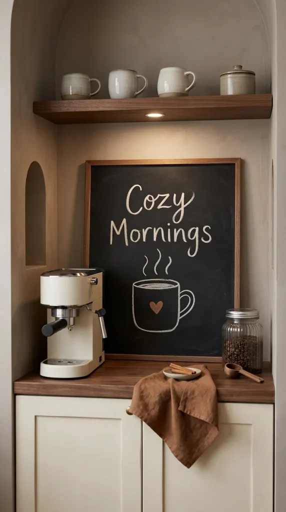
8. Draw a steaming mug with “Cozy Mornings”
A mug is easier to draw than it looks.
Start with a simple rounded rectangle or curved cup shape, add a handle, and then draw two or three loose lines of steam.
Keep the board mostly monochrome.
Then write:
Cozy Mornings
or:
Hello, Sweater Weather
above the mug.
If you want to introduce fall color, use it in only one area, perhaps a muted rust heart on the mug or a small orange pumpkin beside it.
Placed beside a coffee machine, jar of beans, or stack of mugs, the board becomes part of the coffee-station composition rather than a separate decorative object.

9. Create a pumpkin-spice-style café board without copying a brand
You can borrow the visual rhythm of a cozy café menu without imitating a particular coffee chain.
Use one large heading such as:
Fall Drinks
Then list a few household favorites underneath in smaller block lettering.
A tiny mug, leaf, or cinnamon-stick illustration can fill an empty corner.
The important design principle is hierarchy.
The heading should be largest.
The drink names should be smaller.
Decorative elements should remain secondary.
This same format can work at home for a coffee bar or, with clearer lettering and less ornament, in an independent café.
Avoid trying to reproduce branded Starbucks artwork or typography. The useful idea is the general seasonal coffee-board aesthetic, not another company’s identity.
Use the kitchen chalkboard for both function and fall style
A kitchen chalkboard does not need to stop being useful just because you decorate it seasonally.
The most convincing versions often combine practical information with a small amount of seasonal imagery.
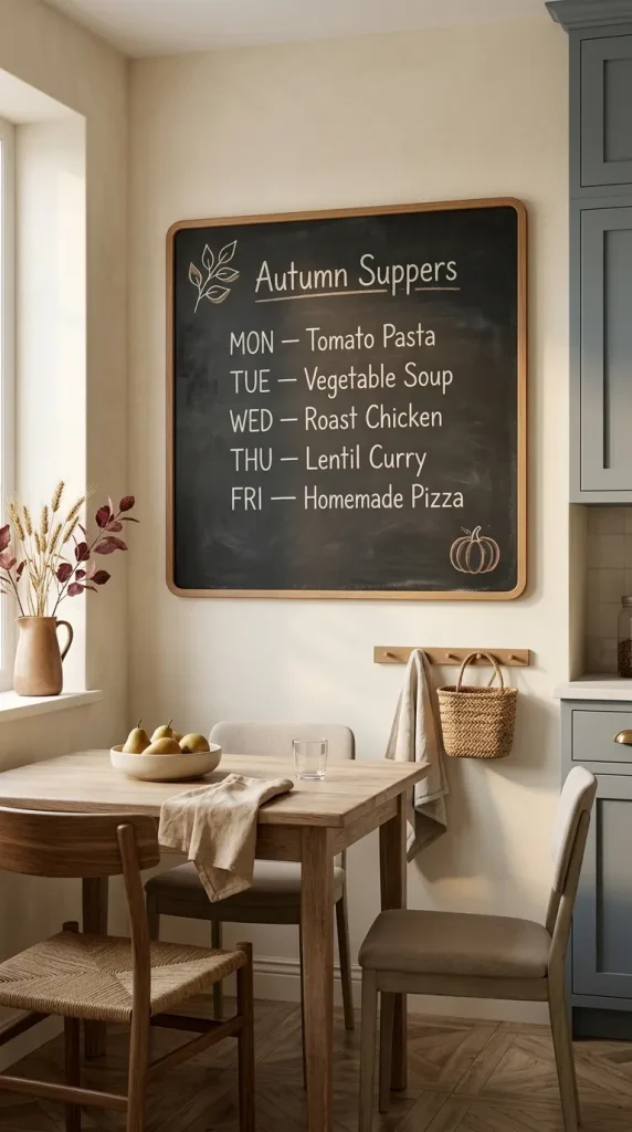
10. Turn the board into an autumn weekly menu
Use the middle of the board for a simple weekly meal list.
Reserve only the top and one corner for seasonal decoration.
A small branch of leaves, miniature pumpkin, or wheat sketch can establish fall without reducing readability.
HGTV has used framed chalkboards as fall and Thanksgiving menu boards, showing how well the format works when the information remains the central feature.
Keep meal names in straightforward lettering rather than decorative script.
Save the script for a heading such as:
This Week
or:
Autumn Suppers
The board remains decorative but actually earns its place in the kitchen.
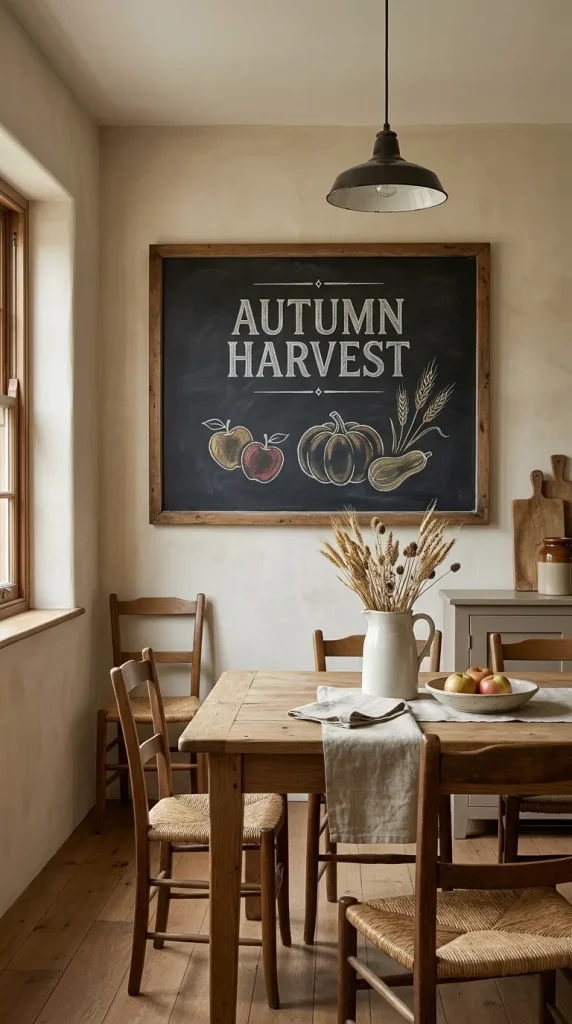
11. Create a vintage harvest-market chalkboard
A larger kitchen or dining-room board can imitate the general look of an old handwritten produce or market sign.
Write:
Autumn Harvest
in larger lettering.
Below it, sketch a few items such as apples, pumpkins, wheat, or squash.
Use classic serif-inspired block letters or slightly old-fashioned hand lettering rather than modern flowing script.
A thin ornamental line above and below the heading can strengthen the vintage feeling.
This style is particularly suited to rooms with aged wood, stoneware, iron, vintage cutting boards, or farmhouse furniture.
But resist distressing every surrounding object just to make the chalkboard fit.
One convincing vintage reference is enough.
Think about the size and shape of the board
A common decorating mistake is choosing a design from an online image without considering that the inspiration board and the board at home may have completely different proportions.
The layout should respond to the actual surface.
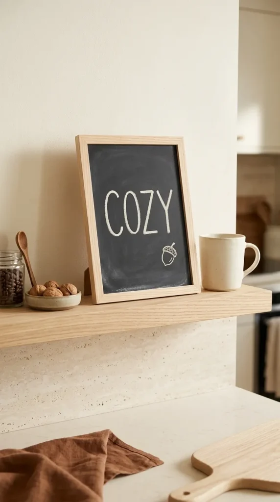
12. Keep a mini chalkboard to one tiny motif
A mini board on a shelf, tiered tray, coffee station, or kitchen counter cannot carry the same amount of information as a wall board.
Give it one job.
Write:
Fall
Gather
Cozy
October
Then add one tiny leaf, acorn, apple, or pumpkin.
That is enough.
Trying to fit a quote, border, pumpkin patch, and decorative lettering onto a board the size of a postcard makes every element too small to read.
Mini chalkboards look best when they behave almost like labels.
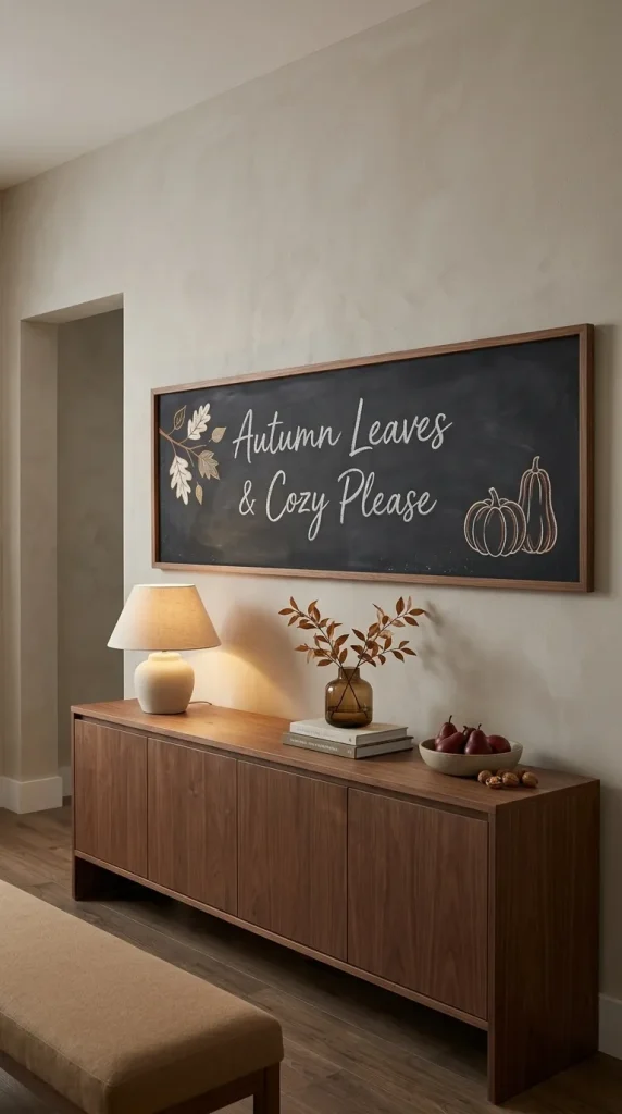
13. Design a horizontal chalkboard around one wide phrase
Landscape boards naturally suit wider lettering.
Use a phrase such as:
Autumn Leaves & Cozy Please
or:
Welcome to Our Cozy Season
across the center.
Then balance the width by placing a small branch or pumpkin group on either side.
Do not stack every word vertically unless the board is tall enough for it.
The composition should follow the board’s proportions.
A horizontal format is also particularly useful above a coffee bar, dining buffet, bench, or kitchen shelf because its shape echoes the furniture beneath it.
Use a chalkboard wall differently from a framed board
A full wall provides far more drawing space, but more space does not mean every inch should be filled.
Large surfaces need stronger visual structure.
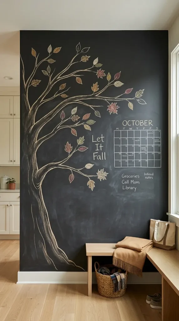
14. Draw one oversized autumn tree on a chalkboard wall
Use a trunk or large branch rising from one lower corner and spreading across perhaps half of the wall.
Add scattered leaves rather than filling every branch.
The remaining space can hold a family calendar, notes, or one seasonal phrase.
Apartment Therapy has shown chalkboard walls functioning successfully as calendars, family message centers, creative surfaces, and large-scale murals.
The oversized tree works because it uses the scale of the wall instead of repeating many tiny motifs.
It can also evolve through the season.
Begin September with more leaves.
Remove some in October.
By November, add a few words of gratitude around the branches.

15. Make a seasonal family chalkboard calendar
A large board is also ideal for a September, October, or November calendar.
Keep the calendar grid extremely simple.
Decorate only the heading and corners.
For September, use apples and leaves.
For October, add pumpkins or a few small bats.
For November, shift toward wheat, acorns, branches, or gratitude prompts.
The calendar should remain readable from several feet away.
Use one accent color for appointments or weekends if desired, but avoid turning every date into a decorative element.
Function should stay dominant.
Decorate the entrance with chalk
Chalkboards near the front door work best when they communicate something quickly.
Visitors should not need to stand at the threshold and decipher a long quote.

16. Create a seasonal chalkboard door sign
Use a medium board near the entrance with a short greeting.
Good wording includes:
Hello Fall
Welcome Autumn
Happy Fall
Gather Here
Draw a loose wreath of leaves around the text or place a pumpkin group at the bottom.
If the porch already contains mums, pumpkins, garlands, or lanterns, repeat only one of those motifs on the board.
That creates a visual relationship between the chalk art and the physical decor.
A board covered in apples beside a porch filled entirely with pumpkins and burgundy foliage may still work, but repeating one existing shape or color will usually make the entrance feel more cohesive.
Let the design change from September through November
Fall is almost three months long.
A chalkboard is one of the easiest decorations to update gradually rather than creating one generic autumn display and leaving it unchanged until winter.

17. Use apples, sunflowers, and lighter leaves for September
Early fall can stay relatively bright.
Use:
Apples.
Sunflowers.
Green-to-gold leaves.
Wheat.
Small branches.
Simple harvest wording.
A phrase such as Hello September or Harvest Begins is enough.
Keep the palette closer to warm white, faded yellow, muted red, and soft green.
Then allow the board to become darker and more pumpkin-heavy as October approaches.
This gradual shift makes seasonal decorating feel connected to the calendar rather than starting Halloween styling while the weather still feels like summer.
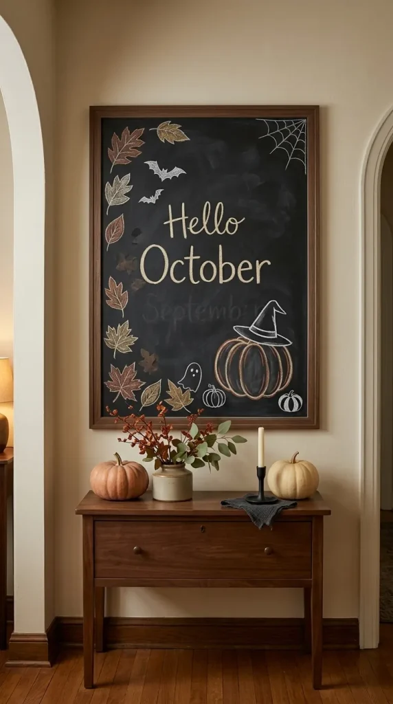
18. Shift the same board toward pumpkins and Halloween in October
You do not need to erase the entire fall design.
Keep the leaf border or pumpkin drawing.
Add:
A few bats.
A tiny web.
A ghost.
A black-and-white pumpkin.
A witch hat resting on an existing pumpkin.
Change Hello Fall to Hello October if you want a stronger seasonal marker.
The key is to retain enough harvest imagery that the board still belongs with the rest of your autumn decor.
A fall-to-Halloween board is more flexible than an entirely spooky design if you prefer to keep your seasonal decorating relatively understated.

19. Turn the board toward gratitude and harvest in November
After Halloween, remove the bats, webs, or ghosts and keep the pumpkins, branches, and leaves.
Then change the message.
Try:
Gather & Give Thanks
Grateful
Harvest Time
Thankful Hearts
or a family gratitude prompt.
A large chalkboard wall can become interactive by allowing family members to add one thing they are thankful for.
A smaller board can use a wheat border or simple branch arrangement.
The transition is easy because pumpkins, leaves, apples, wheat, and harvest motifs already bridge October and Thanksgiving.
Try a cleaner, more aesthetic chalkboard style
“Aesthetic” becomes useful only when it describes specific design decisions.
For a polished chalkboard, pay attention to spacing, hierarchy, line weight, and color restraint.

20. Use white chalk only for a monochrome fall board
A black board with white chalk can feel surprisingly sophisticated.
Draw a single pumpkin or botanical branch.
Use one large phrase.
Leave substantial empty black space around it.
This style is particularly effective in:
Modern kitchens.
Minimalist interiors.
Farmhouse rooms.
Vintage spaces.
Black-and-white entryways.
Because the board already provides extreme contrast, additional colors are not necessary.
Variation can instead come from line weight.
Use thicker strokes for the heading and thinner lines for leaves and decorative details.
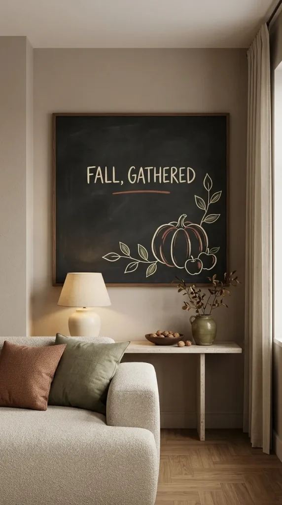
21. Add only three muted chalk-marker colors
If monochrome feels too plain, choose a deliberately narrow palette.
For example:
Warm white.
Rust.
Olive.
Or:
Cream.
Mustard.
Brown.
Use color on perhaps 20 to 30 percent of the overall drawing rather than coloring every shape.
White or cream can remain the main lettering color, while muted accents pick out leaves, pumpkin ridges, apples, or borders.
This creates a more coordinated result than using every marker in the packet.
And because the palette is controlled, the board can relate more easily to nearby pillows, kitchen textiles, pottery, flowers, or fall foliage.
Give the board more personality
Not every fall sign needs to sound sentimental.
Some spaces benefit from humor, hobbies, or another personal reference.
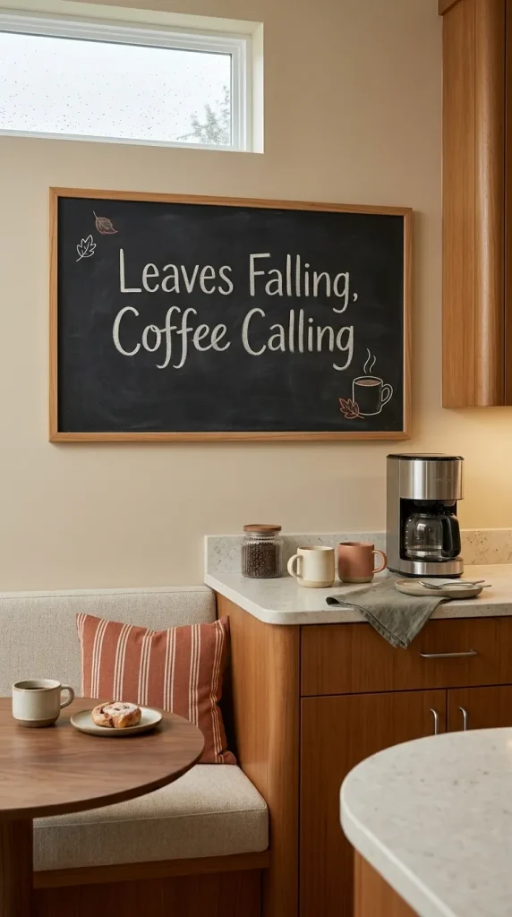
22. Create a funny kitchen or coffee-board phrase
Casual spaces are ideal for light humor.
Use a short line such as:
Powered by Coffee & Cool Weather
Pumpkin Season Is My Personality
Sweater Weather, Better Together
Leaves Falling, Coffee Calling
Pie First, Questions Later
Keep the typography more important than the illustrations.
A small mug, pumpkin, pie slice, or leaf can reinforce the joke without turning the board into a cartoon.
Funny boards work particularly well in kitchens, coffee bars, family rooms, and casual breakfast spaces where a formal harvest quote might feel too serious.
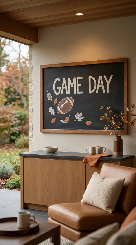
23. Draw a simple football-and-fall combination
Football season and autumn overlap naturally for many households.
Draw a small football beside several falling leaves.
Add:
Game Day
or:
Football, Fall & Food
This type of design works well in a kitchen, family room, basement bar, game room, or covered entertaining space.
Keep team branding out unless you specifically want it.
A generic football motif gives the board a longer useful life and prevents the design from becoming dependent on a particular logo or color scheme.
Pair brown, white, and muted orange for an easy autumn palette.
Use chalkboards in reading spaces and family areas
Fall decor does not have to revolve around pumpkins.
Books, mugs, candles, and leaves can create an equally recognizable cozy-season mood.
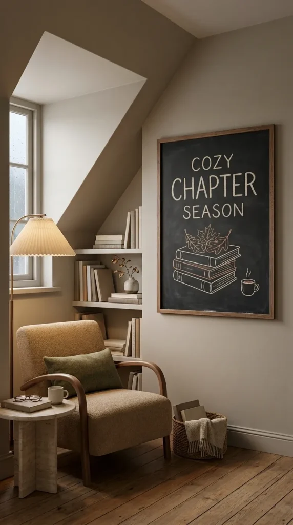
24. Make a books-and-leaves chalkboard for a reading nook
Draw a simple stack of books with two or three leaves resting on top.
Add a tiny steaming mug if there is enough room.
A short phrase might read:
Autumn Reading List
Books, Blankets & Fall
Cozy Chapter Season
A chalkboard in a library, reading corner, home office, or children’s study area can also list books you want to read through the season.
This idea captures some of the school and library intent without turning the article into classroom-decoration content.
For a family version, let children add their own book recommendations or small leaf drawings around the edges.
End the season with a design that can move toward winter

25. Draw neutral branches, pinecones, and a warm-drink motif
Late November does not need to jump immediately from pumpkins to snowflakes.
Create a transitional board using:
Bare branches.
Pinecones.
A warm mug.
A few remaining leaves.
Small stars or dots.
Keep the palette neutral with white, brown, muted green, and perhaps a touch of rust.
The board can say:
Stay Cozy
or:
Warm & Gathered
As winter approaches, erase the final leaves and add evergreen sprigs or snow details while keeping the same central lettering.
This is a useful way to get more life from one composition instead of completely redesigning the chalkboard every few weeks.
Easy fall chalkboard borders you can reuse
If the words are already decided, the border may be all the decoration you need.
Leaves create the most adaptable border because you can make them realistic or extremely simple. Alternate two or three leaf shapes rather than repeating one perfectly.
Mini pumpkins work best along the bottom edge rather than around all four sides.
Acorns can be scattered between leaves.
Wheat suits vintage and harvest boards.
Dots, dashes, scallops, and small lines work well on minimalist boards.
A thin vine can curve around one or two corners without enclosing the entire surface.
The most important rule is scale.
The border should support the message, not reduce the words to a small box in the middle.
How to make easy chalkboard lettering look more polished
Good layout matters more than elaborate calligraphy.
Start by deciding which two or three words matter most.
Make those words larger.
If the phrase is:
Hello Cozy Fall
perhaps Fall becomes the largest word, while the other two remain smaller.
Limit yourself to two lettering styles.
A simple combination is one loose script plus one straightforward block style.
Using four different alphabets on one board usually creates more visual noise than personality.
Before committing to the final design, lightly mark the approximate center, text area, illustration area, and border.
You do not need a detailed pencil-style sketch.
The objective is to know where the large shapes will live before finishing the first word and discovering that there is no room for the pumpkin.
Spacing matters just as much.
Give large letters enough room around them.
Keep drawings away from the frame.
Allow intentional patches of empty board to remain visible.
These choices are often what separate an easy chalkboard design that looks considered from one that feels crowded.
Traditional chalk or chalk markers?
Both can produce attractive fall boards, but they create different visual effects.
Traditional chalk produces a softer, dustier line. That slightly imperfect finish suits vintage, farmhouse, rustic, schoolhouse, and casual designs particularly well.
Chalk-style markers can create sharper edges and stronger saturated color, which can suit café signs, calendars, mini boards, and more graphic modern designs.
For seasonal styling, you do not need a huge marker palette.
White plus rust, mustard, olive, or muted orange is often enough.
Before using any marker on a chalkboard surface, follow the product and board manufacturer’s instructions and test an inconspicuous area, particularly if you want the drawing to erase cleanly later.
Cozy fall chalkboard sayings that leave room for artwork
Short phrases are usually more effective because they leave space for illustration and are easier to read from across a room.
Good directions include cozy phrases, harvest messages, humorous wording, coffee references, or simple seasonal greetings.
Examples that suit home decor include:
Hello Fall
Welcome Autumn
Happy Fall
Harvest Time
Gather Here
Cozy Season
Autumn Leaves & Cozy Please
Fall in Love
Stay Cozy
Give Thanks
Grateful
Apple Season
Sweater Weather
Leaves Falling, Coffee Calling
The phrase does not need to describe every motif on the board.
If the words already say Harvest Time, the drawing can be one small wheat branch rather than pumpkins, apples, leaves, acorns, and baskets all at once.
How to adapt these ideas for cafés, boutiques, and small businesses
Home should remain the starting point for these designs, but many of the same composition principles work on customer-facing chalkboards.
The main difference is readability.
A home board can reward close inspection.
A café, boutique, bar, salon, or restaurant sign may need to communicate information from several feet away.
That means larger words, stronger contrast, and fewer illustrations.
A café might use one steaming mug with a seasonal drinks heading.
A boutique can add a leaf border around an autumn promotion.
A restaurant may use pumpkins or wheat around a seasonal-specials board.
A salon reception board may need no more than Hello Fall with a restrained leaf branch.
Retail boards should avoid decorating over the information people actually need to read.
The principle is the same as home chalk art: establish one hierarchy and let the decorations support it.
What about classroom and kids’ fall chalkboards?
Classrooms and school displays are a secondary use rather than the main focus of a Home Style Atlas article, but the easiest motifs translate well.
Apples.
Leaves.
Pumpkins.
Scarecrows.
Trees.
Acorns.
Children can also recreate many of these designs at home on a playroom chalkboard.
A simple scarecrow face is particularly forgiving because the charm comes from its handmade quality rather than precise drawing.
For a larger family chalkboard, turn the November tree into a gratitude activity and let everyone add a leaf containing something they appreciate.
This allows the chalkboard to become interactive without requiring another physical seasonal decoration.
Faith-based fall chalkboard ideas
Readers who prefer faith-centered seasonal displays can adapt the same harvest visuals without changing the overall design approach.
Wheat, pumpkins, leaves, trees, and branches can frame a short message about gratitude or harvest.
A Bible verse can also be used when personally meaningful, but keep the layout especially restrained if the wording is longer.
Long text needs more negative space, not more decorative motifs.
The faith element should be a choice within the broader fall chalkboard style rather than something every seasonal board is expected to include.
What should you avoid?
Do not fill every inch because the surface looks empty while you are drawing. Empty black space is part of the design.
Do not use four or five lettering styles simply to demonstrate variety.
Do not give the border, phrase, and central drawing equal visual weight. Choose one focal element.
Do not copy a complicated illustration if what you actually want is an easy seasonal board. A simple pumpkin rendered confidently usually looks better than an ambitious harvest scene that becomes visually confused.
Do not make mini chalkboards behave like full walls. Reduce the idea to one phrase or motif.
Do not cover a functional kitchen calendar with so many leaves and pumpkins that the dates become difficult to read.
And for commercial boards, do not let seasonal artwork obscure prices, hours, menus, or other useful information.
Try this if your chalkboard still looks awkward
Erase the smallest details first.
Now look at the board from across the room.
Ask what you notice first.
If the answer is “everything,” the hierarchy is probably too weak.
Choose one element to enlarge.
That might be the word Fall, the pumpkin, the mug, or the main branch.
Then reduce the size or number of supporting details.
Check the margins.
Give the lettering more room from the frame.
And if the board still feels unfinished, add one small cluster of leaves rather than another sentence.
More content is rarely the only solution.
Frequently Asked Questions
What are the easiest fall chalkboard ideas to draw?
Start with pumpkins, simple leaves, apples, acorns, branches, mugs, or basic borders. Pair one motif with a short phrase such as “Hello Fall” or “Happy Fall.” A single focal drawing is usually easier and more visually effective than a detailed scene.
What can I write on a fall chalkboard?
Short phrases work particularly well, including “Hello Fall,” “Welcome Autumn,” “Harvest Time,” “Cozy Season,” “Give Thanks,” “Stay Cozy,” or “Autumn Leaves & Cozy Please.” Short wording leaves enough room for leaves, pumpkins, apples, or borders.
How can I make fall chalkboard art look aesthetic?
Limit the number of colors and lettering styles, leave empty space around the main design, and choose one focal point. A mostly white design with one muted rust or olive accent can look more polished than a board filled with many bright colors.
What should I draw on a fall coffee-bar chalkboard?
A mug, steam, small pumpkin, cinnamon stick, or leaf works well. Keep the wording short, such as “Cozy Mornings,” “Fall Drinks,” or “Leaves Falling, Coffee Calling,” so the board complements the coffee station rather than dominating it.
How can I transition a chalkboard from fall to Halloween and Thanksgiving?
Keep the main autumn elements, such as pumpkins, leaves, and branches. Add bats, webs, or ghosts in October, then remove them in November and introduce wheat, gratitude wording, acorns, or harvest motifs. One base design can therefore last most of the season.
Let the chalkboard change with the season
The best fall chalkboard ideas are often the easiest ones to edit.
An apple branch can welcome September.
A pumpkin can join it in October.
A few bats can temporarily move the design toward Halloween.
By November, those bats can disappear while the pumpkins stay and the message changes to gratitude or harvest.
That flexibility is what makes chalkboards particularly good seasonal decor.
You do not need professional lettering, a complicated mural, or a box full of colored markers.
Choose one strong focal element.
Keep the words readable.
Use leaves, pumpkins, apples, mugs, borders, and branches as supporting details.
And allow enough empty board around them that each mark actually matters.
If the seasonal refresh continues past the chalkboard, the bed is a natural next step, and these fall bedding combos show how to warm up a bedroom without novelty prints.
The result will feel far more intentional than trying to squeeze every autumn symbol onto the same surface.